
Earlier this year I got to create title and credit designs for a short film called How’s Archie, about a couple who must co-parent their dog, Archie, after they breakup. Check out the trailer here! I also created a surprise stop motion animation for the film, which I’ll be able to share more about once the film’s festival run is complete (sometime next year). Working on this which was such a wonderful experience and truly a dream gig!
The intent behind the title design was to create a feeling of intimacy, something that felt classic, warm and familiar, to reflect the film’s themes.
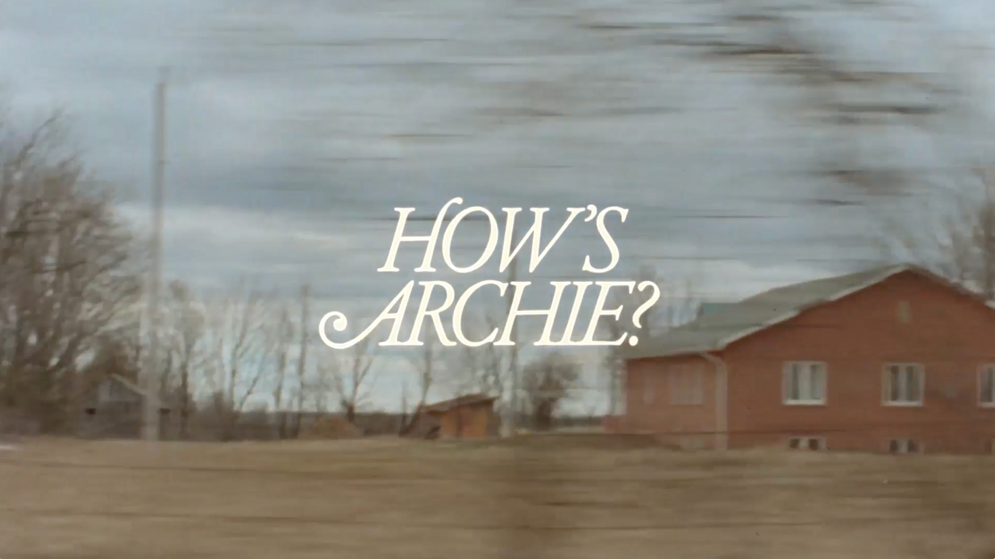
For the credit sequence, the director Jessie wanted to include drawings of Archie alongside the cast and crew’s names. I did several sketches, using my favorite ink brush pen, and then got to work creating layouts!
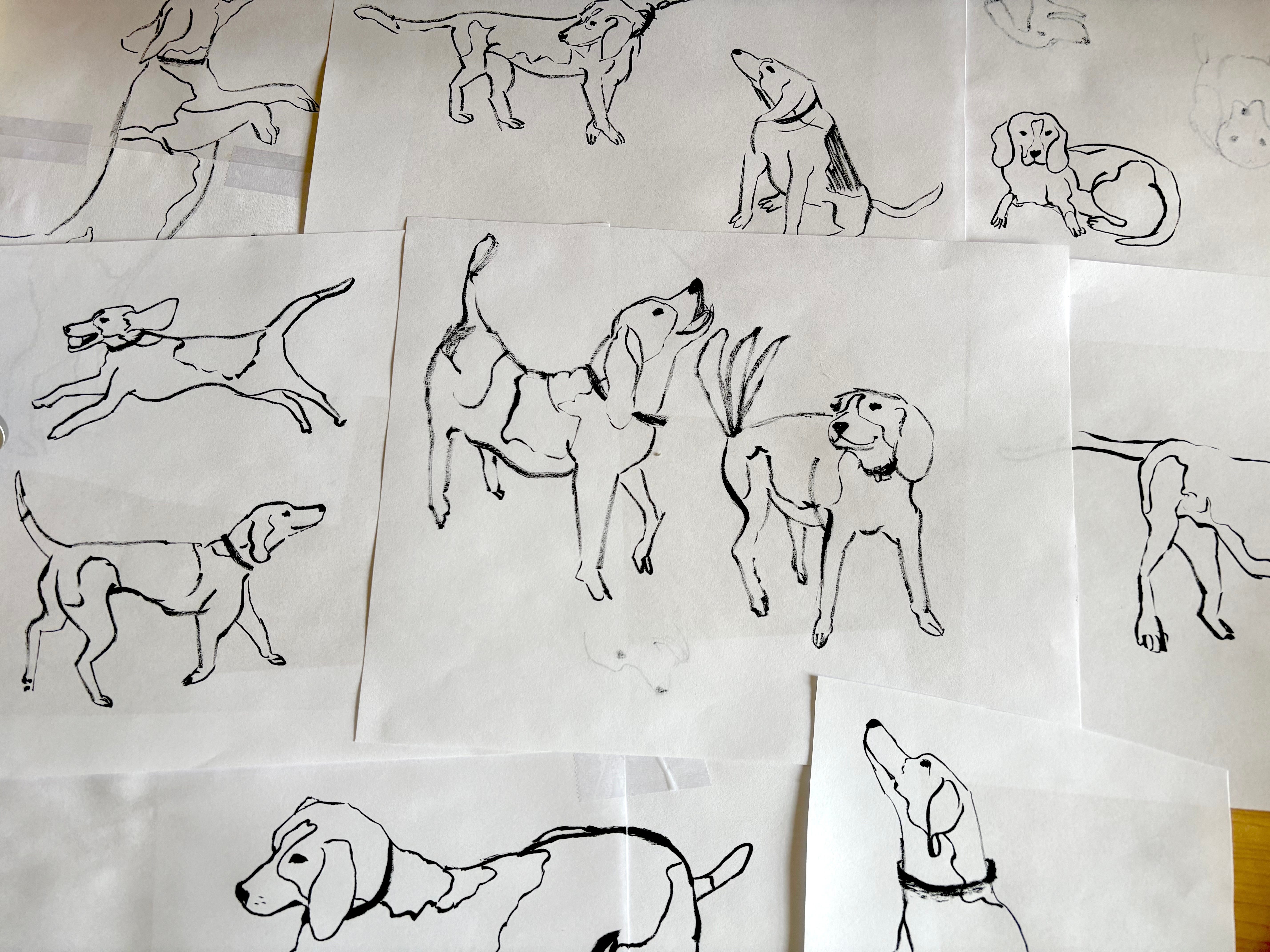
The final credit sequence uses the same typeface as the title, and it was the director’s idea to use this gorgeous vivid blue over film stock, since the film was shot on 16mm. Here’s a sneak peek of the credit sequence (more shared at the end of this post!):
Below I’m sharing the entire process in detail, including the creative brief, process, typeface chosen, and even the designs that didn’t make the cut. AKA, all my design secrets! Read on for all the details:
Comments
Nothing yet. Say the first thing.
Sign in to join the conversation.