
Hello fellow designers, creatives, digital professionals and Eidos Design members!
It’s been a summer of sport. Mostly, it’s been a summer of losing.
Marta Kostyuk (whom I cheered for!) lost her first Wimbledon semi-final to Linda Nosková, 6-4, 6-4. She was one match away from becoming the first Ukrainian in history to reach a Wimbledon singles final. I was shouting at a screen for her, like lots of my compatriots, and I’ve been sitting with that scoreline ever since.
The World Cup is running the same arithmetic at a bigger scale. Forty-eight teams flew in, and now we are standing right before the final. Brilliant Norway is out, as well as Portugal, and Cristiano Ronaldo’s World Cup career ended with it. Tomorrow, on July 19, only one team will lift the trophy in New Jersey, but forty-seven fly home (figuratively speaking).
That ratio is the real shape of sport. Everybody who plays knows it. Losing is the main event, and winning is the rounding error.
Now open the apps we build for those same people. Confetti when you finish. Streaks, personal-record badges, and a glossy narrated recap at the end of the season celebrating the thing you completed. We rehearse the good day and we ship it in high resolution.
Every product has a victory screen. Almost none have a locker room.
The locker room is where sport spends most of its time. It’s the room with a towel over your head, where you decide whether you’re coming back. Loyalty gets made in there. Software has barely tried to build it.
This issue: a full teardown of Runna, and what its “Not Feeling 100%” button teaches the rest of us about designing for the week everything falls apart.
🎖 Honorable Mention
Thank you, Tetiana Shevtsova, for taking the time to promote Eidos Design and introduce new designers to our community!

Runna is a running coach that lives in your phone. You give it a race, a date, and an honest recent time. It hands back a plan, a target pace for every interval, and a workout that lands on your watch before you’ve finished your coffee. Plenty of apps do a version of that.
Runna earns a teardown in July 2026 for the other half of its job. Somewhere in the last eighteen months, this app started designing for the days you don’t run. The missed day gets its own screens, its own questions, and its own way back.
Running is booming, and Strava logged nearly a billion runs in 2024 and then bought Runna outright in April 2025. A huge wave of new runners arrived with race goals and no idea what their tendons can take. Runna spent late 2025 and early 2026 shipping feature after feature about the bad week, while at the same time fighting an accusation that its plans were breaking people. Both of those are true at once, and the tension between them is the whole story.
Dom Maskell and Ben Parker started Runna in 2021 and shipped in March 2022. Maskell describes the starting point with a bluntness I enjoy: “A PDF site four years ago”. Downloadable training plans, nothing more. From there it grew into a coaching product staffed with elite runners and Olympians, including British Olympic marathoner Steph Davis, and landed as one of three finalists for Apple’s App of the Year in 2024.
Then Strava bought it. Runna now runs at roughly two million monthly users and holds a 4.9 average across 32,000 App Store ratings, which is the kind of number a product earns by doing what it said it would do.
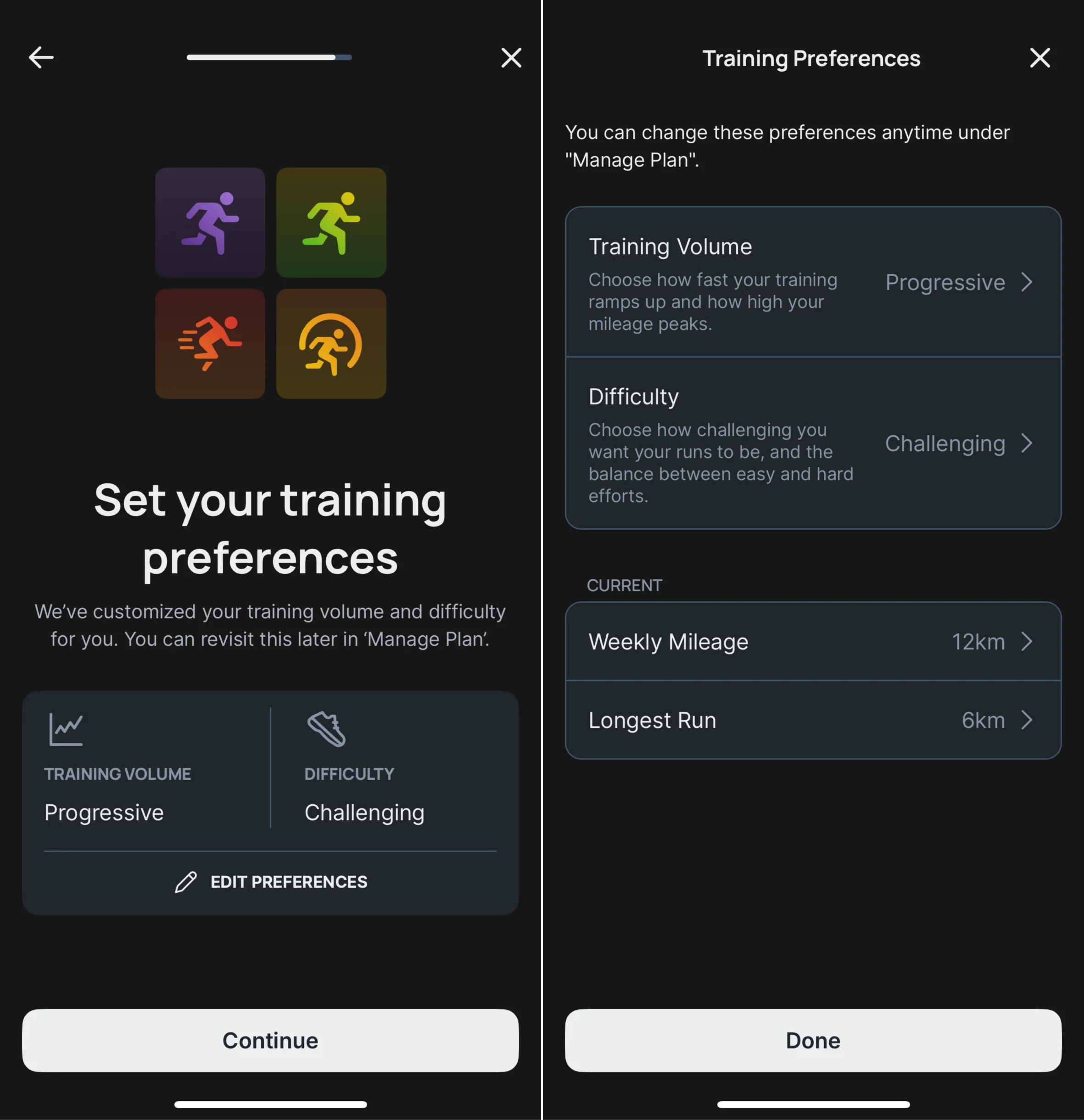
Onboarding asks for the things a coach would ask for. Your goal (5k through ultra), your race date, a recent time you can defend, your self-rated ability, how many days a week you want to run, and which days those are. Then the plan appears, inside a minute.
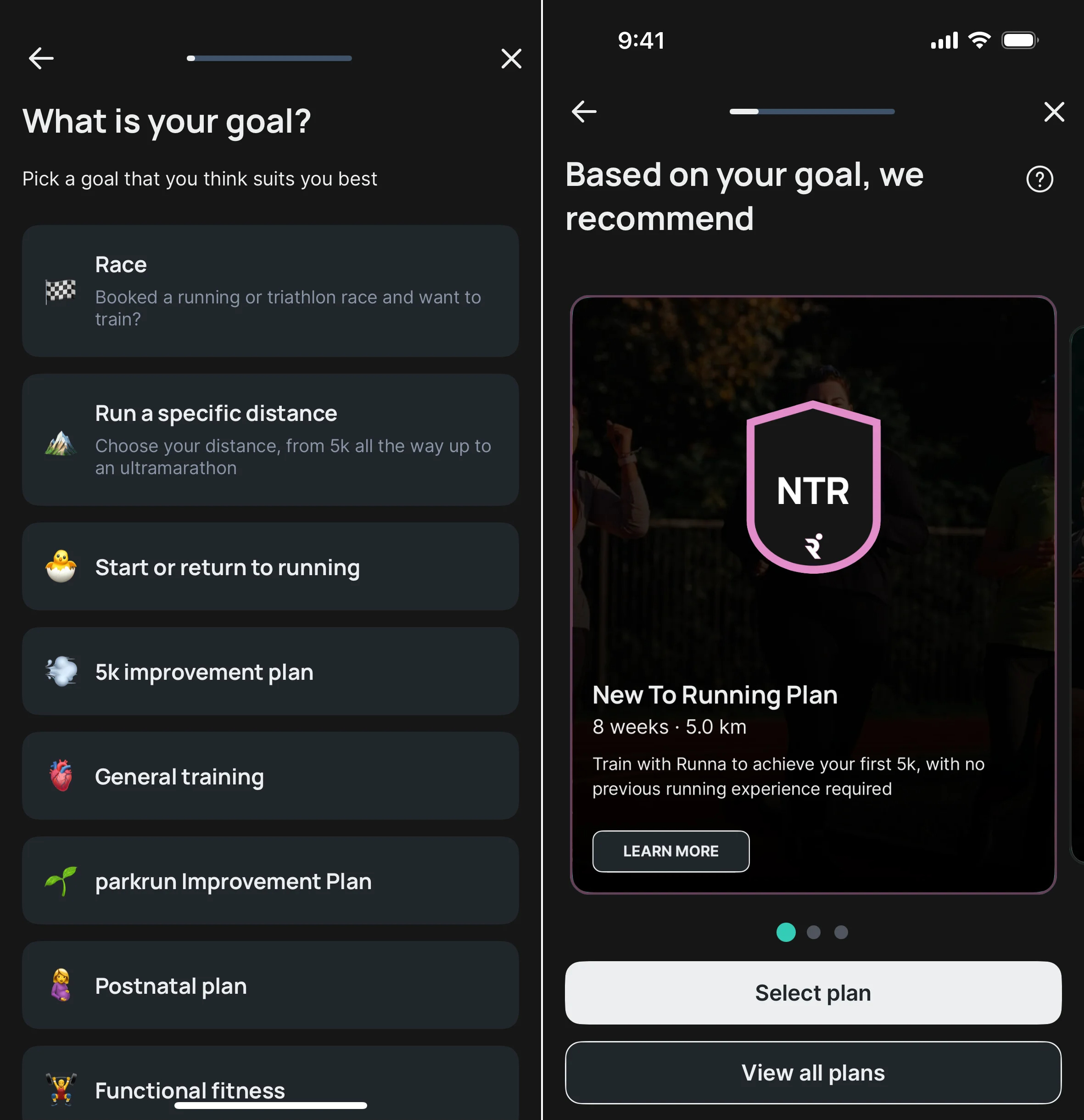
Tom’s Guide’s reviewer got three runs a week, each with a distance, a target pace, and a name: intervals, easy, tempo, long. The naming carries more weight than it looks. It turns “go for a run” into a specific job with a specific purpose, and it’s the first moment the app reads as a coach instead of a tracker.
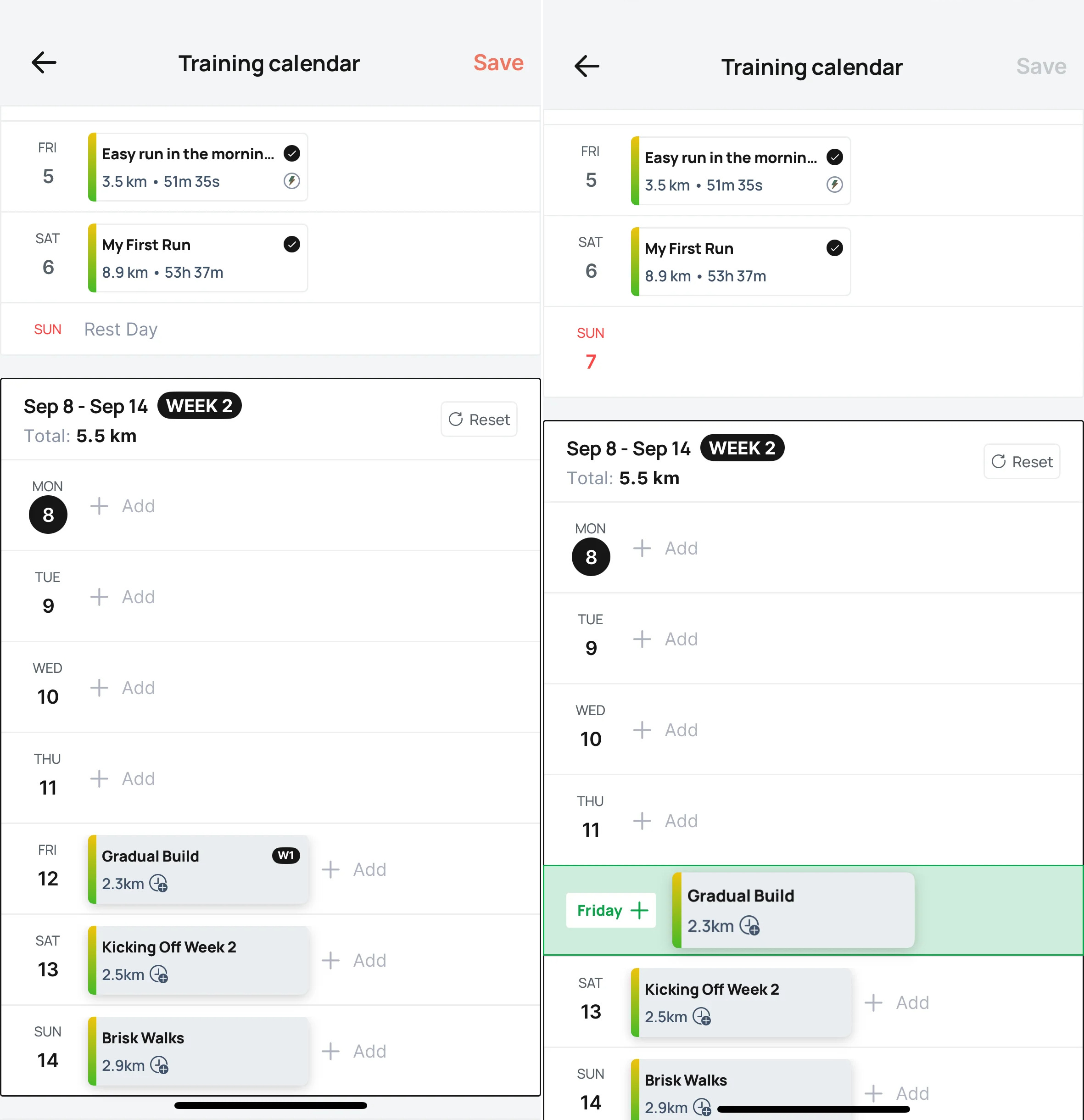
The week sits in a grid of cards. Each session now opens with a Workout Briefing, a short personalized note on what this run is for, and Runna claims no two runners receive the same one. The workout pushes to a Garmin, an Apple Watch, a COROS, a Suunto or a Fitbit. Mid-run, it’ll tell you when you’ve gone out too hot. Afterwards you tick the box and the grid fills in.
And then there’s the third flow, the one this whole issue is about.
Open Manage Plan and you find a heading that reads Adapt Your Plan. Under it sits a button: Not Feeling 100%.
Tap it and the app asks why. Illness. Aches and pains. A busy schedule. Or a plain need to take things easier for a while. Then it asks how long, with a floor of three days and a ceiling of fourteen. Then it asks how far down you want to climb: run easy, run shorter, drop the pace targets, drop the strength sessions, or stop running altogether. Then it asks how you want to come back. Slowly, balanced, or quickly.
Four questions. Somebody at Runna sat down and designed the conversation you have with a coach when you turn up looking like death, and then shipped it as a form.
Reminder: Product evaluation is done according to Don Norman’s 3 levels of design.
The visceral level is responsible for first impressions.
Big confident type, high contrast, a week laid out as a stack of cards you can read at arm’s length while holding a coffee. The pace targets are the hero. The typography does most of the work, and it does it well.
There’s a competence in the first impression that I trust. Nothing bounces, nothing celebrates before you’ve done anything. The app carries itself like a coach who’s already read your file.
The crack shows up on the wrong week. That grid of cards is a compliance chart. Ticked, ticked, ticked, empty, empty, empty. On a good week the pattern reads as momentum and it feels wonderful. On a bad week the exact same neutral design turns into a row of small accusations, and there’s nothing in the visual language that softens it. A blank Tuesday looks the same whether you were sick, working late, or sitting in your car outside the gym unable to go in.
Emotional signal: “This looks like a coach who came prepared.”
This level focuses on usability, how the product performs and whether it effectively solves user problems.
The machinery is the best in its class.
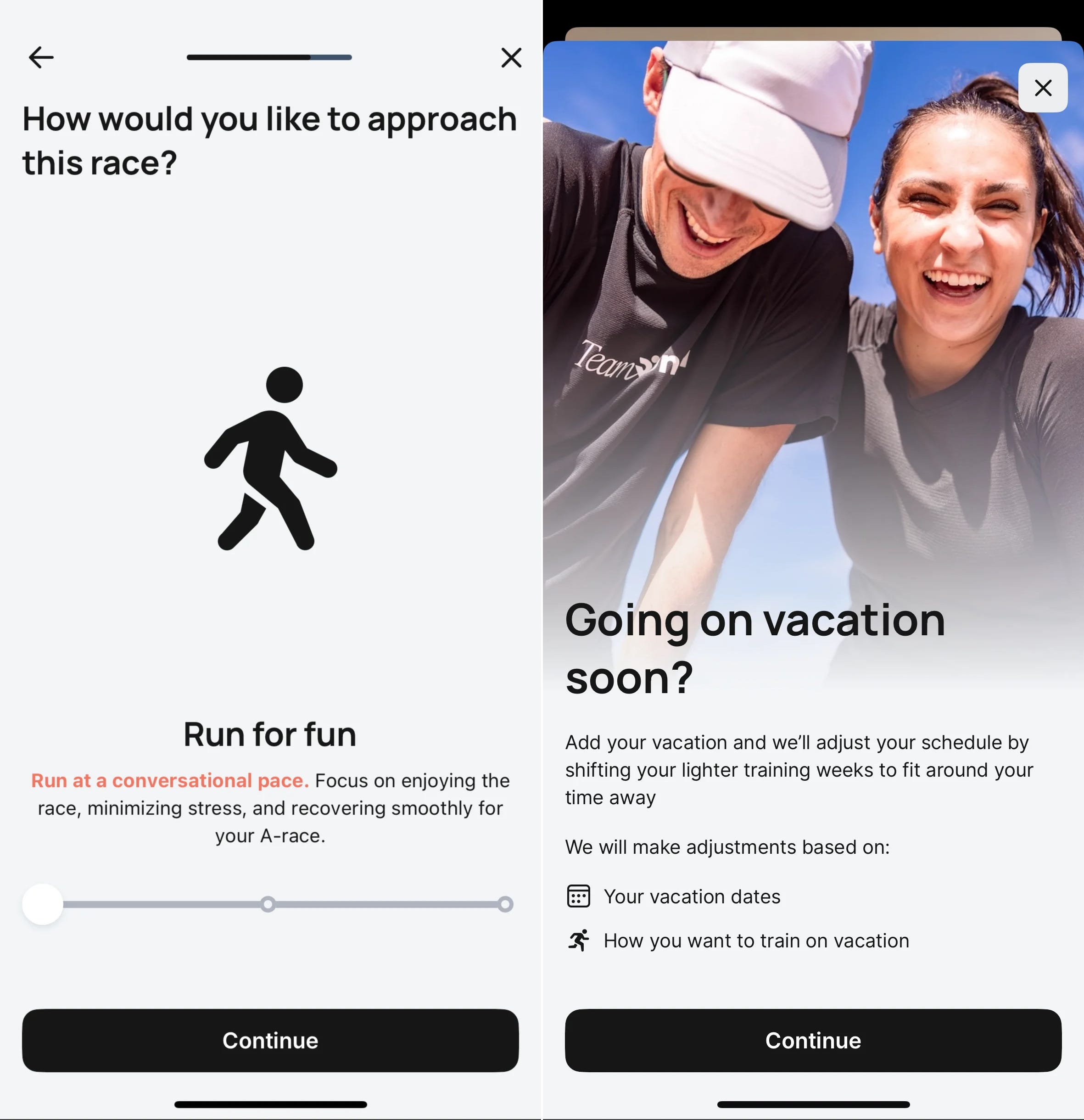
Start with the obvious stuff. You can drag a session to a different day and the plan absorbs it. Holiday Mode reshuffles a whole week around a trip. Runna bakes deload weeks into the plan, so the volume drops on purpose. Workouts land on five different watch brands with the intervals pre-loaded.
Then there are the four features Runna shipped across late 2025 and early 2026, and they’re all about the same thing:
Not Feeling 100%. The four-question setback flow. Reason, duration, depth, return ramp. It strips pace targets, shortens runs, or clears the week entirely, then walks you back in at the speed you chose.
Mileage Insights. The app watches how well you’re sticking to the plan and recommends a more sustainable volume. It notices when you’re drowning without saying so.
Plan Versions. When Runna ships a feature that would change your training, it asks first. It shows you what the update does, waits for consent, and lets you revert if you hate it.
Workout Briefings. Personalized guidance before every session, so the run has a stated purpose.
Emotional signal: “I told it I was struggling and it listened.”
The reflective level considers the long-term impression and deeper meaning of the design, how it aligns with the user's identity and values.
Runna’s machinery forgives you. Runna’s story doesn’t.
In February 2026 the company shipped Plan Replay, described in its own words as an interactive, narrative-style recap that celebrates “a customer’s completion of a training plan.” A Wrapped for your marathon block. It’s lovely, and I’d watch mine.
The word doing the work there is completion. There’s no Replay for the plan you walked away from in week nine, and week nine is the plan you’d learn something from. Runna Levels hands out points for every run, workout and milestone. The whole reflective layer is a trophy cabinet.
The tell is a support article. Runna had to publish a page titled “Why Does My New To Running Plan Go Down in Distance?” because runners saw a planned drop in volume and read it as a bug. Runna’s own progress language taught people that down means failure, and then Runna had to write documentation to undo the lesson. That’s a reflective-level own goal, and almost every product in this category has scored one.
The identity Runna hands back to you is “a person who completes plans.” It’s a good identity on the good weeks. It’s also brittle. In week nine, when your knee goes and the grid fills with blanks, the app has nothing to tell you about who you are now, and that’s the exact moment a coach earns their money.
Runna built the locker room indeed, but the mirror on the wall still only shows the podium.
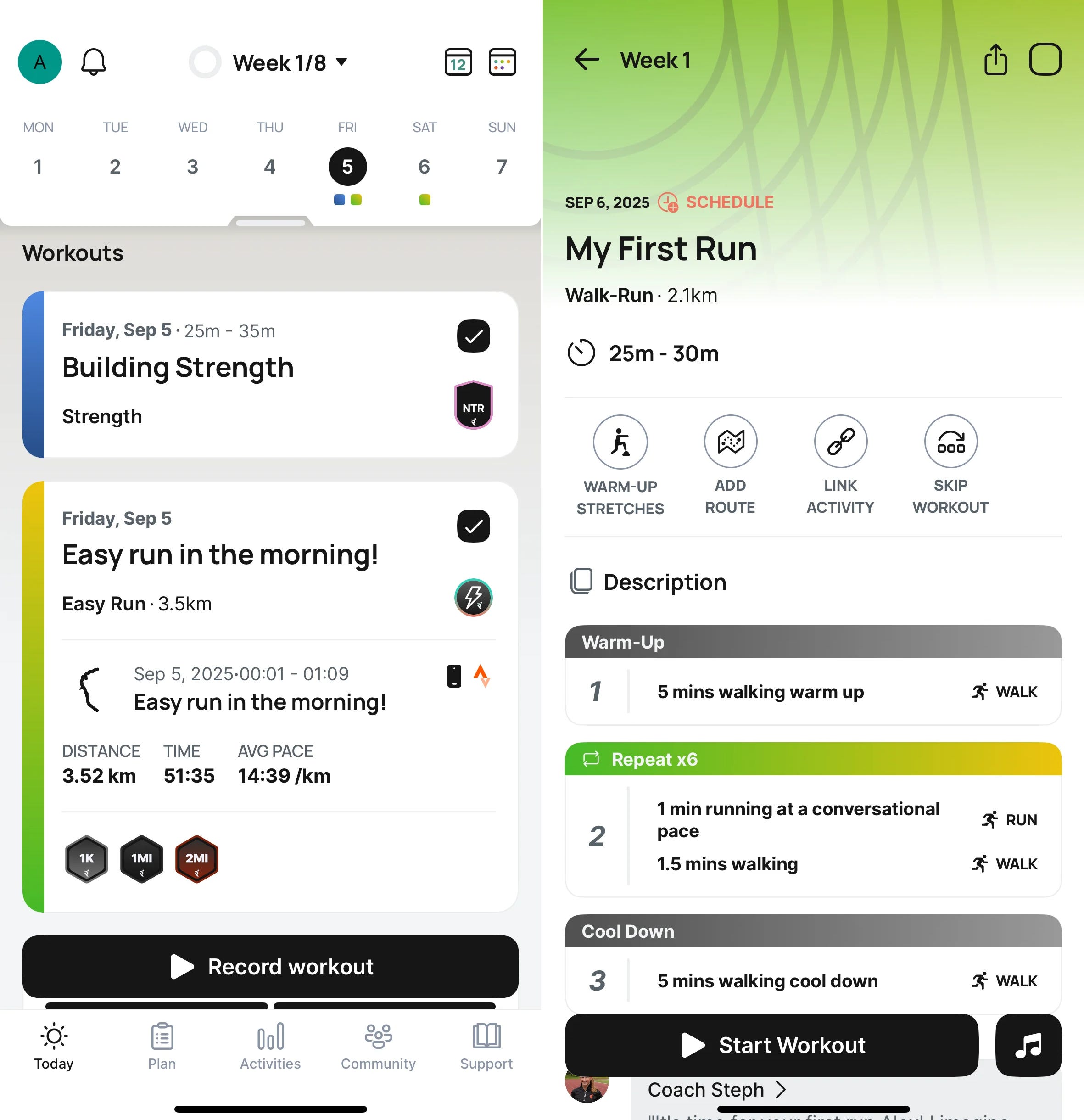
Emotional signal: “I love this app until the week I let it down.”
The setback flow won’t accept the past. This is the one that gets me. Not Feeling 100% only adjusts forward from the moment you open it. A Tom’s Guide writer with flu had already missed two runs and found she couldn’t log them after the fact as illness. Her advice to readers was to file your sickness the moment it starts.
That asks something strange of a person. Losses get reported late. You don’t sit up in bed at 3am with a fever and fill in a four-question form about your training load. You notice on Sunday, when the week is already gone and the grid is already blank. Runna needs you to have known on Tuesday.
The locker room exists, however you have to book it before you lose.
There’s no designed exit. No recap for the abandoned plan. No “here’s the twenty-two runs you did before your knee went, and here’s what they built.” You stop opening it. And since Runna still has no pause button on the subscription, the plan you’re avoiding keeps charging you $119.99 a year while you avoid it.
And the injury argument deserves a fair hearing. In February 2026, the5krunner published an investigation reporting that physios are seeing Runna-linked overuse cases every week, and concluding that AI training plans “are not yet ready for complex scenarios applied at scale to general populations”. The same piece is careful to say no peer-reviewed study shows Runna users get injured at higher rates than people on a static plan, and that calling the product defective would misread the evidence. Runna’s response to Women’s Health is that its plans are written by a team of elite runners and Olympians, and AI monitors progress and surfaces recommendations you’re free to reject.
The design question underneath the argument is the one worth carrying home: the app is at its most confident with the user least equipped to argue back. A beginner can’t tell the difference between the discomfort that builds you and the discomfort that breaks you. Runna’s tone gives them no reason to doubt the plan.
Garmin Coach adapts your load and it’s free with the watch, and it will never once acknowledge that you had a week. It has no emotional register at all. Nike Run Club is free, static, and pure hype, which is a fine product and the exact opposite of a locker room.
The most interesting comparison is one we’ve already covered here. Gentler Streak, from Volume XXVII, starts from what your body can take today and works forward. Its default is rest. Runna’s default is the plan. That single difference explains almost everything about how each one feels on your worst week.
And the market is catching on. Daptiv, a new AI coach, opens its App Store page with “Missed a workout because life got chaotic?” and promises training “without burnout, guilt, or rigid schedules.” The loss is becoming the battleground. Whoever designs it best wins the decade.
Runna is the best-built running coach you can buy for the money, and it solved the logistics of failure while leaving the meaning of it untouched. The four-question form is real design work, but the trophy cabinet undercuts it.
The best thing in this app is three words long. “Not Feeling 100%” avoids asking if you’re injured, which is medical and frightening and sounds permanent. It avoids asking if you failed. It asks whether you’re at one hundred percent, and it lets you say no without explaining yourself. Steal that copy. Steal the whole posture behind it.
For your own work:
Design the off-plan state with the same care you gave the on-plan state
Let people report a setback after the fact, because nobody files it on time
Give the abandoned thing an ending, and put something true in it
Make regression legible, so a planned drop reads as strategy instead of failure
Name the setback in the user’s language, with no shame and no diagnosis attached
Kostyuk will be back on court soon. The forty-seven teams flying home this month will spend the next four years in training, matches and in the locker rooms, where the whole thing gets decided.
Our users are in there, too. Week nine of the plan, day forty of the streak, the month everything went wrong. They’re sitting with a towel over their heads, working out whether they’re coming back, and most of our products are still holding a confetti cannon and waiting for a win that isn’t coming.
Build them somewhere to sit.
As always, this newsletter is free, but if you enjoyed it, please consider sharing it with a friend or two. Spreading the love is what it's all about, folks 🖤
Sincerely,
Vadym Grin
Comments
Nothing yet. Say the first thing.
Sign in to join the conversation.