
Hello fellow designers, creatives, digital professionals and Eidos Design members!
We’re a few days out from the longest day of the year. On June 21, the sun in the northern hemisphere lingers longer than it will at any other point in 2026, and most of us will spend a good chunk of that record-breaking daylight indoors, looking at glowing rectangles.
One app treats that gap as its entire reason to exist. It tracks the sun down to the minute: sunrise, golden hour, blue hour, the last sliver of light before dark. And the whole point of all that precision is to get you to close the app and walk outside.
That’s a strange goal for a piece of software. Most products fight for your minutes. This one hands them back. The best version of this app is the one you barely open. It tells you when the light will be good, then it trusts you to go live in it.
I’ve been sitting with this idea since the app’s big redesign last year, and it keeps tugging at the same thread we pulled in Volume XXVII: the difference between products that need you and products that serve you. A sun tracker is a clean test case. You can’t doomscroll the sunset. You either go see it, or you don’t.
This issue: a full teardown of Lumy, and what its window-to-the-sky design teaches the rest of us.
At the end of this issue, I will introduce you to the new format of the newsletter and invite you to a secret place.
Most apps want to be a destination. Lumy wants to be a window.
You don’t admire a window. You look through it, at the thing on the other side. That single idea runs through every screen of this app. The May 2025 redesign was built on that concept. The maker’s own note calls it a “window to our outside world,” with a UI meant to feel lit by the day beyond the glass. Every view carries a faint echo of light passing through a pane. The app glows the way a room glows in late afternoon.
There’s a small irony here, because Lumy shipped that light-through-glass look in spring 2025. A few months later, Apple made glass the entire personality of iOS 26 with Liquid Glass, and Lumy slid right into it on the Apple Watch. The indie app got there first, on its own terms, for a reason that meant something. That’s the difference between an aesthetic and a metaphor.
Lumy comes from Raja Vijayaraman, a self-taught developer in Chennai who studied mechanical engineering, spent time in VFX, then fell hard for the iPhone and taught himself to code. He builds under the name Waple Stuff, and his wife, a photographer, is his creative partner. His description of how they work tells you most of what you need to know about the app’s restraint:
“We create apps for ourselves. Once we are satisfied, we put them on the App Store, hoping to connect with people who share our design aesthetics.”
Lumy started as a tool the two of them needed, a way to find golden hour for their own photos. It grew from there. This is the same maker whose calculator app, Calzy, won an Apple Design Award back in 2018, so the pedigree runs deep.
Reminder: Product evaluation is done according to Don Norman’s 3 levels of design.
The visceral level is responsible for first impressions.
The trophy shelf is real. Lumy was Apple Watch App of the Year in 2024 and a 2025 Apple Design Awards finalist in the Innovation category. Apple’s design team singled out its “simple design, carefully curated color palette, and elegant widgets and Live Activities.”
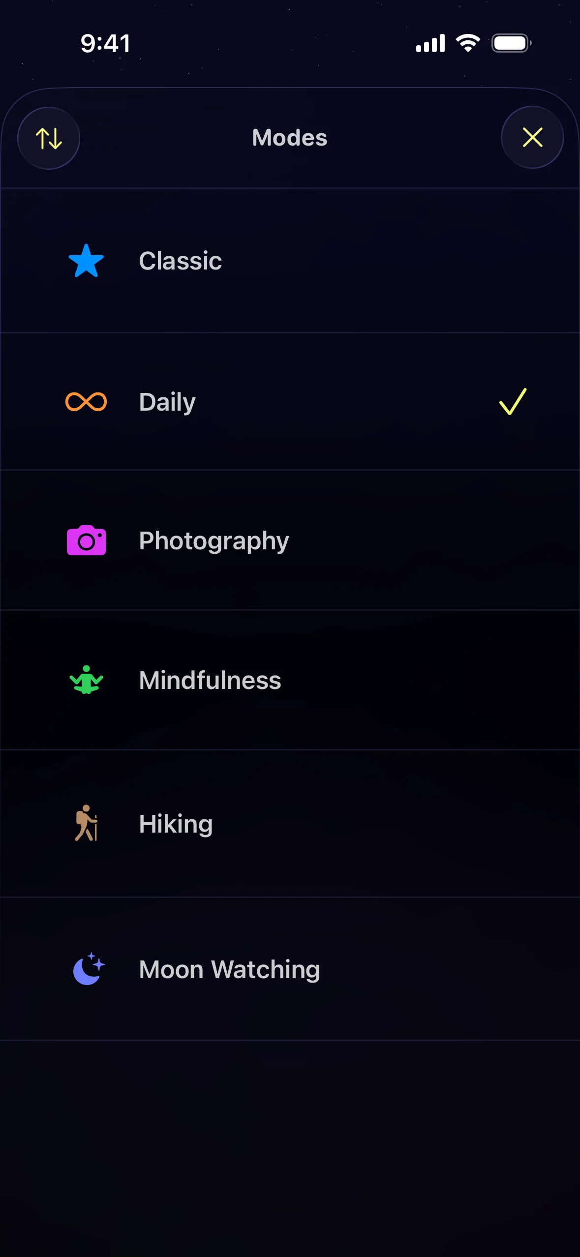
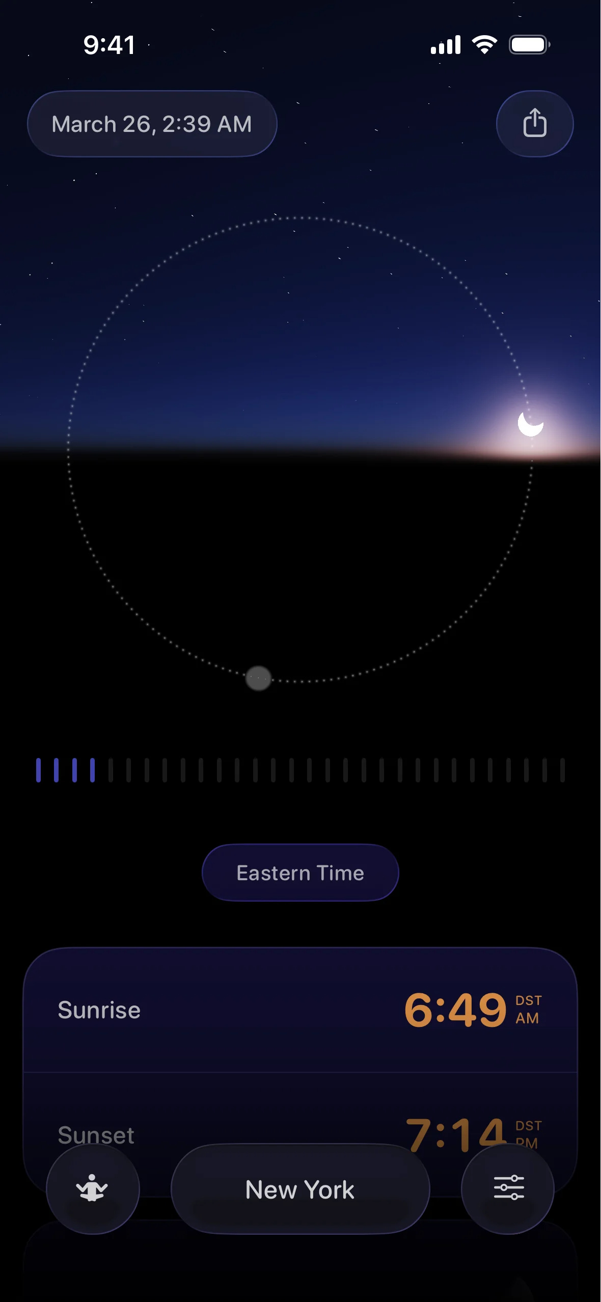
Open it and the first thing you do is pick a Mode. Daily, Photography, Hiking, Mindfulness, Travel. The choice isn’t cosmetic. Your mode reshapes what the app surfaces first, so a photographer leads with golden and blue hour while someone meditating at dawn leads with first light. The app decides what to hide so you don’t have to. That’s an editorial stance built into the product.
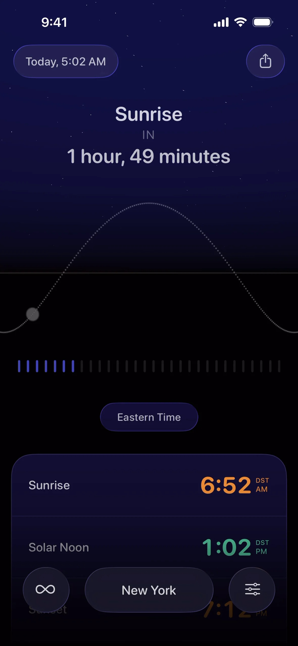
From there, the home view lays out the day as a clean visual timeline of solar events. Tap any moment and Lumy opens up the supporting detail: wind speed, cloud cover, visibility for that exact slice of the day. A time-travel slider lets you scrub the whole day forward and back to see how the light will move, which is the kind of thing photographers pay for in heavier tools.
The move I keep coming back to is the State of Mind integration. Lumy reads your mood entries from the Health app and suggests when to step out for some sunlight, with a thumbs up or down to refine the nudge over time. It calculates everything on-device, no server calls, no tracking. A wellness feature that doesn’t phone home. In 2026, that alone is a statement.
This level focuses on usability, how the product performs and whether it effectively solves user problems.
The first thirty seconds with Lumy feel like opening a curtain. The palette shifts with the time of day, so a morning launch greets you in cool first-light tones and an evening one warms toward amber. The light-through-glass treatment gives every surface a soft inner glow, like sun caught in frosted glass. It reads as calm before you’ve understood a single number on the screen.
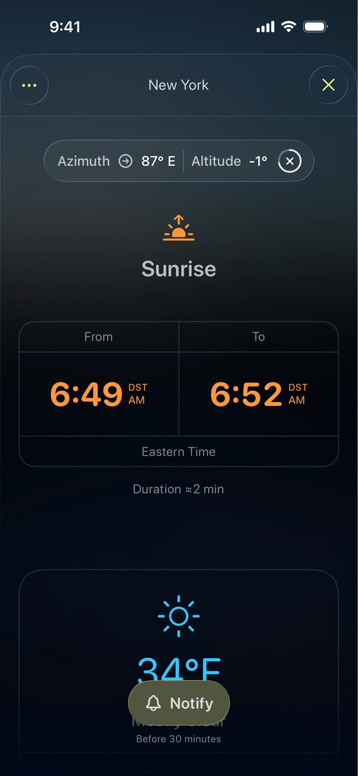
On the wrist, the Liquid Glass version takes that further. The complications feel like little panes of stained light rather than data chips. Apple’s own designers flagged the curated color palette and the widgets for a reason. This is a product where the aesthetic carries real information, since the color you see maps to the light you’ll get outside.
Nothing here shouts. There’s no splash of confetti, no badge, no number trying to spike your pulse. The app trusts that a beautiful, honest picture of the day is enough to make you want to go see it. For a utility that lives or dies on a glance, that restraint is the whole game.
Emotional signal: “Oh. The light looks good today.”
The reflective level considers the long-term impression and deeper meaning of the design, how it aligns with the user's identity and values.
Lumy is fast and it’s quiet, which is what a glanceable tool should be. The Modes do real work by cutting the dataset down to what your current life needs, so you’re not scrolling past nautical twilight to find your sunset. The time-travel slider turns “when’s the light good” into a two-second scrub. And because it all runs on-device, it works on a trailhead with no signal, which is where you’d want a sun tracker.
A few behavioral moves stand out:
Mode-based information hierarchy. The app hides data instead of stacking it. A hiker and a photographer see different first screens, and that editorial choice is the feature.
On-device calculation. Sun and moon math runs on the device, with nothing sent to a server. Privacy ships as the default.
Glanceable surfaces everywhere. Widgets, Live Activities, and Apple Watch complications mean you often get your answer without opening the app at all.
The one place it wobbles is the watch over time. Lumy’s Apple Watch experience has taken a hit across major watchOS jumps, with watch-face and complication breakage reported after big updates. The maker is quick to patch, and that responsiveness counts for a lot, yet the friction is real enough to cost a point here. A tool you trust at a glance has to survive every September.
Emotional signal: “I got my answer before I even unlocked the phone.”
This is where the window metaphor pays off. Lumy makes you feel like someone who goes outside. After a few weeks, the app turns into a small daily prompt to live in rhythm with the light, to catch the last sun on a walk, to notice the sky is doing something worth standing still for.
The State of Mind feature sharpens that identity. When the app reads a low mood entry and suggests a sunlight break, it’s casting you as a person whose wellbeing is tied to the natural world, not to a screen. It never scolds you for a missed sunrise. It offers, then leaves you alone. That posture is the opposite of the streak-and-shame loop most wellness apps run on.
The reflective magic here is trust, the same note we hit in Volume XXVII. Lumy assumes you’re an adult with a life worth stepping into. It hands you a clear, beautiful read on the day and gets out of the way. The app that wins your loyalty is the one that keeps sending you somewhere better than itself.
Emotional signal: “This makes me want to go outside.”
A flawless score with no critique reads like an ad. Lumy has some cracks.
The watch story is the clearest weak point. For an app that won its biggest award on the Apple Watch, Lumy has stumbled across major watchOS updates, with complications and watch faces breaking until a patch lands. The fixes come fast, and the developer’s responsiveness is rare. Still, “wait a few days for the update” is a hard ask for a tool whose entire pitch is a reliable glance.
Then there’s money. Lumy spent years as a clean pay-once app, and it now sits at $6.99 with in-app purchases layered on top. That’s a fair way for an indie to keep the lights on, and the core app still delivers without spending more. The shift is worth knowing about going in, since “buy it and you’re done” was part of the old charm.
And Lumy is light by design. If you plan shoots weeks out, want augmented-reality sun positioning, or need to save and compare locations, this is the wrong tool, on purpose. The State of Mind nudges also lean on a habit most people don’t have, since they only work if you log your mood in the Health app.
The serious planning crowd reaches for PhotoPills, the maximalist toolbox stuffed with an AR planner, milky-way tools, and saved shoot plans. It’s powerful and it expects you to invest serious time learning it. Sun Surveyor sit in similar territory, built around technical position data and AR overlays for people solving a precise geometry problem. And Skylight Forecast, from the Halide team, predicts how good the light will be, which is a smart, different bet.
All three optimize for planning depth. They assume more data and more control is the win. Lumy assumes the opposite. The rivals want to be your planning command center. Lumy wants to tell you the light’s good and watch you leave.
Lumy is a small app with a clear spine. It knows what it’s for and what to leave out, and it treats both as design decisions rather than missing features. The window metaphor does real work. It shapes the palette, the Modes, the glanceable surfaces, and the gentle State of Mind nudge, all pointing the same direction: away from the screen and toward the sky.
What you can steal from it:
Design for the moment after the app. Lumy’s win condition is you, outside, phone away.
Hide data as a feature. Modes work because the app decides what you don’t need to see right now.
Let the aesthetic carry information. The color you see maps to the light you’ll get. Beauty doing a job.
Make privacy a default. On-device math, no server calls, no asterisk.
Offer, don’t nag. A suggestion you can thumbs-down beats a streak you can break.
It loses a point on watch reliability and the quiet creep toward in-app purchases, and it’s not built for heavy planners. The core experience earns the top mark anyway. It measures success by what happens off-screen, and few apps even try.
Lumy stuck with me because it points the other way. It spends all its craft getting you to look up from the screen, which feels like the right note to end on.
I’d love to hear from you on this one. Which app in your life earns its keep by sending you somewhere better than itself, instead of holding you hostage? You can hit reply and tell me, or… There is another way.
We want to bring together a close-knit group of like-minded people. It will be a small and welcoming circle of those who genuinely want to share their experiences, learn and adopt best AI practices, and experiment together!
And another bit of news before you go. We listened to your feedback. The monthly news roundup is our best performer, and you told us you love the product reviews tucked inside the other newsletter too.
So we’re changing things up. From now on, this newsletter is what you read today: in-depth product reviews, deeper and more useful, with a real lesson you can carry into your own work. The essays and longer think-pieces aren’t going anywhere, they’ll live as standalone articles instead. More focus, more value.
As always, this newsletter is free, but if you enjoyed it, please consider sharing it with a friend or two. Spreading the love is what it's all about, folks 🖤
Sincerely,
Vadym Grin
Comments
Nothing yet. Say the first thing.
Sign in to join the conversation.