
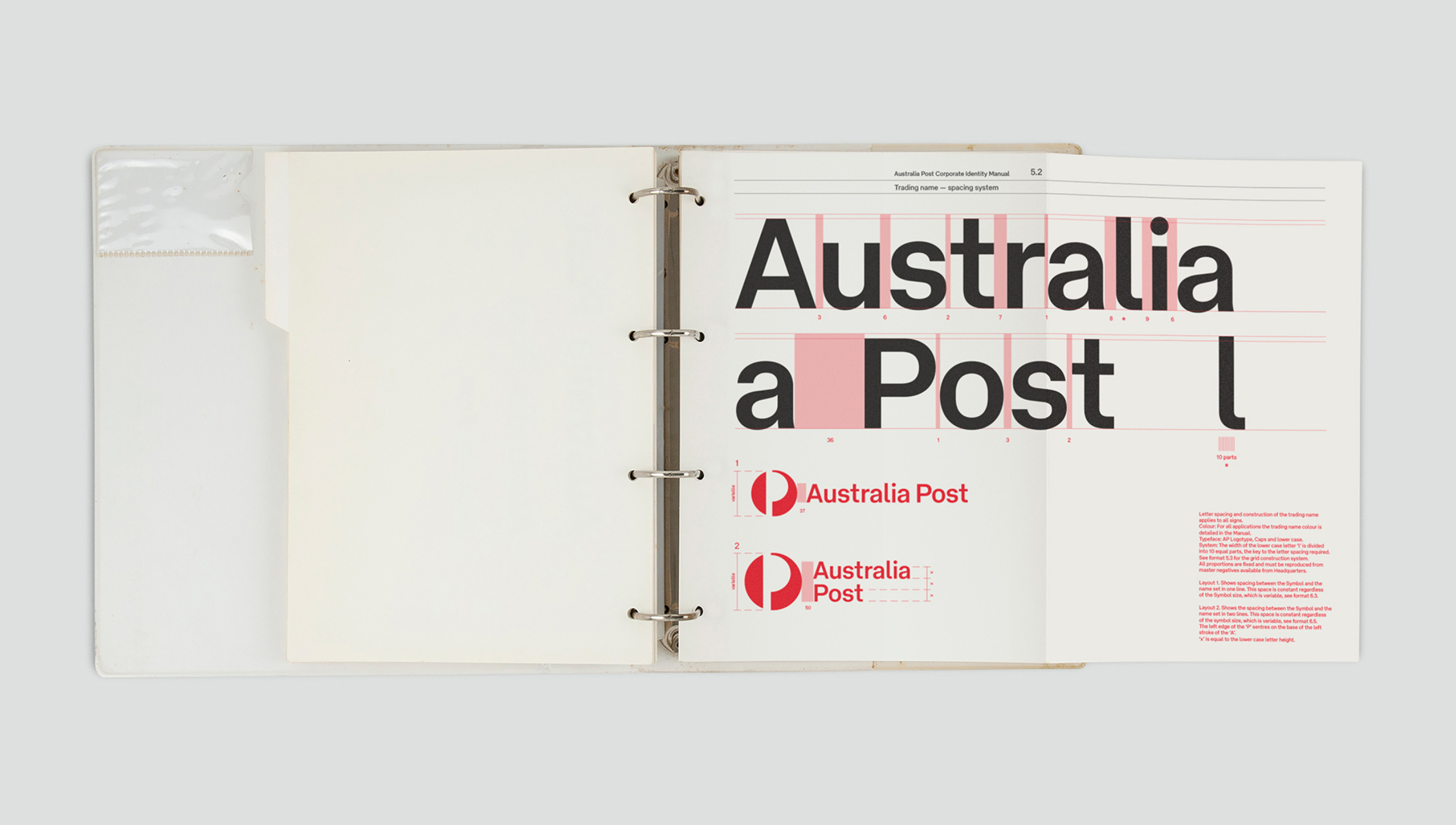
‘Univers typeface will be used in all printed communications. This will ensure optimum legibility of printed matter and assist in creating a unified appearance and negate the confusing array of typefaces currently in use’.
Pieter Huveneers, 1975
These words appeared in a memo titled ‘Benefits to be derived’, documenting the identities developed for Australia Post and Telecom by Pieter Huveneers and his eponymously named studio. The two entities were formed to manage postal services and telecommunications following the dissolution of the Post Master General in 1975. ‘Creating a unified appearance’ was central to the Dutch-born corporate identity designer’s methodology, achieved through the disciplined application of his systems with typography as a key structural component.
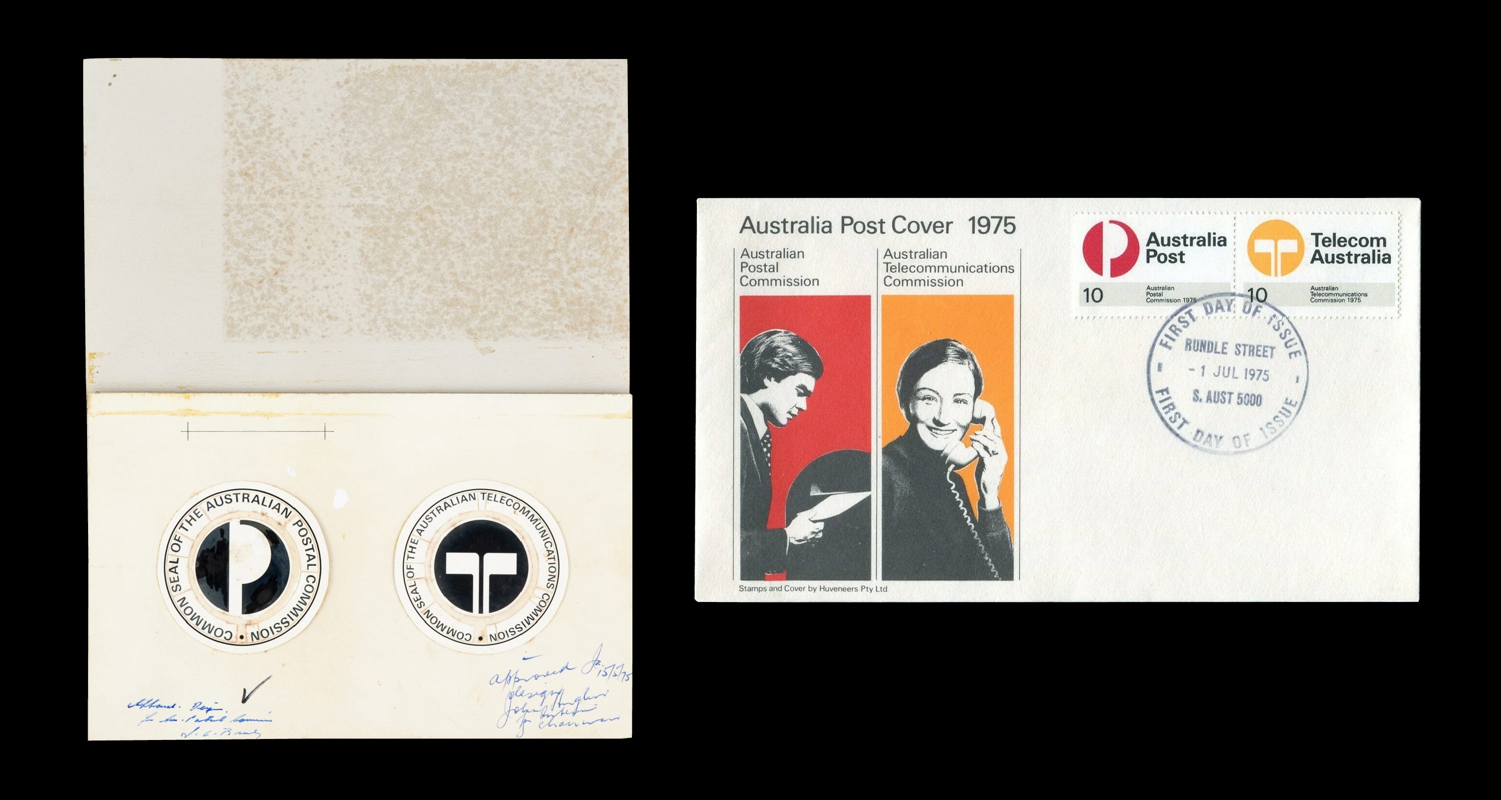
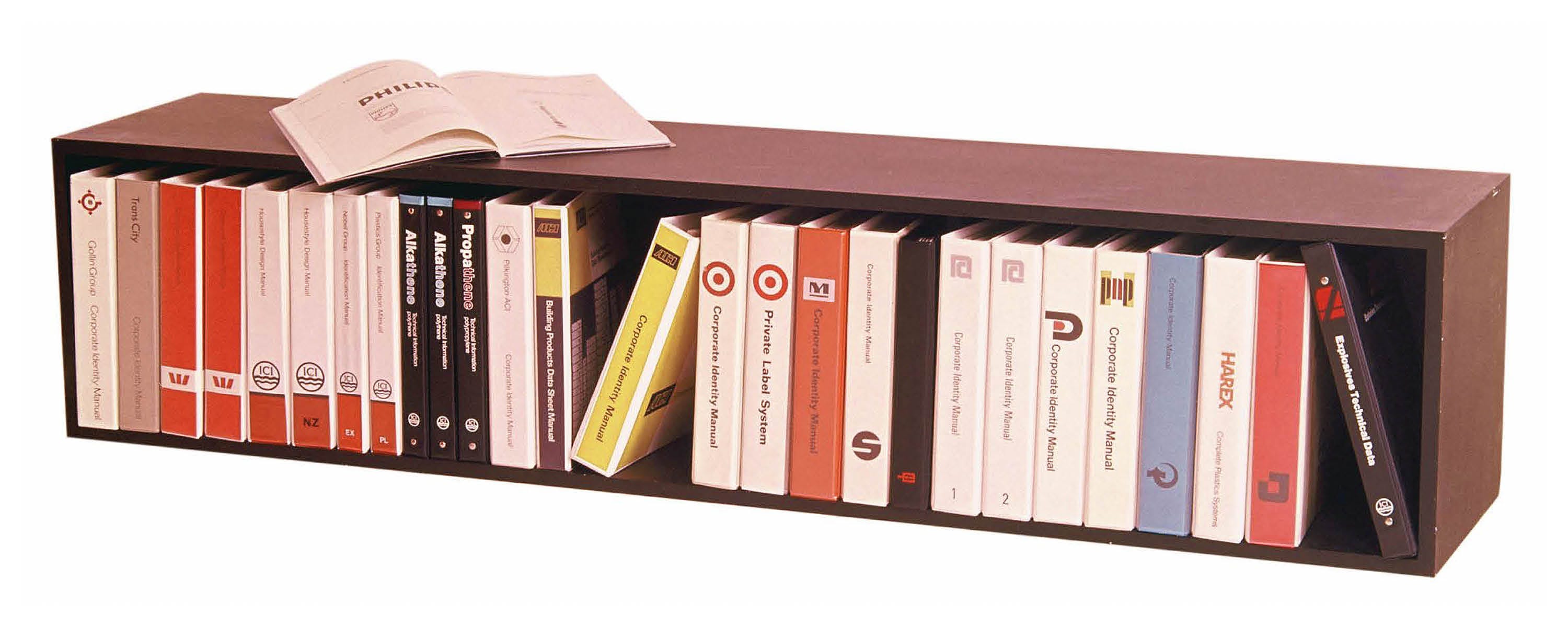
He articulated decisions such as the selection of a typeface through an objective logic, more typical of a numbers-driven executive than a designer. Huveneers understood that educating clients was essential if the work was to endure beyond the initial launch phase of an identity. This approach resonated strongly with corporate Australia throughout the 1970s and 80s as his eponymously named studio undertook identity projects for over 70 major Australian enterprises including Dulux, Myer, TAA, Tooth & Co and the Bank of New South Wales, which was rebranded as Westpac (a portmanteau of Western Pacific).
Reading the memo whilst researching for a rebrand of Australia Post, I was struck not simply by how contemporary Huveneers’ thinking felt, but by the method behind it. Every significant design decision he made was supported by a well-reasoned, practical rationale. Half a century later, faced with the challenge of restoring coherence and unity to a fragmented identity, this was just one of many valuable lessons we would draw upon.
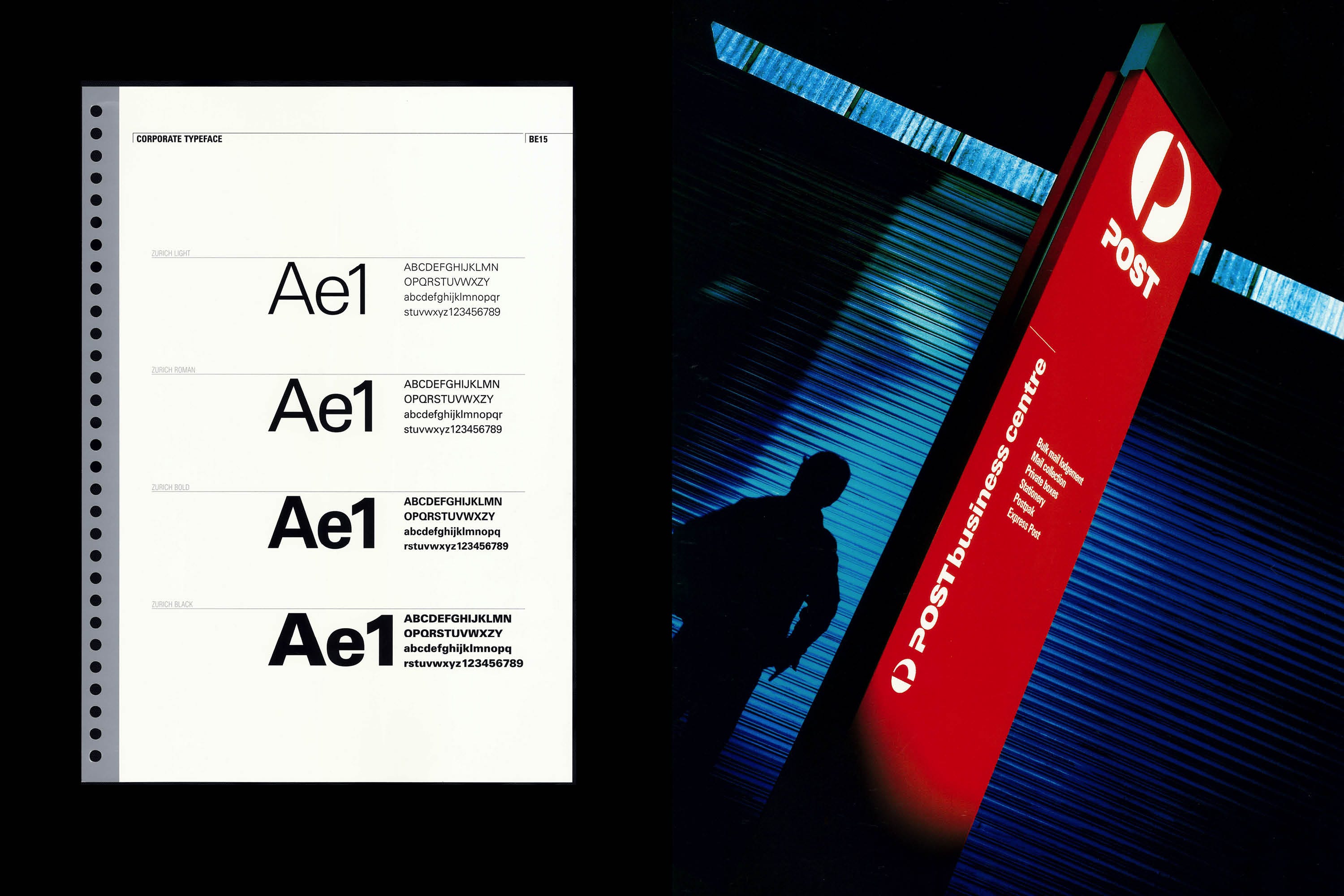
Typographic choices were limited in the early 1970s. Local foundries offered a fraction of the fonts available today, and custom type design would not become a viable option until the onset of the digital era. The ubiquitous Helvetica would perhaps have been an obvious choice for Huveneers, but for reasons unknown he instructed his studio to avoid the typeface ‘if at all possible’. Instead, Adrian Frutiger’s seminal typeface Univers was specified for both Australia Post and Telecom, delivering functionality, neutrality and economy given it would be purchased in large quantities.
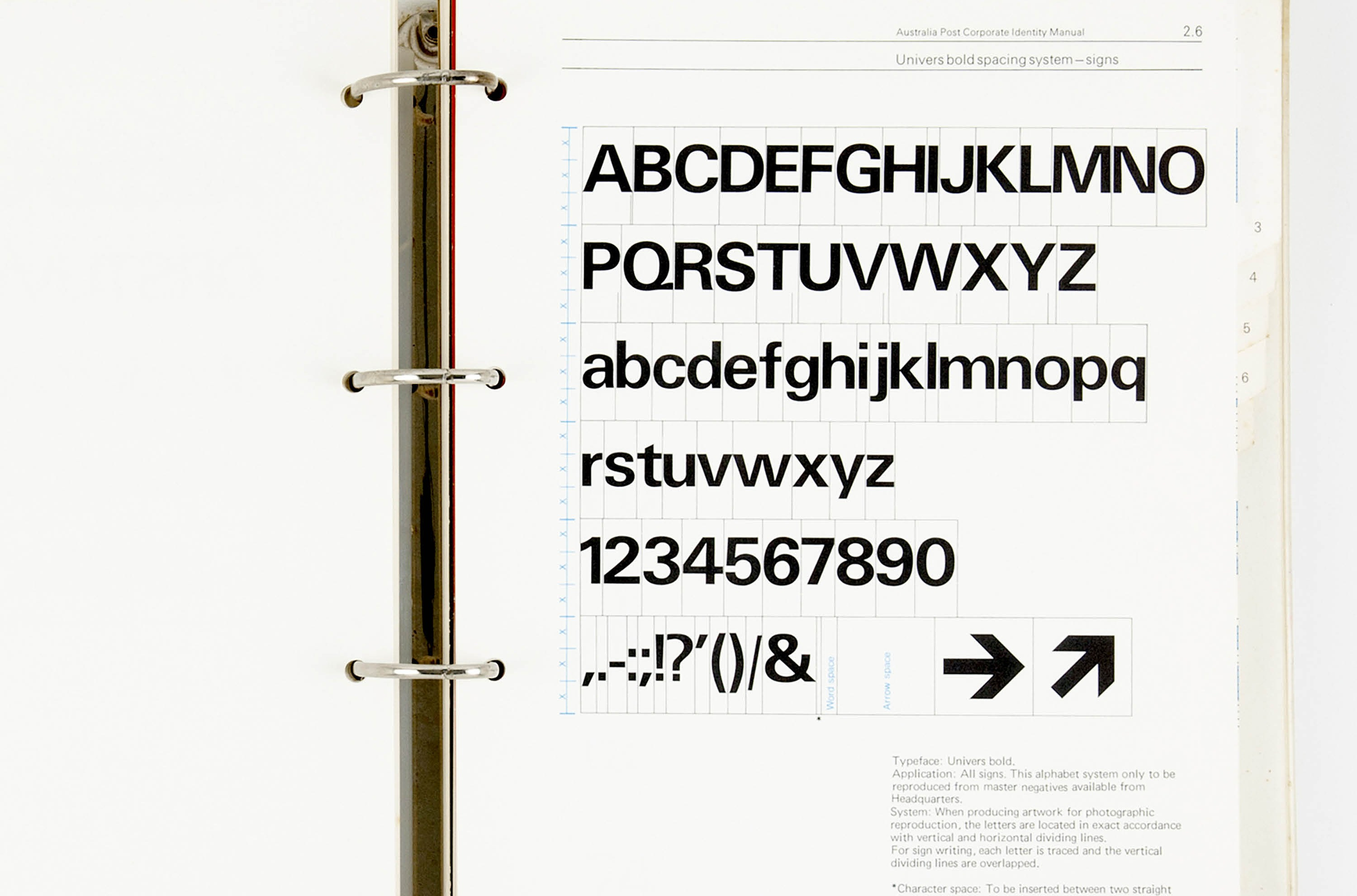
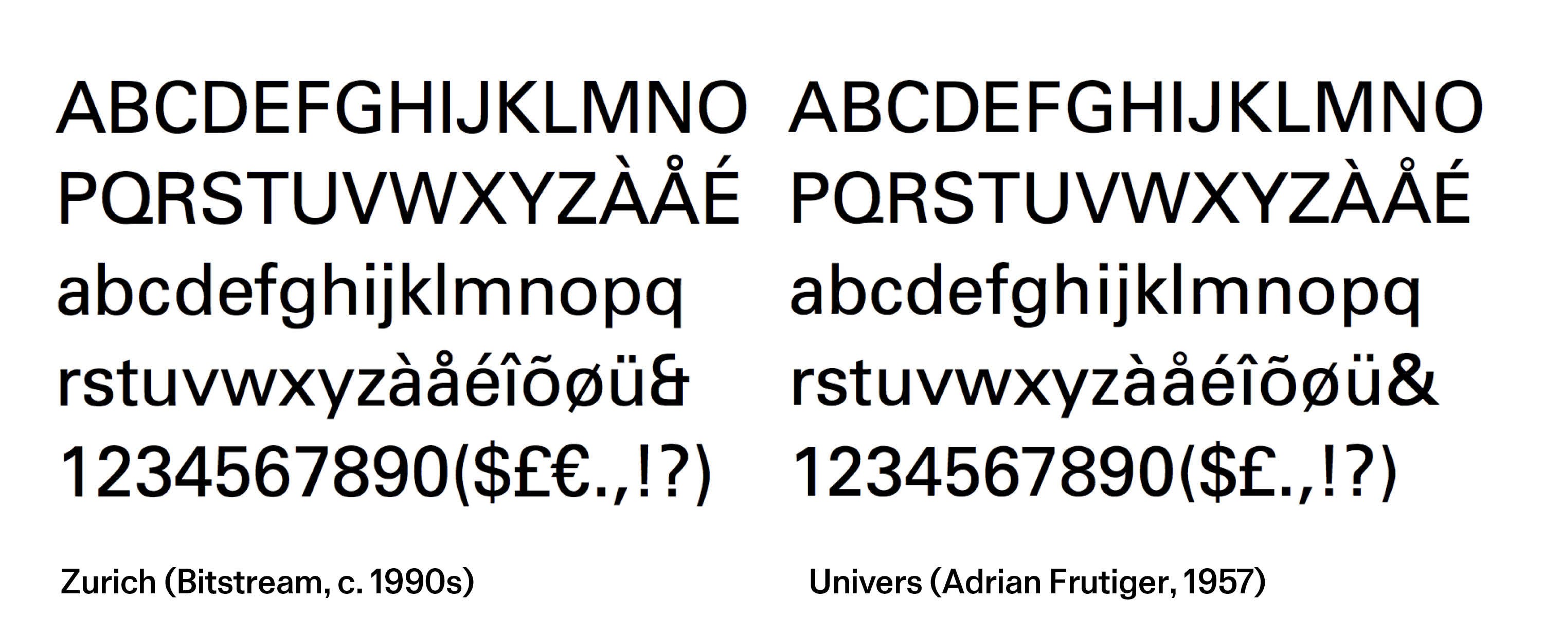
Univers was retained as Australia Post’s primary typeface until the late 1990s when, under the direction of Emery Vincent Design, it was replaced by Zurich. Digitised by Bitstream for desktop publishing, Zurich was heavily influenced by Univers. The foundry specialised in ‘interpretations’ of renowned typefaces under different names to bypass copyright restrictions.
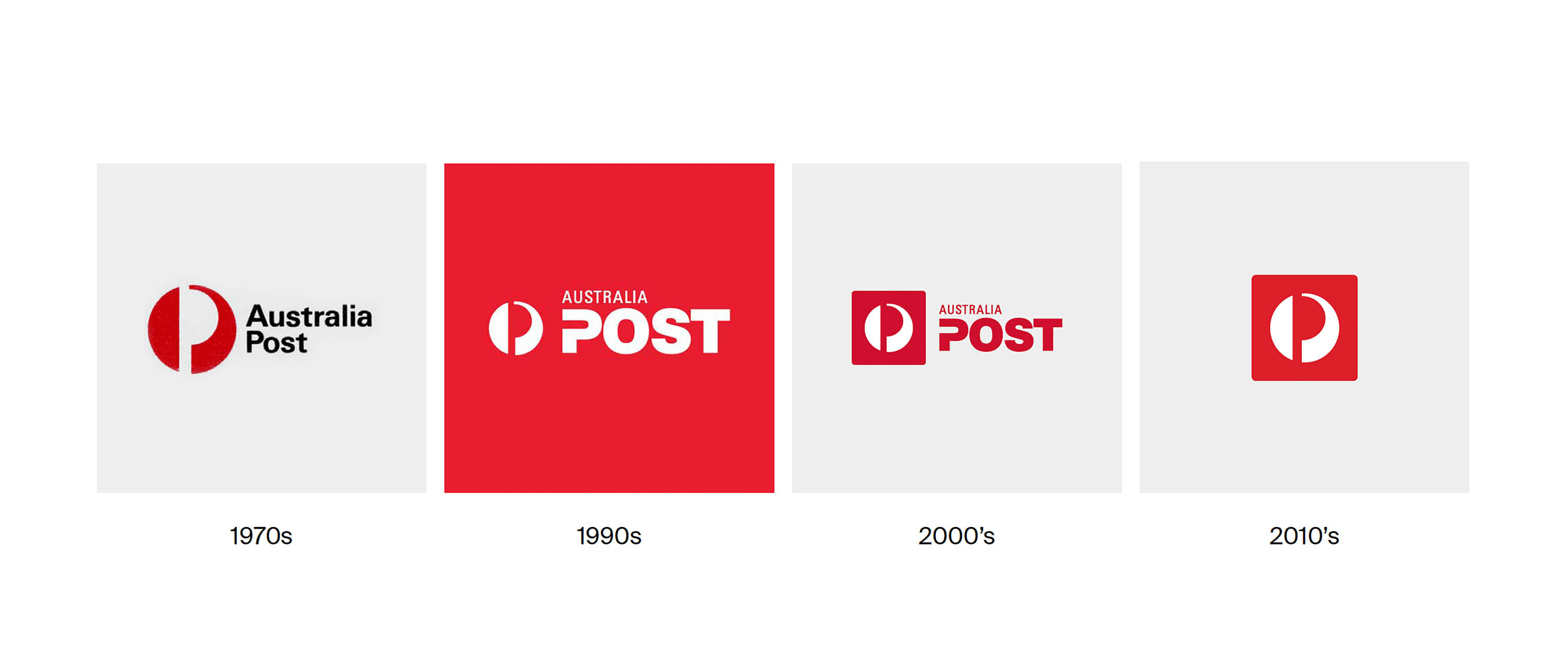
Reflecting a shift towards international markets, the entire system was updated under the remit of rejuvenation; ‘A corporate image is revamped and rationalised, but the well-known symbol is not lost. The P logo, the pillar box red and the word ‘POST’ are reinforced into a memorable combination’.1
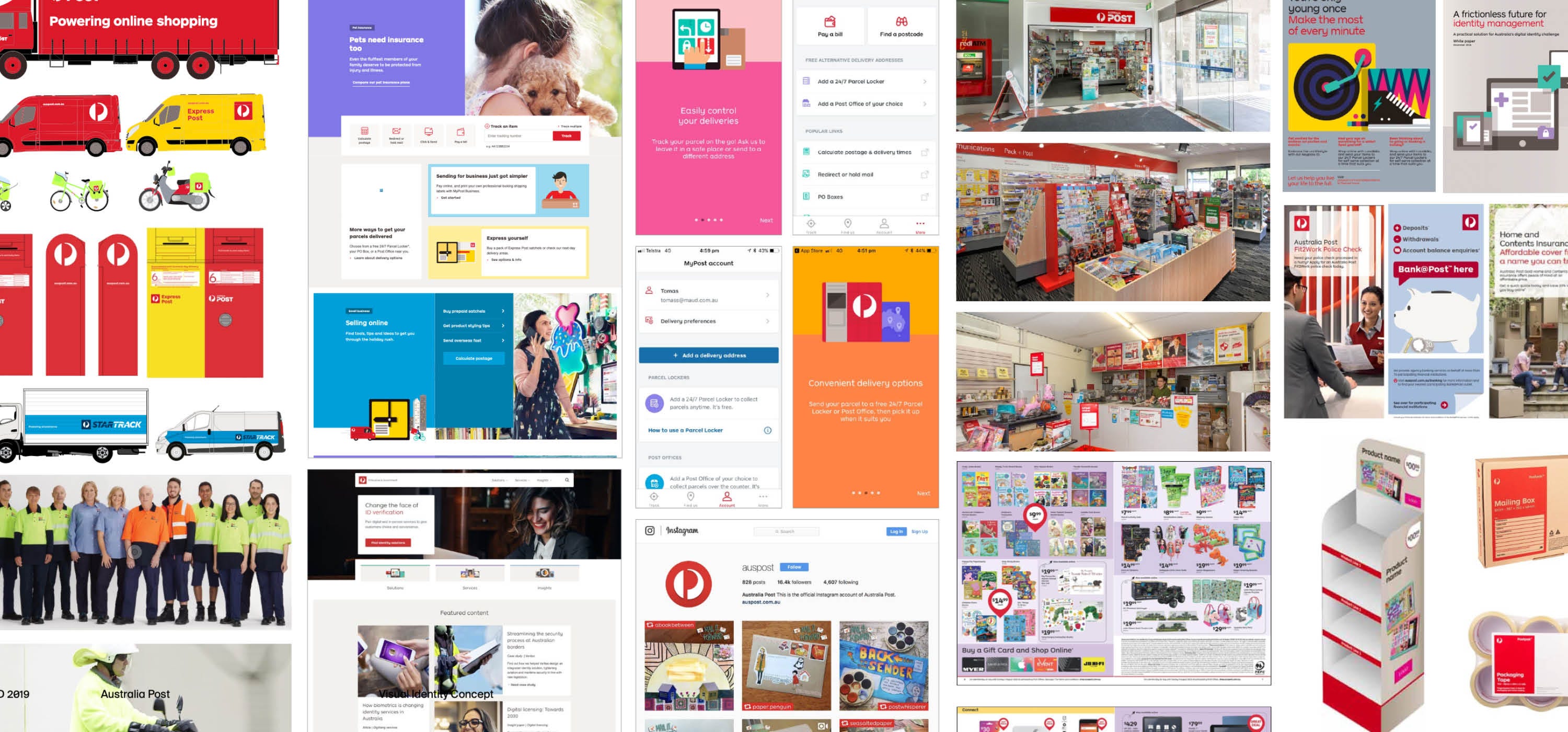
By the 2010s, Australia Post had evolved from a local parcel and letter service to a global, multi-faceted organisation that encompassed banking, retail and courier services. The next significant update by Interbrand in 2012 expanded the brand’s colour palette, refreshed the photography and illustration styles and introduced a new, ‘approachable’ brand typeface, AP Letter. Enclosing the circular symbol in a square to assist with digital applications was the first major modification to Huveneers iconic mark since its introduction.
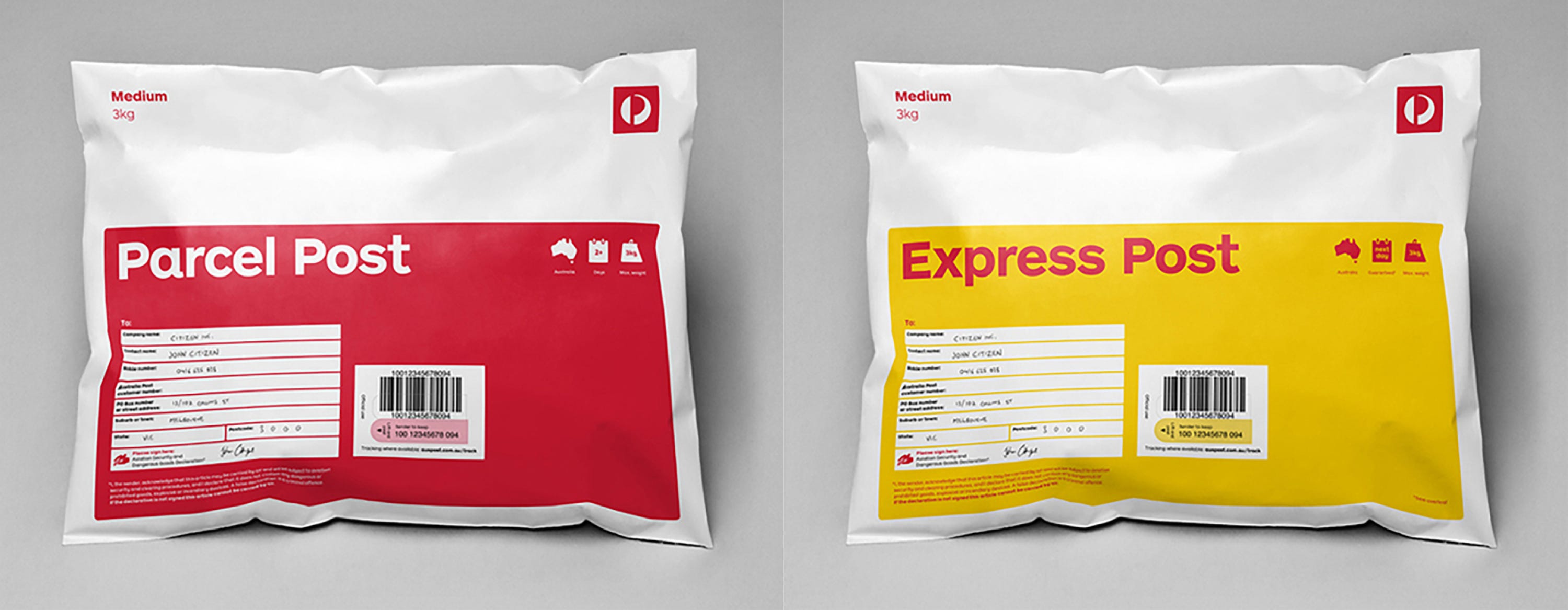
The appointment of Christina Holgate as CEO in 2017 marked a business-wide commitment to return the brand to its former position of respect and standing within the Australian community. Aligning the identity with Holgate’s vision of ‘One Australia Post’ was the primary challenge presented to MAUD’s team of designers and strategists in early 20182. Huveneers’ prescient words would continue to resonate across the 18 month undertaking:
‘We must look to total identity if we are proud of our product, proud of our business and staff. We should stand up and be counted, with a total identity programme carefully prepared… that makes the company deserve its place within the community’.
Pieter Huveneers, 1975
The project began with a phase of exhaustive research and consultation. Australia Post’s complex internal ecosystem resulted in interviews with more than 30 General Managers from across the business. AP’s digital team and roster of advertising agencies were also consulted for their insights as users of the identity, and workshops from across the business identified opportunities for efficiency and improved collaboration.
Our visual research focused on the original 1975 identity. Through a connection to Huveneers’ devoted partner Tanis, I made a whirlwind trip to Tasmania to visit his home studio, untouched since his recent passing in 2017. I felt a strong personal connection to Piet, who, like my father, arrived in Australia in the 1960s as a Dutch emigré seeking a fresh start. Both were raised in the horrors of German occupation in WWII, a childhood of deprivation that instilled a practical view on life, and an instinct to retain rather than discard.
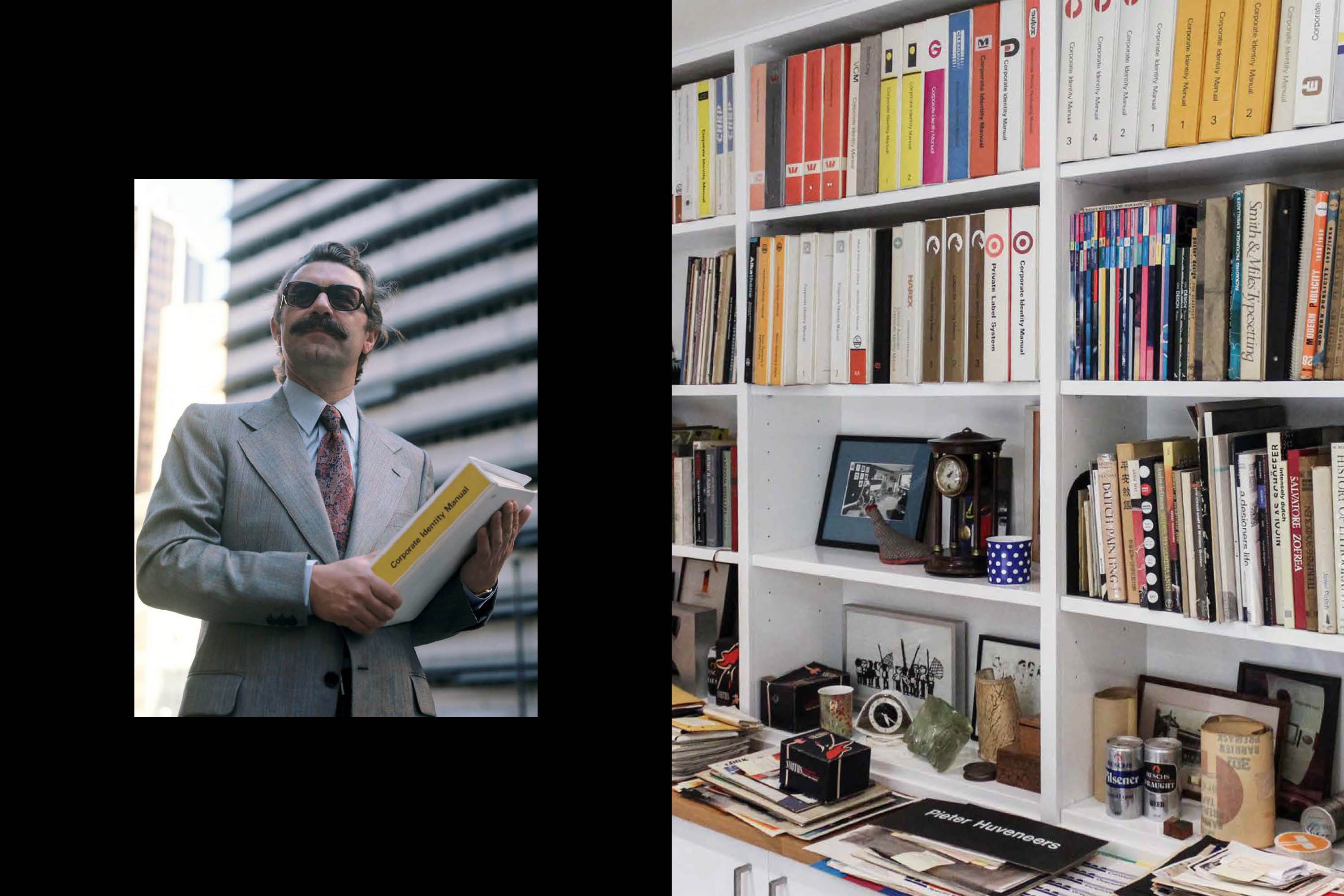
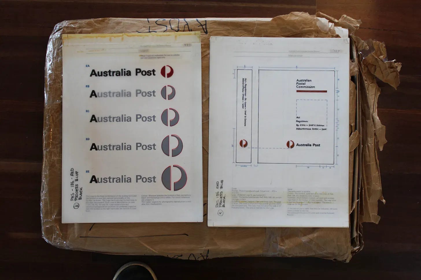
Ever the fastidious archivist, Piet kept copious amounts of documentation for all of his projects, including client and supplier correspondence, mechanical artwork, printed samples and copies of his beloved identity manuals. More valuable than the archive itself was an understanding of Huveneers’ design philosophy; his decisions consistently privileged clarity, efficiency and longevity over stylistic expression.
The temptation in a rebrand, particularly with such scale and visibility, is to see it as an opportunity to make a mark, to leave a personal legacy. This project, inspired by the original designer, would be approached as a restoration, rather than a revolution.
Before applying the learnings from our research, analysis of the existing identity was also a critical part of the initial phase of work. Interviews, workshops and audits established a shared understanding of where the existing identity was succeeding and where it was failing. Many of the issues we identified were not the result of individual design decisions but of decades of incremental divergence from the disciplined system Huveneers had established.
Assessing the incumbent typeface AP Letter, we determined that it lacked the gravitas and dignity aspired to by Australia Post. It had also emerged during our immersion interviews that AP Letter was being substituted for numerous alternative fonts. The typeface’s geometric structure made it too wide for many digital interfaces, where horizontal space is at a premium. Rather than pursue another off-the-shelf option, we began exploring a bespoke solution.
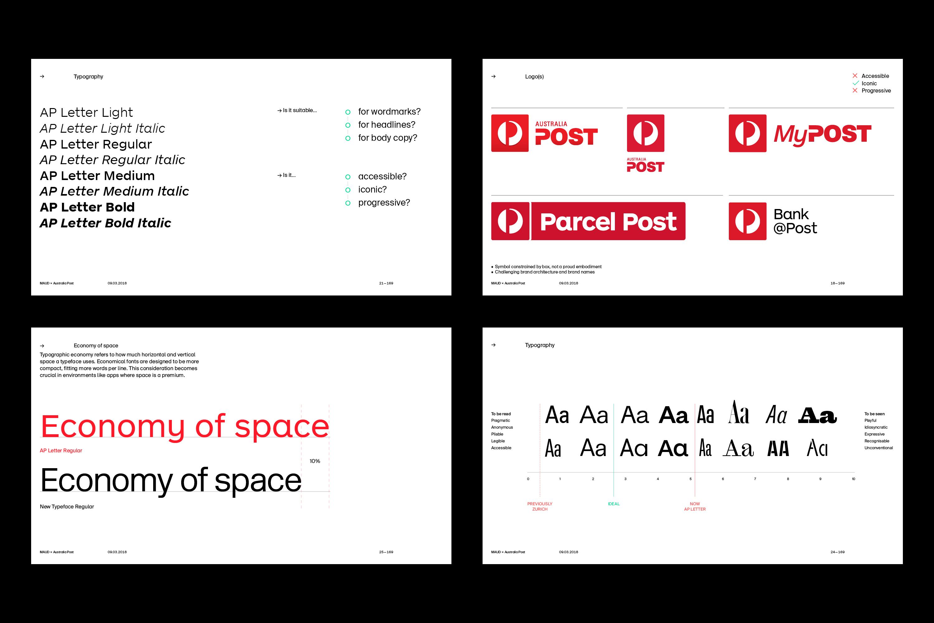
Our recommendation emerged from several practical observations: AP Letter was inconsistently used, inefficient in digital environments, expensive to license at scale, and unable to accommodate future functional requirements. A custom typeface addressed all four issues simultaneously.
The other main advantage over licensing a library typeface, as the name suggests, is the ability to customise the typeface. A bespoke solution ensures alignment with a brand’s identity, offering strategic, aesthetic and functional benefits. Multilingual support, for example, was an important consideration for Australia Post with a global audience and commitments to inclusivity and accessibility.
We recommended a local type designer, Vincent Chan3, for the project. I’d known Vincent for a number of years having worked together on the Re:collection typeface, and he had just delivered Foxtel Sans for MAUD, a project with a similar scope at a smaller scale than the Australia Post rebrand. Alongside his technical abilities, Vincent’s approach to type design is rooted in rigorous research, which mirrored the studio’s methodology.
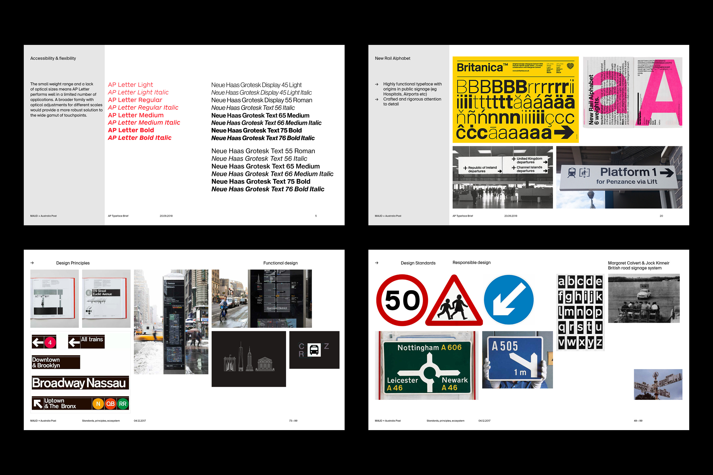
A briefing document summarised the project’s objectives, outlined some guiding principles and we also provided several examples of typefaces that possessed the attributes we were seeking. As a general theme, type in the public realm (e.g. airport or highway signage) seemed a most useful territory to explore; after all, this would be a typeface that every Australian would encounter in some way, from postboxes to parcels.
Vincent’s response to the brief was delivered following an intensive four week development phase. His proposal highlighted three main considerations from the brief for the new typeface; it must be economical & flexible, respectful and complementary to the logo, and recognisable yet universal. He emphasised that we were designing a typeface for millions, which meant the balance between utility and humanity was crucial.
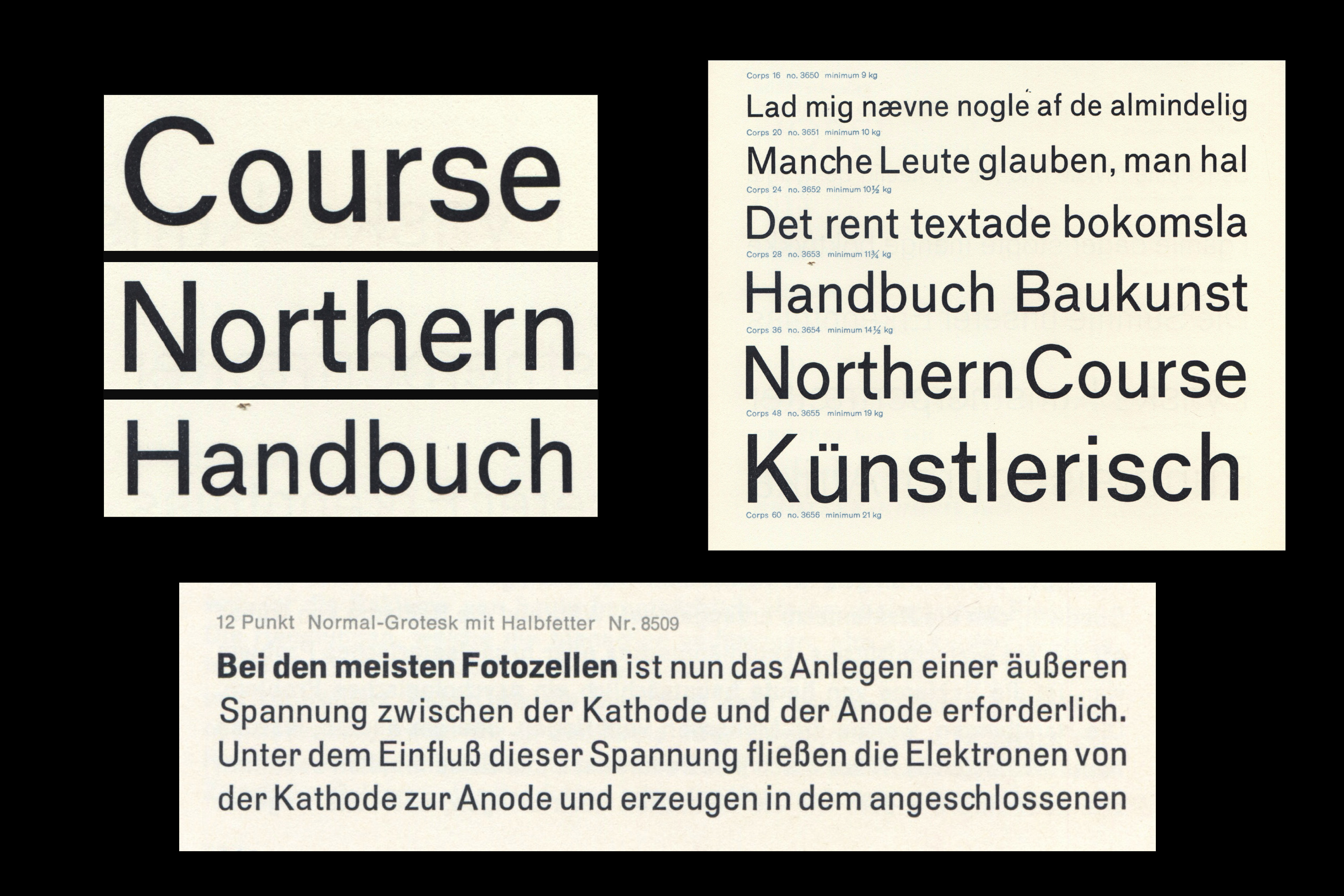
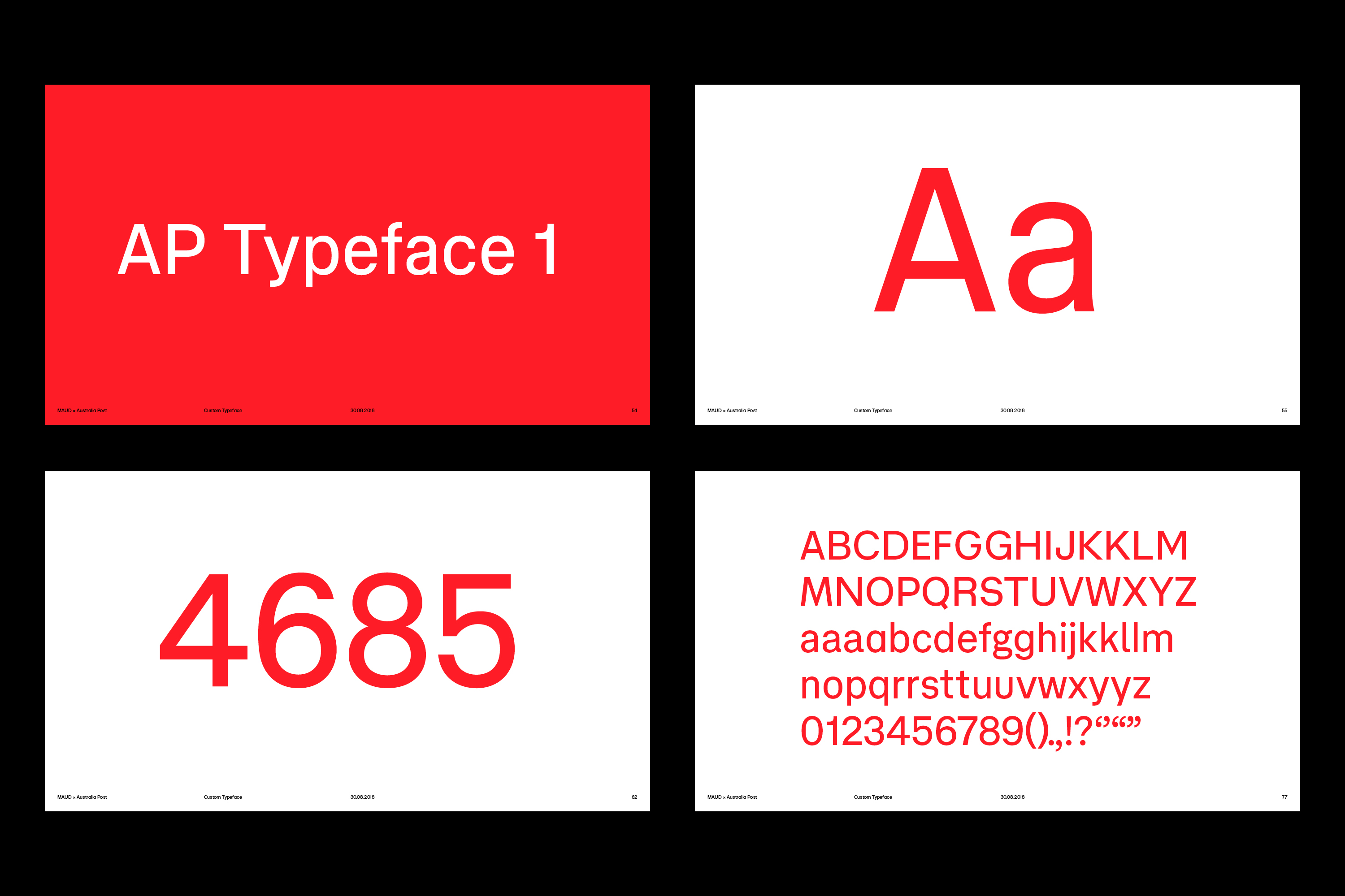
Vincent presented two distinct responses in an academic yet approachable manner that resonated strongly with both clients and designers alike. Both satisfied the strategic requirements, but expressed markedly different personalities. AP Typeface 1 was influenced by lesser-known mid-twentieth century European fonts such as Mercator and Normal Grotesk. Narrow in proportion, it also featured subtle details with warmth and character.
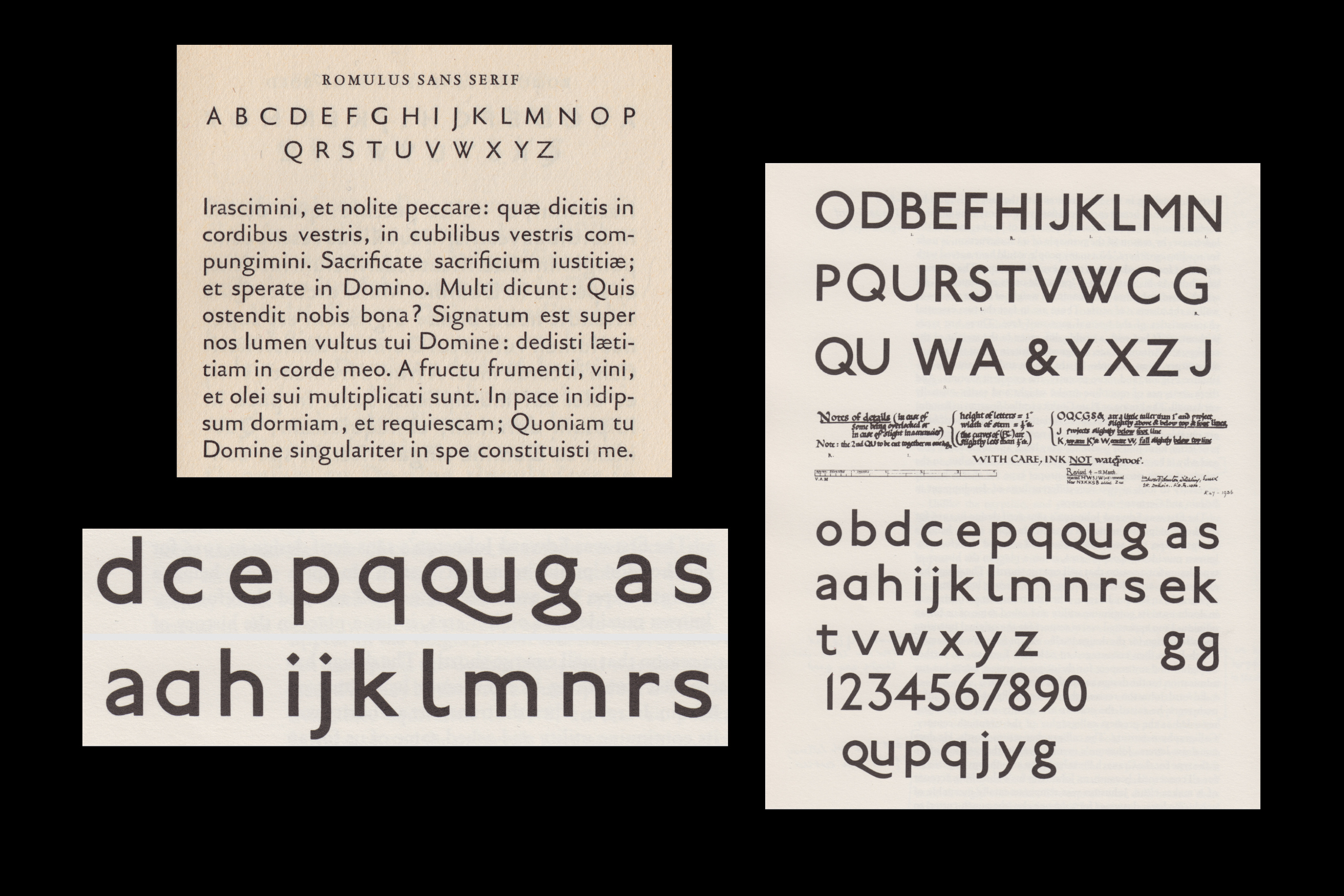
AP Typeface 2 revealed a humanist DNA in the tradition of English classics like Johnston, developed by Edward Johnston in 1916 for the London Underground. Based on classical proportions, with open apertures, vertical terminals and more characterful letterforms, this second alternative expressed a calligraphic flourish that contrasted with the more demure AP Typeface 1. His designs included alternatives for some letters that could be road-tested in the next phase of work.
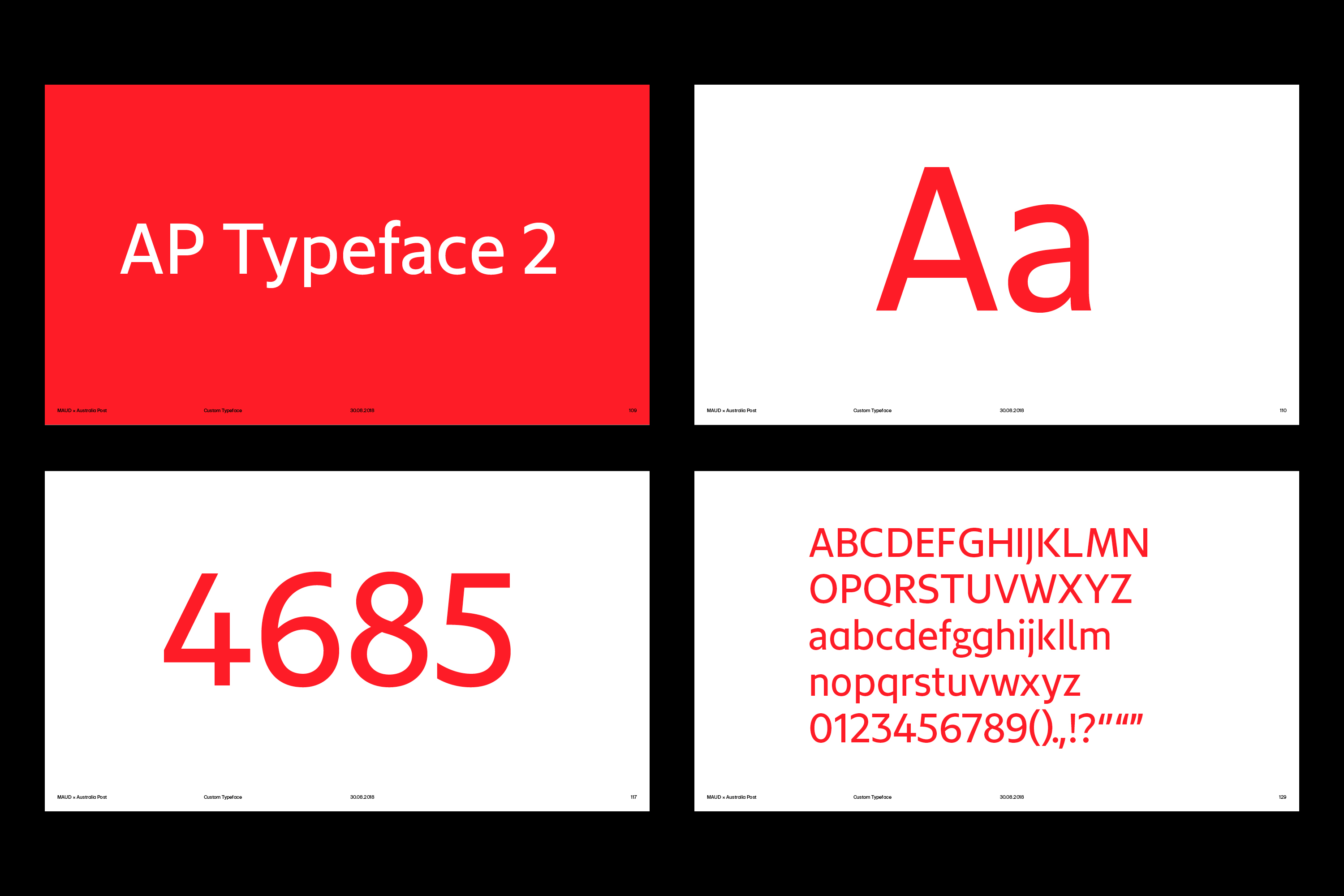

Ultimately, our decision to pursue the first design was based on its more contemporary, progressive tone. In retrospect, perhaps we felt that selecting a humanist typeface would have shifted the identity too far from the modernist spirit of the original identity. With the client’s endorsement, Vincent set about refining AP Typeface 1.
Experience had taught us that the most efficient method to progress a typeface design is by using it in actual contexts as soon as possible. Working with beta versions of the fonts, we were able to quickly start a feedback loop between the design teams (internal and external) and type designer, making adjustments with each draft.
On projects of this scale, with so many layers of approval, small things can become big decisions. Our initial concepts had included a single-storey lowercase ‘a’ in the Australia Post wordmark. As the project progressed, we felt this approach was out of step with our shared aspirations for an elevated and trusted brand.
When the astute client queried this change, I consulted with Vincent and prepared a document mounting a case for the double-storey ‘a’, arguing that the alternative presented a ‘child-like familiarity’ that would undermine Australia’s oldest, continually operating organisation. As Huveneers had demonstrated decades earlier, clients are far more likely to support decisions grounded in clear reasoning than subjective aesthetic preferences.
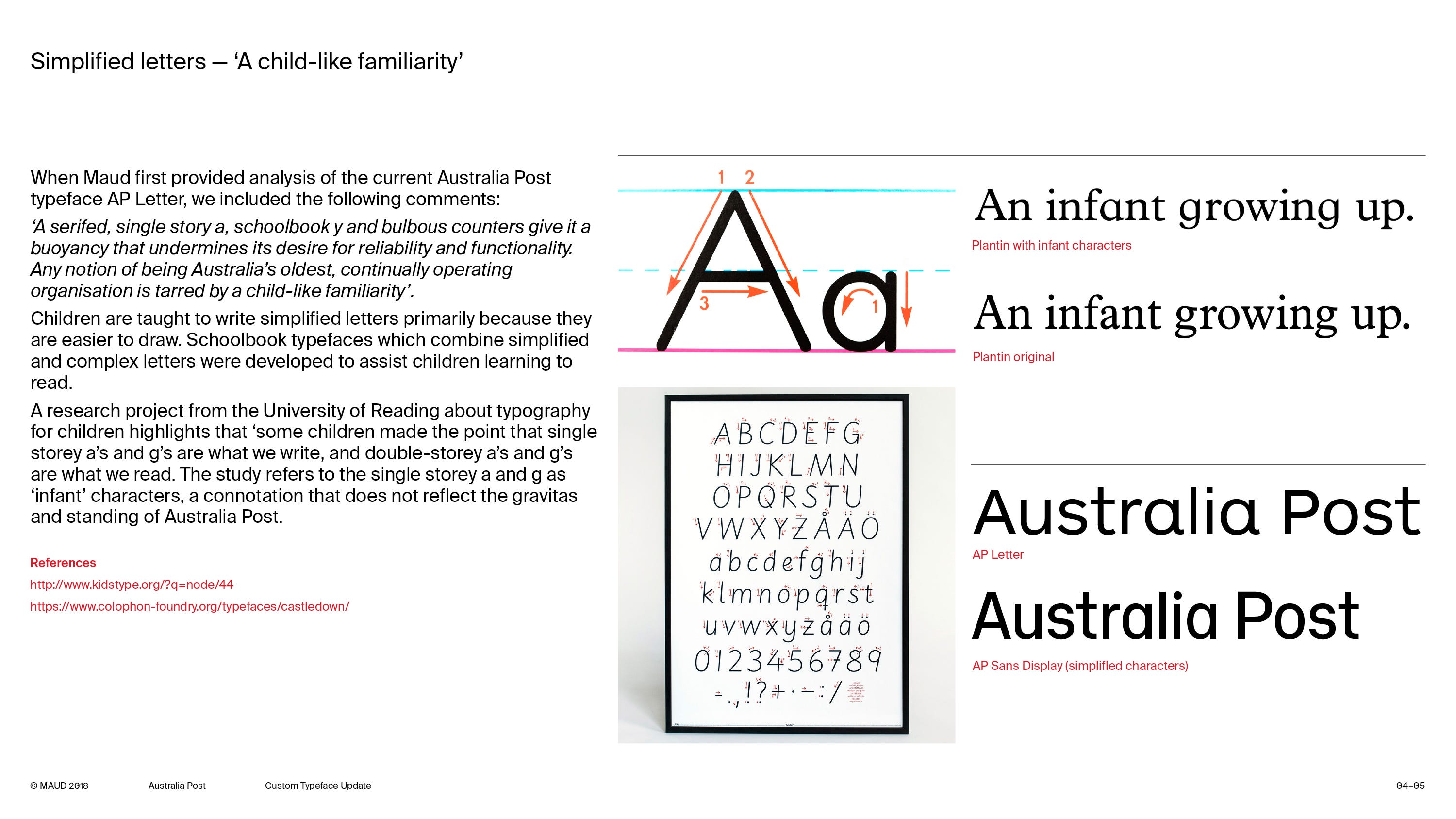
It seems a minor typographic detail, but highlights that successful identity systems are rarely built on moments of inspiration. They emerge from hundreds of small decisions, each supported by clear reasoning, aligned with a larger strategic objective.
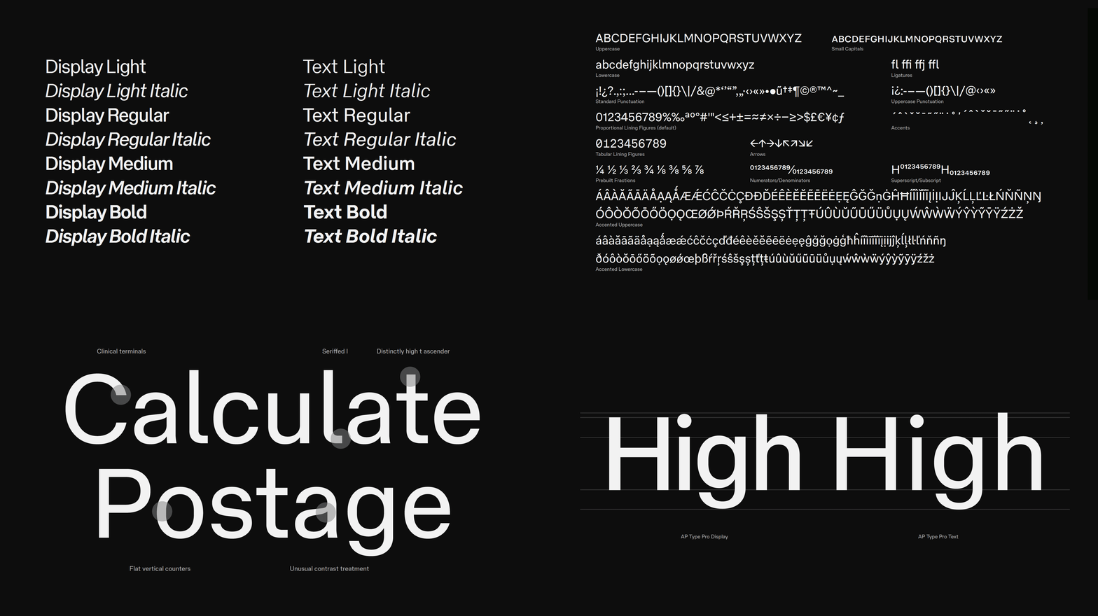
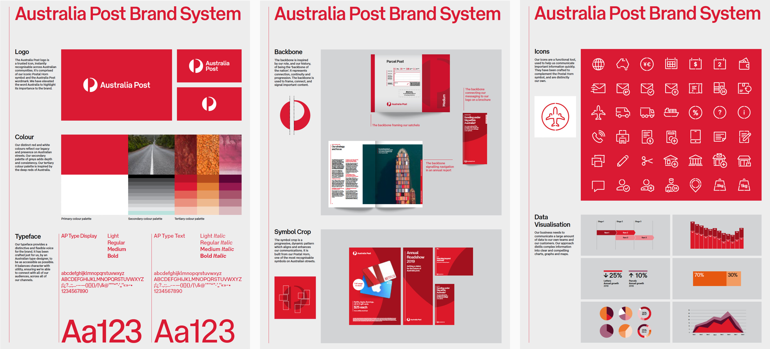
With the final character sets built out to incorporate over 300 languages, it was time to give a name to the typeface. We explored a range of options including Parcel, Postie, Satchel and Sender, eventually landing on the straightforward AP Type (Huveneers would probably have approved). In late 2019, Vincent delivered two dedicated optical sizes for display and text sizes in four weights as well as a custom logotype font to maintain consistency across the multitude of existing and future Australia Post sub brands.
He summarised the outcome as follows:
AP Type is an economical grotesk with subtle flat-sided counters and a clean finish. It is a practical face, used to communicate the reliability that is required of a national postal service. Despite this pragmatism more distinct moments can be seen in the contrast of the lowercase a, the unusually tall ascender on the lowercase t and the seriffed lowercase l. The Display optical size has a higher x-height, truncated extenders and a heavier stroke weight. It also has narrower measure, allowing for stronger wordshapes and punchier headlines.
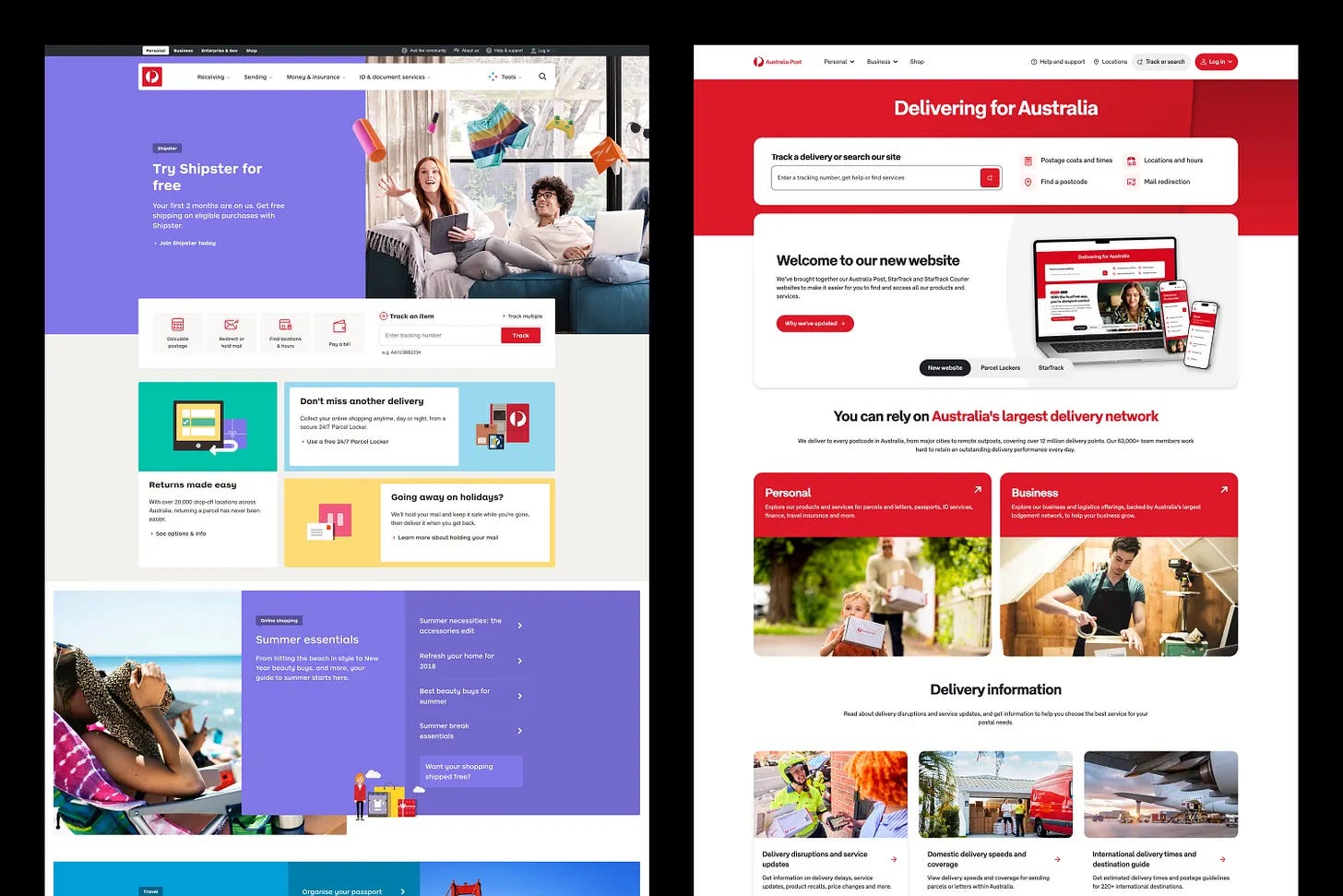
Rebranding an organisation the size of Australia Post doesn’t happen overnight. An unseen yet critical aspect of the project was staging the transition of the identity. Based on a matrix of priorities (including visibility, cost, opportunity etc.), the system, including AP Type, was distributed based on a carefully mapped plan. The organisation’s website was the first major application of the new identity.
Designers often describe their work in terms of creativity, intuition or originality, yet the decisions that endure are usually the ones that can be explained, defended and repeated. Pieter Huveneers understood this instinctively. Our redesign followed the same principle. Whether auditing the existing system, commissioning a bespoke typeface or debating the form of a single letter, the objective was never novelty for its own sake. It was to make decisions that could withstand scrutiny, earn organisational support and endure long after the project itself was complete.
Acknowledgments: The Australia Post rebrand (2018–19) referenced in this text was completed whilst I was Executive Creative Director at MAUD (Melbourne). The core design team comprised Owen Cramp, Daniel Flynn, Tal Levin, Tomas Sabbatucci, Richard Smalley & Sam Turner. Strategy by Georgina Milne and Lisa Aitken.
Dominic Hofstede
Sourced from Emery Vincent Design, Images Publishing Group Pty Ltd, published 1999.
No posts
Comments
Nothing yet. Say the first thing.
Sign in to join the conversation.