
Tiny housekeeping note: This 10-part series, Email Accessibility: How To Open Your Inbox To Everyone, will be worth it for email creators. Join me!
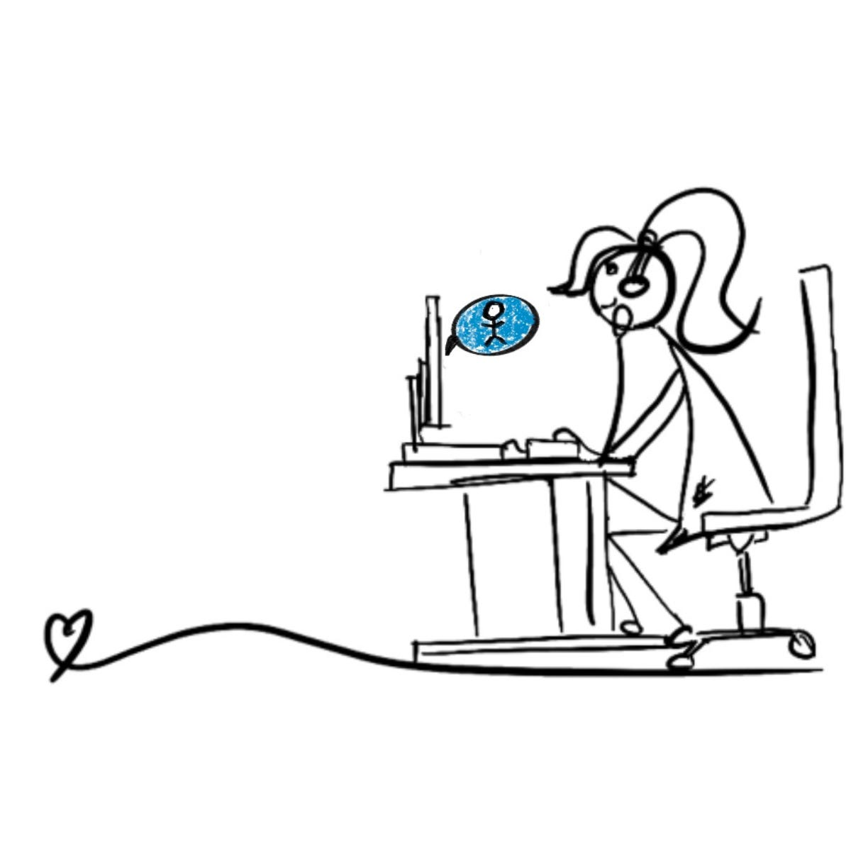
Do you want more people to connect with your emails?
It doesn’t have to be hard.
In fact, it can start with just one kind choice.
What do I mean?
The truth is, we’re all a little distracted sometimes (hello, my 67 open tabs, teehee).
And, for people with dyslexia, ADHD (hey, that’s me!), or challenges with memory, focus, or understanding, a busy email can feel like too much, too fast.
So in this email, we’re keeping it simple: think clean layouts, clear instructions, and no jargon-heavy brain fog.
Want to see how?
My son has dyslexia, and watching him manage school has taught me something big: when we make content easier to read, understand, and engage with, everyone feels like a winner.
Keep sentences short and snappy. Long, winding sentences can lose your reader, especially if they’re juggling focus or memory challenges.
Break up big paragraphs. Large blocks of text are harder to process. Give your reader’s eye some breathing room.
Use clear, simple language. Drop the jargon and write like a human. Active voice helps, too!
Aim for an 8th-grade reading level. It’s a sweet spot that makes your message more accessible to a wide audience (about 85% of the general public).
Pick a clear, readable font. Atkinson Hyperlegible and Sans Serif is your best bet for body copy.
Stick to left-aligned text. Centred paragraphs might look pretty, but they’re harder to read, especially for people with dyslexia or attention challenges.
Mind the spacing. Make sure letters and lines aren’t squished together. Good kerning and line height make your text feel calm, not crowded.
If your goal is to become a more inclusive email creator (and a more thoughtful one), accessibility is a beautiful place to start.
You don’t need fancy tools or a total brand overhaul, just a little awareness and care.
See you next week. 💌
Lia
PS: These shifts work everywhere—from emails and social posts to sales pages and blog drafts. When your content includes more people, it resonates more deeply.
PPS Do you have any questions or suggestions? I'd love to hear from you. Just reply to my email and I'll get back to you.
.
No posts
Comments
Nothing yet. Say the first thing.
Sign in to join the conversation.