
Hi friends!
It’s been a big week — I turned another year older, went to a killer concert, met some alpacas, and all the while have been living vicariously through everyone lucky enough to be in Milan. As you may know, Salone del Mobile — the preeminent design fair — along with the surrounding events of Milan Design Week ran all last week. Designers and tastemakers flock to northern Italy every spring for not only the trade show but all the surrounding installations and debuts. It is no longer just furniture — fashion, sportswear, skincare, and food brands all show up to plant their flag in front of the world’s most design-literate audience.
There has been so much inspiring and fresh work. But a pattern has emerged in what I’ve been seeing: the biggest brands are building fantasy worlds rather than debuting products. Less a showcase of beautiful objects, more a declaration of values and vibes. Think Gucci weaving a hundred years of history into twelve monumental tapestries, or McDonald’s filling a gallery with a sea of primary-colored balls to unlock your inner eight-year-old. Then contrast that with Issey Miyake quietly transforming paper scraps into furniture that makes you question everything you thought you knew about materials, or Hermès letting an ombré cashmere throw speak for itself. Both approaches can work. Both can fail. What I’m drawn to is examining what earns its place — when does the spectacle serve the story, and when does it replace it?
Is this a problem? Not necessarily — I love an immersive experience and appreciate a brand willing to go all out. But I do miss the focus on thoughtful, innovative objects. And I’d hope these giant budgets are finding their way to the small artists and designers who are risking everything just to afford to show up.
This week I’m rounding up what broke through my feed — organized around four tensions I keep coming back to: food as folly, luxury craft, playing in public, and the weight of history. Spectacle vs. substance, brand vs. product, fantasy vs. function. Let’s get into it.
1. FOOD AS FOLLY
Solid Nature x OMA/AMO — Il Sonno
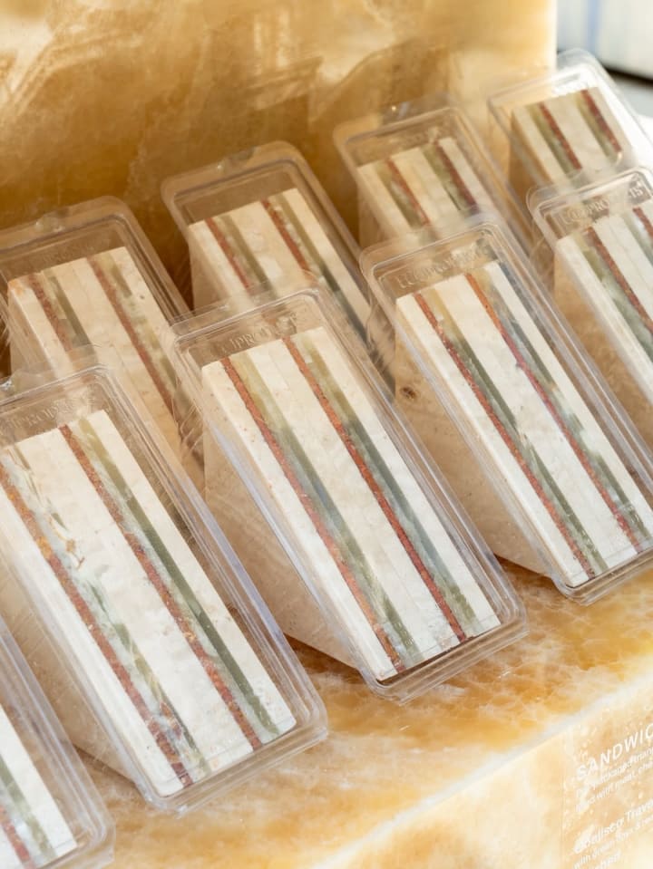

This installation reimagines the familiar supermarket — a space typically defined by consumption and convenience — through the lens of material permanence. Constructed entirely from stone, the shelving, the packaging, the food itself: every conventional grocery item becomes an artifact. It is a meditation on durability, time, and disposability, and an invitation to ask how we perceive long-term value and intention. The materiality of the familiar makes it fantastical and precious. This installation is at once a commentary on consumerism and the most amusing stone samples I’ve ever seen.
Laila Gohar x Arket — Reimagined Fairground
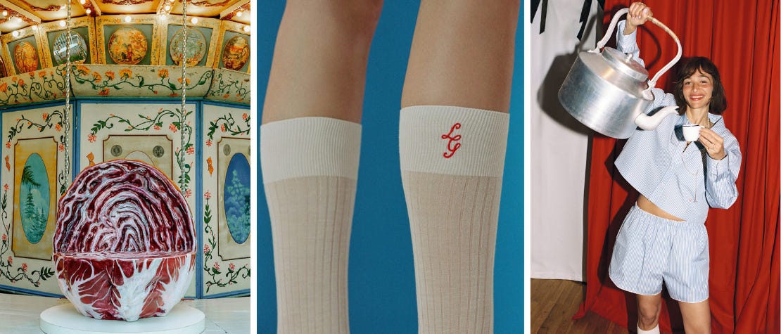
Starting from a historic carousel believed to date back to the late 1700s, this installation replaces its original figures with oversized fruit and vegetables created by Laila Gohar — bringing together food, playfulness, and everyday beauty through Gohar’s characteristically theatrical language. The oversized produce is familiar and comforting in its realism; the simple slice forming each seat is the invitation to step inside the fantasy. These everyday objects made monumental become genuinely wondrous. And as a symbol of the collection itself — everyday clothes that explore the interplay between opposites, masculine and feminine, soft and structured, sheer and opaque — it lands perfectly. The theatrical and the practical, in conversation.
Chloe x Poltronova — Tomato Chair
I am always a sucker for a good tomato-themed design. As I mentioned in the last newsletter while fawning over the perfect scent, my grandfather was in the tomato business, so the fruit holds a permanent spot in my heart. This chair stopped me in my tracks. Originally designed in 1970 by French designer Christian Adam in collaboration with Italian manufacturer Poltronova, it was born from Italy’s Radical Design movement — a proposition for a new relationship between body and object. The soft, organic form rejected rigidity in favor of comfort and sensuality. Chloé, with their affinity for softness, fluidity, and ease, has unveiled a re-edition of the chair. The supple leather and sectioned form are unmistakably tomato, but the rich materiality and restrained color palette keep it elevated — and utterly not gimmicky. Here the product IS the installation. No fantasy world required — just a very good chair.
2. PLAYING IN PUBLIC
IKEA PS Collection
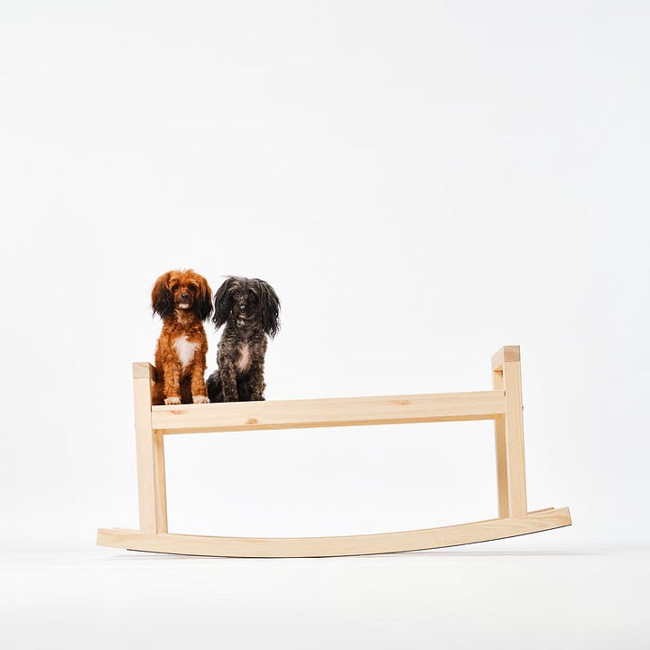
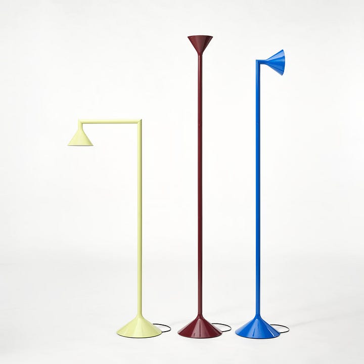
I cannot wait to see the full collection on May 14, but the three pieces teased so far are genuinely intriguing. I have always loved the PS collection — it’s IKEA’s chance to play a little, and some pieces have real staying power. (I still have the yarn-wrapped stool and the classic locker.) The lamp is the clear star: simple form, transformative movement, and a perfect color palette. The chair is a looker, and I love the intention behind the air-filled cushions — flexible, movable, easy to break down — though I do wonder if it’s actually comfortable. And then the bench: a curved bottom rail that invites a wobble, alone or with a friend. A simple form made social. On the whole, IKEA has done what it does best — brought a genuine sensibility of play while keeping one foot firmly in the practical.
Škoda Auto–Ooooh that’s EpiQ
All spectacle — and I mean that with some affection. The Play-Doh-like forms descending into the piazza are dramatic, and the historical architecture does most of the heavy lifting. Set in the courtyard of the Palazzo del Senato — home of the State Archives — it was an inspired choice of venue. The juxtaposition of form, color, and formality plays up the absurdity beautifully. What I love most is how unapologetic it is. Why shouldn’t adults hop around in a bouncy castle and sculpt something out of Play-Doh? It makes you feel something, and feels perfectly calibrated for the debut of Škoda’s EV, a car that is deliberately challenging the traditional auto industry. Whether it will leave any lasting design inspiration is another question entirely.
McDonald’s — Pool: Unlock Happy Memories
Well. Why is McDonald’s at Milan Design Week? Is this the sign of the end? They are celebrating the 40th anniversary of their first restaurant in Italy. Setting aside my lackluster feelings about the brand, I think this is a genuinely successful installation. The iconic ball pit taps into collective childhood memory — but executed en masse, in a gallery setting, it becomes something else entirely. The installation was informed by Damien Hirst’s Spot Paintings , with the aim, according to McDonald’s, of “weaving together play, memory and critical reflection.” The sea of primary-colored balls is genuinely compelling. There is no product here, just a feeling. Which is either the most honest thing a brand can do, or the least. Does the spectacle work? Are you any more inclined to eat at McDonald’s? For me — yes and no.
Marimekko — Osteria Fiori
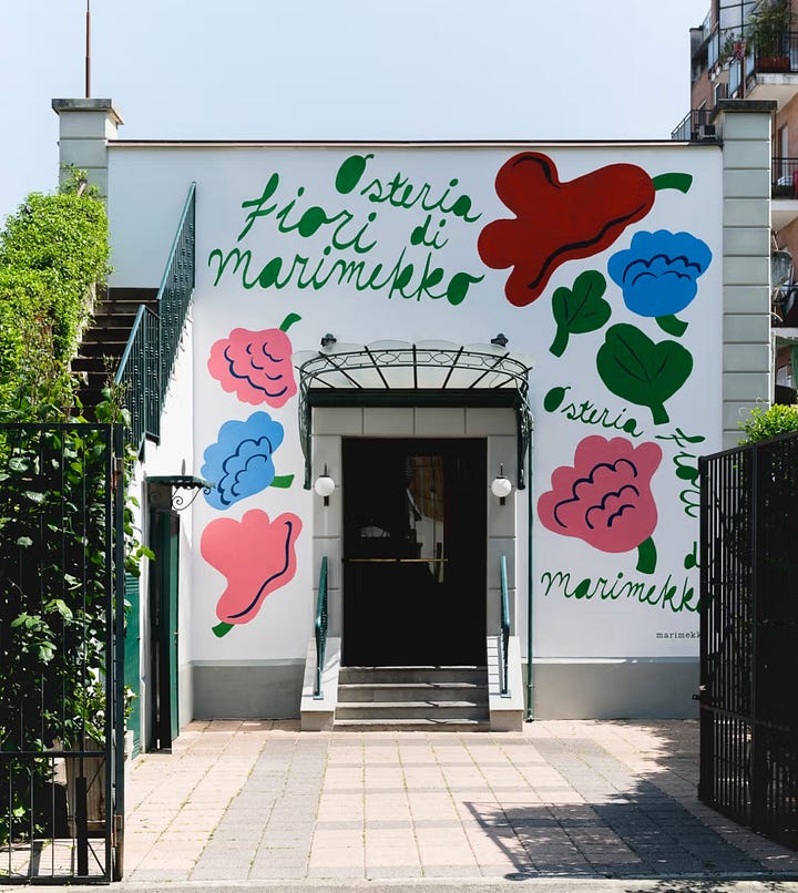
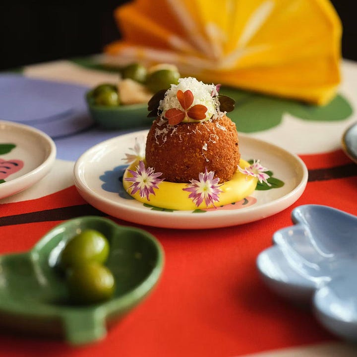
I am continually inspired by this brand, and their installation succeeds in marrying the product with emotion — which is harder than it looks. Nothing groundbreaking, but it is consistent, strong, and distinctly Marimekko. The space they’ve created is like living inside one of their joyful floral prints — it surrounds you, nourishes you, entertains you. The dinnerware and even the food share the same vibrant palette. The Osteria Fiori (Flower Tavern) is exactly that: flowers to be consumed in every sense — eaten, worn, enveloped. I particularly love the bocce ball set, which brings a casual summer lawn game energy to the whole thing. This is how brand building should feel. This is the sweet spot — world-building and product in lockstep. You want to live there, and you want everything in it.
3. LUXURY CRAFT
JW Anderson x Edie Glew
This collaboration between JW Anderson, Creative Director of Dior and Edie Glew, Yeoman Basket Maker and Sculptor, draws inspiration from medieval chests and the poetry of everyday tasks. The four baskets are designed to serve practical needs — laundry, organizing, fire-tending — but the exquisite craft makes them look like they belong in a museum. I love the tension between the rugged inspiration of medieval storage and the delicacy of willow basketry. Sturdy and fragile. Both skillful. Both built to last.
Hermès
A study in how everyday objects can elevate everyday life — which is, of course, exactly what Hermès has always been about. Executed here through luxe materiality and exquisite craft, the color palette is sophisticated but not shy. The real heroes are the pieces where the materials speak for themselves. I am particularly drawn to the ombré cashmere throw with leather fringe and the hammered metal and horsehair-skirted vase. Apparently I have a thing for fringe right now.
Issey Miyake — The Paper Log: Shell and Core
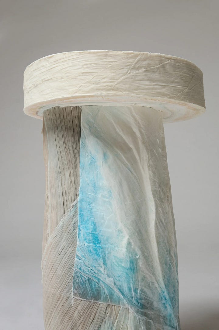
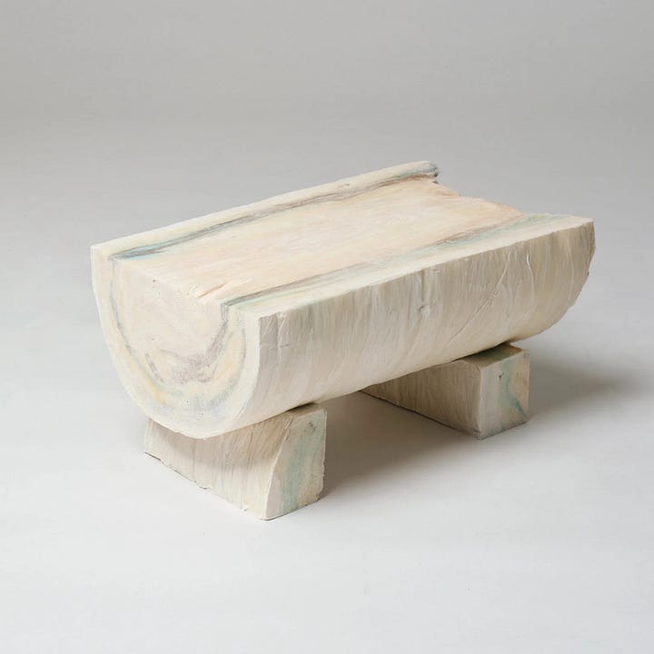
Miyake brings us an exploratory project conceived by Satoshi Kondo of Miyake Design Studio and developed in collaboration with Spanish architecture office Ensamble Studio. The project features sculpture (Shell) and furniture pieces (Core), both made from compressed rolls — or logs —of paper, the byproduct of the house’s iconic pleated garments. The logs were soaked with glue or wax for structure and then treated like timber: milled, sawn, carved. The result is furniture that is genuinely hard to place — marble? Plastic? Wood? The mystery of the material, the innovation of the process, and the elegance of the byproduct-to-product concept make this one of my favorites from the whole week. The resulting forms are mesmerizing.
4. STORYTELLING THROUGH HISTORY
Aesop — Factory of Light
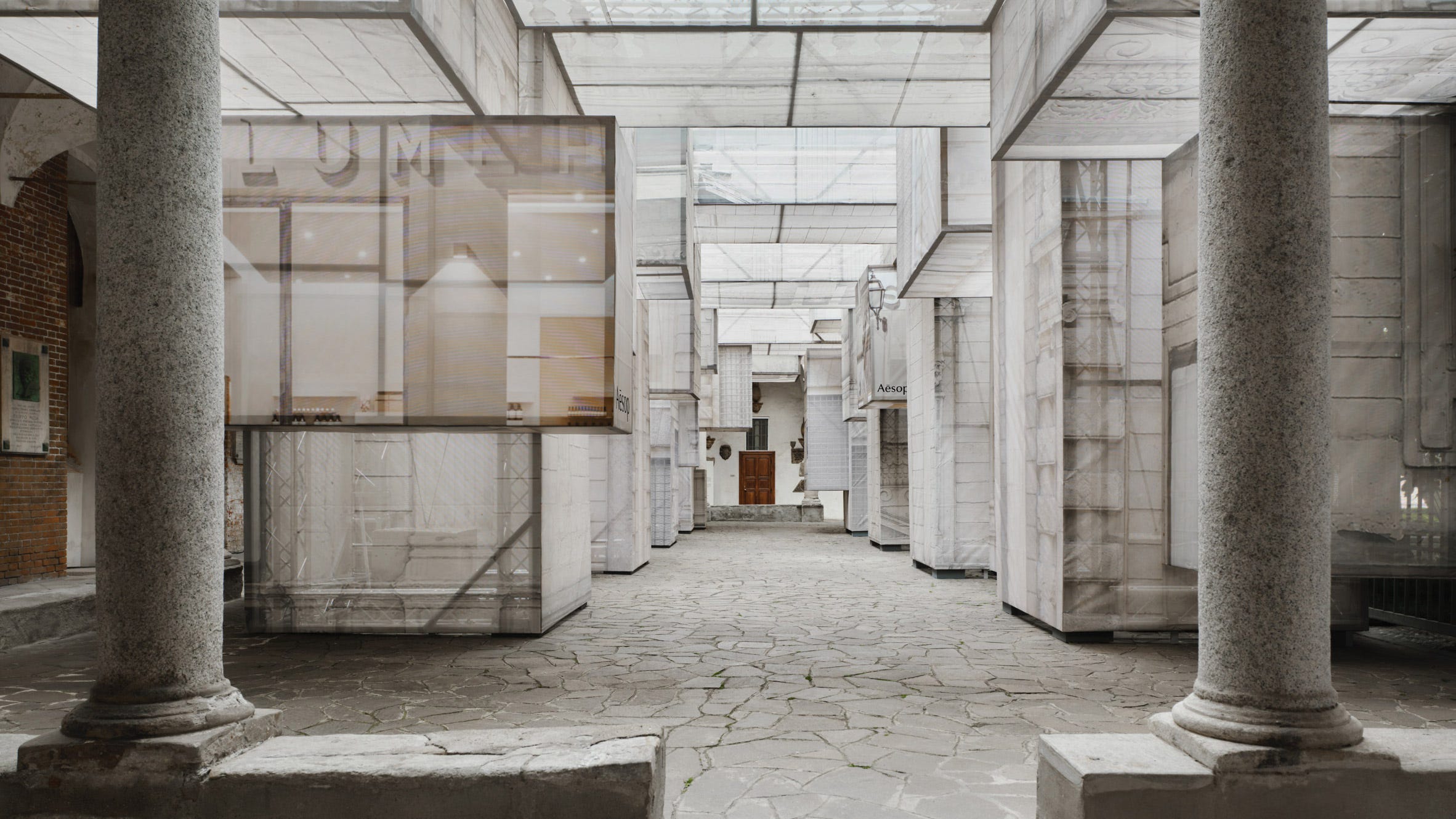
This installation introduces Aesop’s Apose new lighting collection across two spaces. The first is a light-filled structure inspired by the scaffolding that lines Milan’s streets — a ghostly imprint of that inspiration printed onto fabric hanging in rectilinear forms, creating something like a memory of a streetscape. It leads into a second space that is dark and solemn, where the lights sit atop an undulating structure that reads, to me, like prayer candles in a church — reverential, quiet, honoring something. The atmosphere is striking and sensory, as you’d expect from a brand known for extraordinary scent. The lamp itself is striking, minimal, and beautifully made, but like the monastic setting of the installation it feels a bit serious and hard to connect with. The installation is the stronger of the two. The lamp is beautiful but hasn’t fully earned its cathedral yet.
Gucci — Memoria
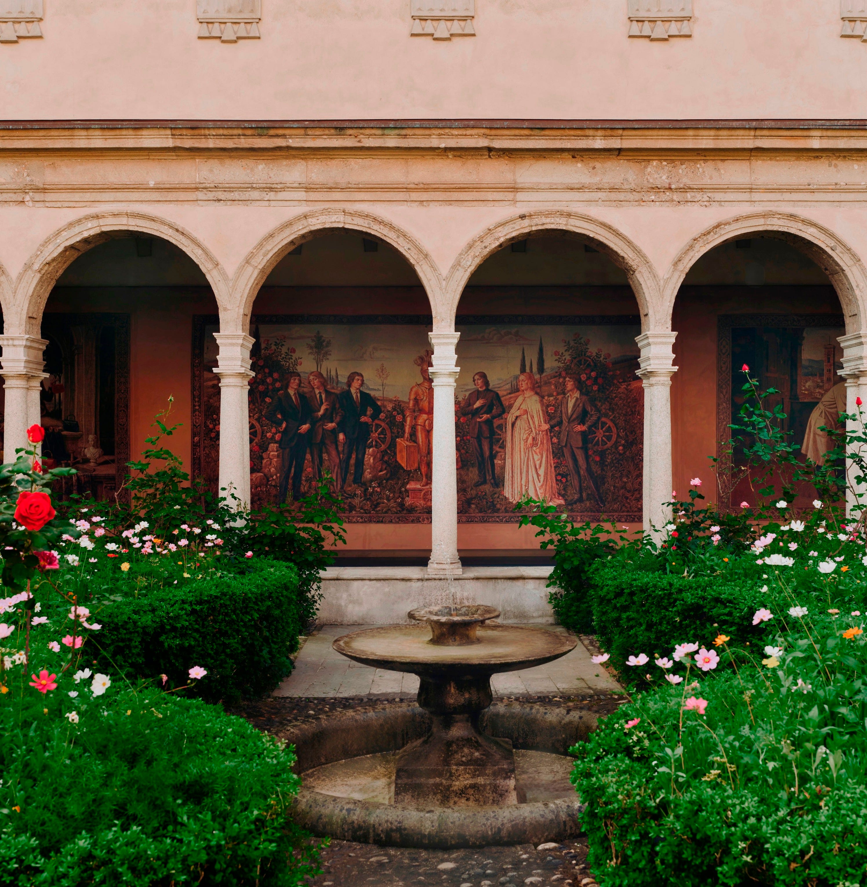
This installation traces the fashion house’s 100-plus-year history from its Florentine roots to its current global status. At its core: twelve giant Renaissance-style tapestries depicting the narrative of Gucci’s legacy, woven in a medieval style while depicting distinctly modern fashion sensibilities. The visual tension between the formality of the historical craft and the modernity of the subject matter is what makes it work. Add a wildflower garden and interactive elements and you have a masterclass in emotional storytelling. History not as nostalgia but as living material.
Miu Miu Literary Club — Politics of Desire
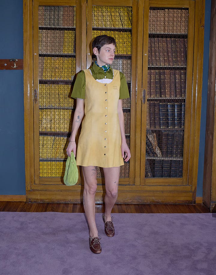

Miu Miu’s focus was not a collection launch — instead, they created a space to host discussion and music centered around desire, sexuality, and consent. And it is one of my favorites from the whole week. I love the formality of calling it a literary club — the air of academia and men’s-only institutions, done deliberately in lavender and olive. The palette alone reframes everything. The subject of sexuality and consent hosted in a space that deliberately evokes patriarchal tradition is not subtle, and it shouldn’t be. It is perfection.

Yes Please to Pleats
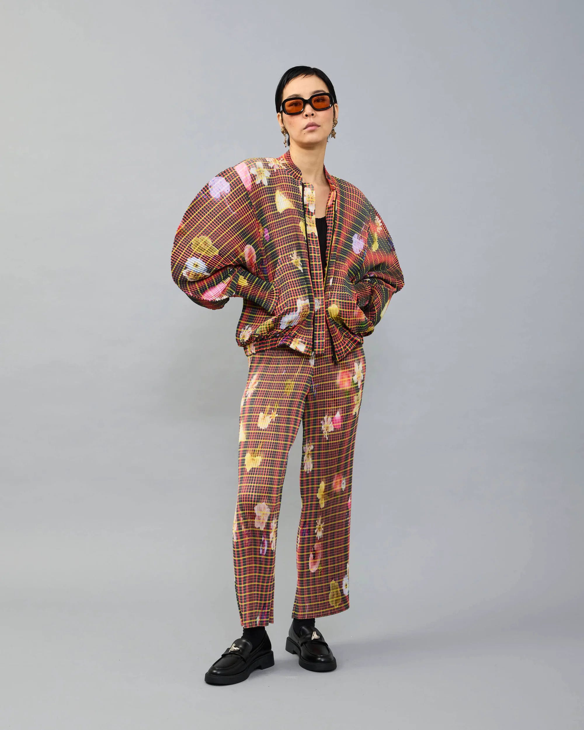
Inspired by the beautiful pleats of Issey Miyake, I went looking to see what Julia Heuer — another master of the pleated form — was up to, and immediately fell in love with this bomber jacket. The oversized sleeves, the dreamy grid and floral pattern, and all that pleated texture — perfection.
What stopped your scroll from Milan this week — and do you think the spectacle is earning its place, or has the trade show become more theater than substance?
Katie xx
No posts
Comments
Nothing yet. Say the first thing.
Sign in to join the conversation.