
In the summer of 2023 Figma released a feature set they call Variables, targeted to improve design system management. A core use case for variable is creating modes for an interface (most often dark and light mode), most often used in mobile apps and more technical desktop workhorse apps. Since the original release, it’s also be used for advanced prototyping (a la Axure), often demoed with a shopping cart flow.
Since the big release I’ve watched variables in use from the sidelines; I’ve been leading a team with a multi-brand design system where variables are the key to reducing effort and adding flexibility.
But no longer do I want to let the designers have all the fun—hence a weekend project to get familiar with the ins and outs of Variables.
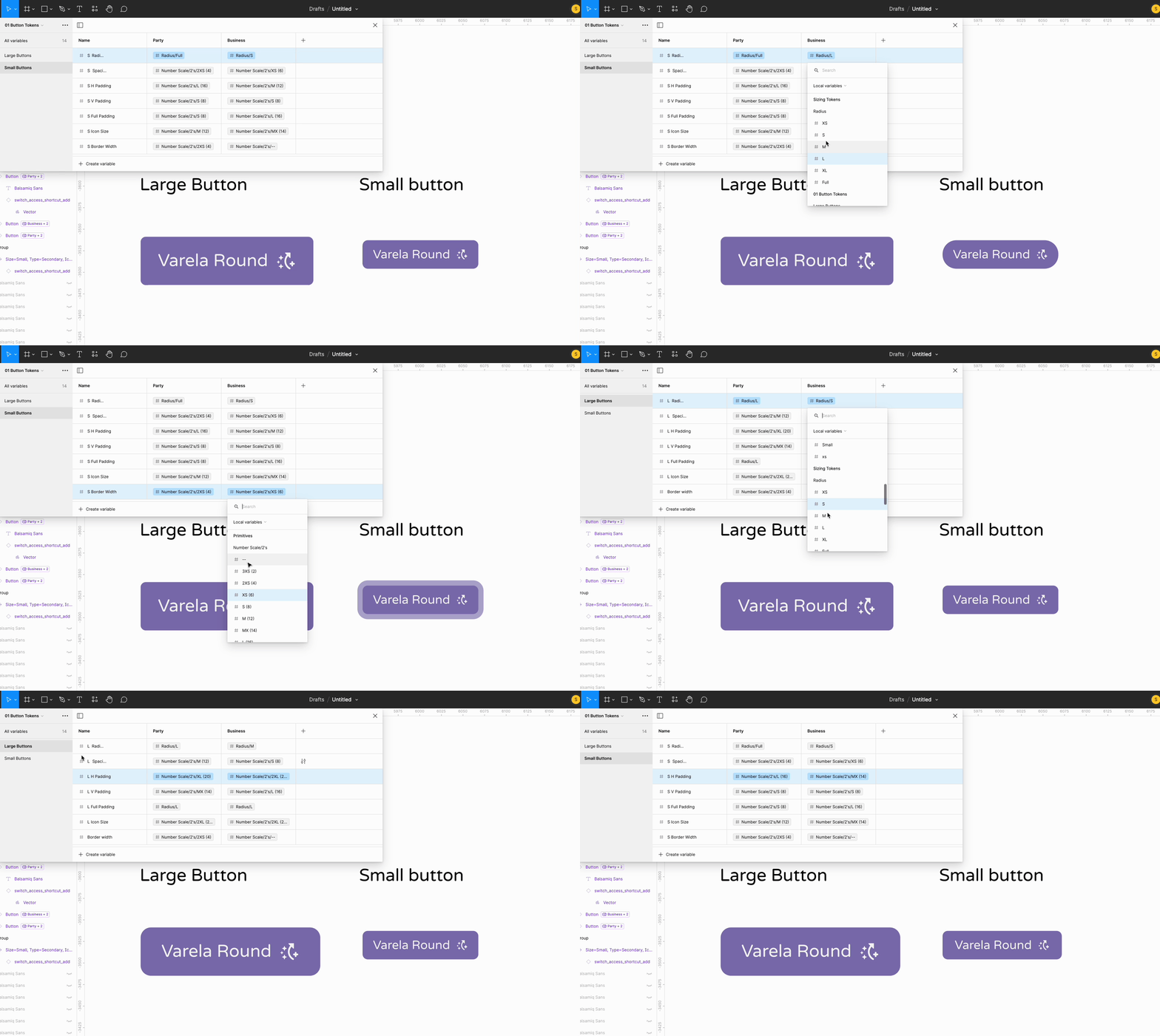
Design systems are all about efficiency — that’s why you start one in the first place. Increase consistency, decrease effort by re-using the same components. If you decide to make a change in something like the overall ‘softness’ of an interface, you have one source to change. Assuming your design system is connected to your coded components, making sweeping changes to the UI’s look & feel is significantly more efficient than it would be otherwise.
For teams working with multiple brands or the desirable light/dark mode dynamic, variables are perfect. They allow all the base components to reference different colors/spaces/sizes/fonts depending on the setting of the layers. For less complex, single UI styled products, Variables can still help with organization, efficiency, and reducing overall file sizes.
For a weekend project, I need constraints. Instead of going light/dark for my modes in this demo system, I picked up a context from recent news: the Etsy debacle over “mature” product listings. Why use this? Really no reason other than it’s funny and weekend projects should be fun.
Etsy has recently announced that it will no longer allow ‘adult’ product listings. This both creates an opportunity in the market (and headache as sellers find new venues), and cements now public Etsy as a family-friendly home-goods marketplace. From a design perspective, there’s an opportunity for a spicy marketplace and one that’s more Werner Hertzog’s line of children’s clothes.
Leveraging Figma’s variable modes, I’ll create 1 system with a brighter look and feel, and one that’s more staid. For fun, we’ll call them Exsy and Etsy. A little party in the front and business in the back. Even better: The Mullet Design System.

To be clear, I’m putting little effort into the actual styling. The entire project exists so I can learn the nuance of nesting variables.
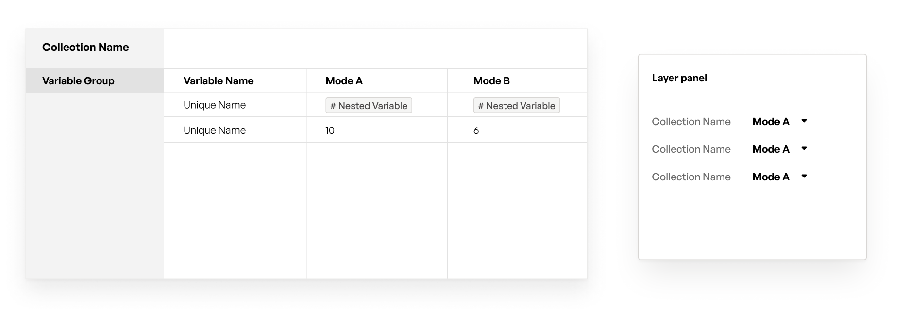
To narrow design system scope, I took the core Etsy results page and recreated it. Etsy has many views, but the results page gives the challenge of managing images and buttons.
Side note: The images must be a huge headache internally at Etsy (and any other visual marketplace for that matter). Product teams have no control over the images and yet they need to drive action on the page.
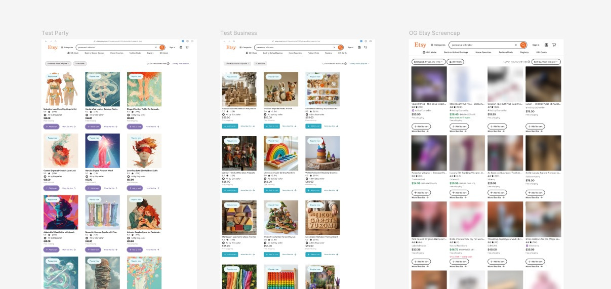
Primitives/Atoms/Basics
System wide modes
Component specific modes

Primitives are going to be the smallest unit you want to keep track of. For colors, this is your hex codes (usually with a name like Red 500). For typefaces, this is the string name of your typeface. For spacing, sizing, and radii, this is a number.
The smallest, most basic components don’t need modes. This is key because any collection with the Mode pairing (Party/Business, Light/Dark) will show up as a layer setting. If your color list doesn’t have Modes, it will mean less noise to work with.
System wide modes are the core characteristics that change when going from mode to mode: buttons, typography, spacing, border radius, etc. You can group these however you want, but all of these system-level characteristics will need a collection or a section of a collection. These collections will need to have the Modes applied.
(You can use variables for lots of other things (prototyping!), but I found these to be the basic way to divide design system related variables.)
While it’s possible to set an individual component (or anything, really) to a mode, do it sparingly. The issue with specifying the layer mode is that it will cause conflicts as your layers and frames become more complex.
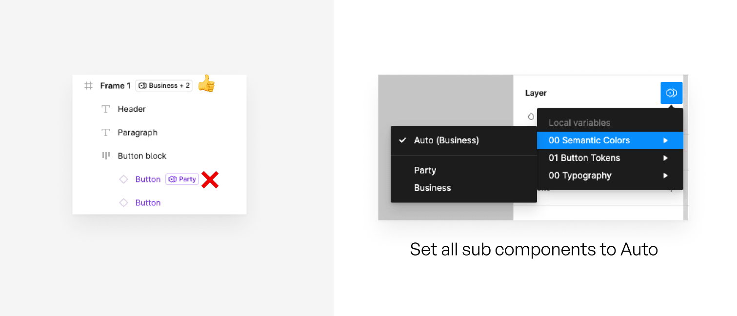
Instead, whenever possible, set your components to Auto and manage the layer styles from the frame level. This will ‘push down’ or cascade the settings to the components within the frame.
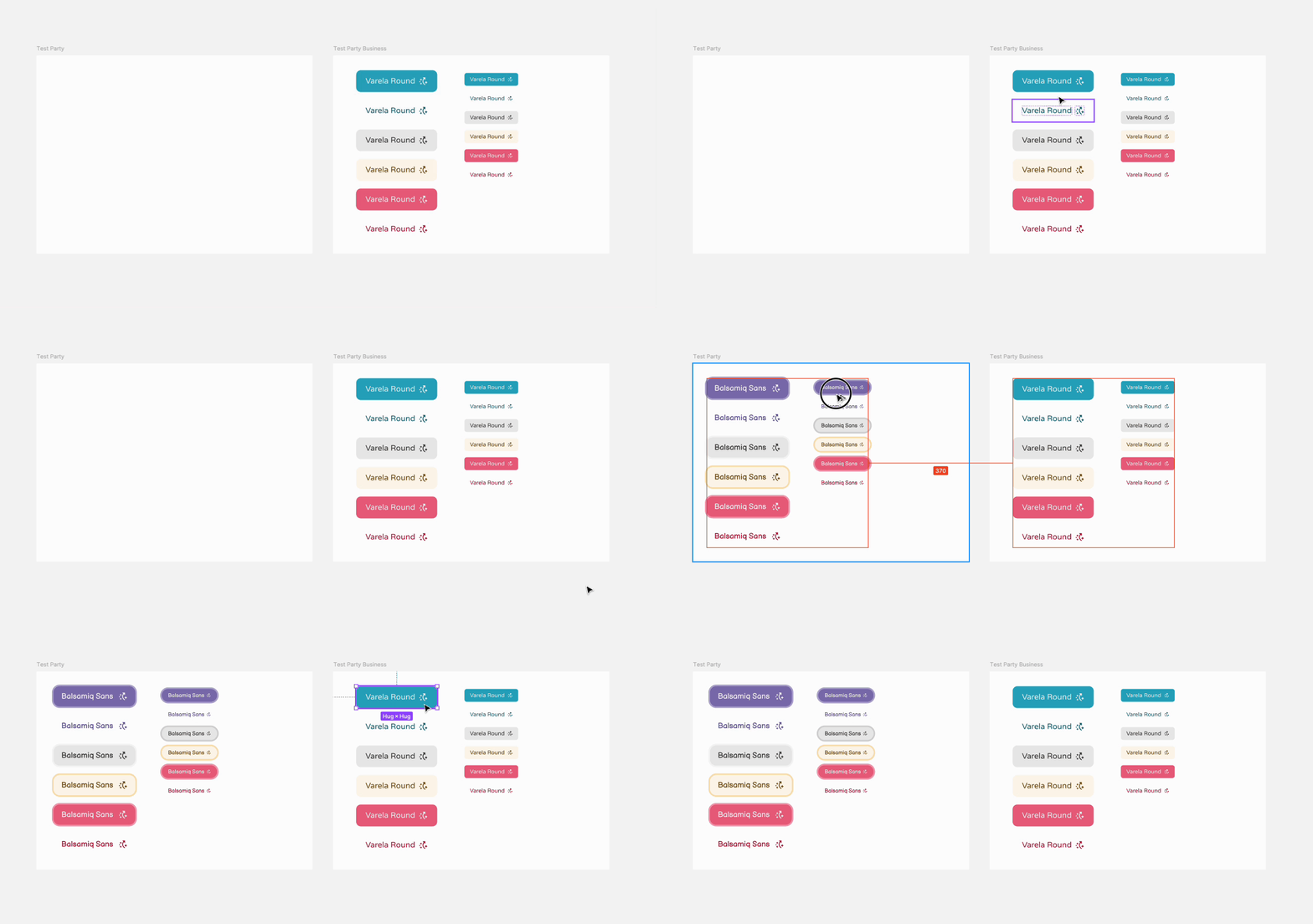
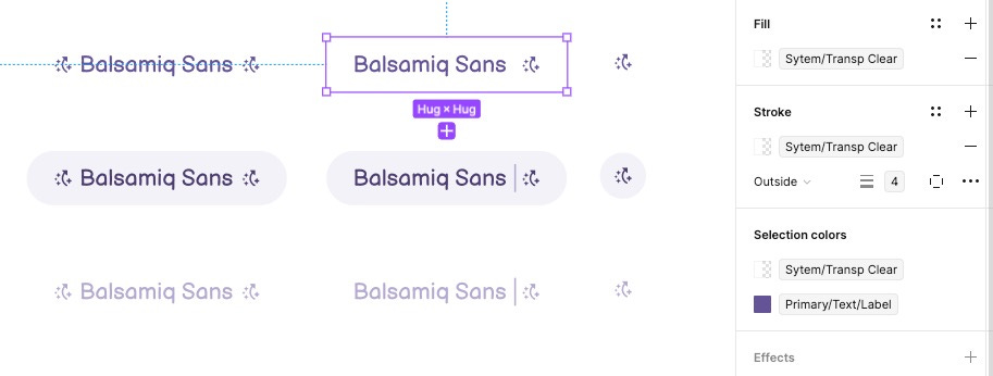
To maximize the advantages you get from the variable feature, you need to use it everywhere. For every stroke, layer effect, type size, padding setting, etc, you want to be using a variable. That means if you want a stroke of 2 on a button, that 2 should be a variable.
Using variables in every possible opportunity gives you the flexibility to return to a style and modify it with cascading effects. For example, if you set all of your button paddings to 8, but when you see the buttons in-situ they look cramped, you want the flexibility to change 8 to 12 with minimal changes.
While it can be tricky to maintain the mental model of nested variables, that ‘optionality’ as product people like to call it, can mean a lot in the future.
For a weekend project, this one scratched the itch. Tangible outcome, familiarity with new features, and some key learnings to take with me.
If I haven’t totally put you off by my placeholder use of Balsamiq Sans, here’s the Mullet Design System file to play around with.
No posts
Comments
Nothing yet. Say the first thing.
Sign in to join the conversation.