
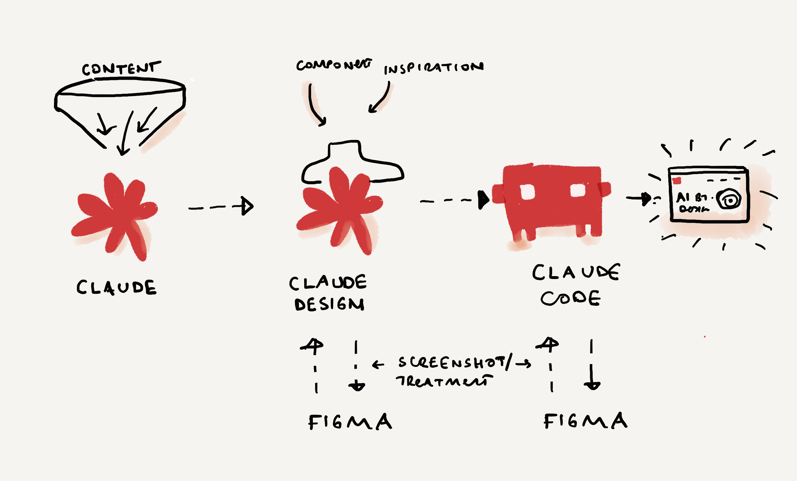
It’s been more than a month since Claude announced their design tool. I was on vacation while the designer internet was buzzing with it, and I’m only now getting the chance to sit down and really play. As usual, I wanted my experiment to be useful, so I went back to my bucket list, and asked Claude to help me design and build a website that actually captured what it feels like to work with these tools and gave my AI work a more intentional home.
For the past year, I’ve been forming a perspective on AI and design—building a practice library, collecting prompts, and refining principles by applying them in real projects. Until now, those pieces lived across Notion and Substack. This experiment became a way to bring them together in a more deliberate, structured format and to make that evolving practice visible.
Here’s my journey, enjoy.
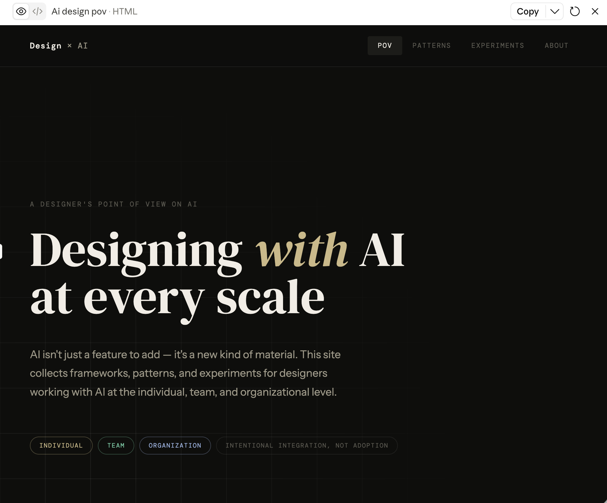
I started in Claude to build a baseline website. For this, I fed my articles, Notion templates, and initial prompt outlining my intent for an AI POV website. I knew it would generate a website with Claude’s aesthetic—a big serif title, a dark background. And yes, it did. It was classic Claude design taste that you come across all over LinkedIn.
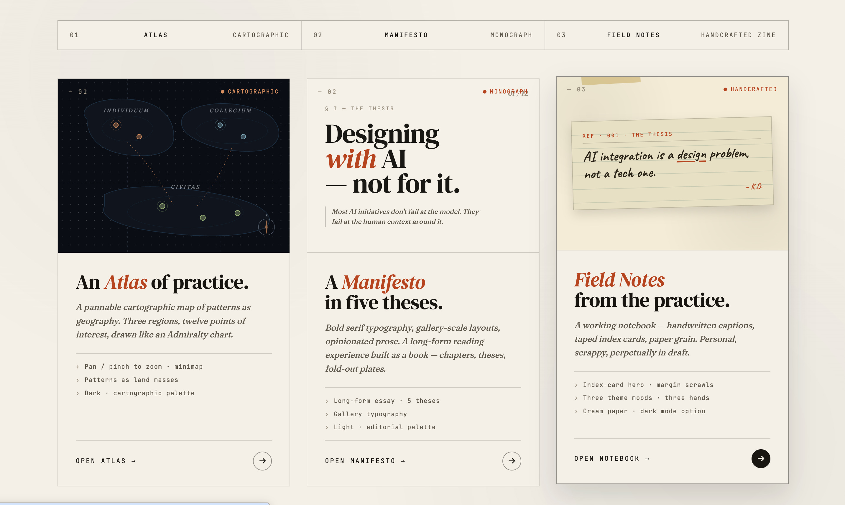
I then fed this baseline HTML into Claude Design and asked for alternative designs with a few different metaphors: an atlas, a manifesto, and field notes. Claude generated three alternatives and explored each of those directions.
These were good starting points, but they had the same challenge of mimicking Claude’s baseline aesthetics. I further asked for hand-drawn illustrations and a modern, minimalist aesthetic, drawing on Swiss modern influences—red on black, dotted backgrounds, and vibrant color accents. Through many iterations, we arrived at a direction that felt aligned with my design taste.
During this process, I noticed how rapidly the prompts shifted from generating options to enabling curation. The abundance of possibilities allowed me to remix and refine, selecting elements that resonated with my intent.
Once I was satisfied with the design direction, I fed that design back into Claude Code, and the real iteration began. One thing I learned quickly: Claude is great at approximate placement, but not at getting everything exactly where it needs to be. I ended up taking a lot of screenshots, tightening the layout in Figma, and then feeding those back into Claude so it could adjust the code to match the precise composition.
There were a lot of cycles. Some were about design—typography, spacing, whether a particular version felt grounded or too playful. But the ones that took the most passes were about language. The AI-generated copy sounded like AI-generated copy. I’d read a sentence, and it would sound a little off—the kind you can’t always name but always notice. So I’d rewrite, or redirect, and then rewrite again. Getting the words to sound like me turned out to be the hardest part of building something that was supposed to represent me.
The content itself also needed more work than I expected. I’d planned to showcase my practice library and prompt library as templates—resources designers could actually use. But pulling them out of Notion and into a public format revealed that they needed more refinement. So the project became a forcing function for me to refine the content. At this point, Claude acted more like a content designer and curator than a coder or designer. We worked out the gaps as we went. At some point, the pieces reached a fidelity that I felt comfortable sharing with others.
In that process, I also bought a domain. I always enjoy buying a new, fresh domain name for my side projects. It gives the work a home address. It makes it real in a way that a Notion page never quite does. Out of all this, a new home for my AI design work emerged: aibydesign.studio.
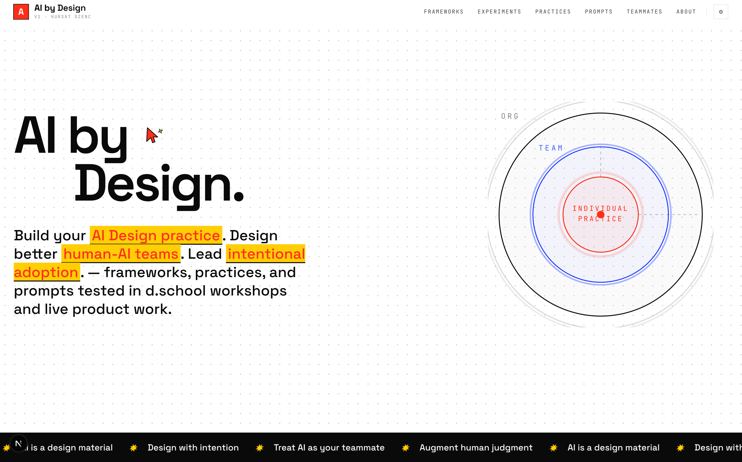
I’ll share more in a follow-up about what’s inside—five theses, practices, and AI teammates you can adapt to your own context. For now, I want to close with a few takeaways from designing this with Claude.
Get specific about design styles (to avoid Claude design slop).
If you don’t bring a point of view, Claude will happily hand you big serif titles on dark backgrounds. The fix is to ground it in real design lineages. In this project, I used Swiss Modern—red on black, dotted backgrounds, vibrant accents. You might also pull in editorial, brutalist, or minimalist product references. If you want to build your own visual vocabulary to feed into your prompts, challenge yourself by browsing real-world typographic specimens on Fonts In Use or exploring highly curated, clean layouts on Siteinspire. The more specific your references and adjectives, the less generic the output.Treat Claude as a small product team, not just a coder.
Claude moved among designer, coder, and content designer roles. Beyond layout and components, it helped with information architecture, copy refinement, and content curation. Prompts like “Act as a content designer and rewrite this for busy product designers skimming on mobile” or “Identify gaps in this page structure for a first-time visitor” unlocked more value than just “Generate a landing page.”Work with a DJ mindset: mix and remix.
Instead of asking for a finished site and choosing one option, I treated Claude’s outputs as samples to remix. I combined the hero from one version with the navigation from another, asked for multiple variations of single components, and mixed in references from other sites I liked. If you need inspiration for your interaction stack, borrow the modular, highly kinetic building blocks found on design-engineer libraries like Magic UI or Aceternity UI. Combine the animated hero layout from one prompt iteration with an intricate, responsive dashboard widget from another, and mix in subtle scroll fx patterns you spot out in the wild. The mindset shift is that you are live-remixing raw, composable code building blocks until the interface feels entirely customized to your intent.Turn Claude into a critic to find its own shortfalls
Some of the most useful moments came from asking Claude to critique its own work: “As a senior product designer, what feels generic or off-brand here?” or “From a UX perspective, what would make this page easier to scan on mobile?” Feeding those critiques back into the next round created a loop: Claude generates → Claude critiques → I curate → the design tightens.
With all this priming, I would like to invite you to explore the site: aibydesign.studio. If you’re curious, start with the five theses and pick a prompt or skill to try in your own work this week. Or jump straight into the Teammates section and see which AI role you’d add—or argue with—for your team.
In a follow-up piece, I’ll go deeper into what’s inside AI by Design Studio: the theses, practices, and AI teammates, and how you might adapt them to your own context and culture. Think of this article as the backstory; the next one will be a deep dive into the what, how, and why of AI design. I’d love to hear your thoughts on these learnings and on the website.
And it’s a wrap for this issue, until next time, take good care of yourselves and your loved ones.
– Fonts In Use — real-world typographic specimens and layout references
– Siteinspire — curated gallery of clean, contemporary web layouts:
– Magic UI — modular, animated interface patterns and components:
– Aceternity UI — interaction-rich building blocks and UI patterns
Comments
Nothing yet. Say the first thing.
Sign in to join the conversation.