

Welcome to Designer, a place for designers, creatives, and the design-curious to explore graphic design styles, the history and future of design, and how art and design carry into the rest of life. In this article, we’re dissecting color theory, diving deep into the emotional, psychological, and hierarchical impact that color has on design.
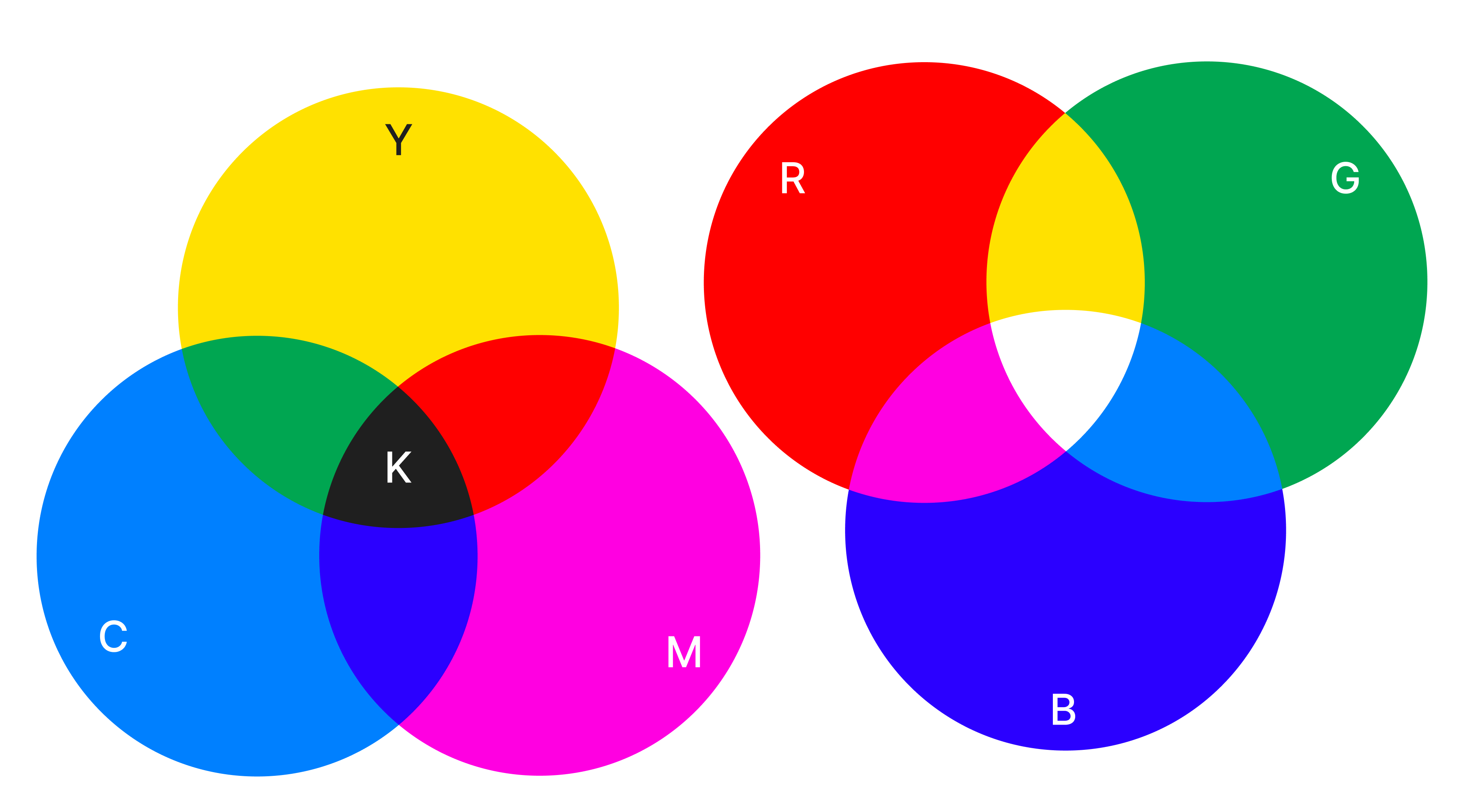
Color is an integral part of every design. Before perceiving any text or graphics, humans look to color to understand the mood of a design. Pushing this further, utilizing color strategically in design can influence behavior, create hierarchy, and elevate your designs. Because color is such an integral aspect of design, art, and the human experience, an entire section of science is dedicated to understanding its impact - called color theory.
What is color theory? Color theory is a practical framework and study of how colors interact, combine, and influence human perception, emotions, and design.
Although the definition is quite simple, in reality, it’s not so easy…
Imagine this - you’re staring at a blank white screen, trying to decide where to start on a new design. You decide to start by choosing colors that match the tone and context of your design. After opening up the color selection menu, you’re overwhelmed by the sheer magnitude of colors you could select. I mean, look at that beautiful color wheel, spiraling in endless options… Where do you even start?
Well, that’s where this article will come in handy. Working with color can be complicated, but through this article, I hope to further your understanding of how color works in design.
That being said, let’s start with a brief history of color theory.
The strategic utilization of color is as old as art itself. From the earliest documented uses of color, when pigments and art tools were still being discovered, color was used as a symbol and means of cultural expression. Artists wielded color to honor their beautiful land, pay tribute to emperors and kings, and commemorate the world around them.
Continuing through the centuries, artists used color to preserve stories of sacred saints, nature, gods, emperors, and more.
Taking a more scientific approach to color, Isaac Newton, in Opticks (1704), composed a theory about light and color: White light is the combination of all colors across the spectrum. Pushing this further, Newton documented the color spectrum and color combinations to create the first documented formal color system - the color wheel.
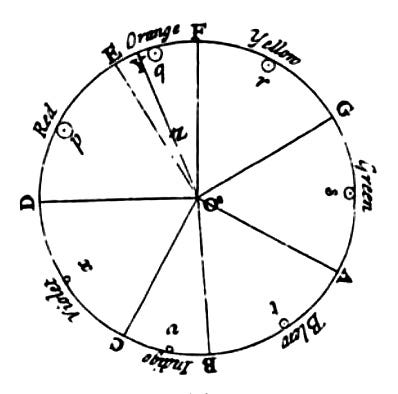
In 1810, as art moved into other modalities, such as design, print, and textbooks, the scientific study of color (or Color Theory) was born.
Johan Wolfgang Von Goethe (say that name five times fast) authored Theory of Colors, in which he distinguishes each color and its associated meaning. His theory took a more spiritual approach, in direct opposition to Newton’s theory. Although it was an interesting claim, society generally favored Newton’s color wheel. However, his take on emotional connection to color was integral to the field.
As new theories were created, more people tried to organize and dissect color theory.
Johannes Itten, for example, saw color in two ways: first, as utility; second, as a gateway to hidden meaning. He believed that color was chosen for three reasons:
Impression, or how the colors looked together;
Expression, or how the artist took meaning from the color;
Construction, or how the colors acted as symbols or common icons.
Organizing color in this way brought color theory into design practice.
Studies have continued into the modern day, especially as modern digital color (RGB, CMYK, and HSL) has become the primary way that humans interact with color. Studying modern-day color theory brings an interesting element into the conversation: people in the 21st century view more color on a daily basis (mostly through screens) than many people did in their entire lives just 100+ years ago. It’ll be fascinating to see how perceptions of color have changed because of this.
Now that you have an understanding of the history of color theory, let’s break down the fundamentals of what you need to know as a modern-day designer.
Color theory is part art, part science. From an art perspective, you need to choose colors that are pleasing to the eye, look cohesive, and are accessible to you and the users. From a science perspective, you need to choose colors that influence the viewers, create hierarchy, and stand out among the crowd.
There’s an almost endless repertoire of advice and “must-know” knowledge about using color in design. However, to begin your understanding of color theory, think about it in terms of two intersecting goals:
To associate the brand or design with a certain feeling.
To create hierarchy and direct the eye.
THAT’S IT!! As designers, focus on these two points and you’ll be miles ahead of the general population’s knowledge about color theory.
Here’s a great example from outside the design world. Look at the images below and assign a feeling/event to each bouquet. Where would you see these flowers? Who would give them to you? How would they make you feel? Where do you see them in the media?
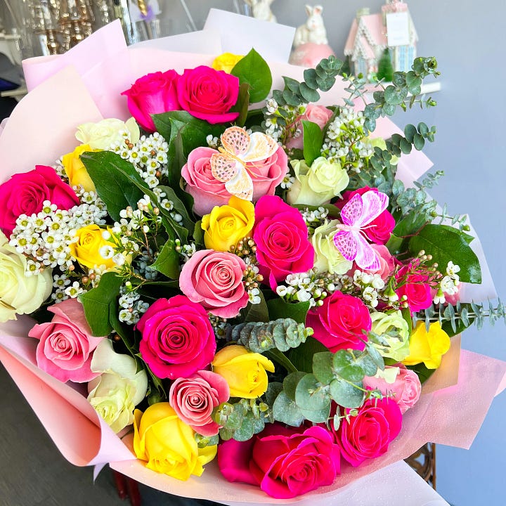

There’s a high likelihood that you viewed the colorful roses and thought of spring, a baby shower, a fun dinner party, or maybe Easter.
There’s also a high likelihood that you viewed the red roses and thought of a fancy dinner, a partner or spouse on a date, or your anniversary.
I bring up this example because it illustrates the power that color has on human perception. Although both bouquets contain roses, flower companies use color to influence feelings, emotions, and context. This same process happens with design.
Now that you understand how color affects perception in areas outside of graphic design, let’s move back into a graphic design setting. Color theory entails more than just choosing a couple of colors and sticking them in a design. Designers must consider color relationships, contrast, balance, and more to create designs that work. Let’s break each of these down further:
Consideration #1 > The Color Wheel & Color Relationships (Color Harmonies)
From a young age, you learn about the color wheel, whether formally in school or through the box of crayons you used to color outside the lines. While seemingly simple, the color wheel is a great tool to help designers pair colors together.
To start at the most basic level, the color wheel is made up of primary (red, blue, and yellow), secondary (primary combinations, so purple, green, and orange), and tertiary colors (combinations one level past secondary).
Warm colors (red, orange, yellow, etc.) reside on one side of the color wheel, representing excitement, movement, and growth. Cool colors (green, blue, purple/magenta) live on the other side, representing calm, serenity, and peace.
Once you understand the design-related implications of warm vs. cool colors, you can begin to advance by combining colors. As the study of color theory advances, combination patterns have been created to ensure colors work well together. Here are some color combinations and when to use them:
Complementary > Two colors that are directly across from each other on the color wheel. Use this when you want to create tension and call out certain elements.
Monochromatic > Using only one hue, but various tints, tones, and shades of that hue. Use this when aiming for a sophisticated, subtle effect.
Analogous > Three or more colors that sit directly next to each other on the color wheel. Use this when you want to create harmonious, clean, and modern designs.
Triadic > Three colors that sit equally spaced from each other. This creates a high-contrast, vibrant palette, best used for high-energy designs.
Others > Other combinations, such as split-complementary and tetradic, push this even further, giving more options to designers.
Understanding how colors relate to each other is a core part of building a design that actually works. Using these combination structures will bring your designs to the next level.
Consideration #2 > Color Properties: Hue, Saturation, and Value
As you become more advanced at working with color, you’ll begin to experiment with color properties. Color properties are essentially the knobs you turn to adjust how a color appears. There are three basic properties:
Hue > The color itself. Red, yellow, green, etc., are all hues.
Saturation > The intensity of the color. Bright neon red has higher saturation than soft pink.
Value > The lightness or darkness of a color. The amount of white or black added to a color. A deep maroon has a lower value than a light pink.
When working with design, think about the context in which the design will live. If you’re designing for a high-energy modern clothing brand, highly saturated colors will match the tone. However, that’s likely not the case for a skincare company targeted toward adults. Remember, it’s all about context.
Consideration #3 > Less is more
A common mistake made by amateur designers is overusing and oversaturating colors. As a general rule, less is more.
Less color allows:
The most important colors to stand out
Visual relief
More certainty or consistency
Easier knowledge transfer
When you cook, you don’t use all the spices on the rack; just the ones you know will make the dish taste good. Do the same with color!
Start with two colors and two neutrals, then design within those constraints.
Consideration #4 > Neutral colors
Neutral colors should always be used; They recede into the background, leaving room for the lead colors to stand out and pull attention to certain areas. Additionally, and potentially most importantly, neutral colors offer visual relief.
When working with neutral colors, try using more than you think. More white space (or negative space) allows the design to breathe and the lead colors to stand out.
Consideration #5 > Contrast
Contrast is the real secret to using color well. While neutral colors fade into the background, contrast allows certain elements to pop. Contrast is essential! Repeat with me! Contrast. Is. Essential! Contrast tells the eye where to look, calls out certain elements, and makes a design look cohesive.
Contrast can be presented in many ways - hue, saturation, or value. To ensure sufficient contrast, experienced designers will view their designs in gray scale. Doing so allows you to view contrast without any color associated with it.
Consideration #6 > Balance
To bring this whole section together, the true test of an experienced designer lies in the balance of all elements previously stated. A well-crafted design requires light, dark, and everything in between; it should contain a balance of hues, saturation, and values.
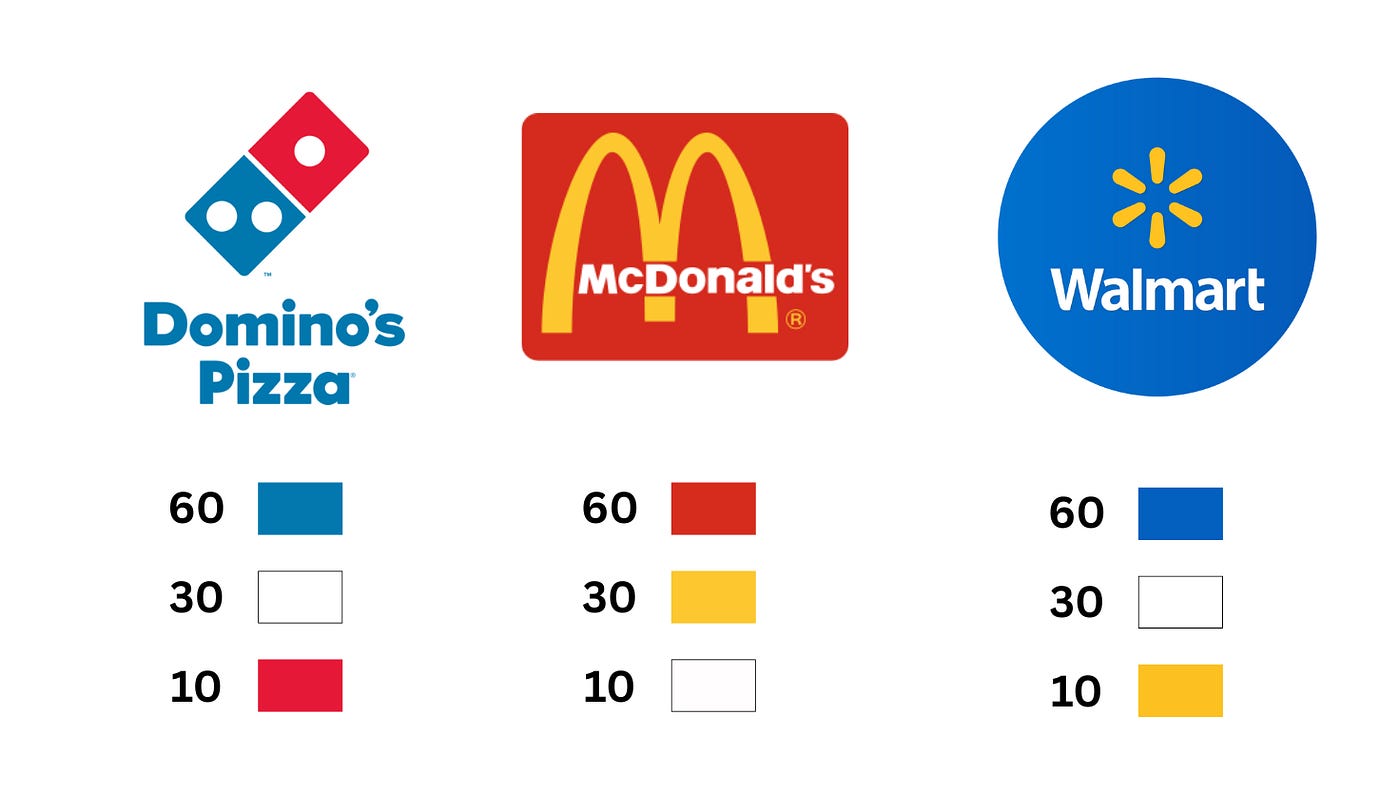
Pro tip: Use the 60-30-10 rule to achieve balance. Allot 60% of the design to the primary color, 30% to neutrals, and 10% to accent colors.
To wrap up the fundamentals of color theory, the most important step you can take is to consider the context. If a design is filled with energetic/sharp lines, but the colors are a tranquil pastel blue and yellow, those might not match. You must consider the hue (actual color), saturation (how intense or muted the color is), and value (how light or dark the color appears) when choosing color. These are the building blocks of color in graphic design.
Now that you have the fundamentals down, let’s move into the psychological responses associated with color.
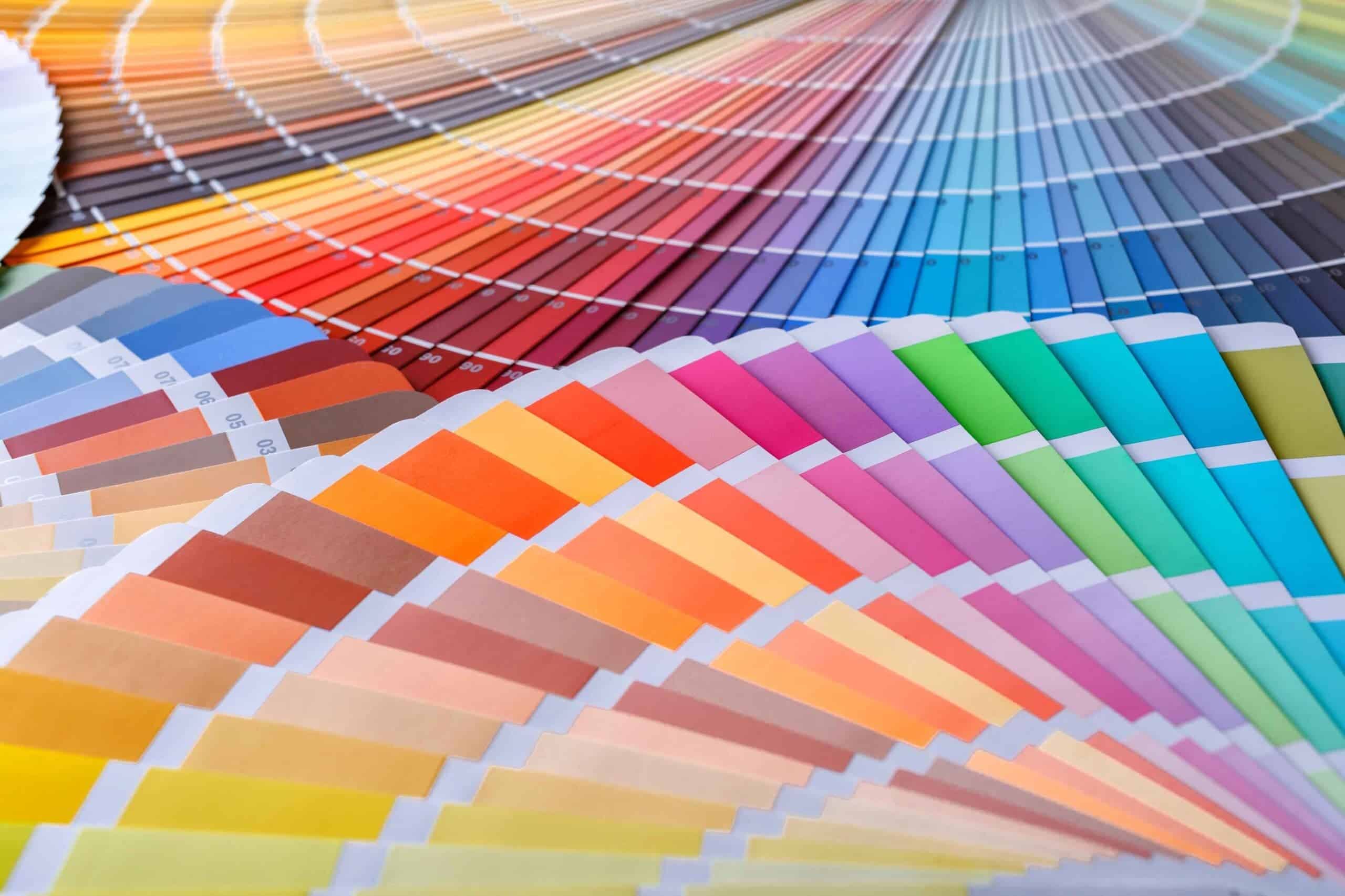
It’s human nature to explore colors and assign meaning to them. Think about this through human evolution - green was associated with nature and healing, red symbolized power and structure, and purple was often reserved for royalty. Although life is very different now, the experiences of those who came before us persisted.
In modern times, it’s understood that color can evoke different emotions. In fact, a study done by Rikard Küller shows that color has a great effect on EEG readings (your brain’s electrical activity), heart rates, and the emotional perception of objects.
Now, it may or may not be human nature to see a color and feel an emotion because of it - color cannot force someone to feel something. However, because of the way humans have built society (especially in the Western world), certain colors are generally associated with certain emotions or contexts.
For example, you’ll likely always see stop signs in red, meaning “stop” or “danger”. Further, think about the colors associated with road signs, warning lights in your car, hospitals and dentist offices, and more. Color is used heavily in society to signal certain traits or characteristics.
As this psychological research has deepened, researchers have found that certain colors are associated with certain feelings, some listed below:
Red > Attention and memory reinforcement
Blue > Feeling safe and secure
Orange > Action and movement
Yellow > Happiness, energy, positive change
Green > Nature, growth, health
Purple > Feminine, luxury, royalty
Brown > Rugged, serious, masculine
Think about your favorite brands and how they utilize colors. A leather boot company will often use brown to foster the feelings stated above. A gym will use orange and yellow. A pharmacy will use green. A bank will use blue. Every designer behind these design decisions understands the unconscious feelings associated with these colors.
To push this further, it’s equally important to understand how to manipulate a color’s saturation, brightness, and contrast; One small tweak can change the tone of the entire design. Here are some examples:
Brightness and low saturation create a soft feeling
Dimness and high saturation create a hard, strong feeling
Weaker contrast is calm
Stronger contrast is active and lively
Finally, culture plays a huge role in how people perceive color. Red might mean danger in Western countries but luck in others. This is an important piece to keep in mind - ensure you understand your audience and the cultural implications of the colors you use.
Now, for the good stuff… Here are the practical steps I’d take when starting a design to ensure I am utilizing color theory well:
Identify and write keywords based on how you want the viewers to feel.
Identify the design’s personality and tone.
Research other designs in the same genre. Strategically copy some elements. Strategically differentiate other elements.
Choose two to four colors to represent the personality of the design.
Apply the 60-30-10 rule (choose a dominant, secondary, and accent color).
Choose a color to lead the design. Then, choose a softer, more neutral color that supports the lead color. Finally, pick a contrasting color to accent and highlight.
Draft a rough mock-up of the design while considering hierarchy. Identify the information you want to stand out and assign an accent or bold colors to it.
Build from the hero color outward; start with the boldest color, then arrange hierarchy, layout, and color from there.
Use neutrals to let the design breathe.
Ensure sufficient contrast and readability.
Here are some great tools I use to help speed up this process:
Adobe Color > Explore color schemes based on keywords
Coolors.co > Explore color palettes
Pigment > Perform saturation tests
Remember, color theory can be broken down into two simple elements: 1) to represent the feeling or tone, and 2) to create hierarchy within the design. There is no one right way to use color; it’s all about context and how it’s utilized.
When considering color theory in my designs, I simplify my thought process. It’s less about picking exact colors to try and force emotion, and rather about choosing colors that match the tone and emulate a feeling.
It’s important to consider the science-backed color strategies mentioned above, but when in doubt, go with your gut.
As always, thank you so much for reading! Did you learn something new? Is there something I didn’t consider? I would greatly appreciate your continuing this conversation in the comments.
https://static1.squarespace.com/static/58584cab9f7456737a53b75a/t/64a19937919d5e02c85a743e/1688312126264/Josef/+Albers-/+Interaction/+of/+Color.pdf
https://programmingdesignsystems.com/color/a-short-history-of-color-theory/index.html
Comments
Nothing yet. Say the first thing.
Sign in to join the conversation.