

Welcome to Designer, a place for designers, creatives, and the design-curious to explore graphic design styles, the history and future of design, and how art and design carry into the rest of life. In this article, we’re exploring the fascinating world of typography. Where did it originate? How does it influence a design? I’ll answer these questions and more below.
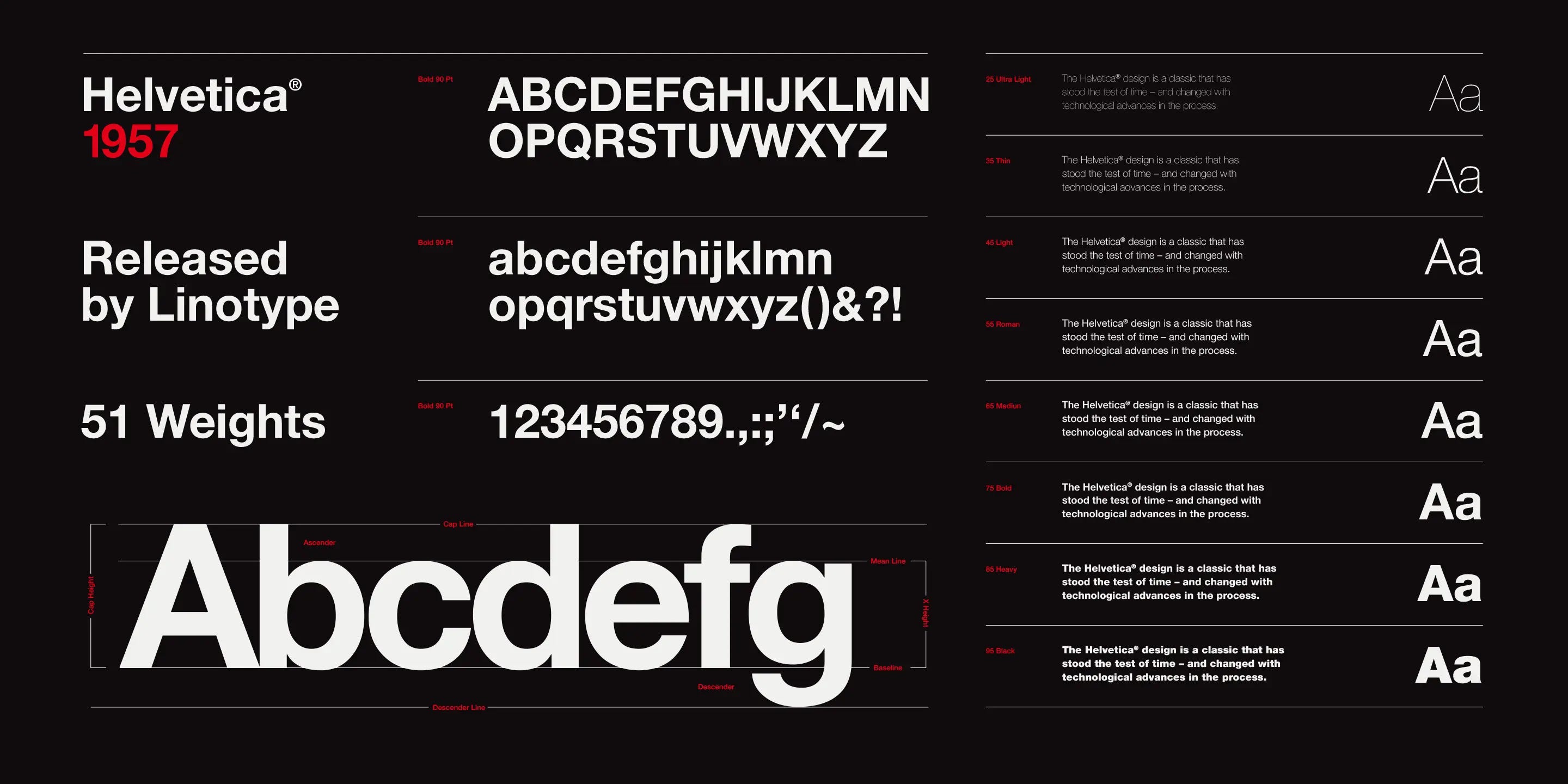
Typography can be the difference between a design that works and one that doesn’t, and most people never notice why. It’s estimated that there are over 200,000 fonts available to design with. On average, each font contains five variations, meaning that there are over 1,000,000 variations of the fonts we use every day. How could we begin to understand the art of designing with fonts? This article outlines the fascinating world of typography.
Now, I’ll be candid, “font” isn’t quite the right word to use here. What’s commonly called a “font” is actually a “typeface”. For example, Helvetica, Roboto, and Arial are all typefaces. Then, a “font” is a specific set of characteristics contained within that typeface. For example, Helvetica size 16 and Helvetica size 32 are two different fonts within the same typeface. Got it?
For non-designers, it may seem as though characters and typefaces have a small impact on design; it’s just something that they choose from the list on Microsoft Word. However, typography plays a much larger role in life than people give it credit for.
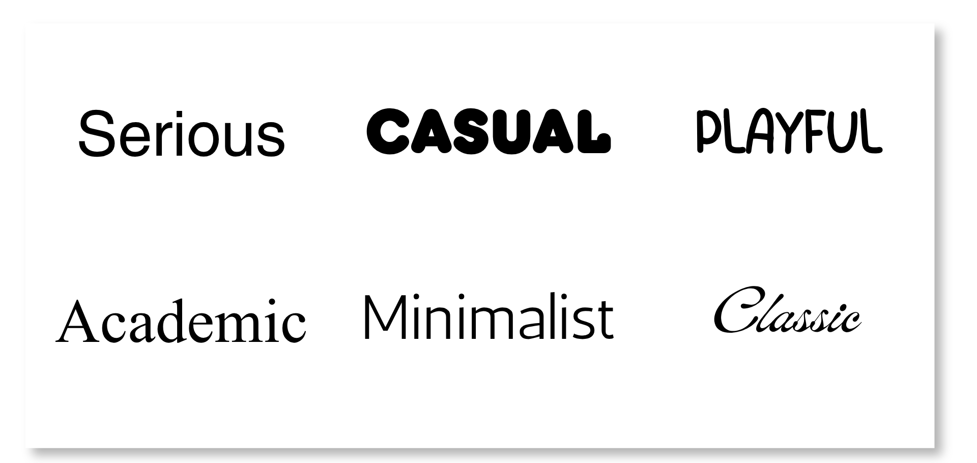
Typography could mean life or death in certain situations, really. Whether it’s text on road signs, words on an academic paper, or instructions on a lifesaving device, the typography choices made by designers heavily impact the world.
And here’s the funny thing: When typography is done well, it’s often invisible to the eye; they support a design while falling into the background.
So, what is typography?
Typography is defined as the design, or selection, of letter forms to be organized into words and sentences to be disposed in blocks of type as printing upon a page. - Brittanica
A typeface is made up of a unique set of characters that combine to form words on a screen or paper.
With the age of the internet and technological advancements, typography has been whittled down to its most basic form. The general population’s knowledge about typefaces is made up of the preselected options present in Microsoft Word.
The true art form and rich history of typography, though, go so much deeper than what’s offered on these software programs, and understanding it gives designers context for the decisions we make every day.
Let’s start with a small history lesson.
Typography goes back to ancient times, where people would use clay symbols (or cuneiform) to act as symbols of trade (similar to how we use money today). Letters and typefaces were heavily restricted by the technology possessed at the time. When words and symbols were carved into stone and clay, letters were quite sharp and made up of straight lines. Throughout history, as technology progressed, typefaces were created using tools similar to pens.
Modern-day typography, the way we know it today, began with the printing press. With this invention, bodies of text could easily be mass-produced and distributed, therefore creating the modern idea of typefaces. At the time, characters were largely serif typefaces, intended to replicate the style of calligraphy. This was challenged, however, for its lack of readability.
Interesting fact: The printing press first used a blackletter typeface, modeled after calligraphy-style handwriting. However, Nicholas Jensen argued that it lacked legibility, and popularized the first Roman typeface, credited for its legibility and sleek form. You’ll still see Nicholas’ impact in typefaces today, such as Times New Roman.
As this transitioned to a digital modality, there became more flexibility to alter and customize typefaces. Each aspect of the character, from the x-height to the line spacing, could easily be customized, unlocking almost limitless potential for typeface variation.
Before we move on further, I want to provide a couple more definitions and context:
Baseline > The invisible line upon which your text rests.
X-Height > The invisible line that defines the highest a lowercase letter will go.
Capline > The invisible line that defines the highest an uppercase letter will go.
So, how do we even begin to customize a typeface?
Now that you have a basic understanding of typography and where it comes from, we can get into the fun stuff - customization. Although typefaces may seem constrained to the pre-selected options shown in Microsoft Word, there are many ways to take a typeface from the stock options to a customized version that enhances your design.
Quick tip: You should always customize your typography. The basic options are like a turkey you buy from the store - it has a great base, but it’s unseasoned and likely unpleasant. To make it perfect, you should season and marinate (customize your typeface) to fit your taste palette.
Let’s start with the basics - serif, sans serif, and display typefaces.
Serif >
A serif is the small decorative piece at the ends of a letter. The popular typeface “Times New Roman” is a great example.
Serif typefaces feel traditional, high-class, and knowledgeable, and often accompany works under that category (academic papers, high-end restaurant menus, and law firm websites).
Sans-Serif >
Sans-serif - translating to “without serif” - typefaces omit the serif entirely and feel more contemporary and minimalist.
These typefaces are often easier to read, which is why you’ll often see them associated with road signs, instruction manuals, and billboards.
Display Typeface >
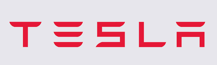
Display typefaces are usually reserved for brand names, logos, or headings. They are usually fully customized and aimed at easily identifying the brand.
Display typefaces are unique in that they are not used in a design for any text other than the logo or heading. Often, they’re so abstract that it would be hard to read any text other than the header. A great example is the Tesla header.
Now, let’s dig a little deeper into customizing typefaces.
Line Height >
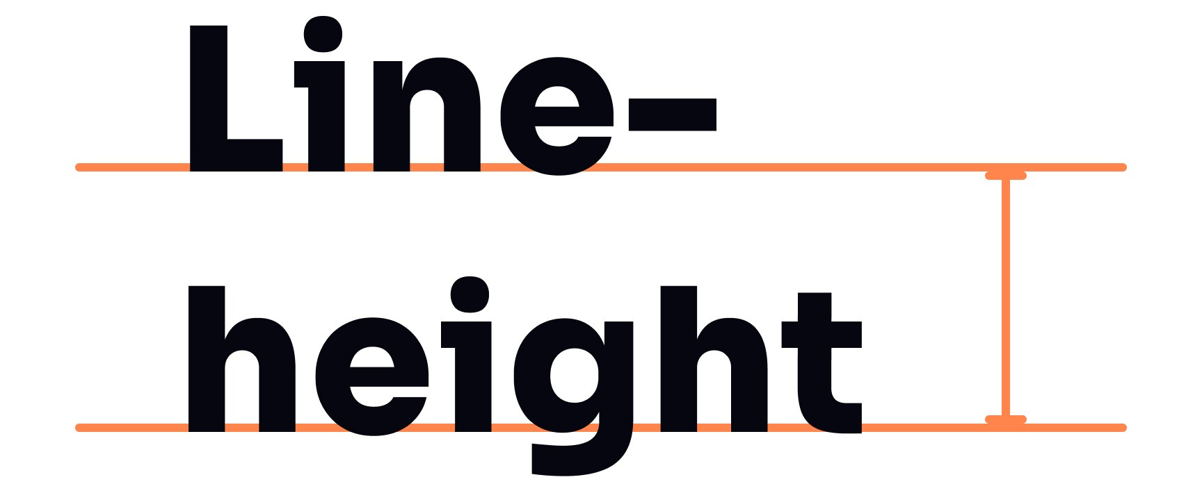
Line height is the distance from baseline to baseline. Essentially, this represents the distance between one line of text and the text above and below it. By default, the line height is usually set between 1 and 1.25.
Typefaces, by default, come with the “standard” sizing, stated above. However, knowing that each typeface is unique, the standard sizing isn’t always what looks or functions the best. This is why it’s always a good idea to tweak the line height.
Text size and line height are inversely related. When using a large/bold typeface, it’s better to decrease the line height to create a “grouping” effect between related text. This will decrease the distance that the eye needs to move when reading large text, increasing readability and connection. When using smaller/thin typefaces, increasing the line height will increase legibility. Doing so decreases the likelihood of small letters blending into each other and gives the eye a bit more breathing room when reading small text.
Of course, this isn’t a hard and fast rule. As you’re designing, go with what feels right to you.
Letter Spacing >
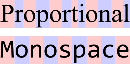
Letter spacing is the amount of space between each character. There are two categories of letter spacing - proportional and monospace. Proportional letter spacing means that each character is afforded a different pixel width in an effort to make the typeface look proportional. For example, an “f” has a smaller pixel width than an “m”. Monospace letter spacing means that each character receives the exact same number of pixels. This is usually seen in coding, making it easier to read through lines of code.
Letter spacing is inversely related. As a general rule, the larger the text, the smaller the letter spacing should be (the closer the letters should be). On the flip side, the smaller the text, the larger the letter spacing should be. Doing so increases the legibility of letters at small sizes.
Kerning >
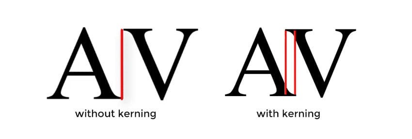
Kerning is a subset of proportional letter spacing, outlined above. Kerning is defined as the space provided between individual characters. So, instead of looking at the typeface as a whole, we are now zooming in on individual characters and editing their spacing here.
Each typeface carries a default kerning, but there are times when it’s advantageous to alter it. In my design work, I have found a typeface that is 99% perfect, but I didn’t like the spacing between the “v” and “a”, so I altered the kerning accordingly.
This is a great tool to keep in your back pocket for when you find the perfect typeface, but don’t love the default spacing.
Font Weight >
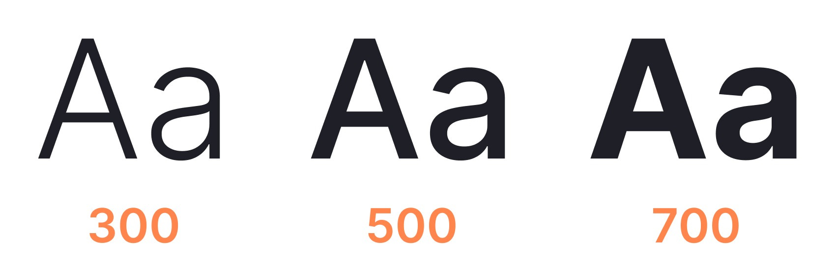
Font weight plays a large role in visual hierarchy and emphasis. As a general rule, serif typefaces usually only come with two weights (a normal and bold version), while sans-serif typefaces come with ~9 variations between extra light and black.
While headings, logos, and buttons are usually heavier weights (semi-bold, bold, or black), paragraphs and labels are usually lighter weights. This differentiation guides the eye around the design to easily chunk information and create visual hierarchy.
As you’re working on a design, chunking information, or creating sections and columns within the page, using font weight is a great way to separate bodies of information and gently guide the eye to important areas.
Text Hierarchy >
Many design programs allow text to be designated as a Heading 1, Heading 2, Heading 3, and all the way down to Heading 6. Designers can customize what each heading looks like to easily reuse them throughout many designs.
In my work, I will go through a process of creating a style guide where I map out what each heading looks like (what the line height, line spacing, kerning, color, etc., looks like on each of the heading levels and paragraph text), and then set up my design program to remember. Then, as I’m designing, I can easily assign my typeface a hierarchy and feel confident in my choices.
Not only does this add to the visual hierarchy, but it also ensures the design is accessible to those using a screenreader.
Color >
Finally, utilizing color in your typography can help signal important information, calls to action, and visual hierarchy.
I tend to use very little color, reserving it for only the most important information - the information I want to draw the eye to. Too much color can easily look messy, inhibiting the effectiveness of the design; the eye will get lost and not know where to land. So, using color strategically (usually minimally) will increase the look and effectiveness of your design.
Another aspect to keep in mind when working with typography is to carefully choose a typeface that represents the tone of your design. Choosing a typeface is essentially choosing a tone of voice, and because we can make an almost infinite number of changes to typefaces, we need to pay special attention to the decisions we make here.
I often say that a design’s typeface often says more about a design than the actual words on the page. The visual cues that a typeface provides often happen more quickly than the process of reading and interpreting the words.
To make this even more complicated, it’s just as important to choose a combination of typefaces that work well together (a heading and body paragraph typeface). Doing so reinforces the messaging that a design is trying to portray. In my work, I match both the heading and body typefaces to the tone of the design, and choose a more readable typeface for the paragraph typeface (usually sans-serif). Then, I go in and adjust the line and letter spacing, weight, and color as needed.
This lends itself to the readability aspect of typography. A design’s text must be readable; if it’s not, then there is no point in the design existing (in my opinion). To check readability, I will identify a typeface I want to work with, adjust it as needed, then zoom in and out to ensure it’s readable at many different sizes.
Digital accessibility is one of the most important considerations in a design. A good designer creates impressive designs. But a great designer creates impressive designs that are accessible to everyone.
In addition to checking readability, ensure that the colors you’re adding to your design offer a high level of color contrast. I prefer WebAIM Color Contrast Checker for this particular step.
Working with type is an art form that can level up your designs. One of my favorite reasons to study and work with typography is to gain insight into the typography decisions made in the real world. Why are the train station signs printed in that typeface? Why would a menu use that letter spacing? There are so many design decisions made that, when you begin to notice them, make the world a more magical place.
While many designs, and my articles, follow “general rules”, that’s exactly what they are - a generalized rule. Being a great designer means understanding the rules enough to know when and how to break them.
My biggest piece of advice here is not to fall into the trap of doing what everyone else is doing. You’ll see a lot of big companies transitioning their logos to a sans-serif typeface to the point that they’re all looking similar. A great example of this is how Jaguar moved away from its classic logo to a more simplistic version that looks… sterile…

When working with typography, keep several things in mind:
Consistency is key >
Create standards and stick to them. Doing so will make your design, set of designs, or brand feel like a curated masterpiece.Match the tone >
Ensure that the typeface(s) chosen match the tone of the design. People will first perceive the typeface and make split-second judgements about the design from there.Create accessible designs >
Build accessibility into your designs from the beginning to ensure a large audience can interact with your masterpieces.
Thanks so much for reading. I hope you enjoyed this article and will consider subscribing to support my efforts.
Comments
Nothing yet. Say the first thing.
Sign in to join the conversation.