
I’m not a designer. But in 2021, I needed to build a visual identity for my podcast, Juan on One.
The format was inspired by Hot Ones — Sean Evans eating spicy wings while interviewing celebrities. My version: playing video games while interviewing entrepreneurs and investors.
Hot Ones has one of the most iconic visual brands in media. And it’s dead simple: bold typography, strong colors, clean layout. You see it once and you remember it.
I needed something like that.

The problem with podcast covers
I spent weeks looking at other podcasts. They all fell into two camps:
Too simple — generic headshot, name in a basic font, forgettable
Too complex — gradients, textures, effects layered on effects
Neither felt right. I wanted something that looked premium and iconic — something you’d recognize in a sea of thumbnails.
I also had a specific constraint: I planned to use these covers as a guest acquisition tool. Send someone a mock-up of themselves as if they were already on the show. It had to look good enough that they’d want to be part of it. Here's a 2 min mockup of what I would send to Antrohopic CEO Dario Amodei if I was trying to get him on Juan on One:

Why duotone works
It was only when I tried duotone that everything clicked. What is duotone?
The technique is simple: take an image’s grayscale values — shadows and highlights — and map them to two chosen colors. That’s it.
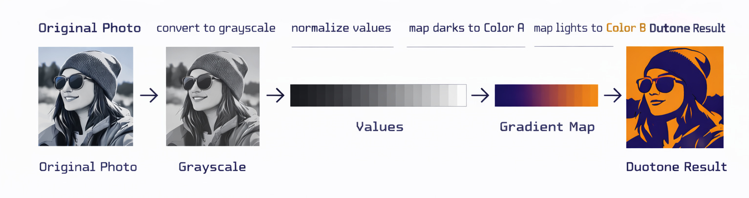
But the simplicity is deceptive. There’s real cognitive science behind why it works:
→ Reduces cognitive load — humans process luminance (light vs. dark) faster than color. Duotone amplifies what our brains already prioritize.
→ Increases contrast — by mapping to just two colors, you exaggerate the separation between foreground and background. Faces and edges pop.
→ Creates instant color harmony — a restricted palette is easier for the brain to parse. No competing hues fighting for attention.
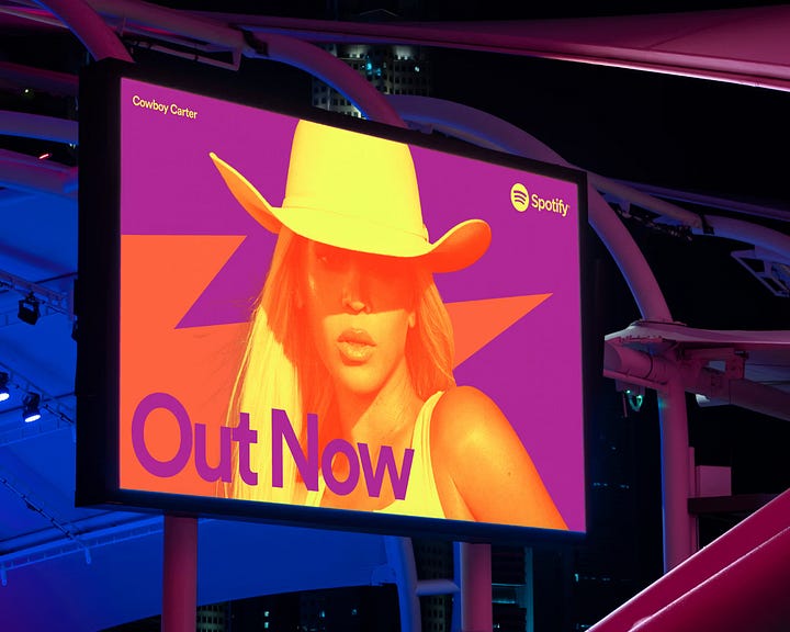
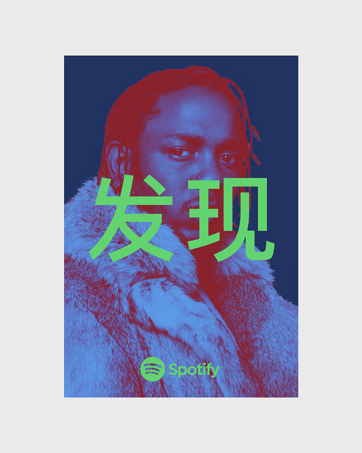
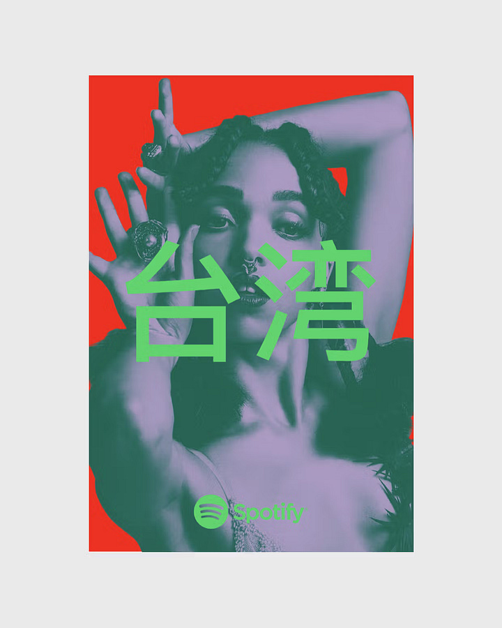
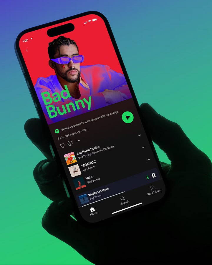
Spotify figured this out around 2015. They built their entire visual identity around duotone portraits and bold color pairings. A decade later, it still holds up.
The solution
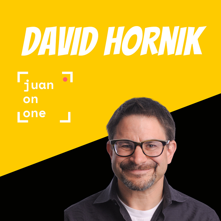
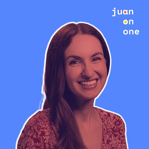
For Juan on One, I landed on duotone with a thick white border separating the foreground from the background. I have to say that even the earliest were significant improvements over my yellow and black style ☺️

The color for each episode? Based on the guest — their favorite color, their company’s brand, something personal to them. It made each cover feel intentional, not templated.
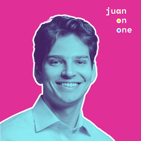
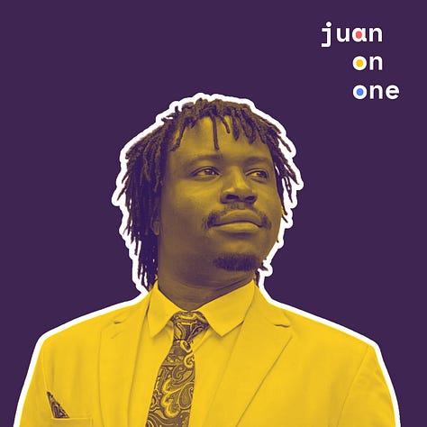


Simple. Clean. Premium. Iconic enough to work as a cold outreach tool.
Standing out by staying simple
Here’s the thing about dithering (that grainy aesthetic on most AI products these days) — it works for the same reason duotone works. Constraint. A limited palette. Fewer decisions for the brain to make.
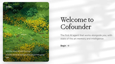
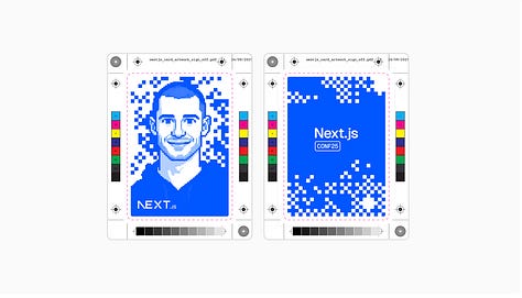
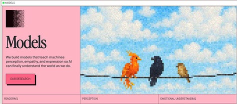
Spotify didn’t become iconic by chasing trends. They picked something simple, committed to it, and owned it for a decade. The duotone portraits. The bold color pairings. The confidence to not add more.
The technique matters less than the taste behind it. Dithering can be stunning. Duotone can be stunning. Gradients, halftones, whatever comes next — they all work when there’s craft and intention driving the choices.
What doesn’t work is adopting a trend because it’s trending.
I’m excited to see where visual design goes from here. More constraints, more experimentation, more weird and beautiful things. The tools keep getting better. One of these dithering-based companies will be as iconic as Spotify's duotone in no time.
The lesson stays the same: find something simple that works for you, understand why it works, and commit to it.
That’s what makes it yours.
P.S. Fancy making your own Juan on One duotone? Feel free to have a go here in the mini app I created:
Comments
Nothing yet. Say the first thing.
Sign in to join the conversation.