
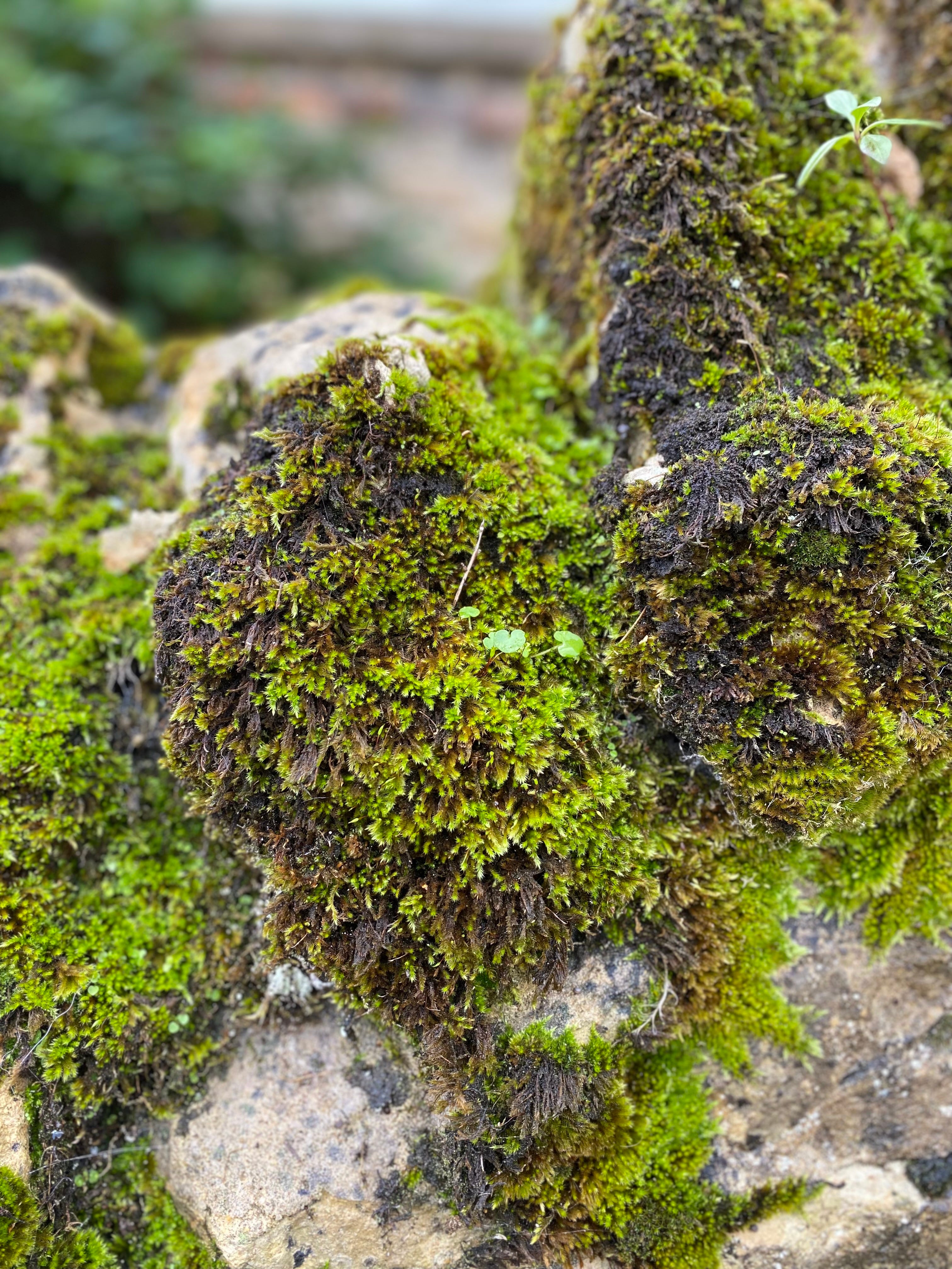
The rich green layer of moss - the gametophyte - is my favourite part for obvious reasons. All these leaves edging past each other in a pile with no sense of personal space, thick and dense and lush. Like Nature’s own velvet, the way it catches the light, with shadows that don’t even behave properly. It goes light around the edges instead of dark, like it’s glowing from within.
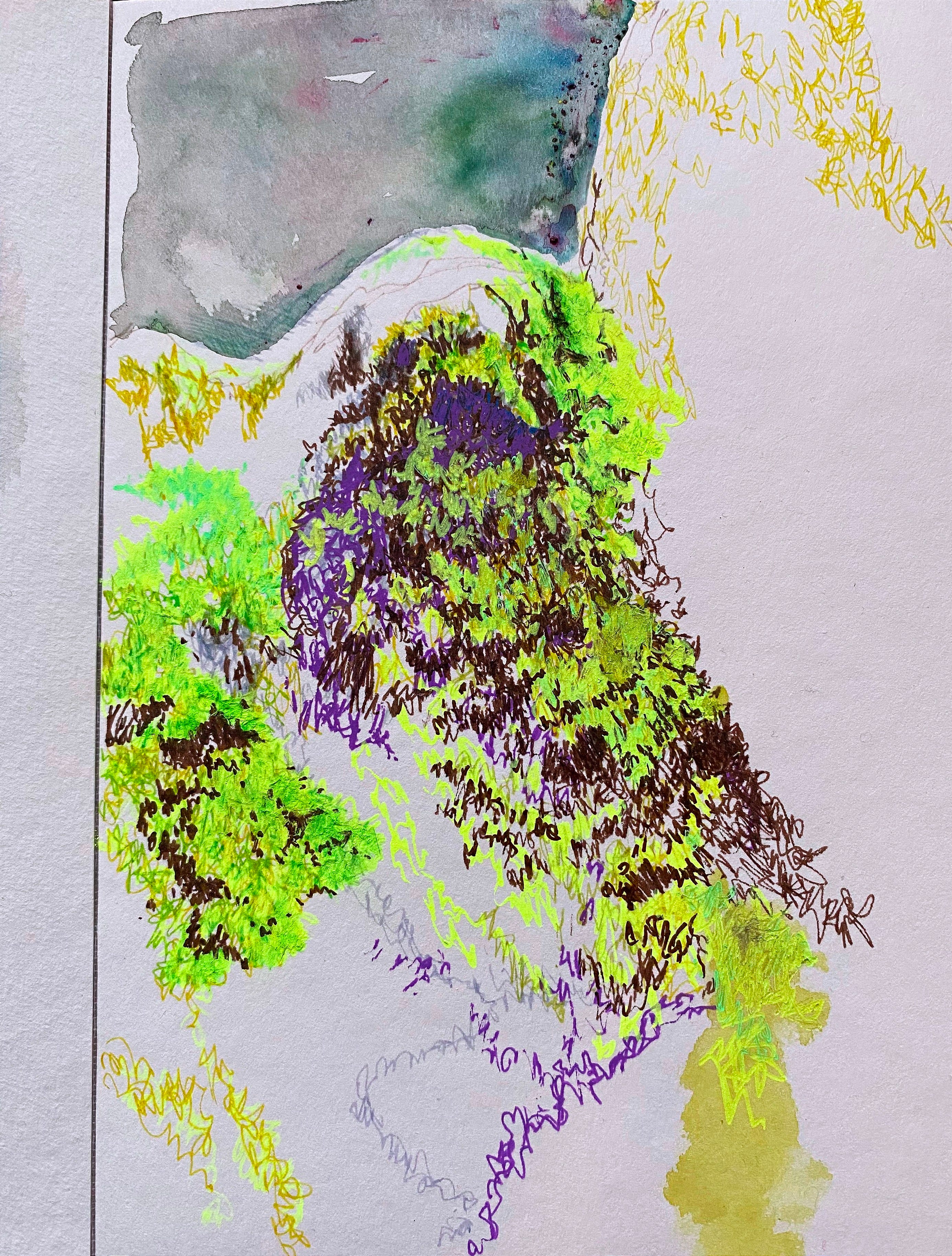
I love the zingy neon green/yellows sparking out of this one, like it’s been plugged into a secret mains. I could look at it all day and never be bored. But it is also infuriating to draw in a hurry (most of my drawing is done in a hurry, for practical reasons linked to SEND parenting). It’s just so busy.
I can’t resist taking close-ups with my phone whenever I come across moss in the street or woodland, especially in mid-autumn when the surrounding crunchy brown leaves enhance its absinthe glow. Passer-bys stare at me like there’s something wrong with me, crouched by a wall obsessing over the texture of something so commonplace, but that’s just me.
When I draw moss at home, my desk becomes chaos with green fineliners sprawling everywhere. What did I say about it being infuriating? I never feel watercolour is a good choice unless perhaps when I’m depicting moss from a distance, but then again I miss out on the details - the minutae of that distinctive pile.
Also that colour! The intensity of its chlorophyll shade, concentrated in one near-amorphous clump. It calls to me like International Klein Blue (IKB) did to me four decades ago with its phosphorus-like vibe. In certain daylight and on some types of moss, it appears like mint frosting. Check out these recent studies of mine.
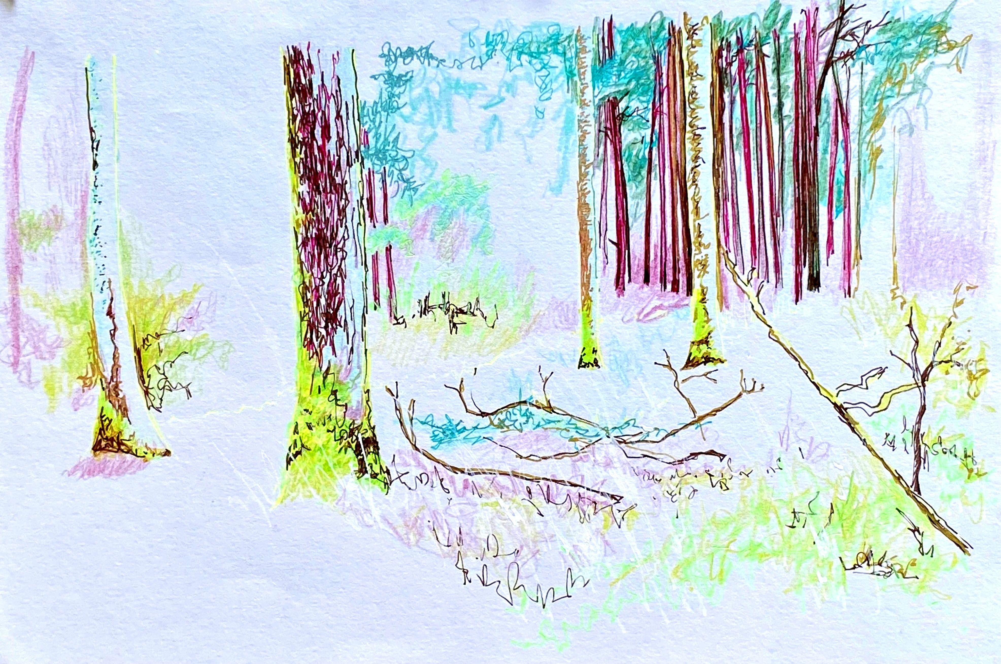

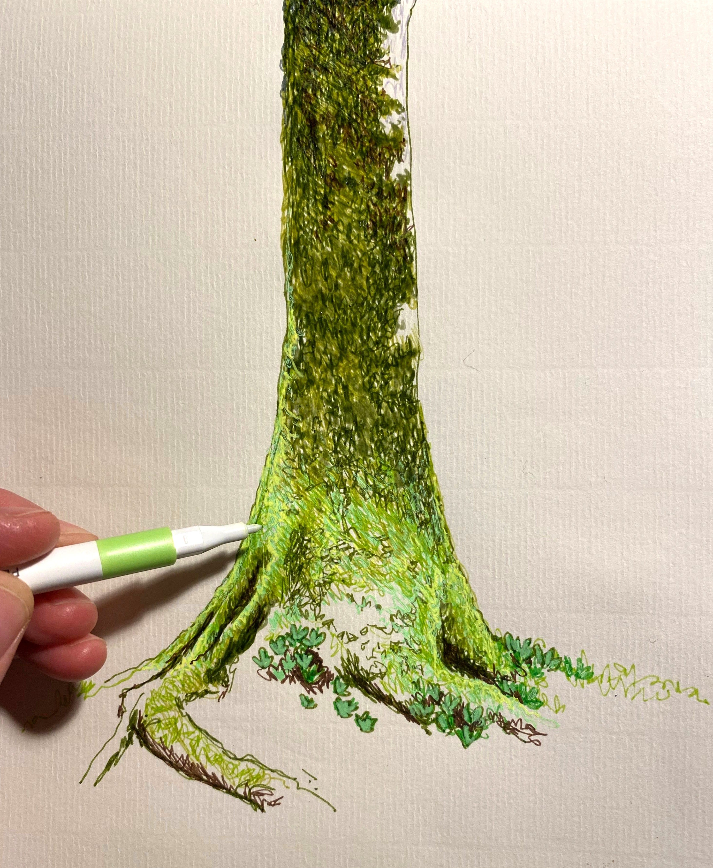
Decades ago, my grandmother knitted some pastoral-themed cushions for my parents using a pattern from Angela Jeffs’ 1979 Wild Knitting book. These were incredible visualisations of rolling countryside, genuinely undulating with puffy hills and pom-pom trees and corn-row fields and fluffy sheep, and they depicted hedges like moss, a mass of tiny graded brownish-green curls.
I don’t have these cushions anymore sadly, but they remain etched on my mind, particularly the memory of my stroking the curly hedges affectionately as a child. Together with their graded hue, they had a lasting impact on me: another formative influence shaping my idiosyncratic love of colour and texture.
While I share other ADHDers’ enduring passion for “dopamine dressing” and sensory-seeking to boost their motivation levels, I’m not so much a fan of the Jack-in-a-box LOOK AT ME brightness that many ADHD wardrobes are renowned for.
I’m more in between the light and shade - a dusk that reveals a crack of brightness but somehow retains its decorum. I do love bright colours; they make me smile, but only up to a point. There’s a time and place for them.
Instead I find myself hunting for alternative shades when my wardrobe gets too same-y and drab and I can feel my emotional stimulation sliding. What, navy again! And purple. Plum, maroon, aubergine, the whole moody fruit bowl.
Maybe I just want my colours the way moss does it: soft but electric; luminous at the edges; oozing, not shouting; thick with shadow underneath the absinthe glow.
Moss knows what it’s doing.
I should probably move the pens now. Or go outside and look at it again.
Related posts:
Comments
Nothing yet. Say the first thing.
Sign in to join the conversation.