
Bad Ideas In Visualization - Michael Correll
Standards for Graphic Presentation - Info We Trust
It’s time for a more sophisticated color contrast check for data visualizations - Lisa Charlotte Muth
Across the ASMRiverse - Data Stuff

Erin@erindataviz
New project up, featuring my favorite guilty pleasure: ASMR! This bad boy has been percolating for >3 years. Finally getting it out of my brain and onto the internet feels like hawking a giant loogie 🧵 erdavis.com/2022/01/12/acr…
4:42 PM · Jan 12, 2022
6 Reposts · 52 Likes
Feeling Data: Aesthetic Empathy in Art and Science Collaborations
米兰理工 Density Design 实验室今年在线上和线下直播和展览了 Algorithm Mediation: 在数据密集型的社会中设计 这门课的学生作品
图解算法: PageRank, Neural Network
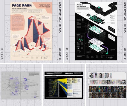
用数据驱动的方法研究科技/平台/算法是如何影响人们获取信息的:
米兰等城市的未来图景是如何在房地产宣传图中被描绘出来的
densitydesign@densitydesign
What kind of people inhabit the city of the future? What do they do? #SoCliché tries to answer that. #DD17Group1 analysed the society from future projects in Milan and divided it in different clichés. Let's take a look at what the city of the future will look like. Link below👇
1:01 PM · Jan 21, 2022
1 Repost · 31 Likes
NFT艺术市场是什么
densitydesign@densitydesign
#WTFisAnNFT gives an easy way to understand what #NFts are and how they work. It puts into the spotlight the ambiguity of ownership in the digital environment and draws on a set of visual explanations, breaking down the complexity of the subject. #DD17Group8 Link below👇
5:09 PM · Jan 23, 2022
1 Repost · 7 Likes
阴谋论平台中的 "infodemic" 兔子洞有多深
densitydesign@densitydesign
"#OffTrack: A Journey inside the #Bitchute Infodemic Underground” is a recorded cruise of investigation designed by #DD17Group2 that analyzes how easily the users can lose themselves in the maze of #misinformation, landing on content often banned from other websites. Link below👇
5:00 PM · Jan 21, 2022
2 Reposts · 7 Likes
注意力战争——流媒体公司如何争取让你留在他们的平台上
densitydesign@densitydesign
#AttentionWar investigates the role of streaming platforms’ interfaces reflecting on how they aim to keep users on the services. Through an interactive experience it presents some strategies implemented by streaming platforms and uses data to expose them. #DD17Group6 Link below👇
9:31 AM · Jan 23, 2022
15 Reposts · 36 Likes
River Runner Global - 在全世界任意一个位置放置一个雨滴,追踪其河流路径 (数据来源: The Hydro Network-Linked Data Index)
The Times@thetimes
These changes depict a country with evolving priorities, social mores and technological capabilities. So what have the past 200 years of national data-collection taught us about life in Britain? Our visual history of the census paints the full picture: thetimes.co.uk/article/the-20…
8:24 AM · Mar 14, 2021
26 Reposts · 99 Likes
House of Cards - 还原迈阿密Surfside公寓的原貌以及为什么会在7分钟内倒塌
无线耳塞往往只能使用 2 到 5 年,2026 年将近 7.5 亿个耳塞可能会报废
Financial Times@FinancialTimes
By 2026, almost 750m earbuds are likely to be defunct, considering their short lifespan. The leftover plastic, copper, circuit board, magnets and batteries will join the planet’s expanding trove of e-waste, and recycling rates can’t keep up with it ig.ft.com/fixing-my-brok…
12:35 PM · Jan 20, 2022
123 Reposts · 269 Likes
Beyond Pronouns - 不同语言是以什么方式重塑性别,性别运动又是如何改变世界各地语言的
Reuters@Reuters
🧍♂️The movement to recognize genders beyond female and male is growing 🧍♀️ But modifying language to reflect a spectrum of gender identities stirs fierce debate reut.rs/3nS0qKH 1/14

7:05 PM · Jan 25, 2022
42 Reposts · 64 Likes
Stefan Reifenberg@Reyfenberg
Check out geo-projections.com if you want to learn more about geographic projections 🌍🌐 Build with #svelte and #d3js, thanks to @Wattenberger. #geography #gischat #rspatial #rstats
4:19 PM · Jan 5, 2022
41 Reposts · 195 Likes
Teun van den Brand@TeunvandenBrand
@dr_allancameron and I are thrilled that the #rstats package {geomtextpath}, a #ggplot2 extension, that we've been rearing over the past few months has landed on CRAN 📢! We loved that there was engagement during development, so a few of our favourites in the 🧵⬇️

4:50 PM · Jan 25, 2022
48 Reposts · 246 Likes
aRtsy - Generative Art with R and ggplot2
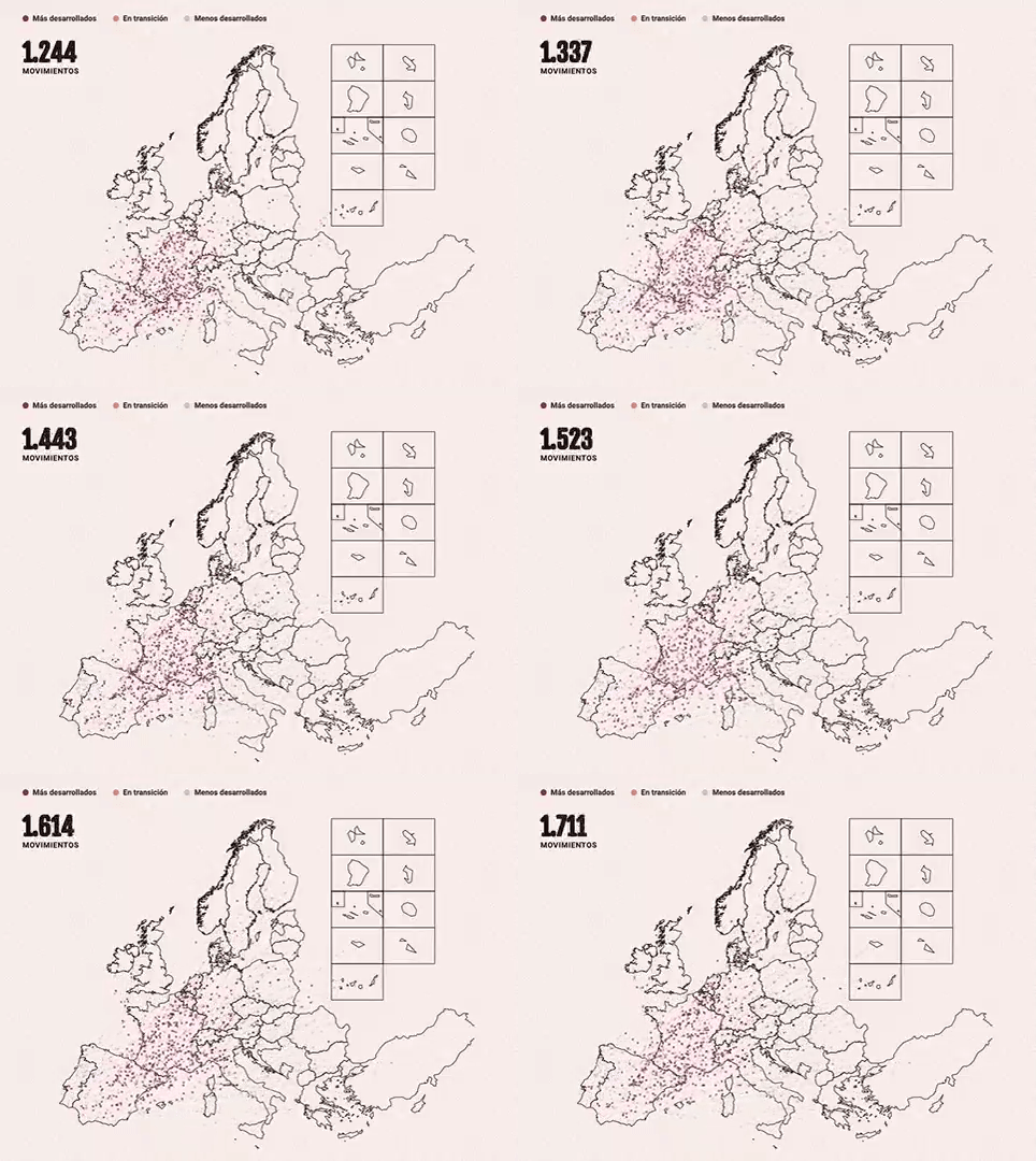
西班牙学生去波兰读书,而德国人去爱尔兰 - 为什么Erasmus交流项目和奖学金援助不足以克服国家和家庭之间的经济不平等
El Confidencial@elconfidencial
Por qué los españoles se van de Erasmus a Polonia y los alemanes a Irlanda. Hoy, el primer capítulo de nuestro especial sobre las becas Erasmus elconfidencial.com/mundo/europa/2…
9:32 AM · Dec 28, 2021
21 Reposts · 59 Likes
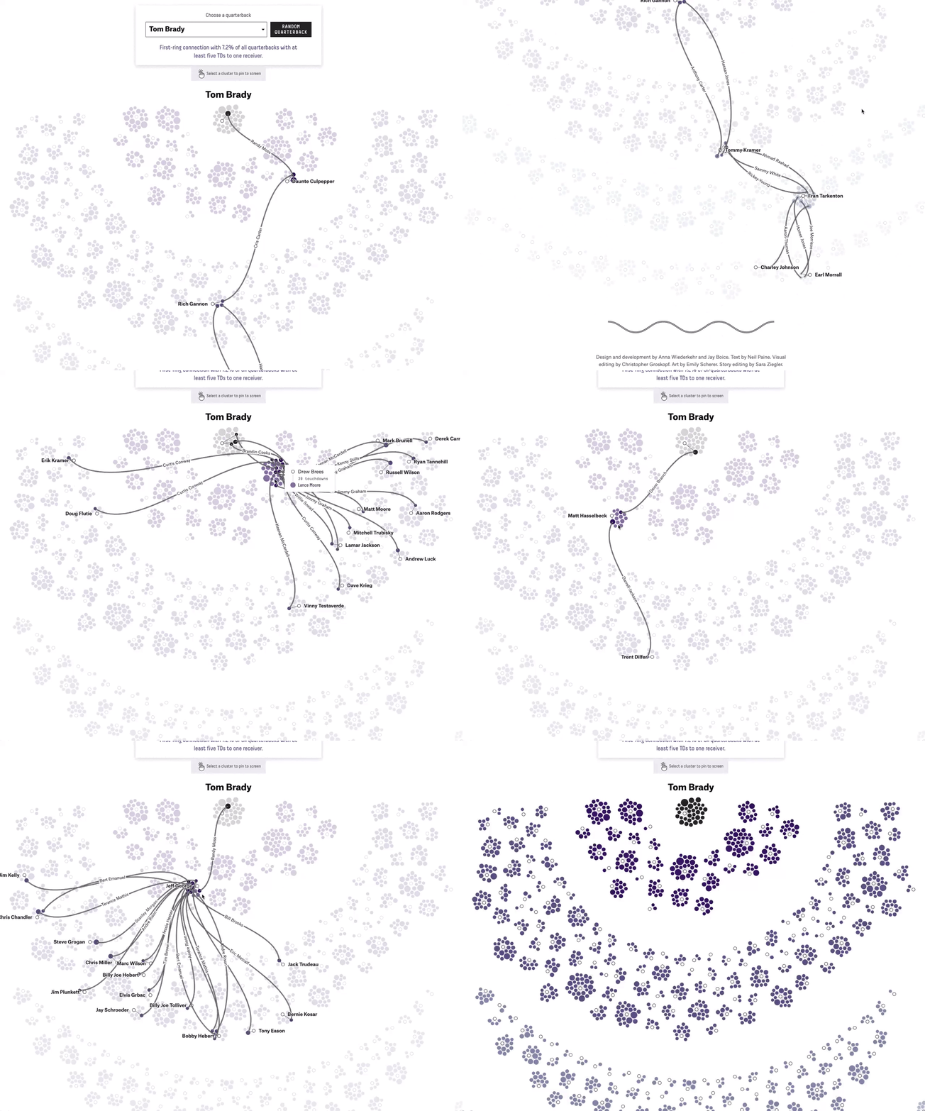
spaghetti sentinel - FiveThirtyEight的设计师 Anna Wiederkehr 把她绘制的NFL球员Tom Brady及其关系网络比作意面,推文中分享了背后的创作过程
anna wiederkehr@wiederkehra
The NFL spaghetti sentinel 🍝🤖 is live and you can noodle around it. It wasn't always so spaghetti-y, though. 1/x
3:43 PM · Jan 11, 2022
41 Reposts · 204 Likes
Interactive article explaining how GPS works
Zines and self-publishing in Chinese cultures
Carwyn Morris@carwyn
@krishraghav @ChaoyangTrap a vital form of reportage

2:26 PM · Jan 21, 2022
1 Repost · 9 Likes
No posts
Comments
Nothing yet. Say the first thing.
Sign in to join the conversation.