
Hi! 这期newsletter应该是今年最后一篇了,勉勉强强坚持了一年,看到大家都在写年终总结,这里就简单plot一下一年来自己在这里都留下了什么——数据吧!
明年见~
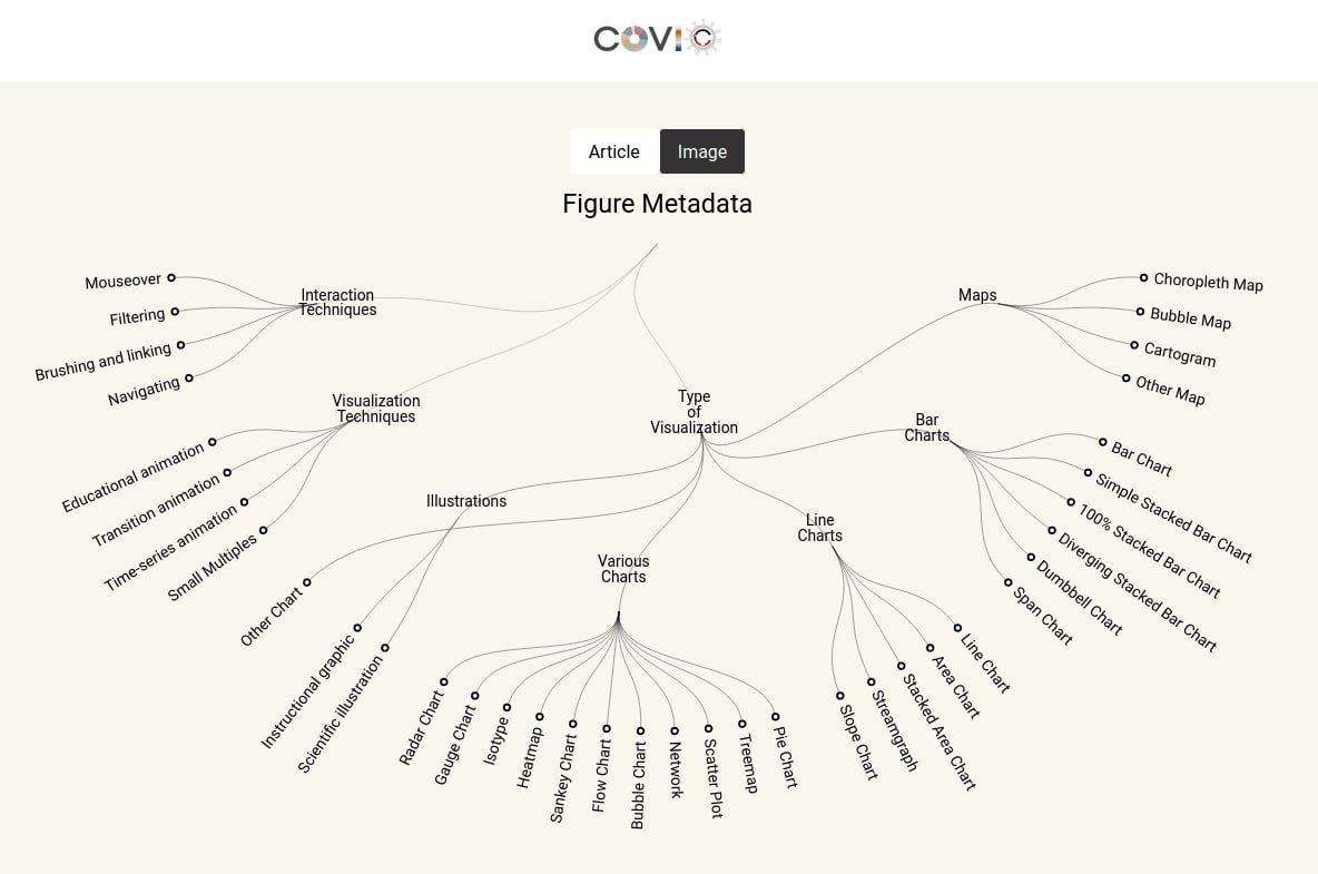
COVID-19 Online Visualization Collection - Northeastern 大学的研究人员收集了全世界 Covid-19 相关的一万多个可视化作品,用于研究视觉语言用于定性和定量可视化疫情的设计空间和可能性,并制作了一个检索工具供人探索
Hearts and minds - 欧洲人是如何看待移民的。在欧洲,关于移民问题的政治叙述是高度两极分化的,设计师 Federica Fragapane 的新项目试图探索六个不同国家公众对待移民的态度和看法

ODI@ODI_Global
The #UK public are not as polarised on #Immigration as we think, most do not have strong views for or against #Migration & are receptive to #Migrants to address labour shortages in essential roles. #MigrantsDay #ItTakesACommunity buff.ly/3dUoU0f
10:39 AM · Dec 16, 2021
8 Reposts · 13 Likes
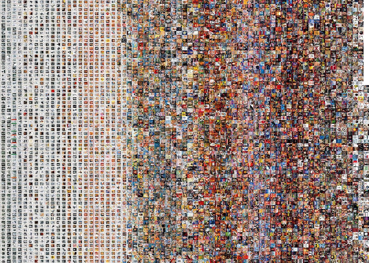
86年『时代周刊』封面的演变 - 可视化1923年第一期到2009年杂志设计及其内容的演变中的不同模式
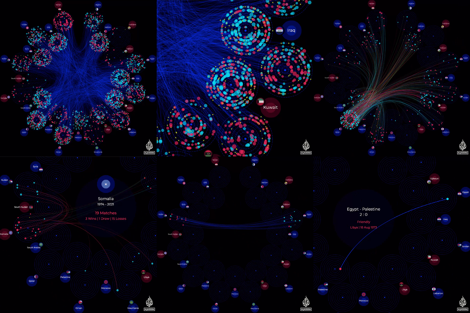
可视化1957 年以来23个阿拉伯国家之间进行的所有国际足球比赛
Mohammed Hussein@muhhossein
🎉NEW #dataviz #ddj with @haddadme @SebBillard_ @ShowkatShafi on @ajlabs @AJEnglish It visualises all the international football match played between all the 23 Arab countries since 1957, in the context of #FIFAArabCup that will start on 30 Nov in #Qatar interactive.aljazeera.com/aje/2021/fifa-…
5:47 PM · Nov 27, 2021
18 Reposts · 70 Likes
制药公司宇宙 - 瑞士制药公司每年都会向医疗组织和医生付钱,数据记者收集了这些数据并创建了一个宇宙。在宇宙的边缘,有制药公司(行星),接受资金的是小行星。一个小行星从制药公司收到的钱越多,它就越接近相应的行星。只从一家公司收到钱的小行星被置于该行星的轨道上。行星和小行星的大小取决于支付或收到的钱的数量
Simon Huwiler@simon_huwiler
Das Pharmauniversum hat eine Suche erhalten: Nun zeigt der Boardcomputer an, wo der gesuchte Asteroide/Planet 🪐 ist. 👉journalist.sh/pharmauniverse/
6:14 AM · Dec 13, 2021
3 Likes
The Pudding@puddingviz
New project! In this personal essay, @codenberg & @mich_mcghee explore the complexities of #foodallergies and the many ways that sesame can end up in our pantries. pudding.cool/2021/12/sesame/
8:33 PM · Dec 14, 2021
8 Reposts · 51 Likes
The Straits Times@straits_times
📦🎄Are your parcels and Christmas orders taking forever to reach you? Over the past year, the global logistics network has seen delays. ST tracks a bicycle from China - which took 40 days to reach Singapore - to find out what’s holding things up: str.sg/3YJG
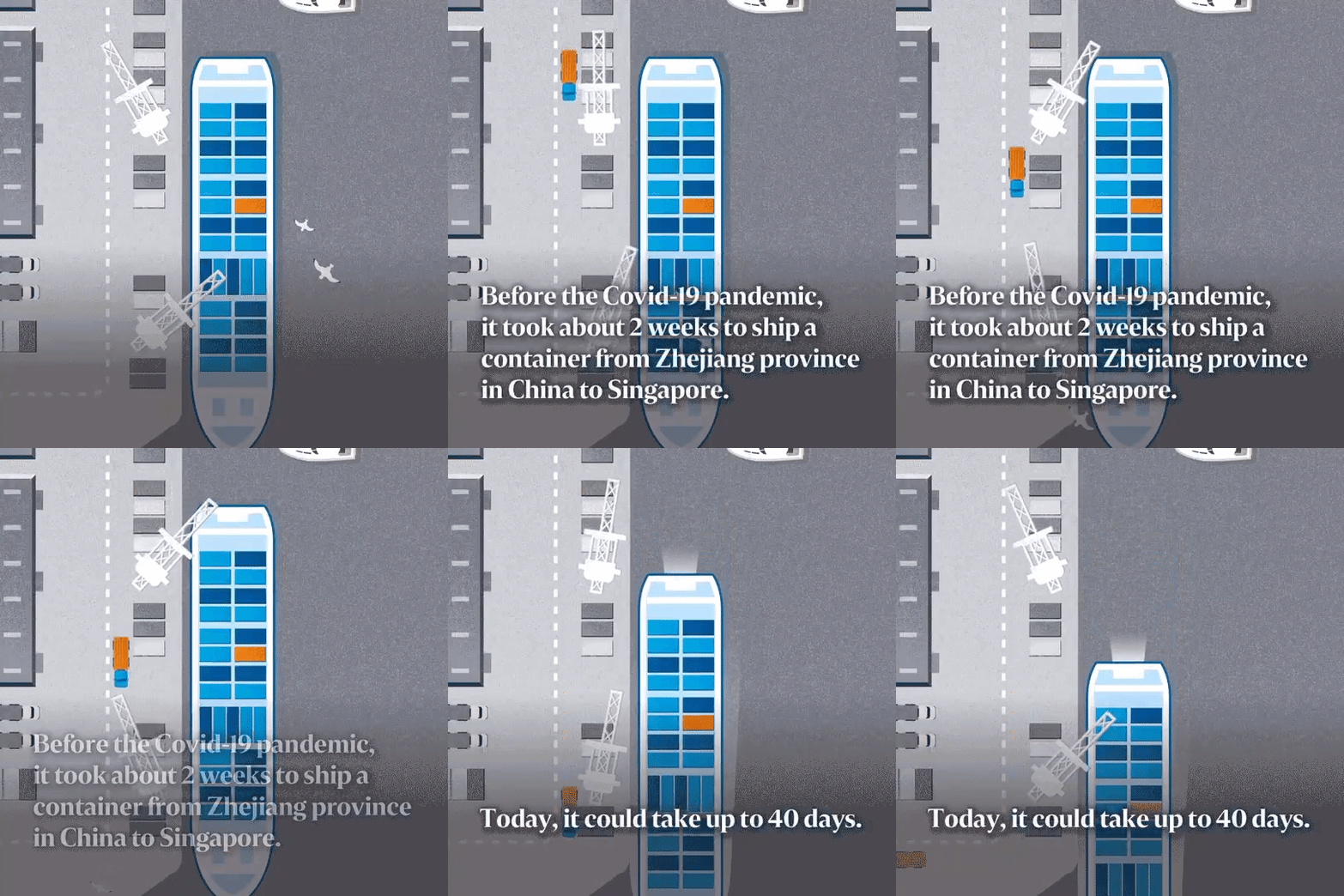
6:00 AM · Dec 15, 2021
8 Reposts · 17 Likes
James Webb 新太空望远镜是如何工作的 (La Vanguardia, Los Angelas Times, EI Pais)
La Vanguardia@LaVanguardia
🟡V+ INTERACTIVO | James Webb, el nuevo telescopio espacial que estudiará las fases de la historia del universo. La nave extenderá nuestro campo de visión hasta el universo profundo. Por @isagavina, @pablogpellicer y Mario Chaparro. stories.lavanguardia.com/ciencia/202112…
8:30 AM · Dec 6, 2021
5 Reposts · 11 Likes
Los Angeles Times@latimes
When the James Webb Space Telescope launches on Dec. 22, it will begin a multiyear mission to help humankind catch a glimpse of the origins of the universe. latimes.com/projects/james…

9:56 PM · Dec 14, 2021
57 Reposts · 157 Likes
Mariano Zafra@Mariano_Zafra
La ciencia espacial avanzará con el inminente lanzamiento del telescopio James Webb 🛰️. En El País damos un enorme paso en narración visual y tecnología para contarlo 👉 elpais.com/ciencia/2021-1… por @Nunodomin @jacob_vx @infoiguacel
8:41 AM · Dec 19, 2021
33 Reposts · 62 Likes
The Washington Post@washingtonpost
Among the busiest spaces in this crowded building was this basement saloon, operated by John and Caroline Schneider, a German couple, from 1864 to 1886. Beer gardens and saloons were essential social glue for German immigrants. wapo.st/3GhSbOA
10:47 PM · Dec 7, 2021
42 Reposts · 200 Likes
zero bytes found - a story about losing phone photos
jackie liu@jackieis_online
I've been working on an interactive web comic and it's finally live! read it here: jackieis.online/zerobytesfound/ it's about losing phone photos, rehashing my early experience at MIT, and general weirdness around getting older, memories, and the passage of time 😳😔🥀
12:32 AM · Dec 13, 2021
6 Reposts · 37 Likes
The Science of Visual Data Communication: What Works
Exploring the past, present, and future of data portals and citizen engagement
Does Data Visualization Have Rules? Or Is It All Just “It Depends”?
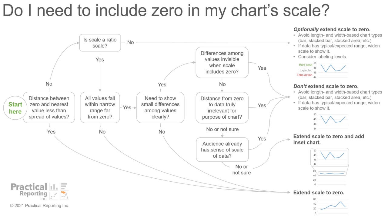
Using Text in Visualization (tweets)
Flourish@f_l_o_u_r_i_s_h
Imagine a chart without a title, no labels, and no visual clues to what it is about – how much would you be able to understand? 📝 Without a doubt, text is one of the most crucial elements of data visualization.
3:49 PM · Dec 8, 2021
50 Reposts · 295 Likes
What are examples of accessible, effective chart descriptions? (tweets)
Frank ⌁@FrankElavsky
"What are examples of accessible, effective chart descriptions?" I get asked this question a LOT, so I am going to make a thread here to easily link to later. (This thread covers both simple and complex use-cases for human-authored descriptions.) Feel free to share/bookmark!
7:17 PM · Dec 9, 2021
67 Reposts · 201 Likes
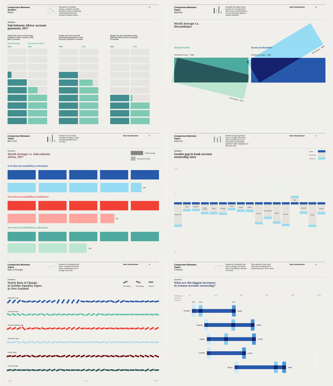
Gender Equality Creative Platform - 可视化性别平等和人文叙事的设计系统
Giorgia Lupi@giorgialupi
Proud to share the work we’ve been doing for the @gatesfoundation in the past months! We designed and developed a new data visualization brand system to help tell rigorous, branded, and above all human stories about gender equality 👉🏼 pentagram.com/work/gender-eq… @pentagram
5:26 PM · Dec 13, 2021
99 Reposts · 772 Likes
Dataviz Catalogue@dataviz_catalog
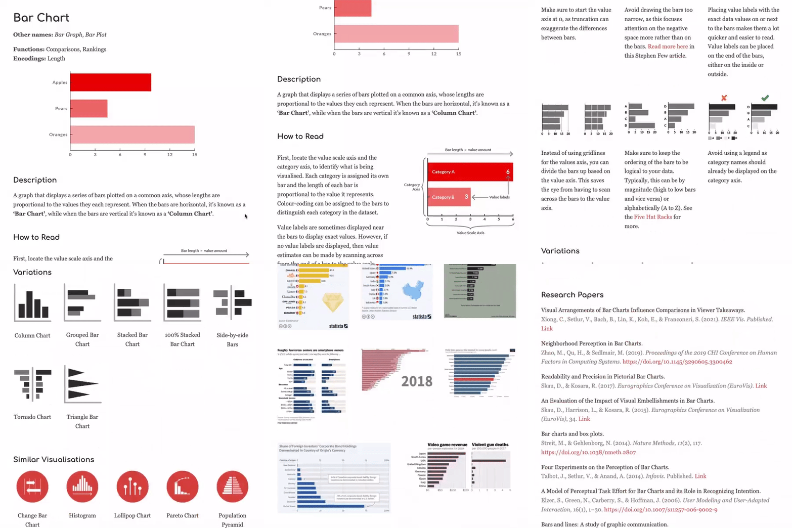
Here's a demonstration of how the content on an updated page on Bar Charts might look like: datavizcatalogue.com/blog/new-forma… #dataviz #datavis #datavisualization #datavisualisation #barchart #graphs #charts #design
1:11 PM · Dec 13, 2021
22 Reposts · 115 Likes
Marco Hernandez‘s fav little details of 2021 on Reuters
Marco Hernandez@TmarcoH
It seems that I won't be able to publish anything else before the end of the year. So, I'm listing my fav little details from 2021 at @ReutersGraphics here: bit.ly/3ry7bE8 I know it's only Dec. 3, but xmas is just around the corner #YearInReview #infographics 🎄🎅🎁

11:02 AM · Dec 3, 2021
8 Reposts · 68 Likes
Bloomberg The Year in Graphics
Postcards From a World on Fire - 纽约时报年度气候灾难报道汇总
Pandas & Tidy Tutor - 来自 UC San Diego Philip Guo 的研究团队 制作了两个小工具 Pandas Tutor 和 Tidy Data Tutor,用视觉+交互形式帮助人们理解的 Python pandas & R Tidyverse 代码是如何操作dataframe (Philip Guo 教授就 The Ph.D. Grind 的作者)
Sean Kross@seankross
Today is launch day!🚀🚀 I am super excited to introduce *Tidy Data Tutor* a web application for visualizing your #rstats #tidyverse data analysis pipelines: tidydatatutor.com (Developed with Philip Guo)
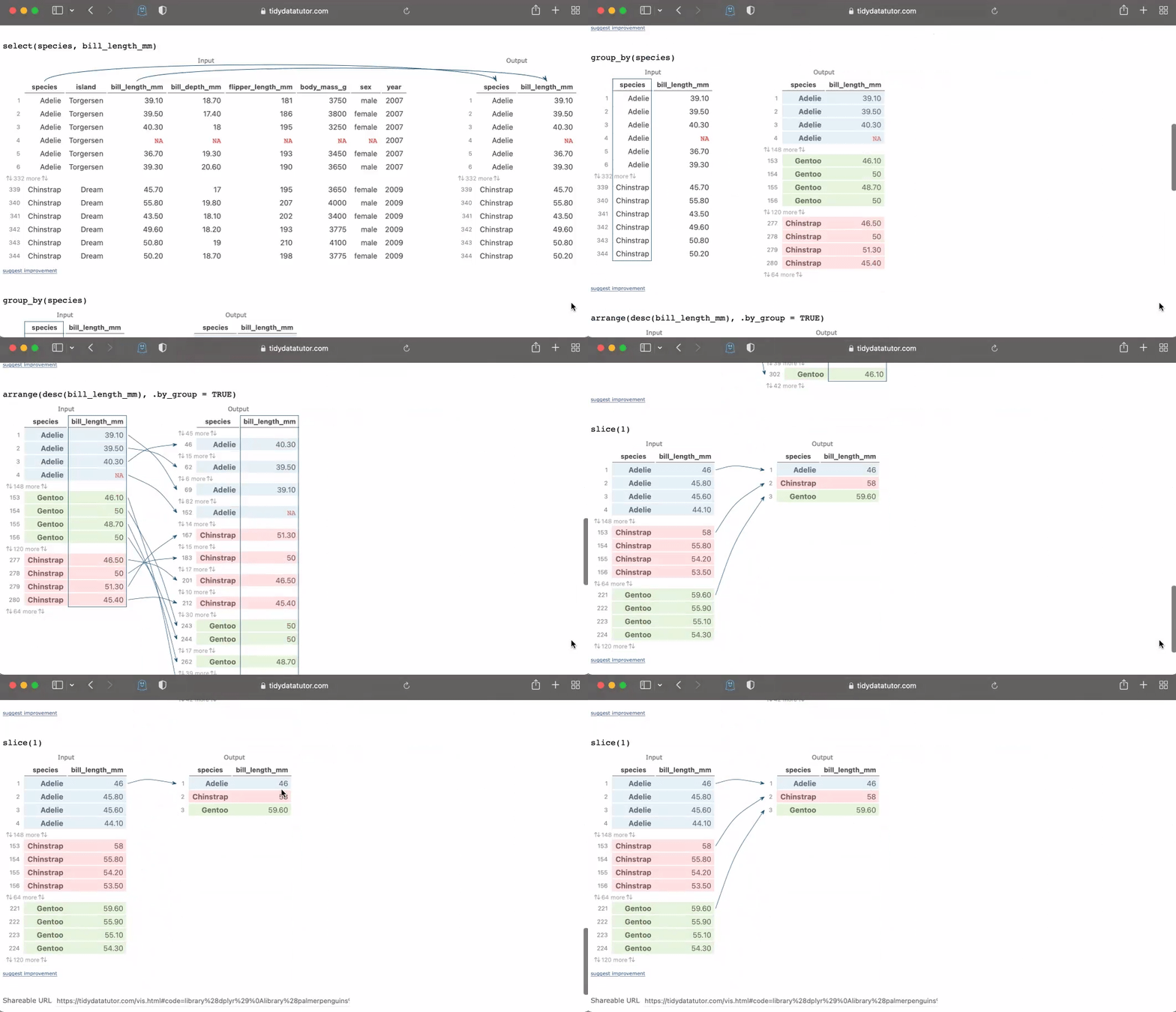
5:48 PM · Dec 4, 2021
489 Reposts · 2.16K Likes
MetBrewer - 基于大都会博物馆展品的调色板
Blake Robert Mills@BlakeRobMills
✨✨New Package✨✨ Happy to announce that I am soft launching my R color palette package {MetBrewer} today! Currently has over 30 palettes inspired by works at the @metmuseum and expanding! Download Instruction and Palettes here: bit.ly/3GDIj1N #r4ds #dataviz #rstats
7:23 PM · Dec 11, 2021
1.08K Reposts · 6.02K Likes
Eric Rodenbeck & Mapping Emotions
D3 and Data Visualization Insights with Mike Bostock
Eric Van Holtz@ericvanholtz
"Wonderful Weirdos of the Web" are welcomed to resize their browsers in another epic @lynnandtonic portfolio redesign. lynnandtonic.com 🤯
8:37 PM · Dec 16, 2021
39 Reposts · 220 Likes
Emoji to Scale (source code, data)
Cubic Bézier: from math to motion
Towards a research community for better thinking tools
🔎Julia Evans🔍@b0rk
I built a new tool where you can experiment with DNS called Mess With DNS! It's at messwithdns.net. I made this with @omarieclaire, and there's a blog post about how we built it here: jvns.ca/blog/2021/12/1…. Here's a gif:
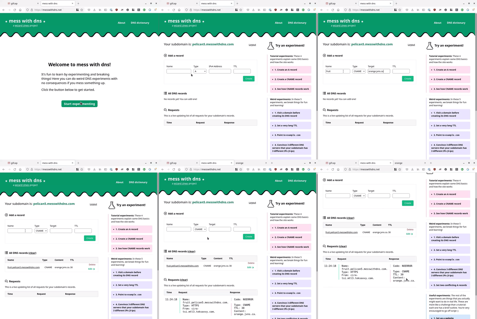
4:42 PM · Dec 15, 2021
678 Reposts · 2.65K Likes
No posts
Comments
Nothing yet. Say the first thing.
Sign in to join the conversation.