
“I am trying to show the value that I brought. But it seems I’m failing.”
Cheyenne is a senior designer with more than a decade of experience, but she had one specific problem: her best work is small.
Sometimes, your best work isn’t part of a company-wide AI initiative with a $17M budget attached. Sometimes, it’s the “one quick thing” she got asked to do that turned into some of her best work.
The key to translating that kind of impact isn’t to fudge the scale. It’s to talk about the problem in more detail.
In 2016, Meta (then Facebook) had a problem that would shape future social media interactions: people didn’t know how to react to a funeral announcement.
Hitting “Like” on news that someone’s uncle died felt wrong. But 90% of Facebook’s traffic came from mobile, where typing a comment was real friction.
So most people stayed silent, and Facebook watched whole categories of human moments slip past the platform, including grief, sympathy, and shock.
The brief was straightforward: build a Like alternative, one tap, that covered the full range of human emotion.
The artifact they shipped looked simple. Six animated emoji. Love, Haha, Wow, Sad, Angry, alongside the original Like.
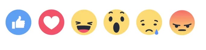
The work underneath the artifact was not simple at all. Geoff Teehan, one of the design directors who led the project, wrote up the process on Medium.
Over a year of global research. A soft launch in three countries. They cut two reactions during testing because no one used them. A late realization that static prototypes didn’t work, and that animation was what made the reactions feel human.
And under all of it, a constraint most companies never face. Facebook’s entire business ran on the Like button. Every change risked breaking a behavior that hundreds of millions of people did every day without thinking.
That is what shipping six emojis actually meant. Which leads to the question that catches many senior designers off guard: how do you describe work like that?
If you asked a designer who worked on Reactions what they did, a lot of them would tell you, “I designed the reactions.” Maybe “I worked on the animations.”
The screenshot tells the same small story. Six little faces. Anyone could have picked six little faces.
What the screenshot can’t show is the dozen decisions underneath each one. Why this set of emotions and not another? Why animation and not static?
How to introduce something new without destroying the behavior that built the company. The taste and judgment that produced the result aren’t visible. The artifact just shows the result.
This is the communication problem I see senior designers run into constantly in case studies and portfolios. The visual does all the talking, and too many decisions are buried beneath it for it to carry.
Mary, a senior product designer in EdTech, put it this way: “I was very proud of the invisible work that was done. The stuff that’s not translated in visual design.”
She named the whole problem in two sentences. A ton of invisible work went into it, and visuals alone can’t show it.
The invisibility isn’t just external. The designer who did the work is usually the first one to undersell it.
“I just designed the reactions.” “I tweaked the interaction.” “I cleaned up the flow.”
This is what senior designers actually sound like when you ask them about their work. They don’t brag or exaggerate. They describe what they did, not what it took. They’ve seen patterns like this a thousand times.
They know the best practices, the industry standards, and the shape of the problem. So, of course, it felt manageable.
But “manageable for me” and “small piece of work” are different sentences, and senior designers blur them constantly. It’s the same reason “another routine operation” sounds incomprehensibly complex to anyone outside the OR.
Other people hear that language and take it at face value. Why wouldn’t they? The person who did the work just told them it was nothing.
Over time, the designer starts to believe their own framing. After enough cycles of describing the work in flat terms, the designer can’t quite remember why it felt bigger than the way they describe it.
The fix isn’t to oversell. It’s to describe what actually happened once you’ve thought about the larger problem.
The move is simple: ask “so what” until the real problem shows up.
UX goal: Design an emoji-based alternative to the Like button to enable easier interactions.
Why does this matter? Users get a way to express nuanced emotions beyond “Like.”
So what? They can engage appropriately with all types of content, including celebrations, sad news, and surprising updates.
So what? That comfort increases overall engagement, because people feel comfortable interacting with more posts.
So what? Higher engagement means people spend more time actively participating in their News Feed.
Product outcome: “Created new emoji reactions” becomes “X% higher engagement by getting more users to actively participate in their feed.”
There are other steps in this process. You may need to learn a bit about metrics to understand what “engagement” means in your context.
But this is how a small solution can solve a huge problem, and how you have to talk about it. A dozen small decisions, otherwise invisible, become legible when you describe the problem in larger detail.
In the 250+ conversations I’ve had with Senior Designers & Design Leaders this past year, the pattern that comes up most often is that designers tend to be humble in a way that doesn’t serve them.
They love the craft. They talk about the things they’re most proud of, the parts where they built a beautiful solution. But they often fail to put that solution into context and explain why it mattered.
This shows up in performance reviews, case studies, portfolios, and interviews, where designers lean on visuals and beautiful experiences rather than making bold (but logical) claims that they affected the business.
Missing this translation has a cost. Businesses today don’t just want craft. They want senior designers who understand how design affects the business and why it matters.
If you can’t answer those questions, the work isn’t the problem. The translation is. And it’s not as hard as you might imagine to solve.
Struggling to translate your work? I help overworked designers land Senior, Lead, or Principal Design positions by telling their story. Book a chat to talk through what you’re working on.
No posts
Comments
Nothing yet. Say the first thing.
Sign in to join the conversation.