
If you're thinking of publishing a book or are in the process of writing one, the cover design might not be on your radar yet. But it should be.
There are no hard and fast rules about what a bestseller should look like. The content matters most and people will spread the best books by word of mouth.
Still, a great cover is just like any other piece of marketing: it gives your work a chance to get seen in a sea of other material.
Just like ads on social media utilize creative to capture attention and landing pages utilize hooks to encourage you to continue reading, an attractive book cover might make just enough of a difference that a prospective reader will pick it up, flip through it and decide to give your book a shot.
Consider your cover the first part of your "funnel.”
Think of it this way: they can't change a reader’s life if they never read your book. And they'll never read your book if they aren't attracted to it in some way. The cover is a tangible piece of the marketing equation you can control that makes a significant difference in conversion from browser to buyer.
This applies online and especially in person. Try choosing a color that most don't use and you'll have a leg up.
The brain recognizes colors and patterns before words, so it's good to look at things from a bird's eye view. Close your eyes and open them quickly without thinking.
What colors really pop for you?
What draws your eye immediately?
Whats blends in or is a bit boring?
There’s an element of subtle symbolism that comes from color.
For instance:
Red: power / energy / caution
Orange: energy / warm / attention
Yellow: happiness
Blue: intelligence / serenity
Green: money / growth / health
These aren't hard rules, but suggestions.
Large font that contrasts from the book cover and can be read easily from far away works well. Back up 10 feet. Can you still read the cover? Back up 10 more. How about now? Is the font big enough? Is it the write typeface or does your brain scramble it.
Often big, clean, and clear font is better than trying to get too fancy.
Combined with the actual title of the book, the cover functions like the headline on a sales page — and as famed copywriter David Ogilvy said:
"Once you've written your headline, you've spent 80 cents of the dollar."
Good advice.
A simple graphic that connects to the theme of the book really ties things together. It's also a good move to use something iconic or directly relatable to your brand. If you have a personal brand, it also works to have a picture of yourself on the cover if you want your readers to connect with a familiar face—though sometimes I think this is more of a vanity move than in the best interest of the cover itself.
It really depends on the subject matter and what you're trying to accomplish.
A great way to determine which cover works isn't just to "go off your gut." You should be actively testing and polling your audience. If you don't have an audience, ask friends and family. You can also spend a little money to run ads and see what gets the best response.
This is called "split testing" in marketing and it's a very smart thing to do. You probably aren’t as smart as you think you are.
For every one of these rules, I could give you a book that's sold millions of copies that defies the rule, which affirms the fact that content and word of mouth matters most.
But don't be silly: if you want to give your work every possible chance of succeeding, a great title and cover can help push you over the edge.
Next time you're at the airport bookstore (my favorite), notice which covers stand out to you and make a mental note.
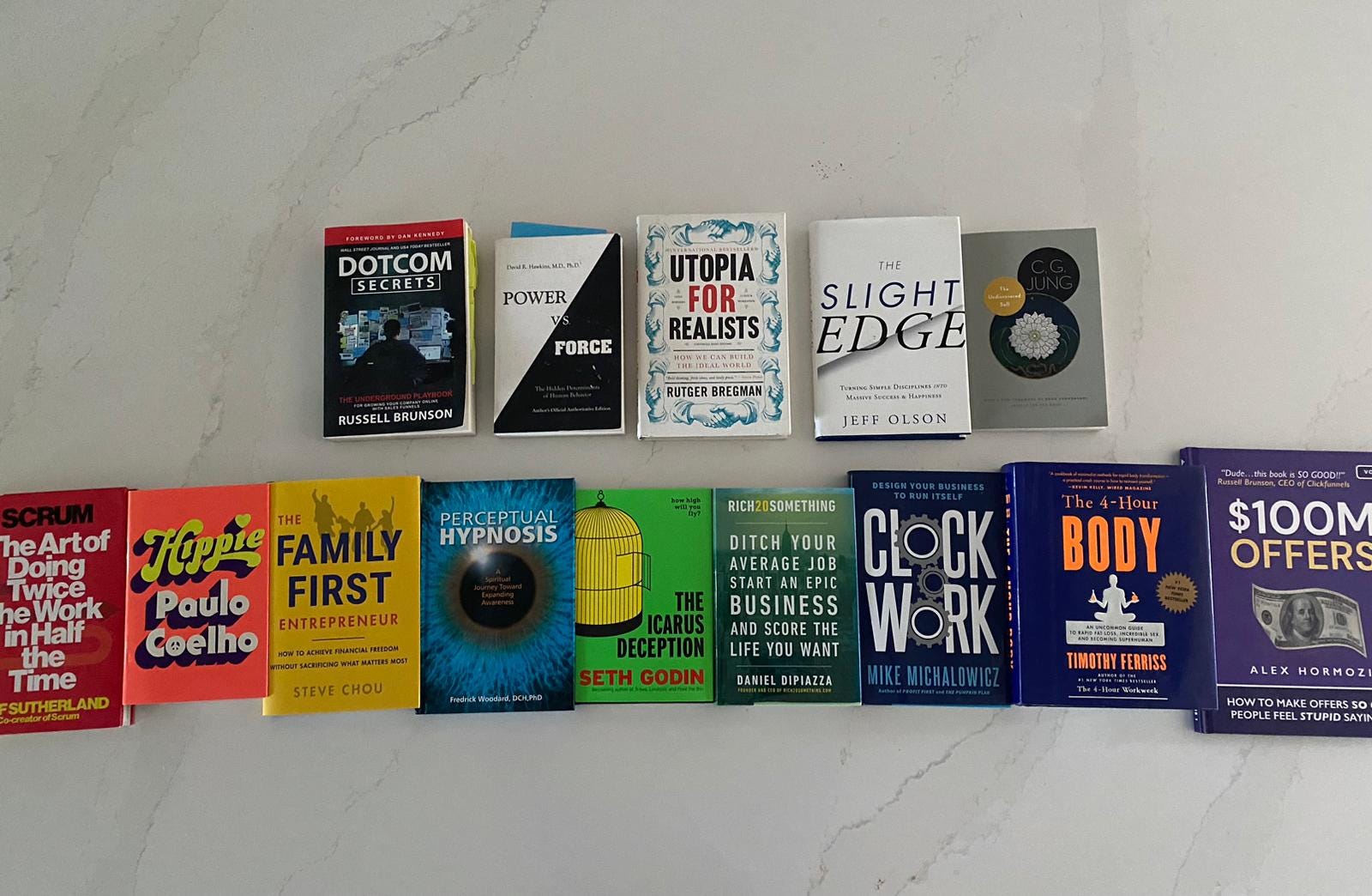
Pictured here: a little demo shot I sent to our author James Swanwick as we were working on the cover iterations for his book CLEAR. In the top row, I shared more neutral tones black, white and gray.
In the bottom row, you can see different color variations lined up in ROYGBIV. My book (Rich20Something) is in there, but I don't think it's the best cover design. I actually never liked that cover and fought to have it changed, but the publisher wouldn't budge. That's another story for another day.
Related side note: the inability to choose my own cover (amongst many other issues) annoyed me so much that I started New Wave Press—where authors get complete creative control—while still having access to the same caliber of professional talent they’d have with a big publisher. Talk about walking around with a chip on my shoulder. But I digress.
From the selection above, I think the most eye-catching designs are on the ends and in the middle: Scrum, The Icarus Deception, and $100M Offers.
BTW: speaking of James’ book, it went #1 in THREE categories upon release.
Here’s a full breakdown of how we did it:
Well, that’s it for today.
What are some of the most attractive book covers you’ve ever seen? Which covers were so good you just had to buy?
Leave me a comment below so that I can check them out.
No posts
Comments
Nothing yet. Say the first thing.
Sign in to join the conversation.