

I’m writing this on the verge of an eclipse hitting my Leo ascendant to the degree (!!!). So I naturally had to make this month’s Brief about one of the key placements to look at when building your brand: Your Ascendant.
Your Ascendant (or Rising Sign) is the first placement I point to people when looking at their charts from a branding lens, simply because it is the most natural, easeful way to learn how people perceive us saying a word. And isn’t that what branding is all about?
In traditional astrology, our Ascendant represents your physical body, vitality, core personality, and how you naturally meet the world. It’s the anchor that sets up the rest of your chart.
Within my own framework, it represents the part that covers brand design. Your logo, colors, typography, imagery. The outward appearance of your very own brand universe.
Before anyone reads your About page, figures out your mission or buys one of your products, they see you. With their eyes (!!). They encounter your colors, your photos, your packaging, your feed. All of these visual cues that call them in, long before you’ve had a chance to fully explain yourself or what you’re about.
This makes your Ascendant a key point of your of your brand. And while the rest of the points in your chart greatly influence it, this is an ideal place to begin.
Before we go any further, I need to make one thing very clear: Brand Design is nuanced work (really) and applying an astrological lens is super helpful but has been overly simplified online. Just because you have a Leo Rising does not mean your brand needs to be gold and covered in sun symbols and lions (have you seen me do this? ew), a Scorpio Rising brand does not automatically need to be black and mysterious and moody. Having your ascendant be Pisces does not equate to your website needing to look like an underwater dreamscape (Unless that’s your thing, obvi.)
I’m not interested in assigning each zodiac sign an immovable, exact aesthetic, but understanding the qualities behind the sign and translating those qualities into design. The cool thing about astrology, and art, is that its subjective and can represent different things to different people.
I’ve had the absolute joy of working with Daniela Karpenos of Cosmic Latte for the past three-ish years. She’s a Virgo Rising founder who has built a brand so unapologetically rooted in her chart that you can’t help but follow along.
She’s leveraged her Virgo energy by creating a brand so intentional, so detail oriented, and deeply focused on delivering quality. There’s something super calming about the way she creates structure around spirituality, organizing and considering every piece of information for you in a practical, easy to digest way.
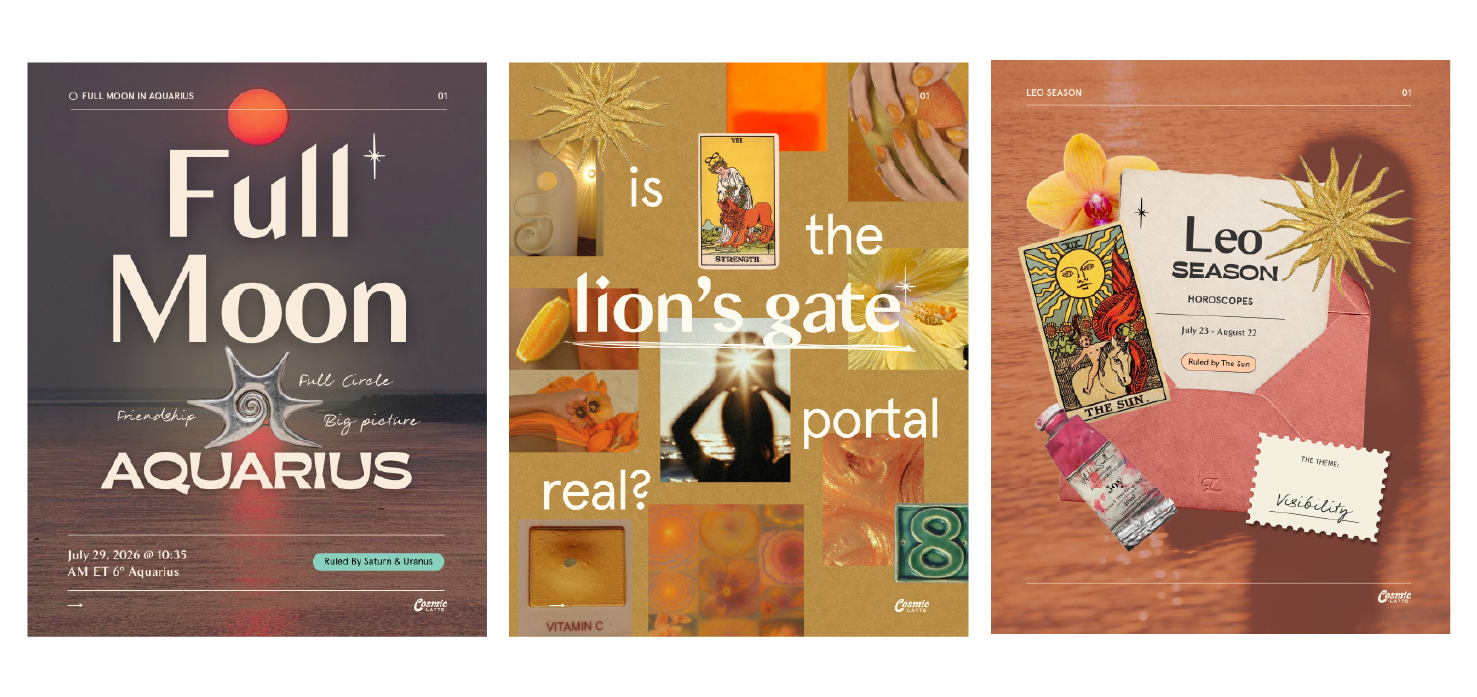
Her visuals are known for having strong typographic hierarchy, being super consistent with the fonts she uses, and you simply know that every single detail has been put in there for a reason. Nothing feels accidental when you’re scrolling through her New and Full Moon posts or reading through her eclipse guides.
While her color palette leans heavily into her own Leo Sun and Cancer Moon, it’s in the execution and everyday choices of her brand that her rising comes through.
Have no fear, two brands with the same rising sign won’t ever be the same. Because while the Ascendant gives us the doorway, we still have other placements to explore. And here is when the ruler of your Ascendant becomes super important.
Every sign is ruled by a planet, and below is a little cheat-sheet for you to reference and find yours:
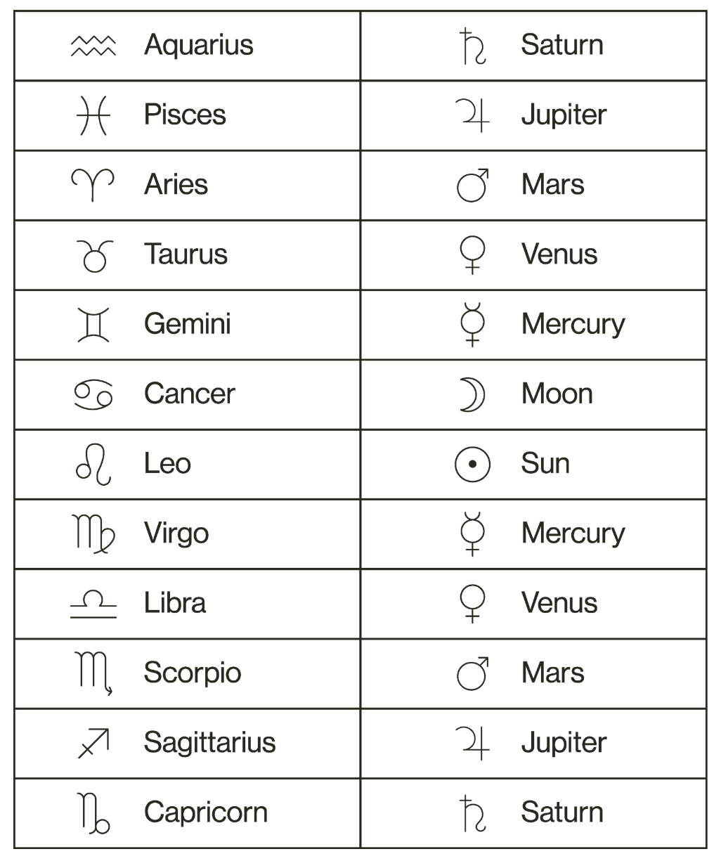
Once we know our rising sign, we can look through our chart and ask, where is the ruling planer? What sign is it in? This gives us much needed context to how your Rising wants to express itself.
For example, I’m a Leo Rising, so my Ascendant is ruled by the Sun. My Sun is in the sign of Capricorn, therefore my visual branding will have the energy of both Leo and Capricorn, you see?
Now let’s imagine two people that have Scorpio as their Ascendant instead. One has their Mars in Leo while the other has Mars in Gemini. The Mars in Leo person might express the natural depth and intensity of Scorpio more expressively and dramatically. Their brand could feel bold, highly personal, even theatrical. While the Mars in Gemini person could take those exact same Scorpio qualities and express them in a more playful, curious or eclectic way. They both have the same Scorpio Ascendant but created completely different brand universes.
Let’s forget about what’s trending or what’s working for the “biggest” names in your industry (seriously) and instead reflect on these questions from the lens of your own chart:
What would someone assume or feel about your brand before reading a single word of your copy?
Does your current branding look like you, or does it look like what is expected in your industry?
If your brand were a physical space, how would like for someone to feel when they walked inside?
Where is the ruler of your Ascendant, and what additional qualities does that sign bring into your visual identity? Can you easily identify them in your current branding?
Much like a good outfit, the best visual identities work because they don’t feel like a costume you’ve put on or a mask that makes you more enticing to who you think you want to work with. The best visual identities feel lived-in, and coherent with the energy you naturally carry. So when you meet the person behind the brand, you can’t shake the feeling that you’ve already met them before, because, through their visual branding, you already have.
Creating or expanding your visual universe becomes wayy easier when you’re no longer asking yourself how you should appear and instead begin paying attention to how you naturally do.
Here’s how I would begin translating each Ascendant into a visual brand universe:
Aries Rising
The real magic for you, Aries Rising, lies in strong visual decisions, bold typography and color usage, and a sense of self-assured movement. Aries doesn’t need a bunch of decorative elements to make an impression, it needs one strong concept or idea that is executed with confidence and that you stay consistent with.
Comments
Nothing yet. Say the first thing.
Sign in to join the conversation.