
Few things fill my creative cup as quickly as a trip to Miami. I might be biased because I grew up in South Florida, but I really do think there is something magical about that city. It’s loud in every sense of the word. It’s colorful. It’s hot and sticky, and the humidity cures any woes I have in the blink of an eye. My love for color stems from growing up in Florida, so you bet I was collecting color combinations like it was my job while I was down there recently!
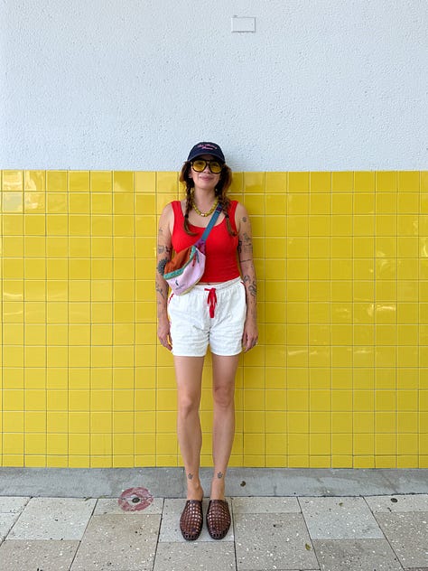
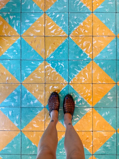

While the number of well-designed hotels in Miami is infinite, my favorite place to come back to is the Esmé Hotel in South Beach. It’s a design lover’s paradise and feels more like a tiny peaceful village than the chaotic party you might picture when you think of South Beach. The hotel spans a few different buildings, and each one has its own personality while still feeling like part of the same family. Every corner of this place is a color lesson, so I’m walking you through my favorite combos from the space and exactly where I found them.

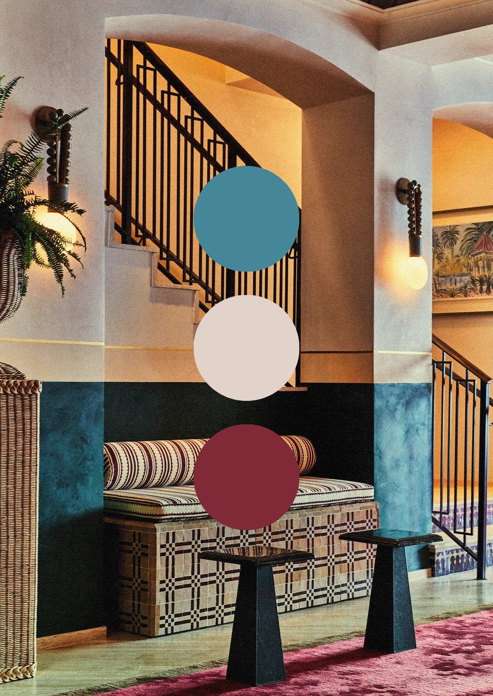
Never underestimate the power of a neutral. Teal and burgundy are already strong on their own, but set them against cream and they get bolder by comparison. That’s the whole trick! This corner is the entryway to the hotel, and as you move deeper in, things get moodier.
Steal the look if: You want your entryway to set a mood without giving away the whole story.
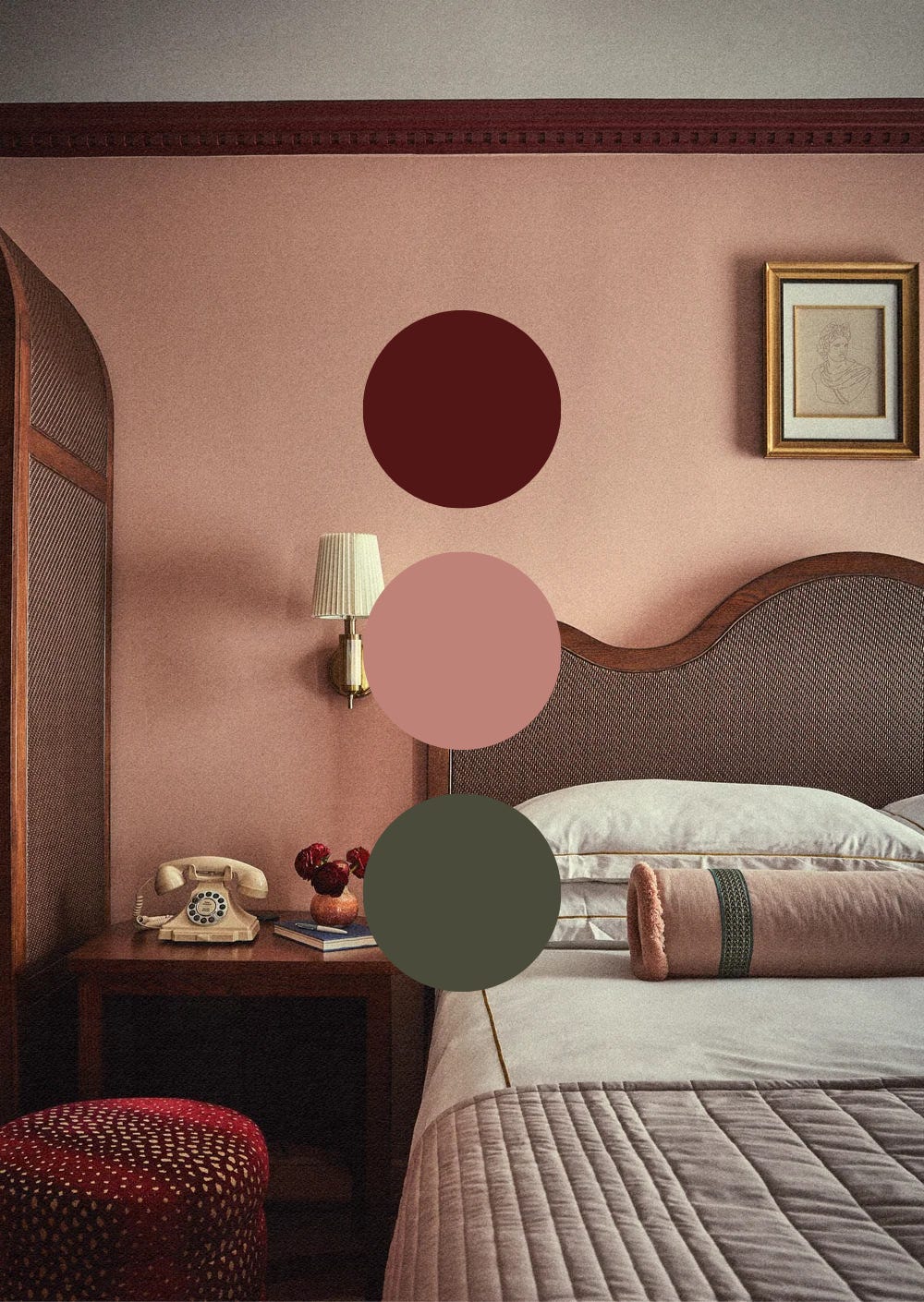
This bedroom palette is calm, but I find it the furthest thing from boring. That’s the oxblood’s doing. It pushes right up against all that blush and gives the wood and rattan something to argue with. The pop of green also keeps things from falling too much in the pink family. And unrelated to color, but related to shape, notice the work the curved furniture and headboard do here.
Steal the look if: You want your bedroom to feel romantic without turning it into a Valentine’s cliché.
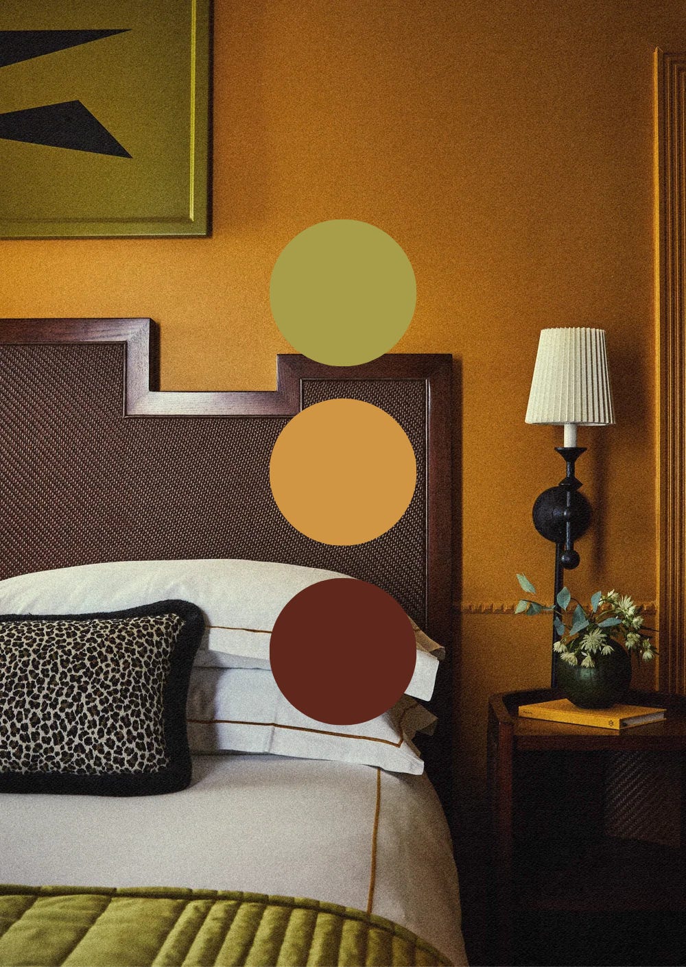
Nature is the ultimate inspiration for color combos, and this room reminds me of one of my favorite plants: the Bird of Paradise. The only thing missing is a tiny spark of purple! Whenever a palette leans this saturated, I like to ground it with something warm like the brown doing the job here.
Steal the look if: You’re drawn to bold color but want your bedroom to feel grounded.
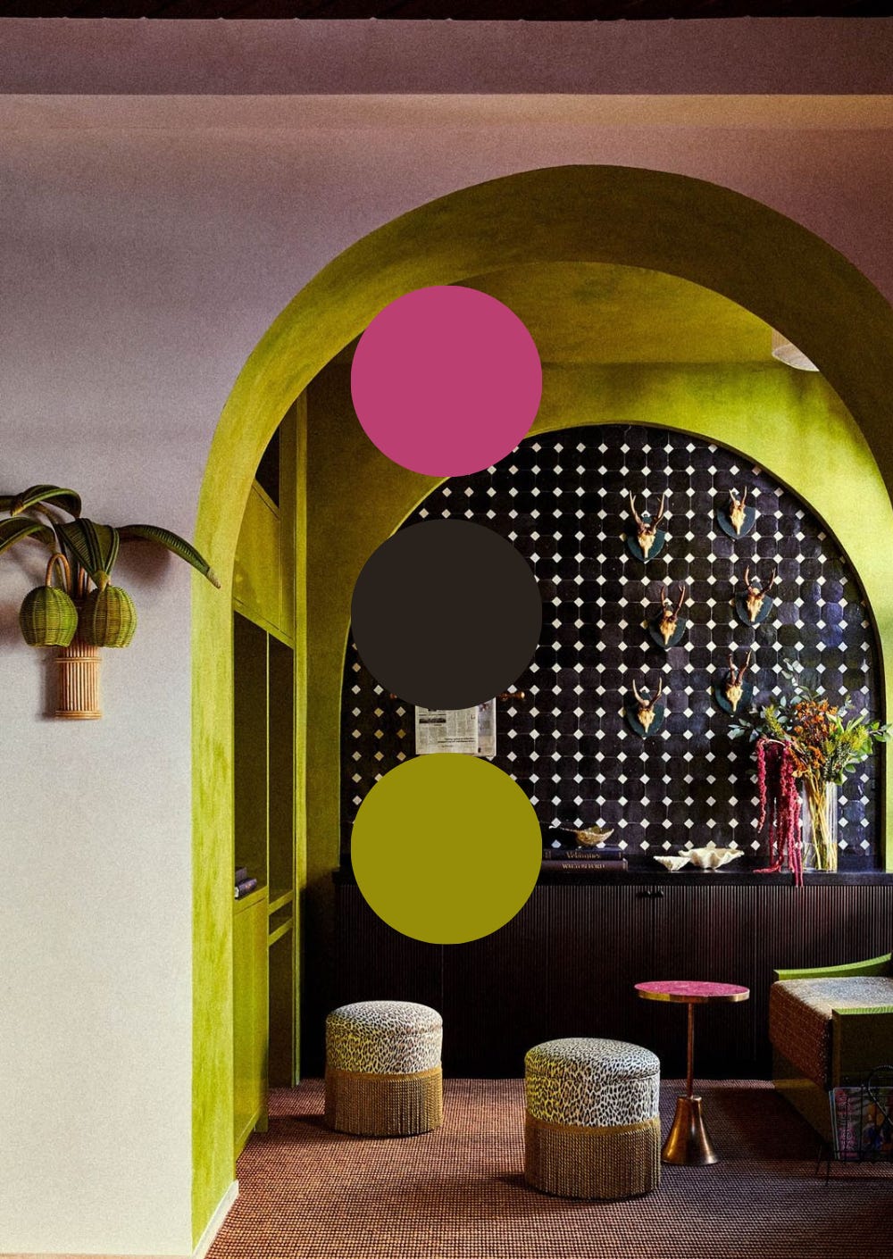
I’m obviously drawn to the vibrancy of the chartreuse and pink here, but black is the one doing the real work. It elevates the overall feel of the palette. Remove the black, and you’re looking at watermelon. Fruity, fun, but not as sexy or dramatic as what we see here!
Steal the look if: You want the theatrics. If you’ve got a dark or moody surface in a room, it earns you permission to go bold elsewhere.
If there’s one thing this trip confirmed, it’s that bold color is never too risky a thing. At least in my book!
🧡 Daniela

I’m currently booking interior design projects, from full-service interior design to focused color and design consultations. If you have a space that’s ready for a real transformation, I’d love to hear about it. Get in touch directly!
P.S. Don’t forget that The Color Shop is always open with other suggestions on how to bring color home.
Comments
Nothing yet. Say the first thing.
Sign in to join the conversation.