
Investors,
Before we begin with this 4th edition of the monthly chart request series, where premium members ask me to analyze the individual assets that are most important to them, I want to talk about Bitcoin…
Specifically, a new momentum thrust signal flashed that you need to be aware of.
I don’t care if you’re bearish or bullish on the asset, if you hate it or if you love it…
You need to see this.
The chart below shows Bitcoin with weekly candles and the 1-week rate of change indicator, highlighting each case where Bitcoin has gained at least +20% in a week.
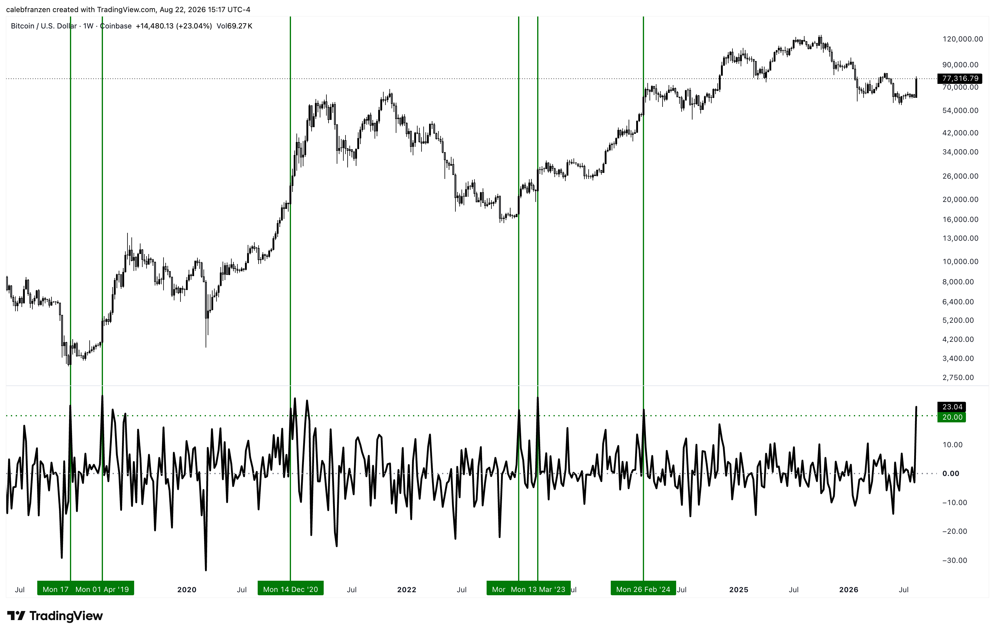
Since Q4 2018, this signal has occurred a total of 6 times, with the 7th flashing now.
Particularly in the context of a bear market, this momentum thrust initiated the bull markets going into 2019 and 2023… and it’s flashing now for the first time since 2024.
Yes, the signal in February 2024 “failed” because it was followed by multiple months of consolidation with a peak to trough drawdown of -33.57%… but an investor who bought that signal in real-time “only” experienced a drawdown of -22.3% and was up +49% exactly one year later.
So did it really fail?
Particularly given the clear success of the signal in other cases?
On average for these 6 cases, this signal has produced a 6-month return of +51.28%
On average for these 6 cases, this signal has produced a 1-year return of +85.4%
That’s not something I want to fade…
But this is what I do with Cubic Analytics: I give you the exact data and research that I’m using to literally make investment decisions in my own personal portfolio.
I can’t tell you exactly what you should do.
I can’t sit there and click buy & sell for you.
I can’t manage your risk or build your convictions.
But I can teach you exactly how I use data to my advantage, put my money where my mouth is, and be fully transparent with how I’m actively making decisions based on my own analysis.
That’s why I bought the breakout above the 200-day MA cloud on Thursday night.
Just look at the data…
The “beachball underwater” setups are a thing of beauty!
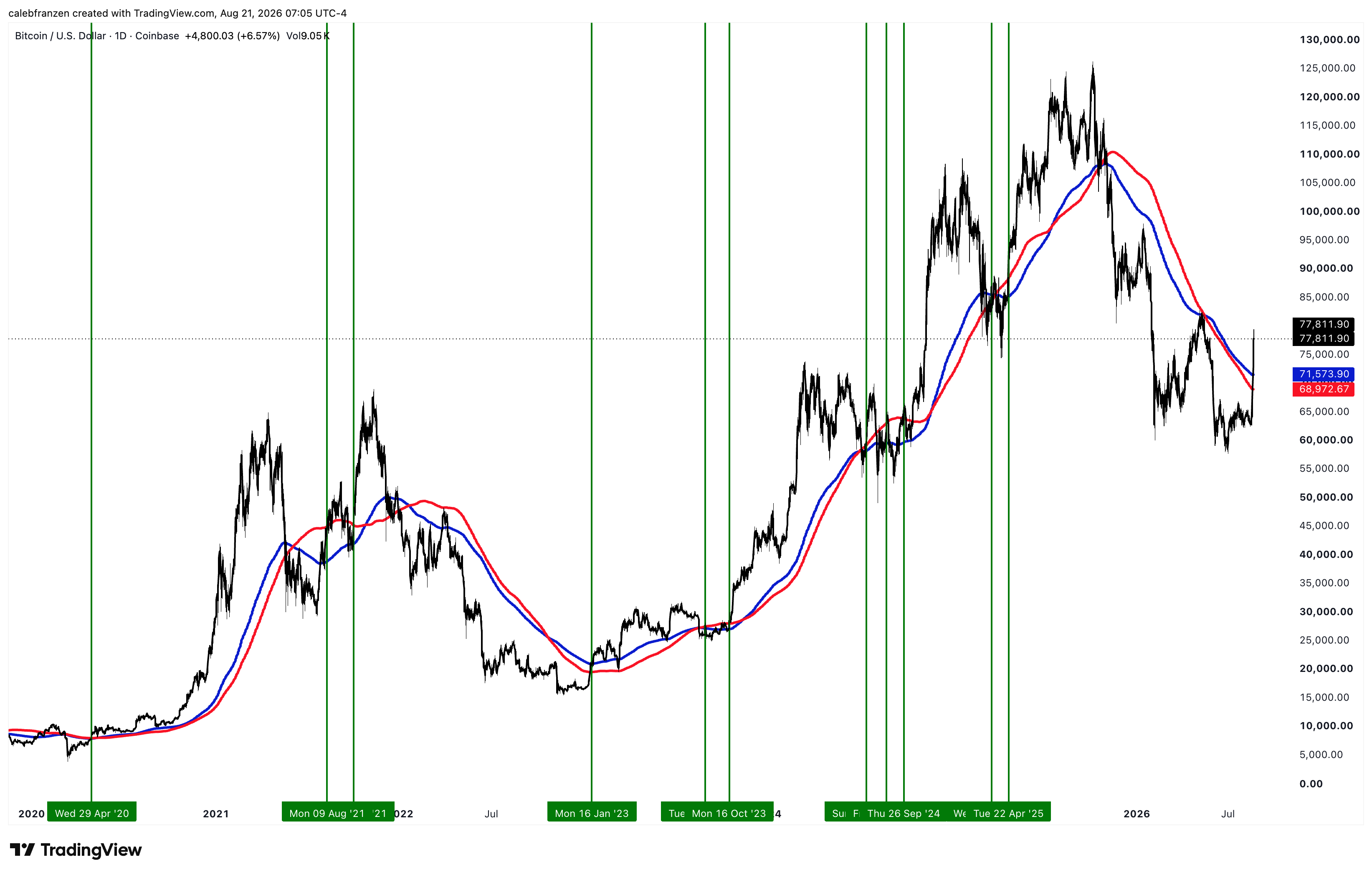
Are they perfect? Absolutely not.
Do they put odds in my favor as a buyer? Absolutely!
The moment you accept that there are no guarantees in the market, the sooner you realize that a slight improvement in the odds is the best you can do, particularly when you can identify a confluence of indicators that are working in the same direction.
That’s enough about Bitcoin… for this report.
Let’s get started with this chart request…
Premium members submitted 120+ tickers in the past 24 hours, and I’ve analyzed every single one of them in order to prepare this deck with my favorite charts.
I’m sharing unfiltered analysis on 78 different assets in this report, including Google, Nvidia, Tesla, Palantir, gold, HIMS, ORCL, Solana, Chainlink, SUI, and many others.
A few things before we begin:
This report is long and contains a lot of charts, which means that you won’t be able to view the entire analysis natively within your email. Please go directly to the Substack app if you’re on mobile/tablet, or directly to the Cubic Analytics website and find this report.
The assets that I analyzed are presented in alphabetical order, by the name of the company, commodity, ETF, or cryptocurrency. For example, Alphabet ($GOOGL) will be listed as one of the first in the report, under the A’s.
All charts are in daily candles, unless explicitly stated otherwise.
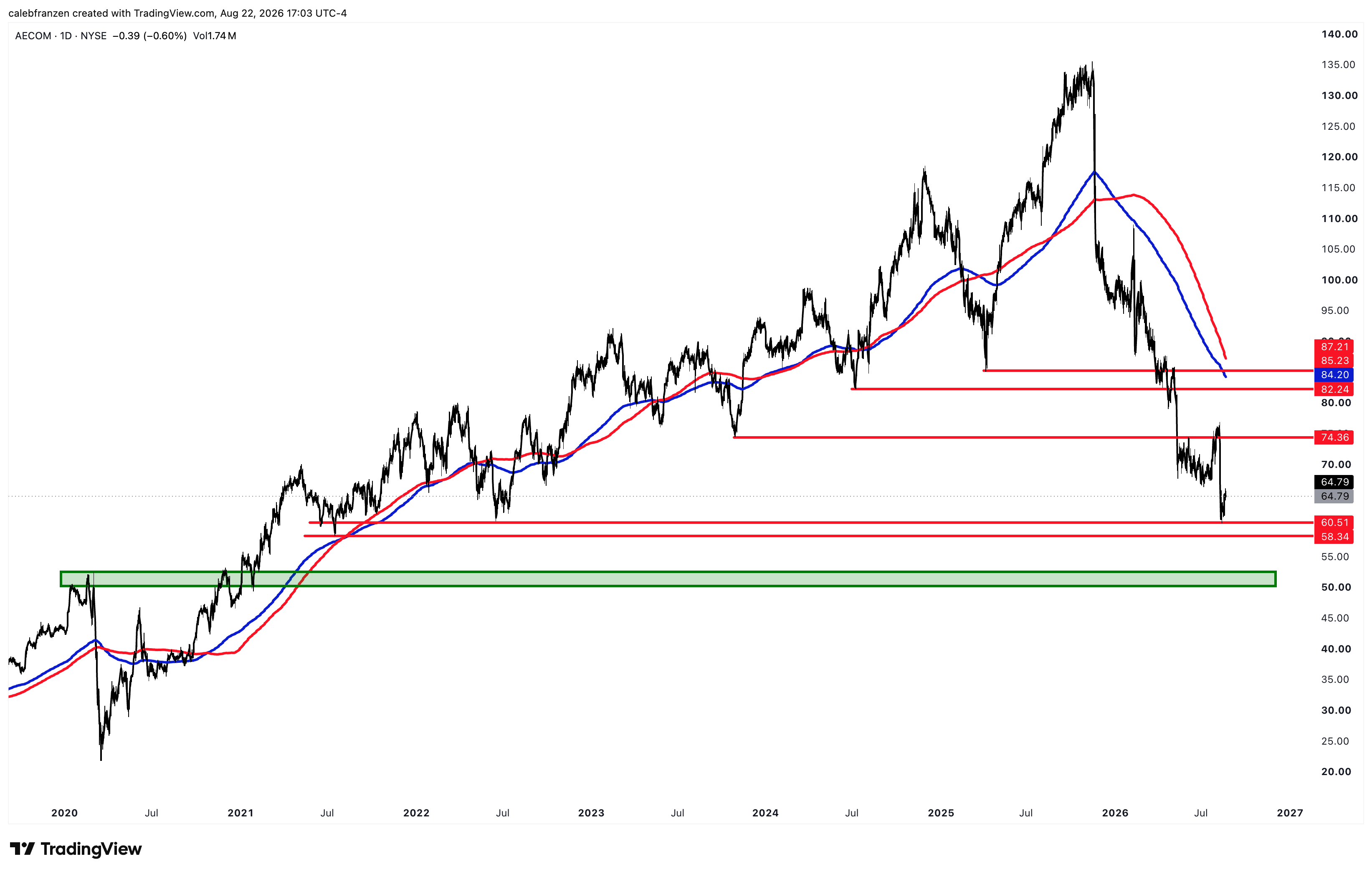
This one has cut through every potential support level like a hot knife through butter, so I think this next one will likely fail also and I’d be patient to wait to buy until a retest of the pre-COVID highs (green). But the point is… any level on this chart is like trying to catch a falling knife, as currently constructed.
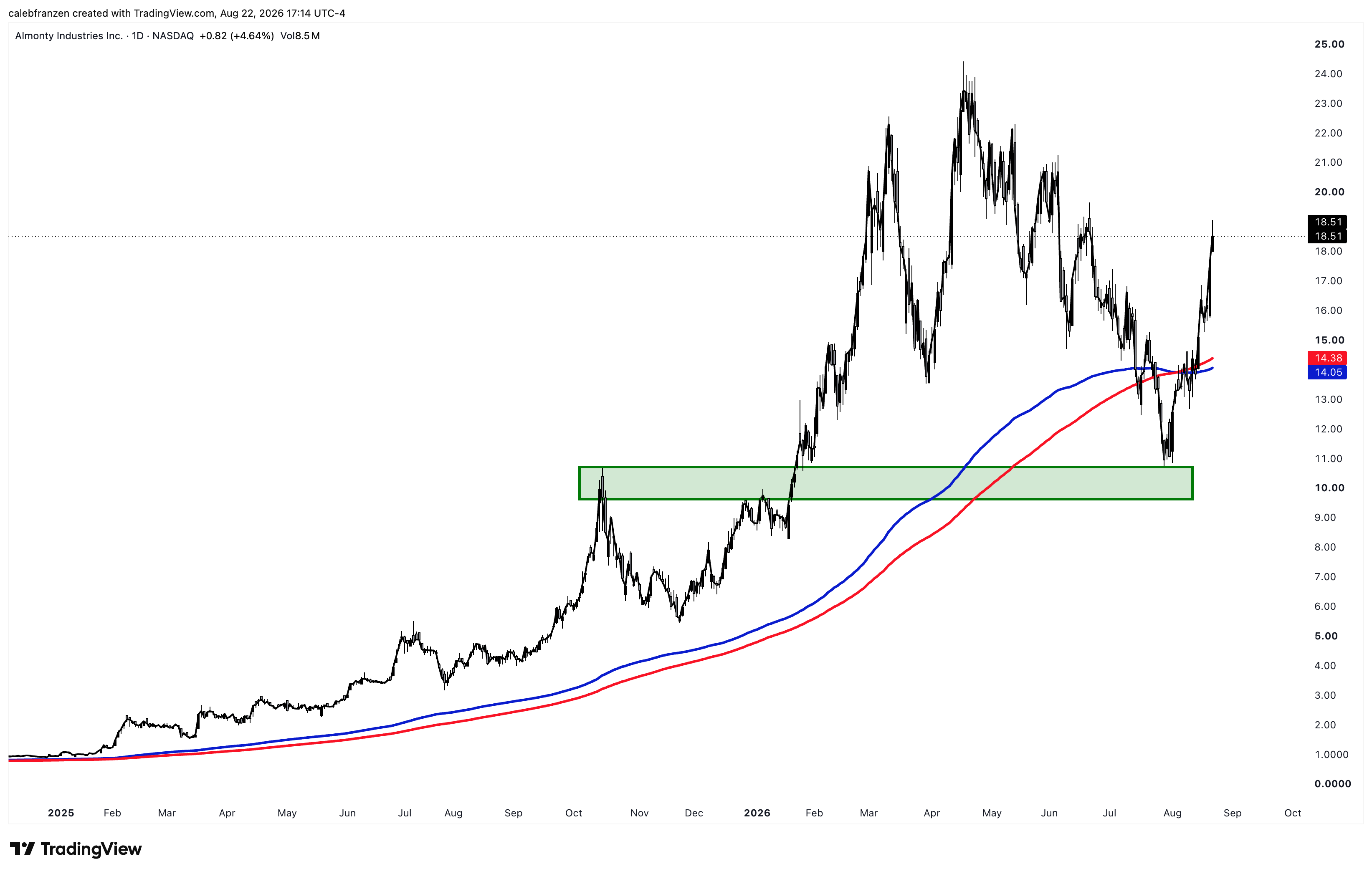
The last time we talked about this one, I said to wait for the “breakout, retest, rebound” setup… look how nicely that worked out. That’s a +73% gain since retesting that buy zone! Imagine fading Cubic Analytics.
Comments
Nothing yet. Say the first thing.
Sign in to join the conversation.