

This issue sees us revisit some slider demos built earlier this year. Some of these were then presented at Figma Config 2024. A major theme of that talk was leaning on web platform primitives to do the work for us.
These recently ended up doing the rounds again so let's dig into how it works.
My brain works in a way that wherever the scrolling happens, there's a constant question of "How would I make that?" and "Could I do it with this?".
So how would you go about implementing this design from Malay?
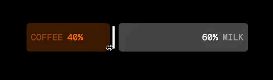
This is what I put together for reference.
If you said, "Start with an HTML input of type 'range'", that's a great start.
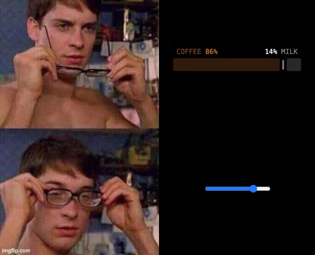
Where do you go next? The difference in approaches from looking around the web surprises me. But more often than not, there are divs involved and sometimes an input hidden somewhere. That input is usually hidden and only made available to a screen reader. Then it's the job of the divs and some well-placed interaction logic to let you interact with it. And those interactions will likely keep that input in sync at some point.
You could say the "historical" approach might be to throw some JavaScript at it.
When you think about the issue, it's applying styles to a primitive input. The underlying mechanism works fine (Albeit with some quirks). We only want to create a new style for it. So instead flip your thinking to "What does my CSS need to make this happen?". In this case, it only cares about the value of the input. Give your CSS that and let it handle the rest.
Let’s assume we start by wrapping an input and its label.
<div class="slider">
  <label class="sr-only" for="slider">Some label</label>
  <input
    type="range"
    id="slider"
    min="0"
    max="100"
    step="1"
    value="25"
    tabindex="0"
  />
</div>
Note the explicit tabindex for Safari.
The easiest way to pass a value to CSS? Use a custom property with a little JavaScript.
const slider = document.querySelector('.slider')
const input = slider.querySelector('input')
const update = () => {
  slider.style.setProperty('--slider-complete', input.value)
}
input.addEventListener('input', update)
But you might not need that. You could wrap it in one of these:
if (
  !CSS.supports(
    '(animation-timeline: scroll()) and (animation-range: 0 100%)'
  )
) {
  // syncing code
}
That's because you can use the CSS scroll-driven animations API to get the value of your input. What?! Yeah. Attach a view timeline to the range thumb and then animate a custom property using that timeline.
@property --slider-complete {
  initial-value: 0;
  inherits: true;
  syntax: '<integer>';
}
@supports (animation-timeline: scroll()) and (animation-range: 0 100%) {
  .slider {
    timeline-scope: --thumb;
    animation: progress reverse both linear;
    animation-timeline: --thumb;
    animation-range: contain;
  }
  @keyframes progress {
    to {
      --slider-complete: 100;
    }
  }
  .slider input {
    overflow: hidden;
  }
  .slider ::-webkit-slider-thumb {
    view-timeline: --thumb inline;
  }
}
The gist is this:
Set
overflow: hiddenon the inputCreate an inline axis
view-timelineon::-webkit-slider-thumbHoist its visibility with
timeline-scopeAnimate a defined custom property from 0 to 100 using the
view-timelineStyle whatever you want within the parent
Profit (makes sense, right?)
In this example, we can take the value and use it within a counter to show the updating value (Demo link)
.slider::after {
  counter-set: progress var(--slider-complete);
  content: 'Debug: ' counter(progress);
}
You could even do something like have a dynamic accent-color:
.slider input {
  accent-color: hsl(var(--slider-complete) 70% 65%);
}
Some of you might have noticed that the above JavaScript version isn't gonna hold out. Our scroll animation tracks the progress of the thumb from 0 to 100. But our JavaScript passes through the input value. What if we have a different min? max? step? We need to account for it.
A rudimentary but perhaps overkill starting point:
if (
  !CSS.supports(
    '(animation-timeline: view()) and (animation-range: 0 100%)'
  )
) {
  class Slider {
    constructor(element) {
      const input = element.querySelector('[type=range]')
      const sync = () => {
        const val = (input.value - input.min) / (input.max - input.min)
        element.style.setProperty('--slider-complete',
          Math.round(val * 100))
      }
      console.info('polyfilling scroll animation for input:', element)
      input.addEventListener('input', sync)
      // on iOS, you'll also want to cater for starting an interaction
      input.addEventListener('pointerdown', sync)
      sync()
    }
  }
  const sliders = document.querySelectorAll('.slider')
  for (const slider of sliders) new Slider(slider)
}
Note that if you're going to use CSS to show the current value, test it against the input value too. Especially if you're adjusting the available range.
Now you’ve got the mechanism in place, you can focus on the fun stuff, styling it up. You’re free to do whatever you can imagine now you have the value.
Here’s some HTML, you could use:
<label for="slider">Volume</label>
<div class="slider">
  <div class="slider__track">
    <input type="range" id="slider" min="0" max="100" step="1" />
    <div class="slider__fill"></div>
    <div class="slider__indicator"></div>
  </div>
</div>
This will come down to your design though. For example, you might want to do something fun with the label. You could introduce new elements that are aria-hidden for this. Then hide the real label making it still available to screen readers.
Here’s a basic styled “Slider” (Demo link):
You want to fill in the track and move the handle as the value changes. To move the handle you need the width of the slider. You could be explicit here and pass down a custom property for that. You could also use container query units.
.slider__indicator {
  translate: calc((var(--slider-complete) * 1cqi) - 50%) -50%;
}
.slider__fill::after {
  translate: calc(var(--slider-complete) * 1cqi) 0%;
}
Same for the fill. The fill is a pseudoelement that translates across.
Remember earlier when we mentioned solutions hiding the input? They tend to backfill the interaction on other elements. For our technique though, we can style the underlying input to increase the touch target of the input.
.slider {
  /* use these values on the track and elsewhere */
  --height: 2rem;
  --width: 400px;
}
.slider input {
  height: 100%;
  width: 100%;
}
.slider ::-webkit-slider-thumb {
  width: var(--height);
  height: var(--height);
}
That way we keep all the interactivity from the underlying input. And without having to rebuild the basics ourselves.
One last nice touch. Use grab hands where you can.
.slider [type='range']:hover {
  cursor: grab;
}
.slider [type='range']:active {
  cursor: grabbing;
}
Now you know the mechanics. Our Coffee & Milk slider doesn't seem so bad, right? It's the same underlying technique with two visual labels that update.
For them, we can use CSS counters and some Math.
.slider__label {
  counter-set: low var(--value) high calc(100 - var(--value));
}
.slider__label::before {
  color: hsl(24 74% 54%);
  content: 'COFFEE ' counter(low) '%';
  left: 0.5rem;
}
You might make these aria-hidden and then hide a real label that might say something like “Coffee to Milk Ratio (%)”.
The track is interesting because you can build it as one long piece with different colored ends. Leave a gap in the middle for the handle. Then translate it within a clipped container. Alternatively, you could transition the width of the two pieces and the position of the handle.
There is one ugly part. The way we change the height of the track. That's hard-coded into a keyframe using an extra custom property.
.slider {
  animation: sync reverse, shift;
  animation-timing-function: linear;
  animation-fill-mode: both;
  animation-timeline: --thumb;
  animation-range: contain;
}
.slider__label {
  translate: 0 calc(var(--shift) * 50%);
}
.slider__track {
  height: calc(50% + (var(--shift) * 50%));
}
@keyframes shift {
  0%,
  31%,
  61%,
  100% {
    --shift: 0;
  }
  32%,
  60% {
    --shift: 1;
  }
}
You could likely do something with the value using clamp or some of the newer CSS Math features available now.
That's how you take a range input and turn it into a Coffee slider. Where else could you take it though?
How about these iOS-style vertical sliders?
These are a little trickier and involve vertical orientation. You might think to use a transform and rotate the inputs. But that only gets you so far as you'll encounter issues with touch on a device. Instead, tell the browser these are vertical using writing-mode and direction. That will also mean reverting your view-timeline to block axis and no longer reversing the animation.
.slider {
  timeline-scope: --thumb;
  animation: sync both linear;
  animation-timeline: --thumb;
  animation-range: contain;
}
.slider [type='range']::-webkit-slider-thumb {
  view-timeline-name: --thumb;
}
.slider [type='range'] {
  writing-mode: vertical-lr;
  direction: rtl;
  -webkit-appearance: slider-vertical;
}
The icons for each slider morph based on clamping our --slider-complete value. Then use that to transform the SVG. Remember to use transform-box: fill-box on your SVG.
The cool part here is the little overstretch bounce.
You can achieve that with a little JavaScript. Track the pointer position when dragging the slider and calculate the overshoot. Depending on the direction you go, adjust the transform-origin. And the last piece is to update a --stretch value that we use to scale the track.
.slider__track {
  scale: calc(
    1 - (clamp(0, var(--stretch), 1) * (var(--stretch-ratio) * 0.5))
  )
  calc(1 + (clamp(0, var(--stretch), 1) * var(--stretch-ratio)));
}
And then there's this example.
But this could be a whole article in itself. The point is that it's all powered by that one trick of grabbing the --slider-complete value. This one leans into 3D transforms, some trigonometry, and the fact you have Math.round in CSS now!
Demo Link: codepen.io/jh3y
Comments
Nothing yet. Say the first thing.
Sign in to join the conversation.