
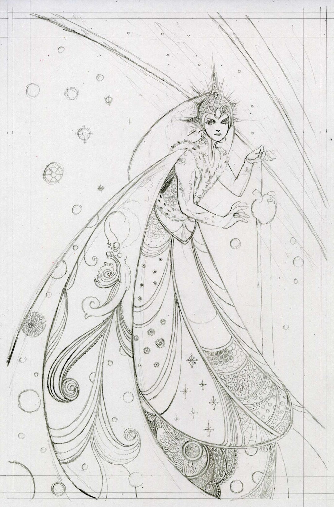
While this book has run through it’s 8th (I think) printing at our original publisher, it is now out of print. But I bought out the remaining inventory and if you are interested, you can get it direct from me at this link.
This was a very, very dark tale that I adapted from the well known short story.
Below, the original thumbnails. Marker on paper.
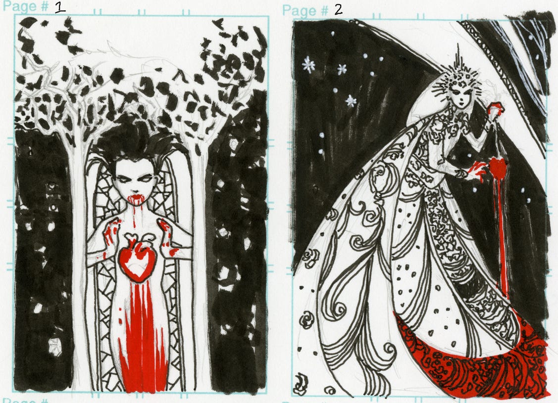
I really like the one on the left, too and did a version of it that’s somewhere lost in my files.
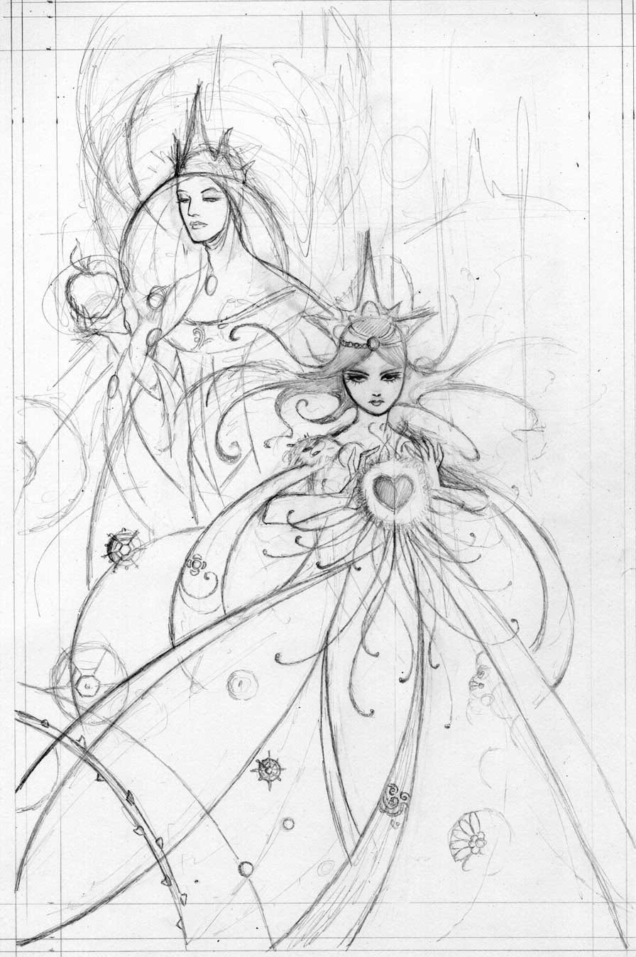
I did these sketches after my first idea for the cover (below) was wisely rejected as looking too much like a kid’s book.
After submitting the prelim drawing shown at the top of this post, I went straight to ink.
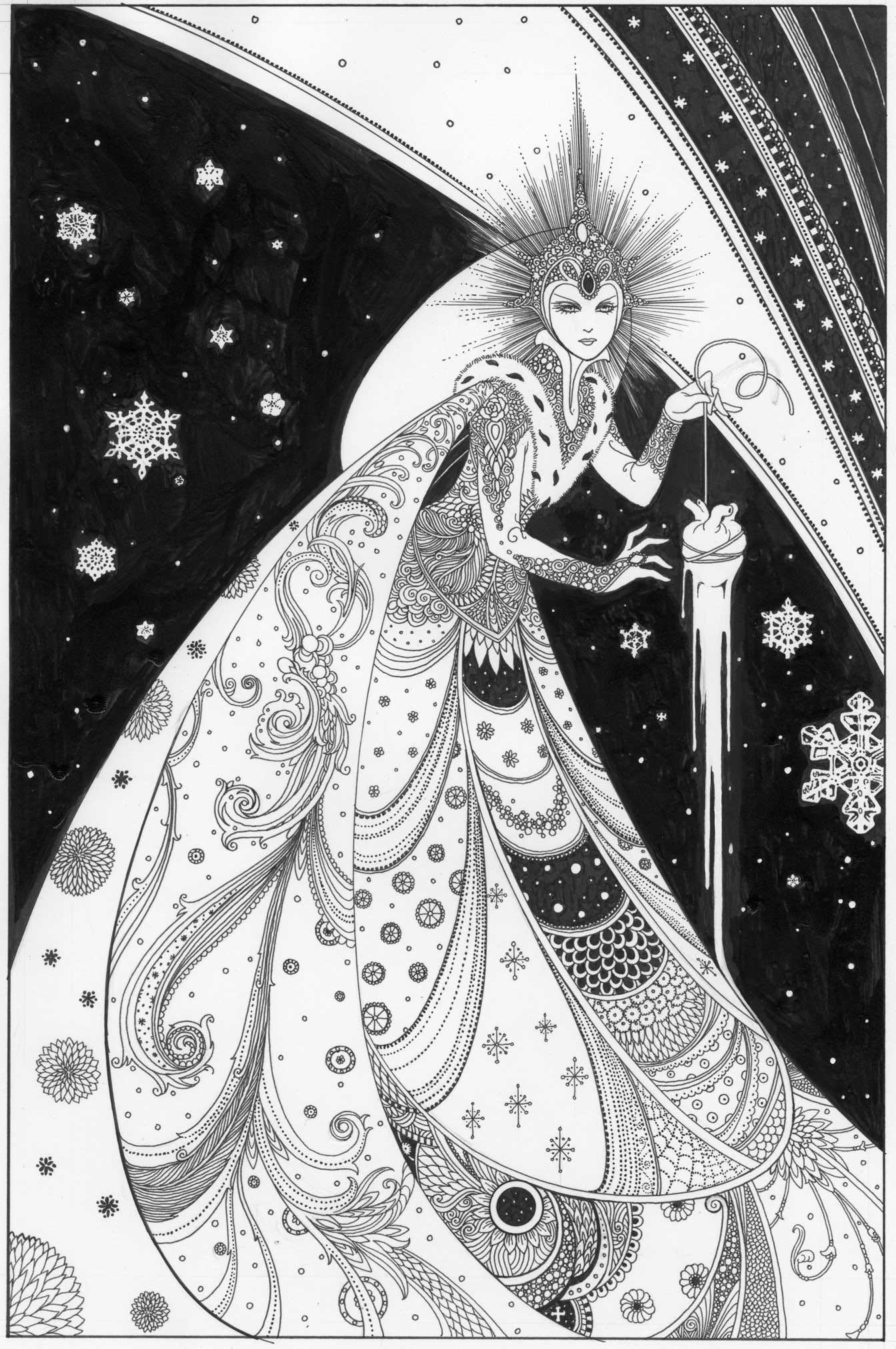
Raw black and white scan of the original, hand drawn art. I added more black digitally. Spotting blacks by hand on art like this is extremely tedious and time consuming, and there are several places in the book where large areas were dropped in using the paint bucket tool. I try to do them all by hand, but I had to cut a few corners as time got tight. I spotted blacks later by hand.
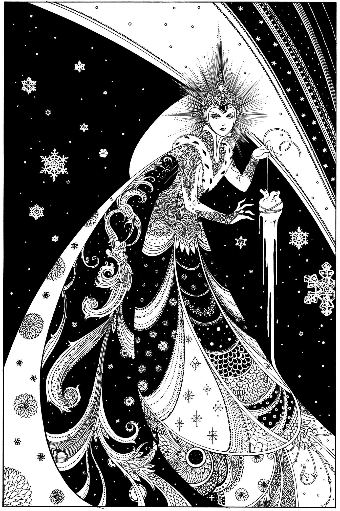
Final black and white art with digital clean up.
Color begins. My first thought was to make it look as if the art was drawn on parchment, so I scanned in a piece of parchment and started coloring.
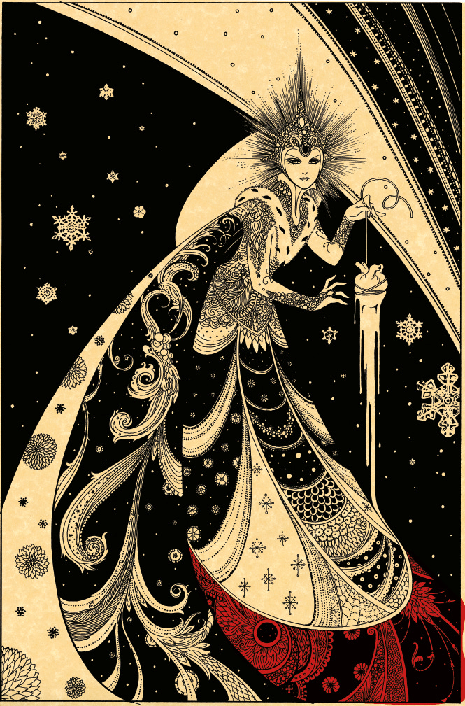
All color is digital.
The parchment is too yellow, so I lightened it and kept going.
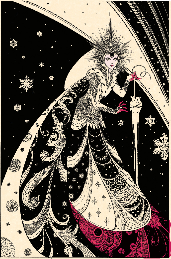
I tried changing the red to magenta, but am not at all happy with this approach. I throw out the parchment layer.
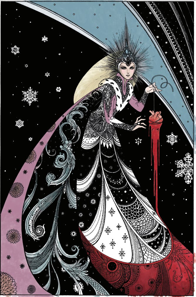
Now we’re getting somewhere. I make a screen shot of this and send it to Neil Gaiman and our editor Daniel Chabon to see if this approach works for them.
It does.
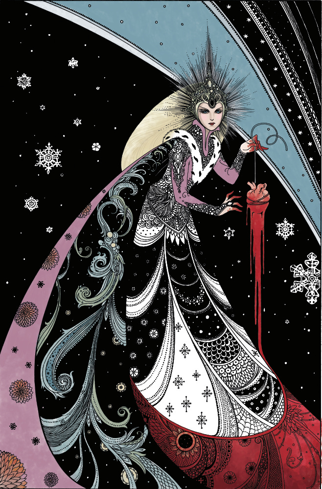
Coloring on the face is too harsh, and Mr. Gaiman wisely pointed out I need to stay away from Photo-shoppy styles, so I soften the face.
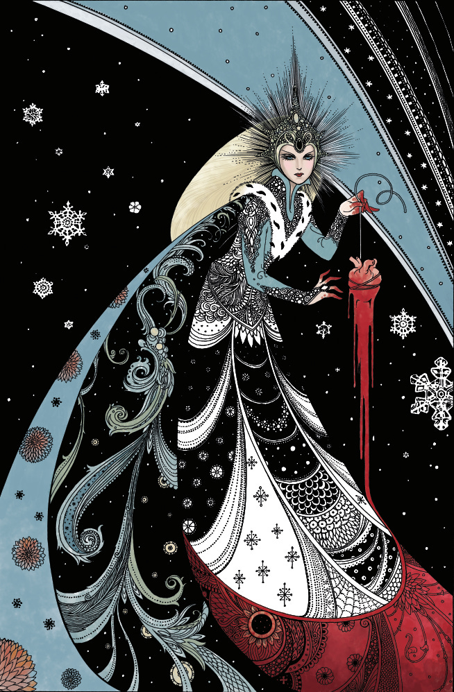
I let the art percolate for a day, and realize blue should dominate the color scheme. So I switch out the color on the cape.
It was while working on this piece that I finally learned how to properly use some of Photoshop’s tools for adjusting color. It wasn’t until the end of the color on the Troll Bridge graphic novel that I even began to use these tools: I ended up recoloring entire areas, which was a crazy time sink. I love being able to move a slider from side to side to get where I want to go with color. I try to be careful about putting elements of color on correct layers so I can do this as I go. One color on the wrong layer can end up being a pain, and since I am using transparent colors and I didn’t know about flatting when I started doing this book, it was hard to make selections.
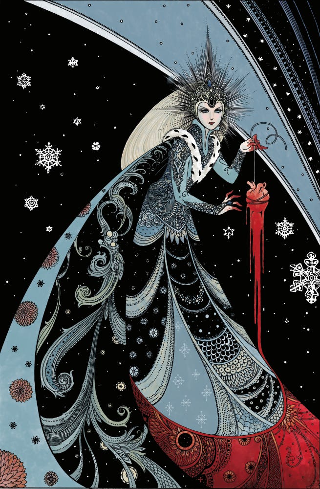
Almost done at this juncture. I start adding a touch of yellow to the skirt.
I like leaving the painted areas imprecise and watercolor-like. It looks natural and hand painted.
Still tweaking the color. Can’t decide if the flowers on the cape stand out too much. So using Photoshop’s adjustment tools, I change them to a blue/lavender.
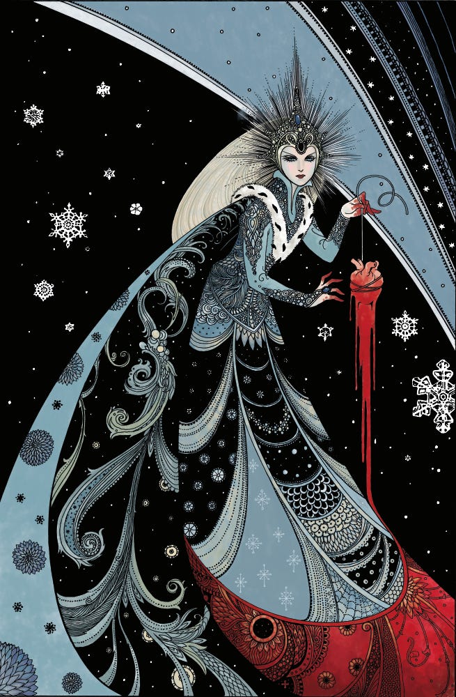
Side by side comparison sent to client and Mr. Gaiman for approvals.
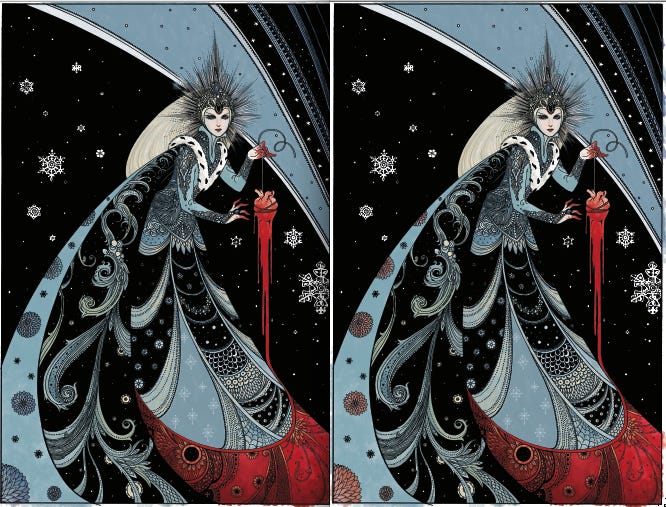
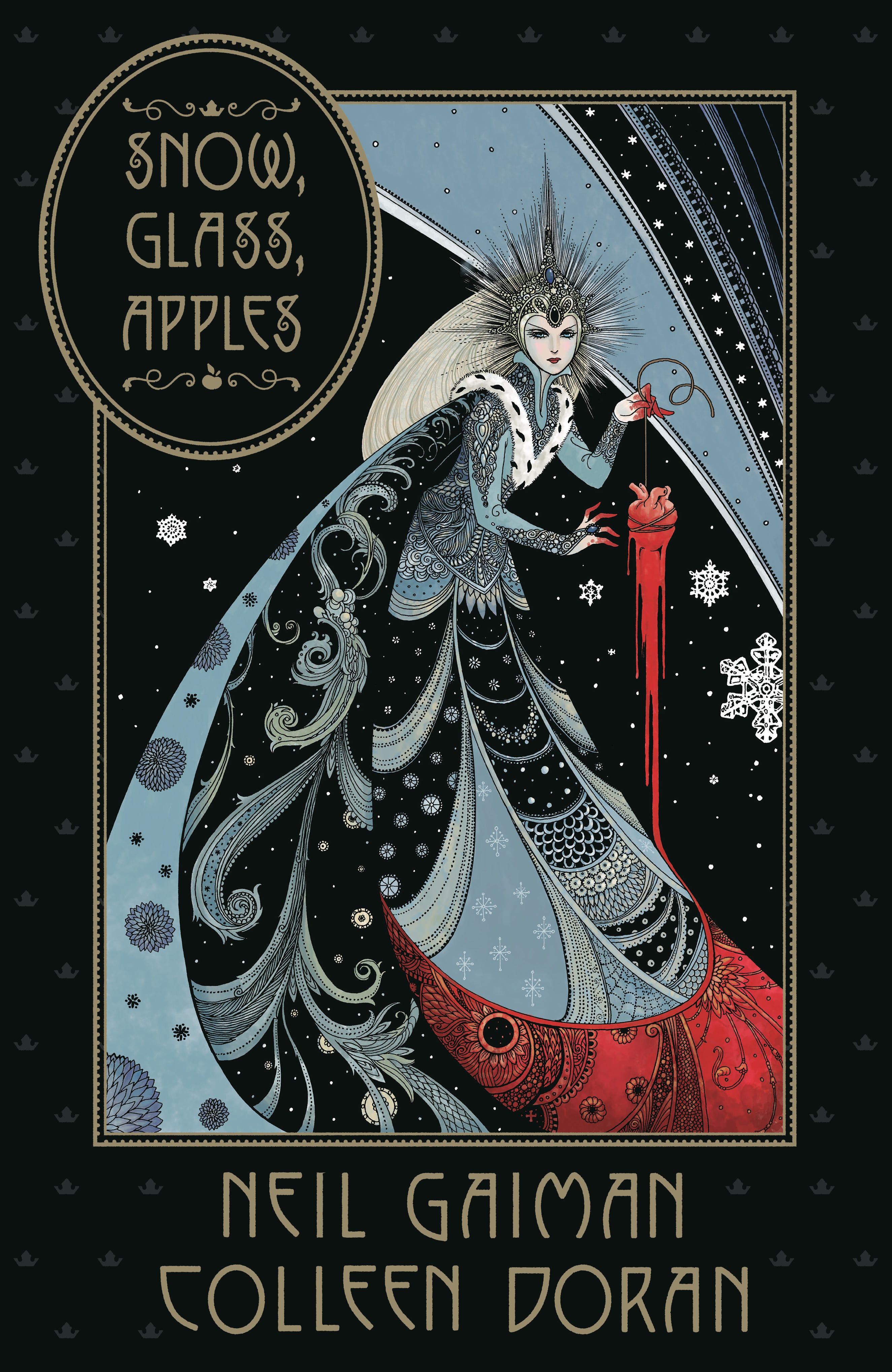
Now the design process begins. In house design team at Dark Horse does the job.
Here’s a look at some of the options Dark Horse sent.
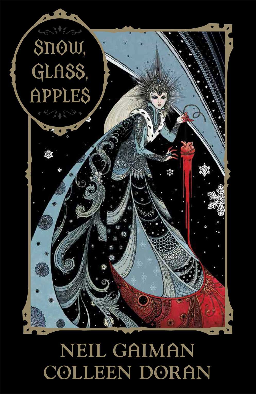
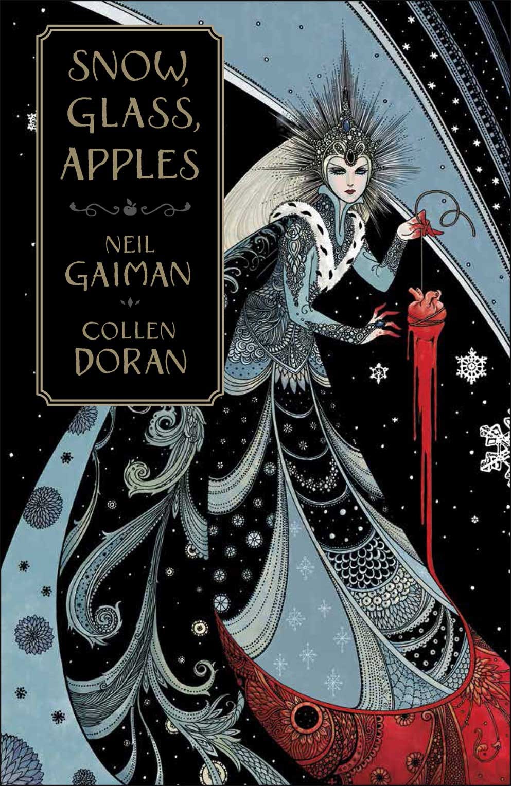
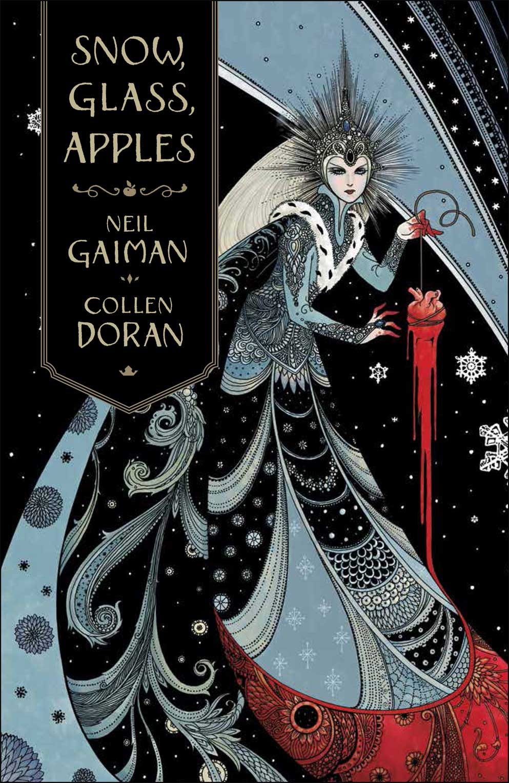
I’m absolutely blown away by the final design. I could not be happier with the job Dark Horse did!
The flatter program saves me around 1-2 hours per page, and over the course of a graphic novel, that can easily be 100 hours of work. Totally worth the few bucks the plug-in might cost you.
Comments
Nothing yet. Say the first thing.
Sign in to join the conversation.