
Note: I’m headed to the Pole Shift with The Ethical Skeptic conference this weekend in the Colorado Springs area. I lived there for a few years more than 50 years ago when my dad was stationed there for the Air Force. It will be meaningful trip both backward and forward in time, all at once. If you’ll be there Saturday/Sunday perhaps I’ll see you there.
I’m still stunned by the genius of Craig Stone’s recent Geodesy work (his chart is in the banner of this post.)
He created an amazing visualization that confirms, in an elegant way, that “something really is different” with respect to the motion of the geographic North Pole in 2026.
It’s a brilliant visual that—in my opinion—belongs in future textbooks for its simplicity, beauty and insight. More about it below.
The thing that grabbed me by the lapels today was this: what inspires us to have original ideas like these? That thought returned me to an article I had written a few years ago about Memetic Injection.
But let’s start here.
In a recent post, I had written about the North Pole—
Using AI, I was able to create a few useful charts at pole.mjttech.com that helped satisfy my own curiosity about the novel motion that is currently happening with the North Pole.
I was inspired to do this by the work of other researchers and titans in this field of inquiry: The Ethical Skeptic, Craig Stone, Tami Camarata, Ben Davidson, and the anonymous genius who goes by ZachariasPro on X.
In particular, I was intrigued by what ZachariasPro has been posting about: the fact that the two components of the “wobble” of the North Pole have dramatically reduced in magnitude in the past few years. Fascinating discovery, that.
His own site can be found at geosyncmonitor.com
I wanted to find a way to see that wobble phenomenon for myself to corroborate his findings, using relatively simple historical chart data while animating it over time to visualize the changes.
The post I wrote a few weeks ago describes HOW I was able to create these charts, without really getting into the question of why. Because that is something that I only started to figure out today.
Why. More on that below.
To set the foundation here: one of the charts that I made was this one, which showed something curious about March of 2026: there were days when the distance that the North Pole moved was the smallest “step length” that had occurred in more than 50 years. The red bars are the days of March in 2026.
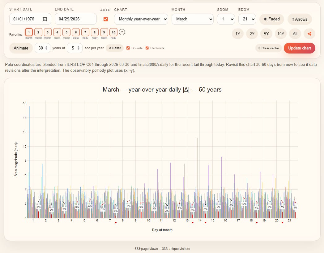
To understand more about the “what”, read that earlier post I wrote. But here’s the gist: in that chart above, the five days of March 2026 with the red dots below them (March 7, 13, 14 and 20) were those days where the distance that the pole moved was smaller than on that same day of March for 50 years.
Why is the pole doing this? The short answer is: nobody really knows, but there are some new theories being proposed by Ethical Skeptic, Ben Davidson, ZachariasPro and Craig Stone that have significant implications for our planet.
That was one element that got me going down this road in the first place: the oddities in the March 2026 polar movement are because of the cessation of polar wobble, as ZachariasPro has been writing and analyzing (much more available from ZachariasPro here, on github).
Anyhow, a few weeks ago, I posted another chart on X from my new tool: I saw something odd in the motion of the pole in the 1999-2000 year when I was flipping through the animation sequences. Later, I saw another similar anomaly in 2005-2006.
I jokingly said “did an arctic penguin knock over the laser level or what” which got a chuckle out of Craig Stone (there are no penguins in the arctic, of course.)
But when he looked at some of my animations that showed some strange “pirouettes” that the North Pole made in certain years, something else clicked for him.

Eric Tilton@cognitivecarbon
What happened to the pole in 1999-2000? Did an arctic penguin knock over the laser level or what

8:55 PM · Mar 25, 2026 · 6.13K Views
2 Replies · 1 Repost · 16 Likes
Craig has been working on this topic for years, has brilliant skills at analysis and presentation, and also has a depth of insight about what it all might mean that is matched by very few on the planet.
He’s been talking on X and writing some papers about “Phase space” for a while, but he suddenly found a brilliant way to make his point understandable to everyone.
You don’t really need to understand everything about this chart below to easily see the obvious point it makes: the data for the yellow line is 2026, and the blue lines represent data for the prior 50+ years.
That is a powerful graphic, in its simplicity.
To explain this chart simply: Craig is graphing something that relates the angular position of the North Pole on any given day (an analogy for angular position: think of the angle ϴ made by the second hand of a clock—relative to, say, 3pm—as it sweeps around in a circle) versus the angular velocity ω : that is, how quickly the clock face’s rim is “swept” past during any given movement of the second hand.
Unlike a watch, whose second hand moves in precisely equal steps (360 degrees in 60 seconds, or about 6 degrees per “tick” of the second hand) the movement of the North Pole is more chaotic; it moves in a roughly circular path that takes sometimes more, and sometimes less than a year to return to its starting position (the same angle ϴ ) and the distance that it moves on any tick (a day, in the case of polar movement data) can vary significantly.
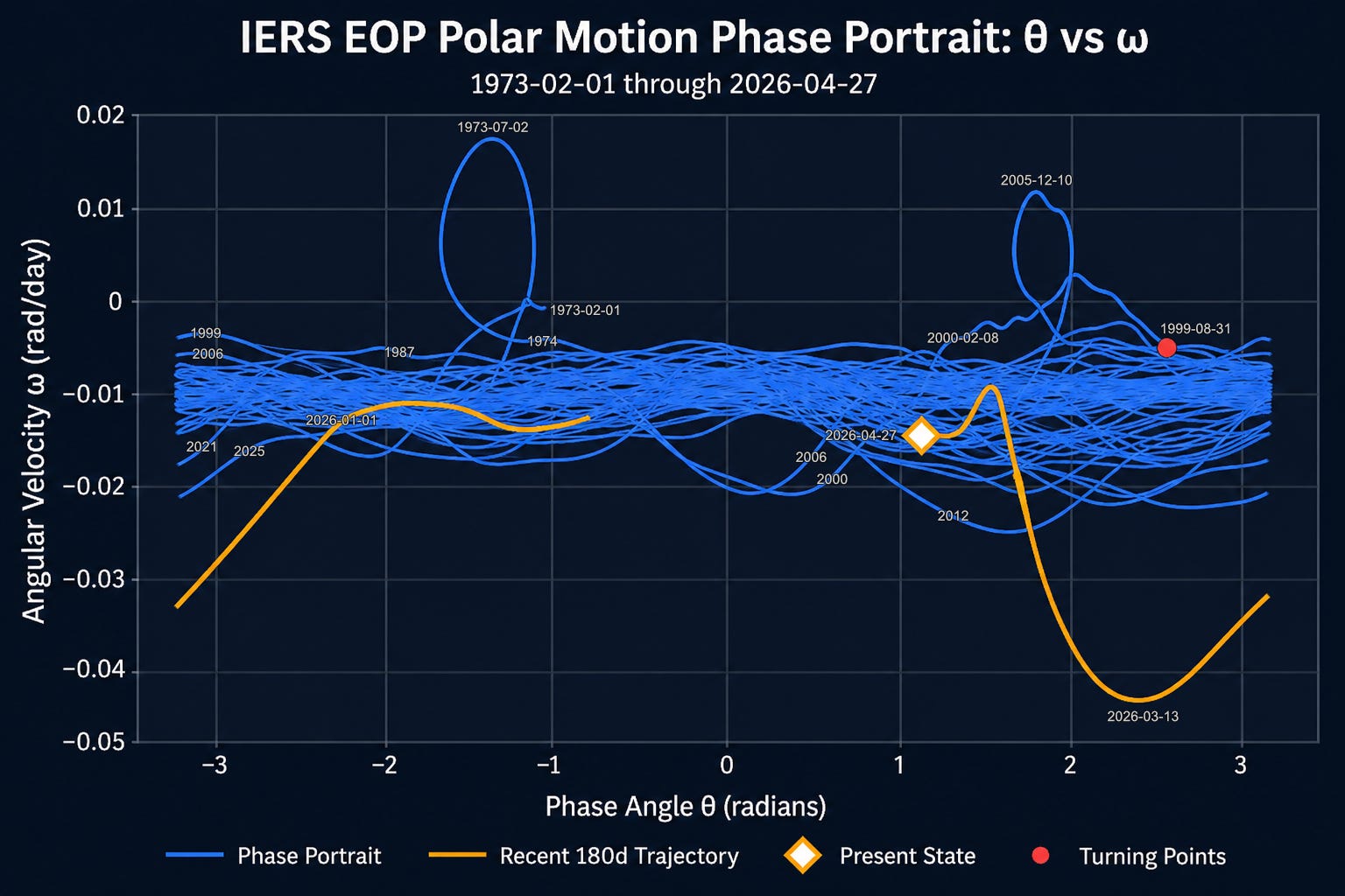
What this chart above shows, roughly speaking, is the varying and sometimes chaotic relationship between the angle and the speed of motion of the geographic North Pole for any given day over 50+ years.
Going back to our watch analogy: if the second hand of a watch moved the way that these squiggles move, you would sometimes see the second hand take more or less than a second before it moved; sometimes you’d see it move “backwards”; and sometimes you’d see the second hand move more or less than 6 degrees per tick.
The brilliant insight Craig has is that it’s sometimes much easier to see what’s going on in “phase space”, rather than coordinates of x, y and time.
Even if you don’t grasp all of this: what we can clearly see is that in March of 2026, the Earth’s North Pole moved in ways that were far outside the ‘usual’ over the prior 50+ years. You can see, too, that there were two other oddities: one in 1973, and one in 2005.
My question to Craig today was this: is 2026 just another anomalous year, after which things will return to “normal”?
Or does it lie far enough outside the expected pattern to be a harbinger of something bigger to come? ZachariasPro has some thoughts about this, so keep an eye on his X channel.
Here was Craig’s feedback about my pole motion charts:

Craig Stone@nobulart
Eric has put together a really neat EOP data exploration tool at pole.mjttech.com. A couple of weeks ago he noticed this little polar motion dance during the 1999/2000 new year period. The 🐧 dance appears in the raw data at the moment of angular acceleration inflection


Eric Tilton @cognitivecarbon
What happened to the pole in 1999-2000? Did an arctic penguin knock over the laser level or what
10:40 AM · Apr 4, 2026 · 7.77K Views
3 Replies · 18 Reposts · 93 Likes
What I realized today is that something that I was inspired to do (create those pole motion animation charts) may also have helped to kindle the tiniest additional spark that helped Craig look at something differently that he’d been studying for quite some time.
And maybe, in a small, subtle way, it helped lead to his breakthrough.
So WHY was I inspired to do what I did—create this web tool and charts? It wasn’t simply curiosity, although that was an element. I didn’t do it to gain any kind of recognition; I’m not an academic researcher in this field. I’m just an armchair nobody with a little talent, time, and inspiration.
Curiosity got me started; but once I had gotten the basic charts working, something else nagged at me: maybe if I animate these charts over time, I’ll see patterns that are hiding in the data.
Which I did, and there were.
Perhaps I was the first to see these patterns in this particular way. But sharing them inspired others.
That drive and inspiration, in my humble view, came from somewhere else: a God nod.
This takes me back several years to a post I had written about the genesis of ideas:
Memetic Injection
·
April 18, 2022

I have several partially-written draft posts that connect in various ways to a “big-idea”topic that I've been grappling with for some time, trying to sort out.
In that post, I mentioned this concept:
What I also want to dive into deeply in a future post is this: what, exactly, is the inspiration for that very first, original (creative) idea? From where—and how—did the very first instance of an idea or creative act actually spring forth?
I didn’t fully develop that idea in any other post: but I believe that genesis of truly novel, new ideas cannot just be due to the random firing of neurons in a slug of brain matter. There is something that comes before: the original inspiration for the animating idea precedes, and is outside of, the brain that conceived it.
I think that this process:
inspiration + curiosity, talent → idea → ignites a spark in another’s mind
… is fundamentally important.
The God whisper — the genesis inspiration — starts it all.
I was inspired to make those charts and animations…because someone else needed them as a nudge to help germinate another set of ideas.
That’s the Why.
Thank you, Craig for that brilliant chart. Hopefully it makes it into future textbooks (if there even will be such things in the world that we are now moving toward.)
As always: my writing is my own, not AI generated. Those em-dashes above are something I’ve always used, long before there was a ChatGPT to abuse them. Genuine content will be increasingly rare in the era of AI-slop: If you appreciate my work, please consider being a paid subscriber to keep the human creators able to do what we do.
If everyone reading this made even just a one-time donation of $10 to buymeacoffee/cognitivecarbon it would make a huge impact that helps stabilize things for our small family.
No posts
Comments
Nothing yet. Say the first thing.
Sign in to join the conversation.