
We always knew that the foundation of our game had to be engaging gameplay and strong storytelling. And just like with a book, article or piece of art, it’s hard to know when to put down the pen, wrap up the creative process and send our baby off to the publisher. But as we’re fine tuning the last of those details, we’ve been having a blast working with our illustration partner Migy, to develop the next crucial ingredient: the artwork and illustration that will bring those stories to life and express the character of our game.
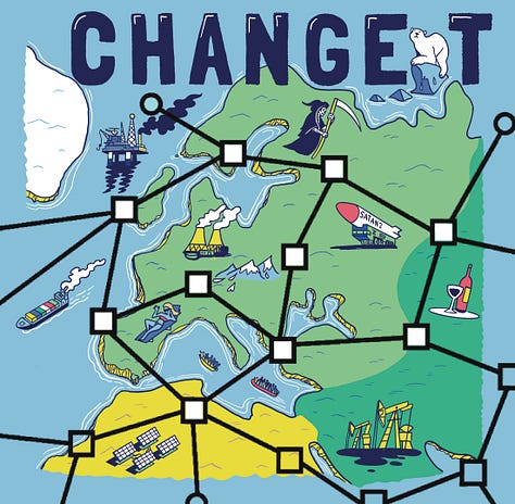
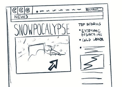
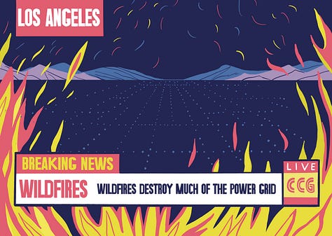
One of our great blessings in the team is that James is a graphic designer, who has been making creative content for decades. So we were able to work up an attractive and functional version of the board and cards with no budget or outside support.
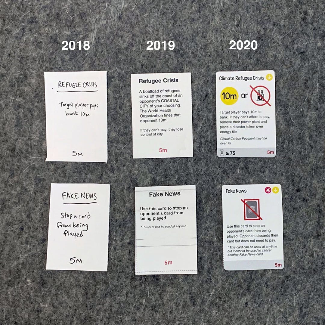
Even the layout of the image above shows how important it is to have a graphic design background - choosing the felt background for its neutrality but also subtle texture; the slightly wonky alignment; and the fact that the date overlay font matches that of the cards… It’s those subtle touches made by James that have enabled even our earliest versions to be user-friendly and engaging.
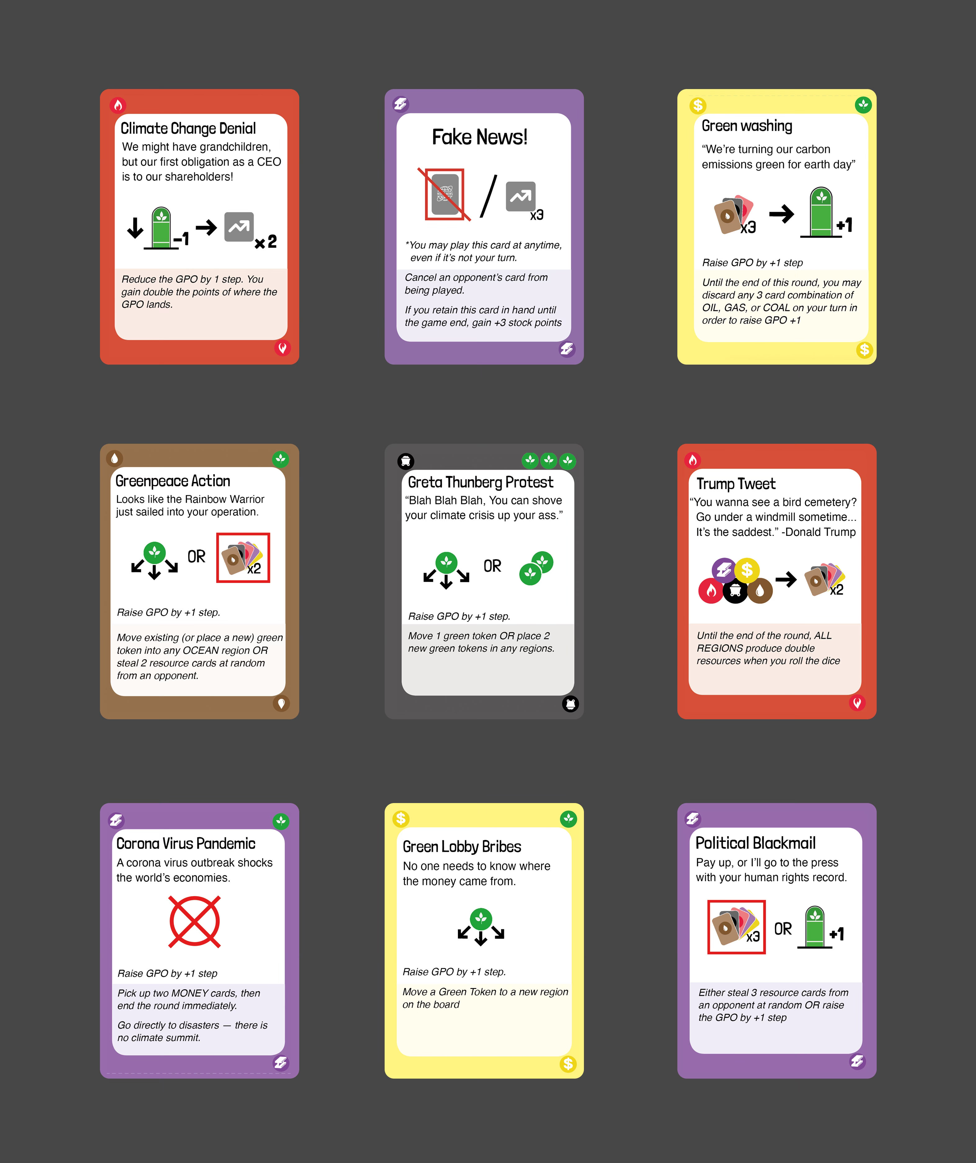
So once we had got to this stage, we started hunting around for an illustrator who could bring real character and style to the board, the cards, the box and our marketing materials. We looked on Instagram, we talked to friends and family, but we never really made the match. And then we were blessed with the sort of serendipity that makes all the effort and cost of attending a conference worthwhile. Across the airless and noisy room during a networking event, with its low ceilings and rising aroma of BO, we spied someone else who looked as out of place as we felt.
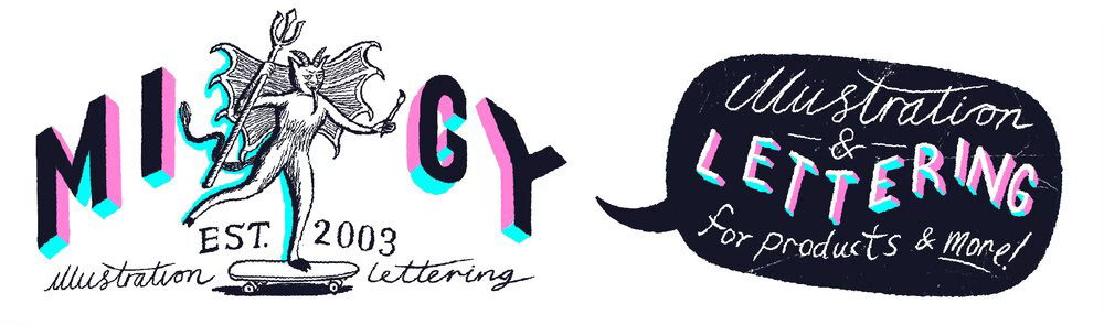
We described the game and our vision to Migy, identifying some of our inspiration as coming from The New Yorker and Private Eye.
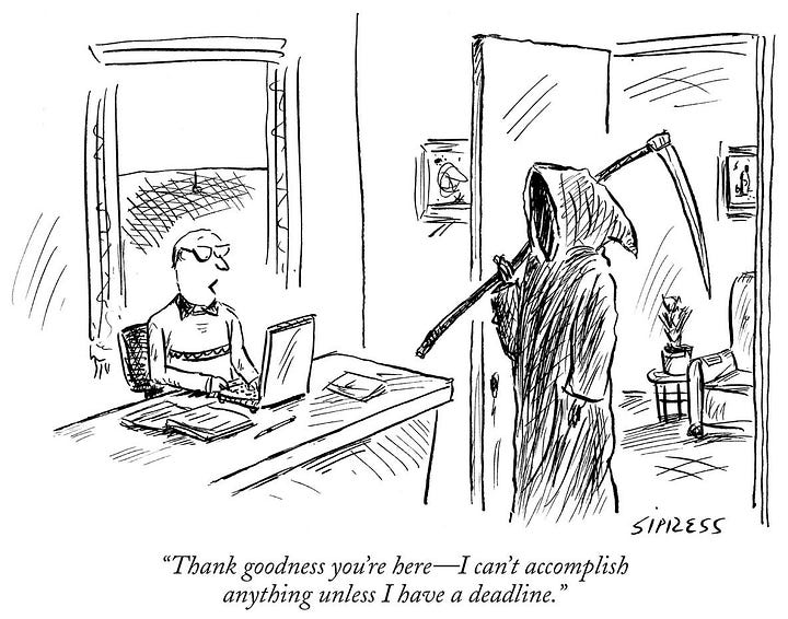

And we knew we’d be a good match when he said:
“Oh, it’s like RISK…but for the end of the world.”
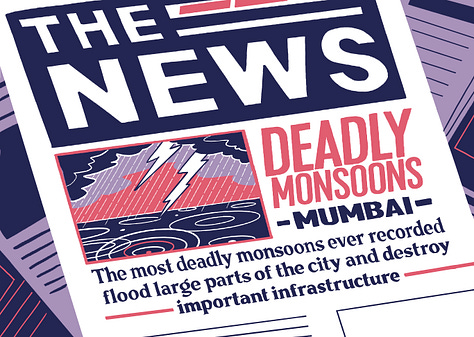
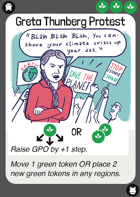
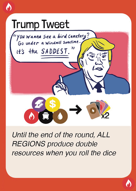
This summer he produced the first prototypes of World News and Disaster cards for us:
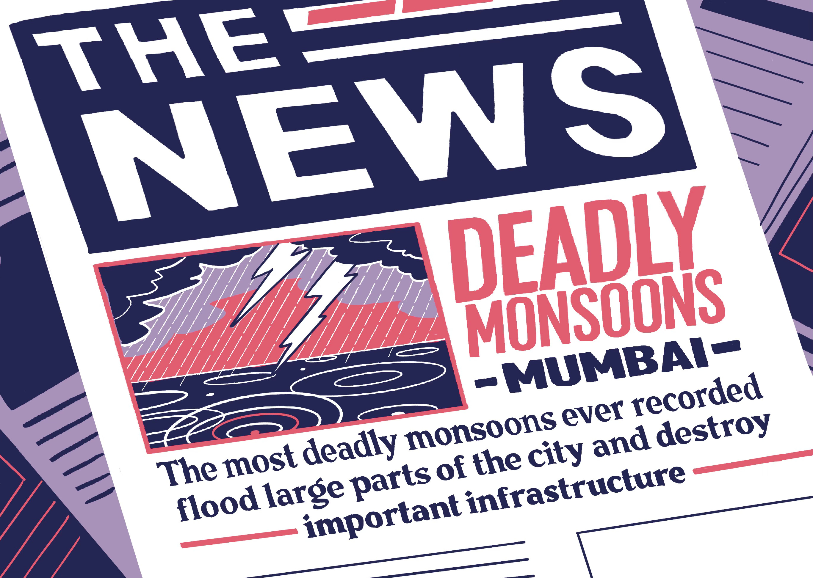
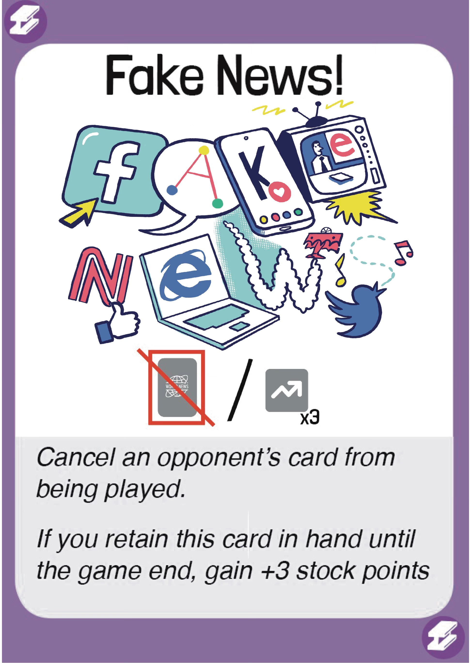
Now, as we prepare our for the launch of our crowdfunding campaign in the spring of 2024, we are trying to finalise details of our graphic design, colour schemes and iconography.
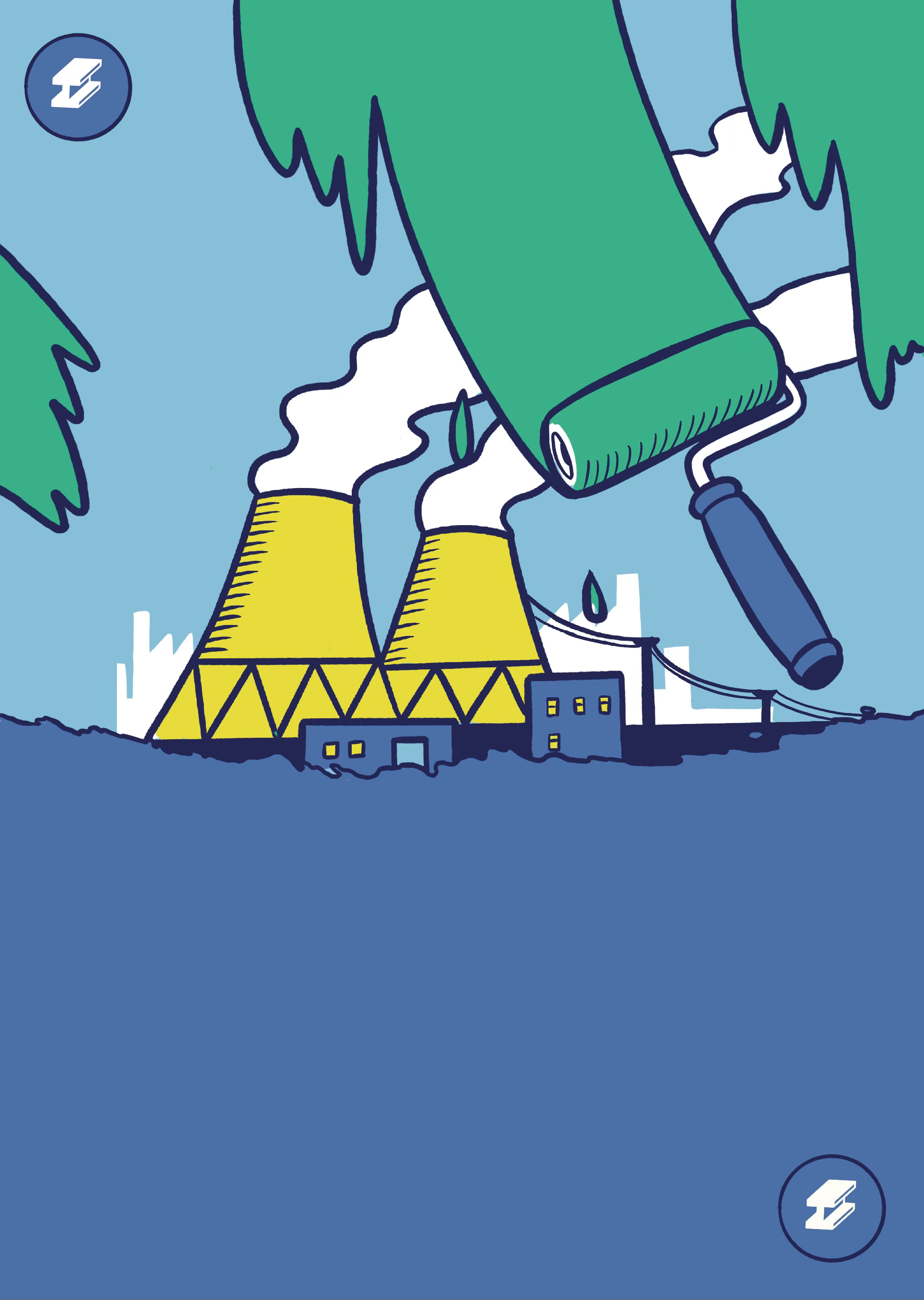
We want the game to stay relevant as our crazy world continues to change around us. For example, in 2024, more people will vote in democratic elections around the world than in any other year in history. We’ll surely need new content to respond to all the joys and horrors that those bring. So we are combining the illustration skills of Migy with the graphic design wizardry of James to create templates where we can easily update images and text to release new card decks.
We’ll be sharing much more about this creative process in the coming weeks. What do you think about the journey so far? What features of our joyous contemporary world do you think should be included in the cards?
Comments
Nothing yet. Say the first thing.
Sign in to join the conversation.