
Hello again! Return readers will know I’ve been writing a Complete Shopify SEO Checklist guide which is going up in installments on my website. The second part, on UX, is live now. Below is an excerpt on mobile optimization for your e-comm site. Why did I want to highlight this section? Because good mobile UX is important not just for SEO - it’s make-or-break for the majority of customer’s first impressions on-site. E-comm is moving to mobile, and your site must be prepared for that shift.
Read on for more, and if you find this useful, check out the rest of the guide. And, as always, if you have any questions, hit reply and reach out!
Google uses mobile-friendliness as a factor in their search ranking algorithm, so it’s important from an SEO perspective. But beyond that, mobile-friendliness is one thing you have to get right in order to create great user shopping experiences. Currently about 40% of all e-comm transactions take place over mobile, and that number is only going to continue to grow. (Source.)
Even if customers complete their purchase on desktop, they’re still very likely to encounter your site for the first time from their phone screen. You want to make sure your mobile site is as easy-to-use as possible. And guess what? If you do that, Google will reward you.
Convenient menu design and layout: we’ll be talking more about menu link structures in the next section, but for now let’s focus on design. You’ve probably been on lots of sites where the mobile menu was challenging to work with. Mobile menus should easily fit within one phone screen, and be proportioned so that the user can click in/out without issue. I really like the proportions of Everlane’s mobile menu, which has tabs for Women’s vs. Men’s product and makes it super simple to look at subcategory links:
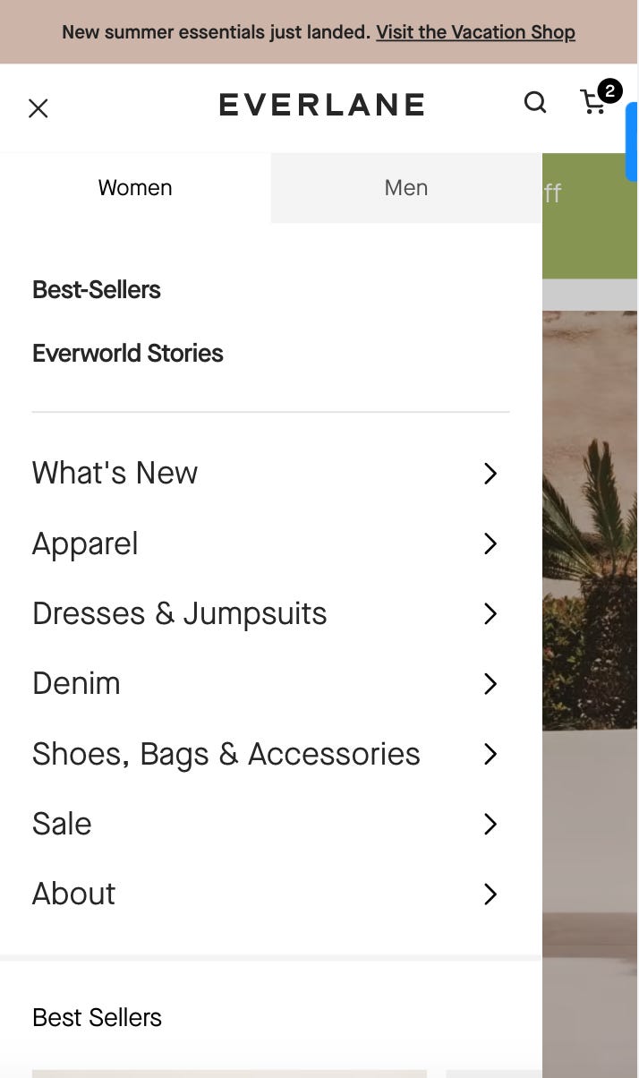
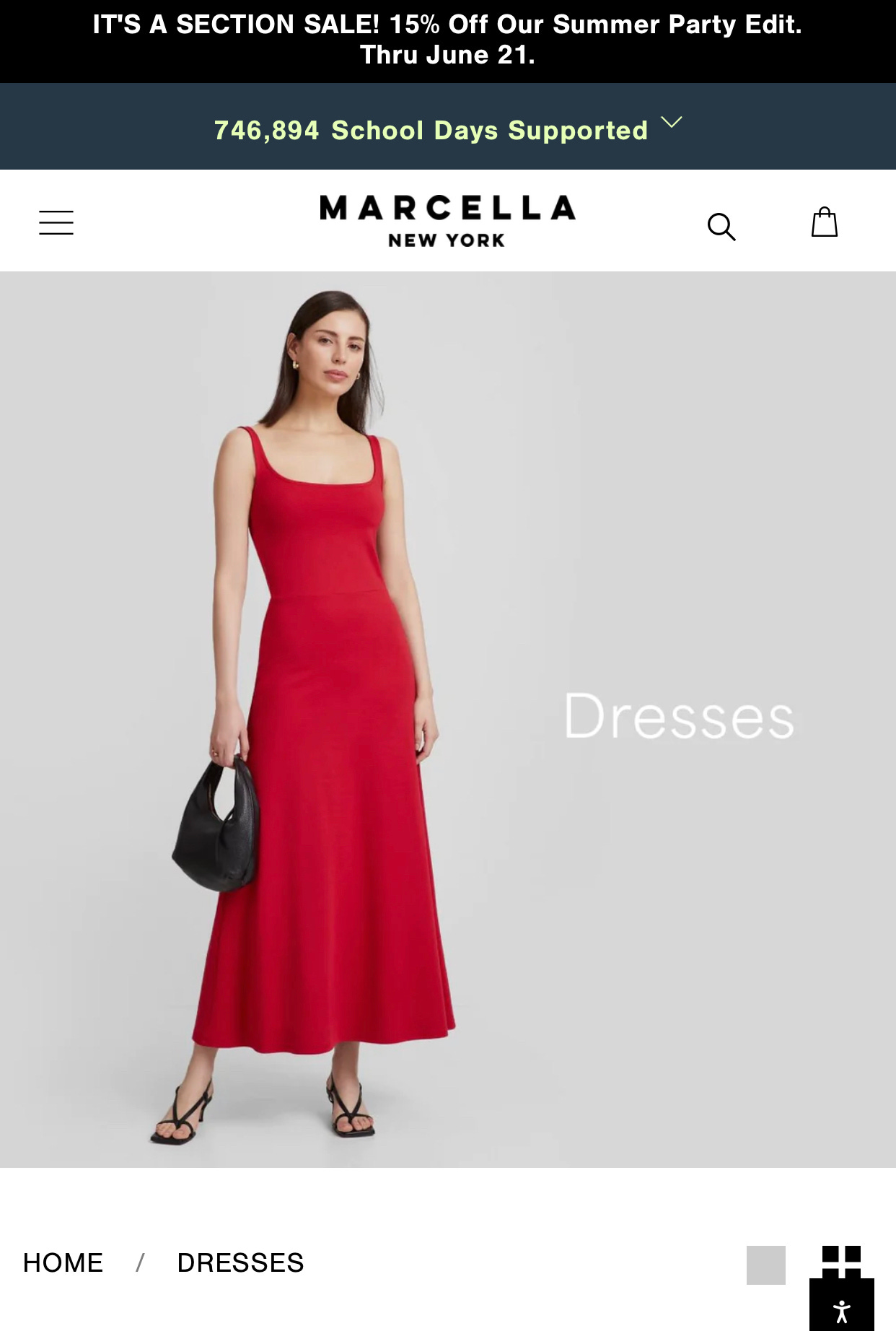
Image sizes and cropping: do images look correct on mobile? Is anything cut off or sized incorrectly? Are any images extending below the fold, forcing customers to have to scroll to see basic info? Take Marcella’s collection pages, for example: on mobile, the header images are so tall for each collection that they block users from seeing shoppable products (unless they scroll). You don’t want that!
Check all pop-ups: are they too large, or proportionally overwhelming on mobile? Remember, just like with menu design, pop-ups can be really hard to work with on phone screens. If you overwhelm customers with full-screen pop-ups they can’t easily exit out of, they may just leave. (Who among us hasn’t done this?)
Are buttons large enough? Same deal - make sure important design features, like buttons, are proportional on mobile.
Content readability: are any fonts too small? Conversely, is any text so large that it doesn’t fit properly on the screen?
Google’s Mobile-Friendly Test tool is a great (free) way to quickly sweep your site for any issues. This tool is going to give you a quick high-level technical snapshot and call out any glaring errors; what it can’t do is give you granular ideas as to how to improve your mobile UX.
I’ve recommended MS Clarity before (broken record alert!), but reviewing user heat map data is a great way to see where on mobile customers may be getting tripped up. MS Clarity tracks a metric called “rage clicks,” which happen when a customer gets frustrated by something not working as expected and clicks multiple times. I see rage clicks a ton on my client’s mobile sites - maybe it’s because a link is slightly too small, or the dropdown menu isn’t working as expected. Either way, this type of data can be really helpful when it comes to optimizing your site’s UX.
Do you find this guide helpful? Share it with another business owner who could use it:
Some mobile UX issues are easy to fix without coding or development support. For example, you can probably update font sizes, etc. on your own. But what if you complete an audit and notice you have a lot of complex mobile UX issues to fix? The easiest solution might be to look into a new Shopify theme. Many older Shopify themes just aren’t up to par with current mobile needs, and that’s okay, because there has been tons of improvement in recent years. Before you dive into a ton of expensive coding updates, consider shopping for a new theme - it just might help both your site speed and mobile accessibility.
If you enjoyed this excerpt, you can find the rest of my guide to UX for SEO here, and part 1 of the series, on content for SEO, here!
Have a question? Hit the reply button and reach out! I’m here to help. I also LOVE addressing brand owner’s pain points in this newsletter, if you feel inclined to share with me :)
Interested in working together on a Shopify e-comm, SEO or email marketing project? Get in touch with me here.
Book a Power Hour Consult with me and I’ll help you design a tangible plan to move your business out of an SEO, e-comm, or marketing rut.
No posts
Comments
Nothing yet. Say the first thing.
Sign in to join the conversation.