
Thanks to AI, I now have fully-functional apps in the both Apple’s App Store and Google Play. Both of them. As of this weekend. I keep opening my phone and looking at them like they might disappear.
You make a handwriting font for free at FontCrafter.net, import it, type your message, and share it as an image. The person on the other end sees a handwritten note. They don’t need the app or the font.
The work started weeks earlier. I’d been using Expo Agent to prototype the interaction design: how the font import should feel, what happens when you tap “Send It,” which export sizes to support.
Export sizes turned into a rabbit hole. Instagram Post is 1080x1080. Instagram Story is 1080x1920. Facebook is 1200x630. X is 1600x900. TikTok is 1080x1920 (same as Story but different context). YouTube Thumbnail is 1280x720. LinkedIn is 1200x627 (three pixels shorter than Facebook, because of course it is). Pinterest is 1000x1500. I spent two days on export presets alone, checking every platform’s current spec, because getting the aspect ratio wrong means your handwritten note gets cropped at the chin.
The other big pre-weekend decision was what NOT to build. I had a list: sticker packs, a font preview gallery, social media posting (not just sharing), a handwriting practice mode, a greeting card template system, collaborative handwriting (two fonts in one message), and animated handwriting that draws letter by letter. Every one of those would have been cool. Every one would have delayed shipping by weeks. I cut them all. PenSend does one thing - for now.
I used Superapp on my Mac. You describe your app in plain English, Superapp generates a real Xcode project with native Swift, and you iterate from there.
Each piece took a few rounds. I’d describe what I wanted, Superapp would build it, I’d test it in the iOS Simulator, find something that felt wrong, and describe the fix.
The part of iOS development that scares people off? Xcode. But Superapp handled all of it. I didn’t touch a single Xcode setting. I don’t even know where most of those settings live in Xcode. I described what I wanted to happen. Superapp made it happen.
By Saturday evening, PenSend was running on my Mac’s iOS Simulator. I was testing font imports, trying different messages, checking export sizes, and taking screenshots for the App Store listing.
Same day, different toolkit. Claude’s web interface and Android Studio.
Claude and I have a working relationship at this point. Claude and I have been building together for a few months. I know how to describe what I want. I know when to be specific (”the preview should update on every keystroke, not on a debounced timer”) and when to be vague (”make the share flow feel natural”). Claude knows my patterns.
Android was in some ways easier because Claude could reference the iOS version’s behavior as a spec. “Build the Android version of this interaction” is a clearer prompt than “build this interaction from scratch.” I described screens, Claude wrote Kotlin and Jetpack Compose, I ran it in Android Studio’s emulator.
The HSL color picker was a good example of product thinking in action. The free tier has six preset ink colors. PenSend Pro unlocks a custom color picker. My first instinct was a standard color wheel. But I wanted the picker to feel like choosing ink, not necessarily choosing a hex code. Small distinction, but it changes how the feature feels in your hand.
By Friday evening, both apps were submitted.
Google Play was not quite straightforward. Write the listing, upload the APK (AAB), fill out the data safety form (PenSend collects no data, so this was a lot of “no” checkboxes), submit, wait.
You could tell that developers designed the damn thing.
Apple was a different experience, of course - but equally as tedious (and equally as poorly designed as Google’s app developer portal if not worse).
For each, I spent an hour on screenshots. Not taking them (that’s quick), but choosing which screens to show and in what order. The first screenshot needs to communicate what the app does without reading a single word. I chose a screenshot of a handwritten message on warm paper, with the “Send It” button visible. You see the output before you see the interface.
Then there’s the privacy policy. Both require a URL to your privacy policy, and they check that it’s accurate. PenSend collects no data, requests no network access, and works offline. My privacy policy says exactly that, in plain language. I suspect this helped with the review, because a privacy policy that matches the app’s actual behavior is a signal that the developer thought about what they were shipping.
PenSend renders handwriting fonts. I checked “none” on everything. But I spent a minute thinking about whether user-generated text could be considered objectionable content. Apple’s guidelines put the responsibility on the user, not the app, for user-generated text. So “none” was correct. That minute of thinking saved me a potential rejection.
I submitted Friday night. Early on Easter Sunday, the approvals came through!
I read the emails three times. I opened the stores, searched for PenSend, and there it was. My icon, my screenshots, my description, my app. Downloadable by anyone with an iPhone or Android device.
Am I an app developer now?
I’ve built 300+ apps that run in the web browser. Building native for a mobile platform felt similar in some ways and alien in others. Worth documenting while it’s fresh.
Sharing is a first-class citizen. On the web, sharing means copying a URL or using the Web Share API (which works on some browsers, sometimes, if the stars align). On iOS and Android, sharing is built into the OS. You tap “Share,” you get every app on the phone as a target. PenSend’s core feature, sharing handwritten images, works better on native because the platform was designed for it. On the web, I would have been fighting the browser. On native, the OS did the heavy lifting.
Font rendering is platform-specific. On the web, browsers handle OpenType features through CSS (font-feature-settings). On iOS, Core Text handles it. On Android, it’s the Compose text rendering pipeline. Each platform interprets contextual alternates (the feature that makes FontCrafter fonts cycle through character variants) with slight differences. A font that looks perfect in Chrome might render kerning pairs with subtle variation in SwiftUI. I spent time on each platform making sure the handwriting looked like handwriting and not like a broken typewriter.
Offline isn’t special on native. It’s the default. On the web, making an app work offline requires service workers, cache manifests, and careful asset management. On iOS and Android, the app is installed. It works. No internet ceremony required. PenSend works offline on all platforms, but on native, I didn’t have to do anything to make that happen. The files are on the device. That’s it.
The submission process is a product exercise in itself. Writing an app store listing is marketing and UX combined. You have 30 characters for a subtitle. A few hundred words for the description that most people won’t read. And 3-5 screenshots that need to do all the selling. I treated the store listing like a product: what does the user need to know, in what order, to decide to tap “Get”? First screenshot: the output (a handwritten message on warm paper). Second screenshot: the input (the compose screen). Third: the options (ink colors, backgrounds). The listing tells a story in three images. That’s product thinking applied to a marketing surface.
I knew to show a preview that updates as you type, because I’d built that interaction in four other apps and learned that a “preview” button adds a step nobody wants. I knew to make the share action one tap, because every extra tap between “I want to send this” and “it’s sent” is a tap where someone gives up.
I also knew things about app store expectations that came from watching other apps succeed and fail. I knew the description should lead with what the app does, not how it works. I knew that “free, no account required, works offline” are the three things that make someone tap “Get” instead of scrolling past. I knew that the in-app purchase price should be visible in the listing so nobody feels tricked.
The iOS build came out to 869 KB. Less than a single photo on your phone. I didn’t try to make it small. I tried to make it focused. One job, no extras. Small was the side effect.
I’ve been using this phrase and I’m still working out what it means.
A software developer writes code. A product manager writes specs. A product developer does what I did over the course of a few days: describes the thing, shapes the experience, iterates on the output, makes the judgment calls about what stays and what goes, ships it. The AI handles implementation. The human handles taste.
I think this is a real job now. Not in the buzzword sense. In the “I shipped two native apps with zero prior mobile experience” sense. The constraint wasn’t technical knowledge. It was knowing what I wanted the thing to feel like in someone’s hand.
I’m not sure “product developer” is the right term. I’m not sure there is a right term yet?! But “software developer” doesn’t fit when the software writes itself, and “product manager” doesn’t fit when you’re the one shipping the product, not managing someone else who ships it.
What I am sure about is that this skill, the ability to define a product, shape its experience, and ship it, is available to anyone willing to build a lot of small things and pay attention to what works. Those web apps weren’t a resume. They were training.
So, if you haven’t already, try it for yourself - for free:
Then, most importantly: send someone a digitally handwritten note!
Depth Window: Webcam-powered parallax using Three.js and MediaPipe face tracking. You move your head and the 3D scene shifts. You can drop in your own 3D models. I spent an evening moving my head back and forth like an idiot. Worth it.
MomentMiner: YouTube transcript analysis that finds shareable clips and generates social copy. The clip finder works well. The article generation mode is getting close.
Convertacle: Batch image converter. HEIC, PSD, SVG, JPG, PNG, WebP, TIFF, PDF, ICO, QOI. Free alternative to the paid converters that charge $30/year to turn a HEIC into a JPG.
SocialMarkdown: Markdown to platform-ready social copy. LinkedIn gets Unicode bold/italic. X gets thread splitting. Nine platforms. I built this because I was tired of reformatting the same post by hand for every platform.
Movable Type: Kinetic typography playground. 15 physics modes. Custom Verlet physics engine. One of those apps where the bugs were more fun than the features.
BrickGen: Generative 3D brick art. Mandalas, spiral towers, cityscapes from interlocking bricks. Relaxing in a way I did not expect.
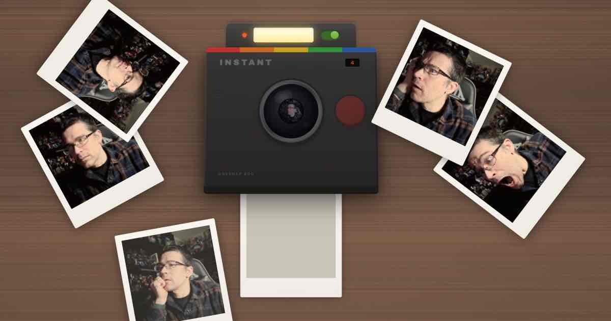
Instant Snap: Instant film camera sim. Skeuomorphic web camera, photos develop like real instant film. The sound design took longer than the image processing.
Updated: CodeSnap got a full mobile overhaul, window frame styles (macOS, Windows, Linux), and auto-language detection. About 80 bugs found and fixed in one pass. The mobile version went from “don’t look at it” to “works.”
I’ve been curating open-source “skills” (custom instruction sets) for Claude that make the AI better at specific jobs. The full writeup is in the most recent ctrl+alt+create newsletter, but the highlights: stop-slop for killing AI writing patterns, agent-skills by Addy Osmani for frontend engineering discipline, and ai-legal-claude for contract review. I’ve adapted all three for my workflow. If you use Claude or any AI assistant that takes custom instructions, these are worth grabbing.
OpenGranola / OpenOats: Open-source meeting copilot for Mac. Transcribes both sides of your call on-device, searches your own notes, surfaces relevant talking points while you’re in the conversation. Works offline with Ollama. I’ve been on calls where I knew I had the right data point in my notes but couldn’t find it fast enough. This fixes that.
TaxHacker: Self-hosted AI accounting. Photo a receipt, upload an invoice, it extracts everything into a structured database. Custom prompts, historical currency conversion (including crypto), CSV export. Still early, but the receipt scanning alone is worth the setup.
Skales: Desktop AI agent for Windows, Mac, and Linux. No Docker, no terminal. 15+ AI providers, autonomous coding, desktop automation. Built by a designer who got frustrated that every AI agent assumed you live in a terminal. Free for personal use.
Dreamer: Consumer AI agent platform from the team formerly known as /dev/agents. Build agents through conversation with a personal “Sidekick.” Meta acquired the team for their Superintelligence Labs. Worth exploring the beta before the acquisition changes it.
I’ve got a new community brewing - hosting free monthly workshops in Seattle (and online). I’m showing people how to do what I’ve been doing. It’s continuing to be sponsored by Every!
Last time, my colleague Jon Levesque helped people get started with Claude - and even I learned a few new things I didn’t know before. When I went looking to pull out highlights from his presentation, I wound up creating Moment Miner to help. Here’s some of what it extracted:
Immediately actionable Claude tip. The arc of it becoming a jerk is funny and relatable.
The single biggest behavior switch in Claude? The personal preferences box.
Jon shared his approach: “Think with me, not for me. Help me develop better points — don’t just run with bad ideas.”
But Claude pushed back too hard. Started shooting down every idea. So he added: “Do this gently. Don’t be a negative Nancy.”
That iteration loop is how you get an AI that makes you better.
Concrete money, clear model, built by AI. Most shareable moment.
Jon got frustrated doing hard drive price math. Asked Claude for help. Realized others have the same problem.
Claude built buyperunit.com — scrapes Amazon, Best Buy, Newegg, ranks by cost/GB, earns affiliate commissions. $400 in two months. No code written. Didn’t know how APIs work. Just knew the problem and talked to AI until it existed.
Jaw-dropping before/after. Makes people stop scrolling.
Jon publishes The Drizzle — a local Seattle newsletter, 6,000+ readers, twice a week.
Before Claude: 10 hours/week. After: 40 minutes total.
Claude finds stories, aligns to a theme, finalizes drafts, generates social posts. That’s not a chatbot — it’s a publishing partner.
Things I keep circling back to:
Thirty years of telling myself “I’m not that kind of person” doesn’t evaporate in a weekend. I keep opening the App Store on my phone and looking at PenSend like it’s someone else’s work. I know how it got there. I built it. I submitted it. I watched the approval come through. The feeling hasn’t caught up with the fact yet.
My daughter builds apps too. She doesn’t have this problem. She never told herself she wasn’t allowed. I envy that directness. I’m trying to learn from it.
Every time I see a 200MB app that does one thing, I wonder how many meetings it took to add the other 199MB.
Yours Digitally,
Comments
Nothing yet. Say the first thing.
Sign in to join the conversation.