
Thank you for tuning into my live show with Jeremy Ney discussing the history and practice of equality visualization. You can (re)watch our discussion above.
We picked through 200 years of inequality charts and maps. In one sense, we are still grappling with the same challenges as Charles Dupin: understanding and comparing distributions. As we saw, the struggle is rich with new visual forms and analytic surprises.
You may also enjoy my recent associated essay on the topic:
The Geometry of Inequality
·
Feb 25
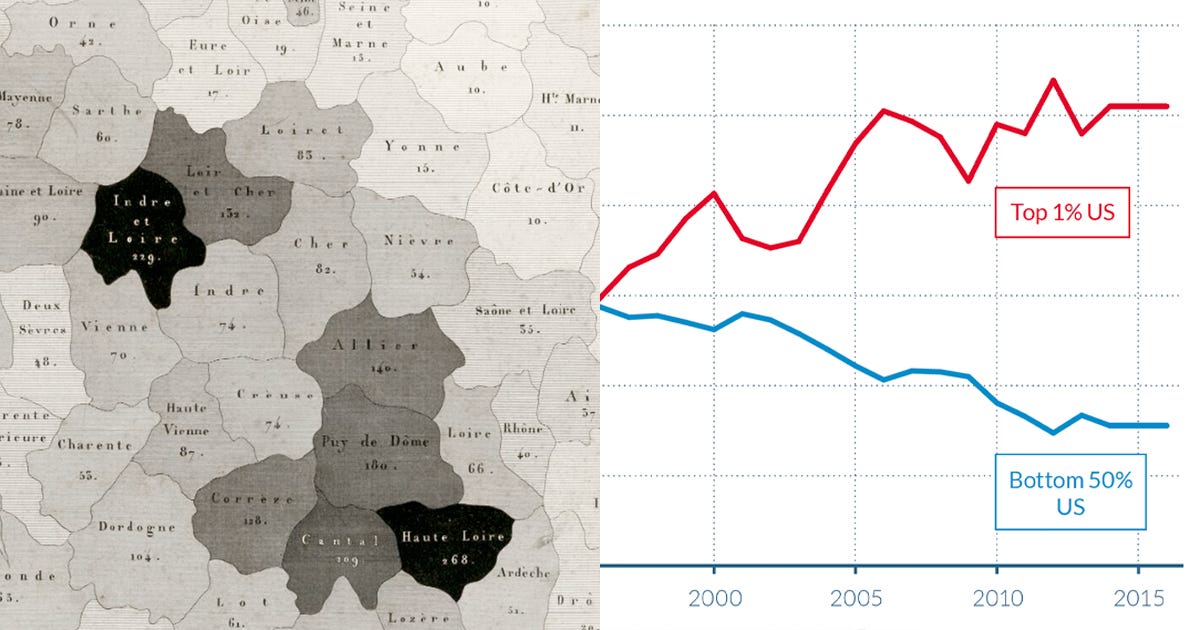
What follows is a whirlwind tour of my favorite graphic gestures at understanding and conveying inequality.
Onward!—RJ
Chartography is the newsletter of Visionary Press and Info We Trust, by RJ Andrews.
RJ Andrews is obsessed with data graphics. He helps organizations solve high-stakes problems by using visual metaphors and information graphics: charts, diagrams, and maps. His passion is studying the history of information graphics to discover design insights. See more at infoWeTrust.com.
Comments
Nothing yet. Say the first thing.
Sign in to join the conversation.