
I have a habit I will defend to the death: when I open a new Substack, I don’t read a word of the actual post. I look at the homepage first, the same way you clock someone’s living room the second you walk in, before either of you has said hello. What’s framed on the wall, what’s clearly a hand-me-down, whether the lighting is doing them any favors. You know almost everything before anyone opens their mouth.
Most Substacks, bless them, still look like someone moved in three months ago and never got around to the last box. Same template as everyone else, a headshot slapped on top, done. And listen, I get it, writing is the actual job and design feels like homework nobody assigned. But every so often I land on one where somebody clearly sat with it. Where the palette and the covers and the layout are having a conversation with the writing instead of just standing next to it looking awkward.
So I rounded up sixteen of those. This isn’t really an essay, it’s more of a nosy walk-through with reciepts, plus whatever I couldn’t stop myself from saying out loud in front of each one. Bonus affection for anyone brave enough to run an actual palette or real typography instead of hiding behind safe beige and default sans-serif. We’ve all hidden there at some point. I’m just saying it’s nice to see someone leave the house.
And if by the end of this you’ve started giving your own homepage the side-eye, that’s exactly what my free Substack Brand Audit tool is for. Details at the bottom. For now, pour something, get comfortable, and let’s actually look at what’s in front of us.
(*Click on the post title above if you’re reading this on email. Due to size limits you may not be able to see the whole post, or click here to read it on Substack)
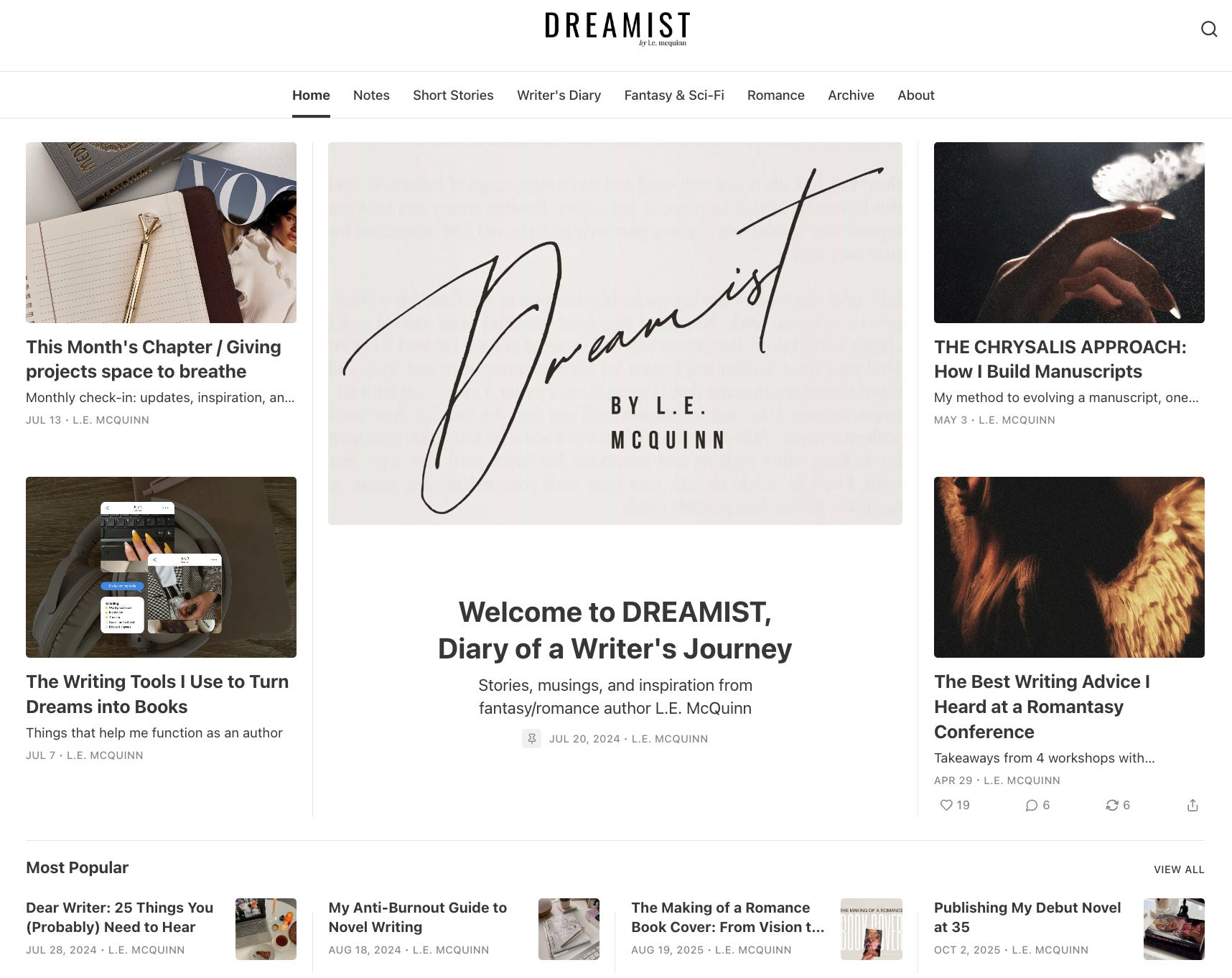
There’s a kind of confidence in knowing when to shut up visually, and Dreamist has it. Bookish imagery, academia mood without the costume, post covers that all feel pulled from the same shelf in the same library. The homepage is sorted by genre with its own little corner reserved for her novel, and nothing on the page is fighting for attention it hasn’t earned.
I am, embarrassingly, a full book nerd, and I also have a novel manuscript rotting in a Google Doc that I will not be taking questions on today, so this one hit somewhere personal. Minimal here isn’t a lack of ideas. It’s someone with plenty of ideas who had the discipline to leave most of them out. (Also I LOVE her articles, if you’re a fiction writer definitely reccommend reading through her Writer’s Diary section.)
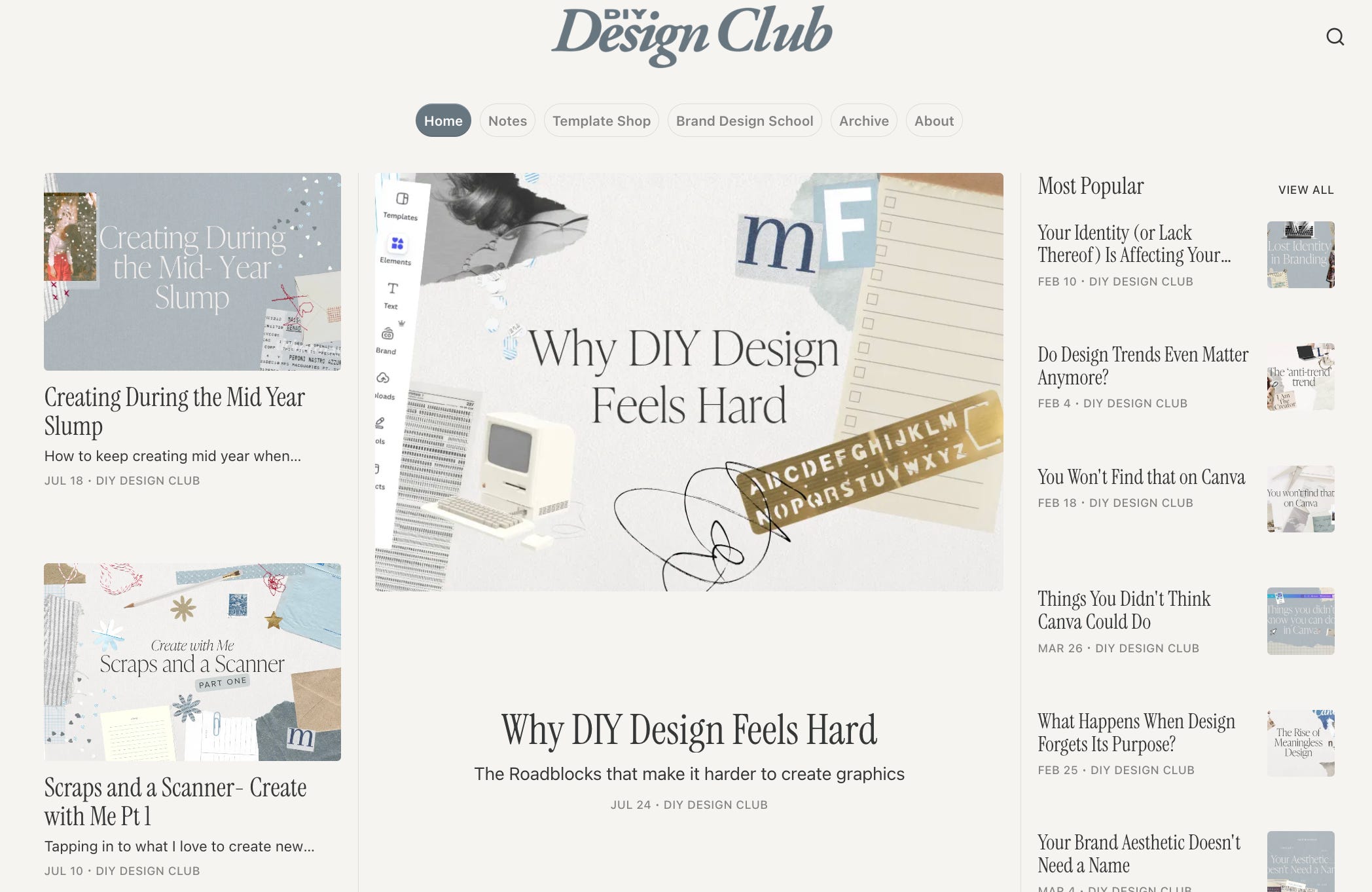
Baby blue and collage, but collage that refuses to ever pull the same move twice. Torn paper edges, texture on texture, a scrapbook logic instead of a grid. She’s a designer, so the whole homepage doubles as an unofficial portfolio, which is either very smart or a happy accident, and honestly it doesn’t matter which.
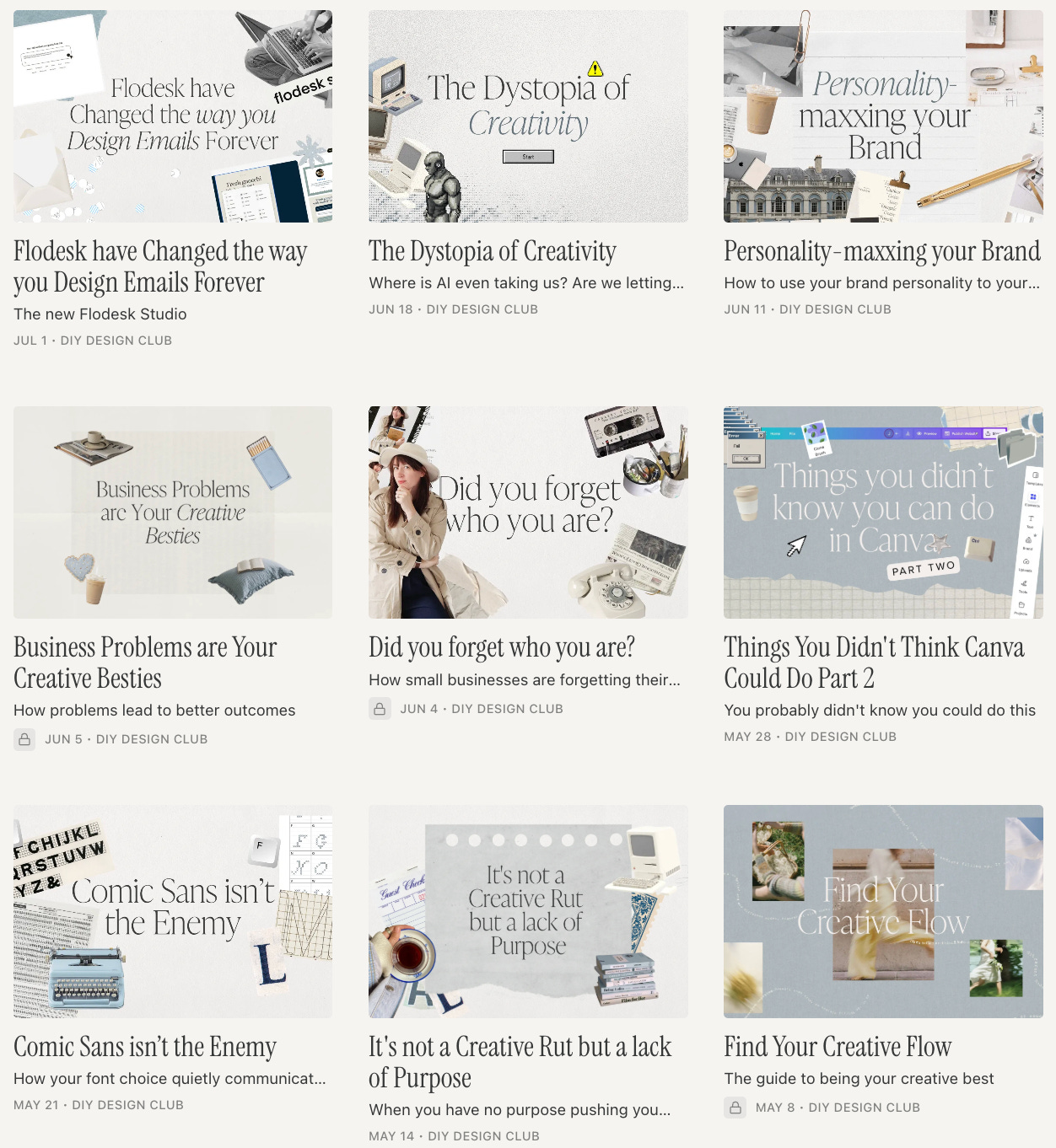
On paper this should not work. Scrapbook aesthetics are one bad Tuesday away from looking like a group project gone sideways. But there’s enough breathing room and restraint in her color choices that it reads as playful instead of cluttered, which is the tell that someone actually understands spacing even while they’re being loud with everything else.
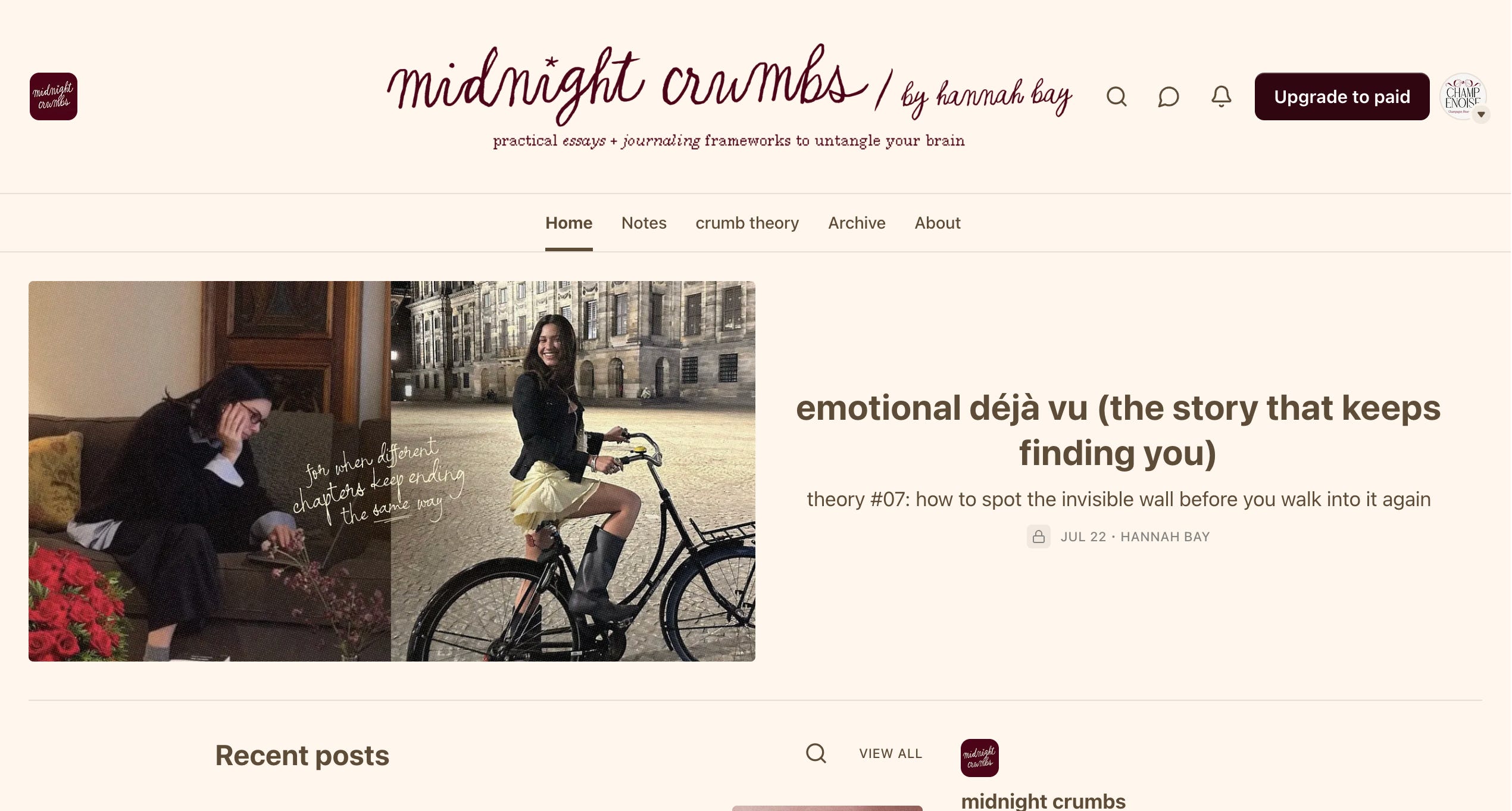
This one feels like reading a diary you were technically not invited into but got handed anyway. A handwritten cursive font does the emotional heavy lifting, laid over the exact same grainy film filter on every single post cover. One or two lifestyle shots, one line of text in her signature script, over and over, and somehow it never once feels like a rerun.
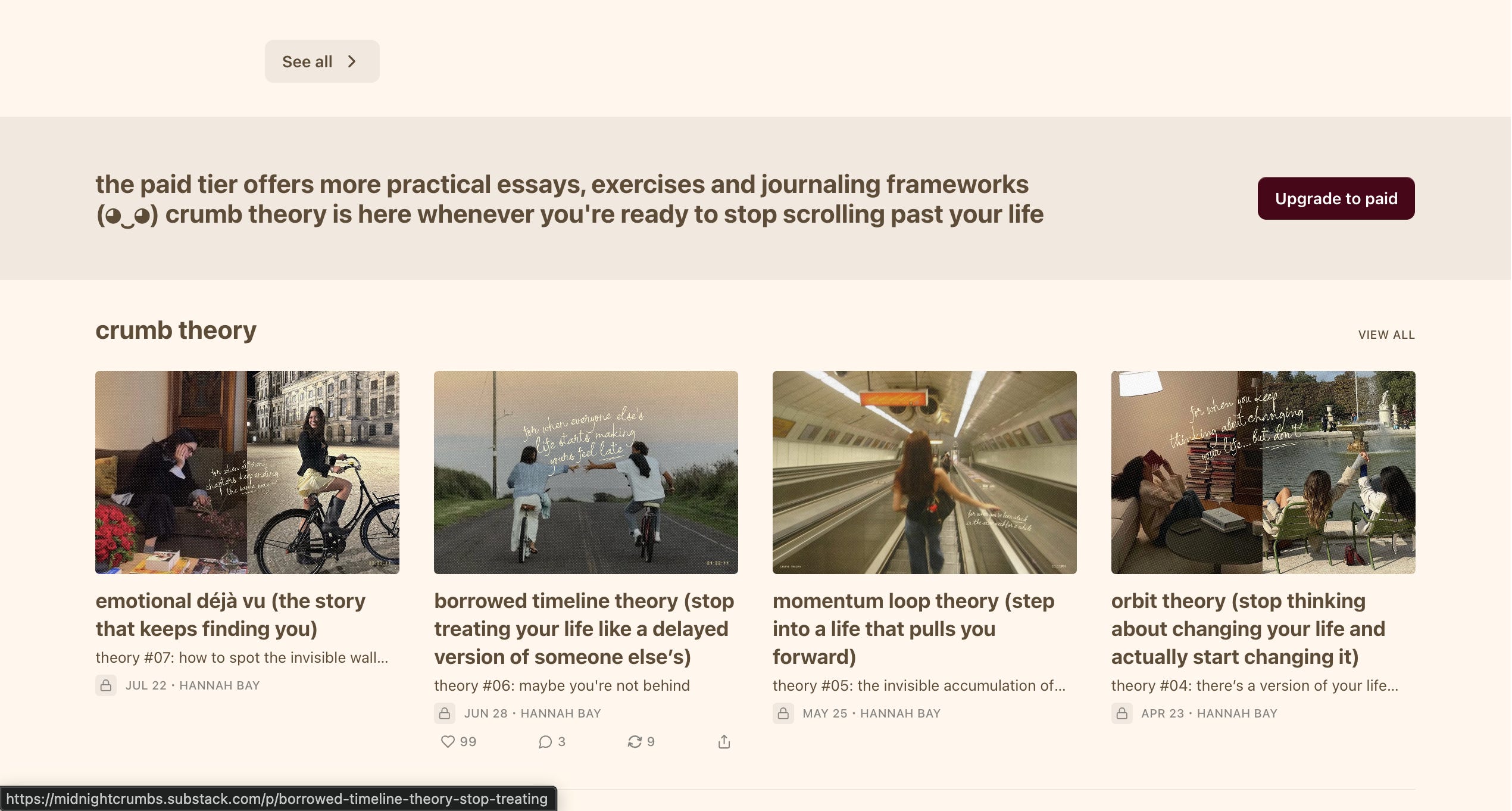
She writes personal essays and runs her own ongoing “crumb theory,” which I refuse to explain here on principle, mostly because stumbling onto it yourself is half the fun. The visual system is so simple it’s almost invisible, and that’s the entire trick. Nothing is elbowing its way in front of what she’s actually trying to say.
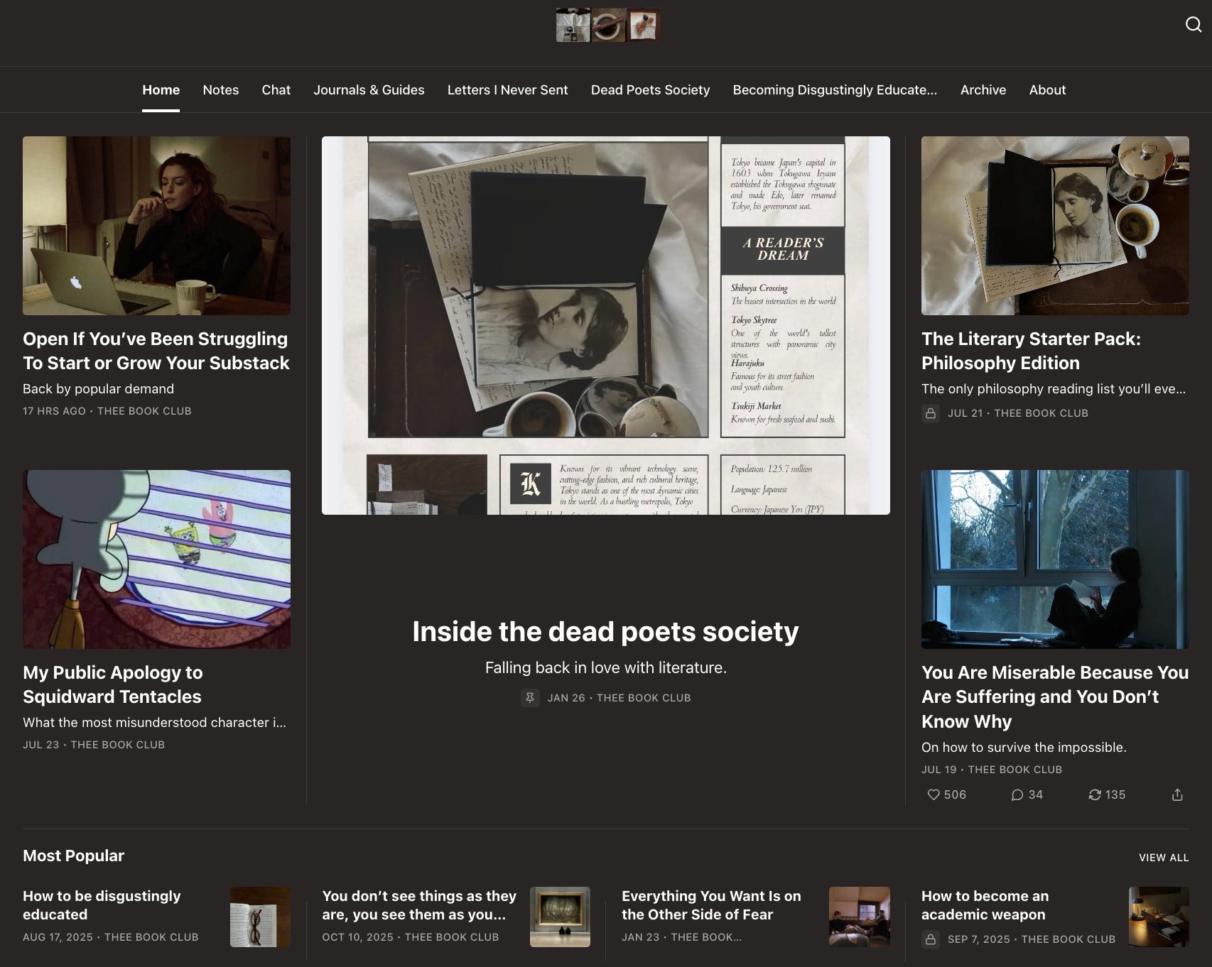
A very active community for people trying to fall back in love with reading, and you can feel that energy the moment the page loads. What actually stopped me was how many distinct little worlds live inside it, Letters I Never Sent, Becoming Disgustingly Educated, Dead Poets Society, each with its own personality, none of it feeling like it wandered in from a different publication.
My honest note: this is what happens when a Substack outgrows being one voice in a feed and starts acting more like a small magazine, on purpose, with an actual masthead logic behind it. A lot of newsletters hit this stage of growth by accident and it shows in the mess. This one clearly planned for it, and the sections are doing real branding work, not just organizing content into buckets.
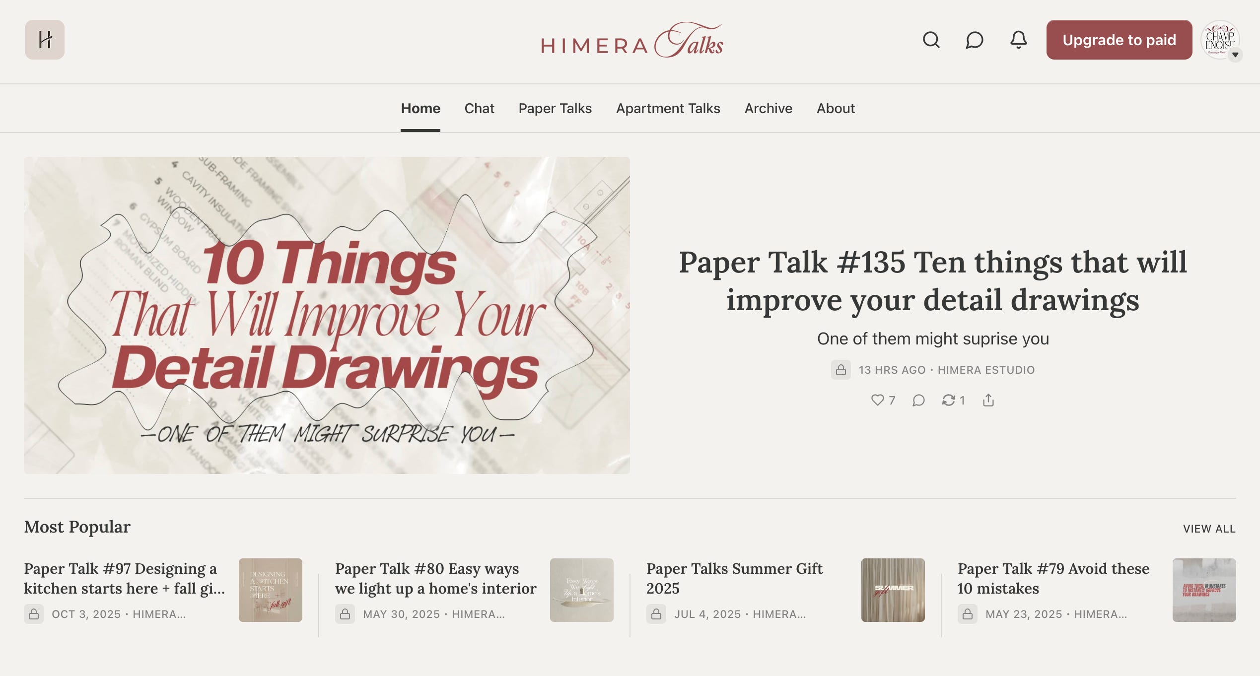
Full disclosure, I am not a neutral party here. As an architecture student, their Paper Talk posts have quietly bailed me out of more than one grade this semester, so take everything below with the appropriate grain of salt.
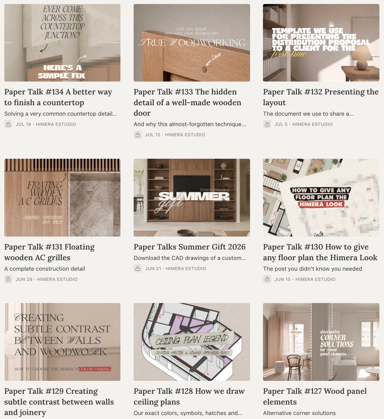
That said, the typography here is genuinely doing something clever. A recognizable architectural drafting font shows up specifically on the technical drawing posts. An elegant serif and script combination takes over for architecture inspiration content. A wide, bold sans handles everything miscellaneous. You can tell what category of post you’re about to read from the font alone, before you’ve absorbed a single word, which is such a small detail and such a smart one. Layer a consistently warm, woody, white-and-red-orange interior palette on top of that system, and the imagery basically carries the entire brand identity on its own. This is the kind of thing I think about constantly in my own work, type not as decoration but as an actual functioning signal.
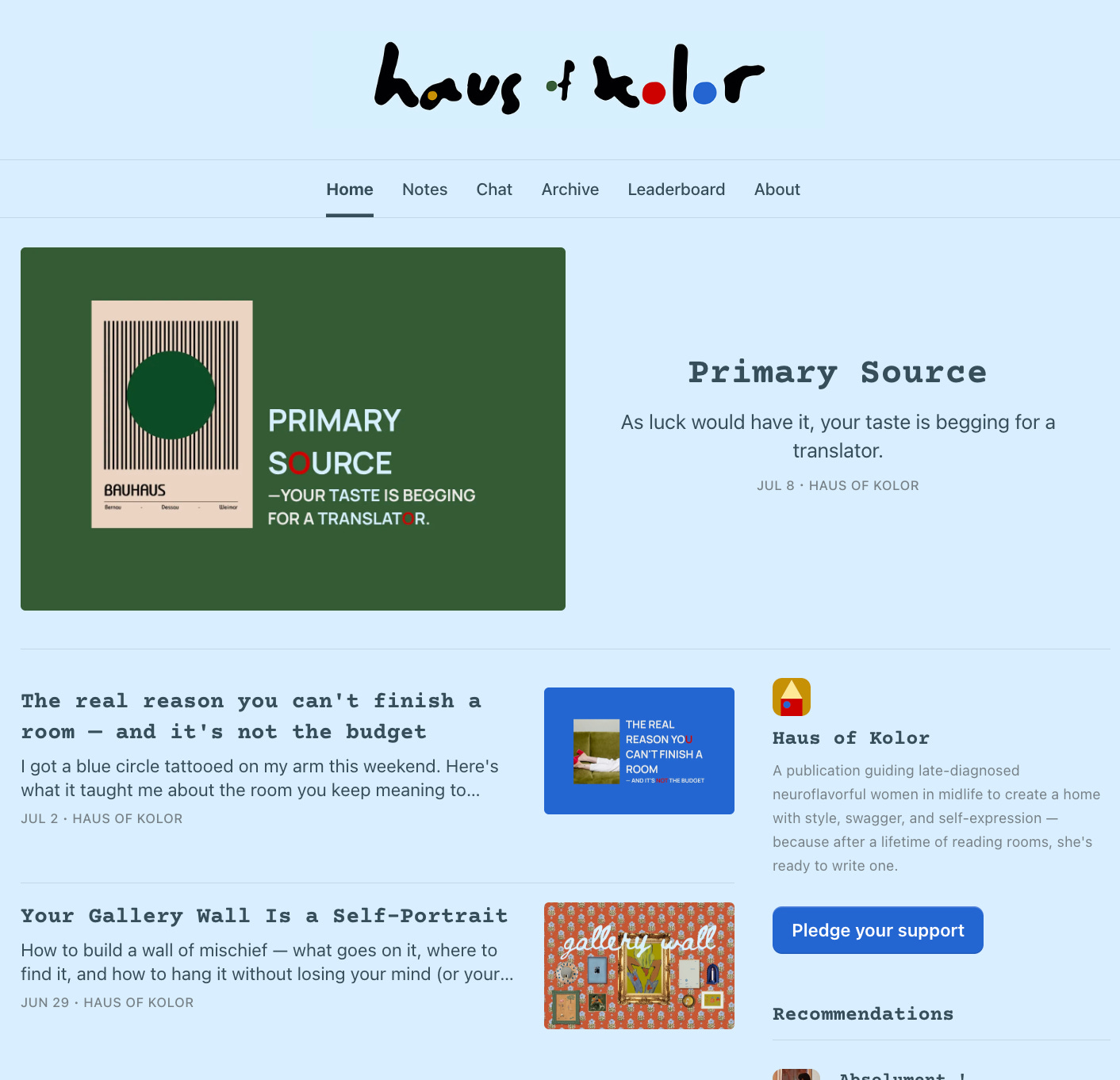
I love this name a genuinely unreasonable amount, I’ll get that out of the way first. It’s colorful in the way the title promises and not one degree less. Every post graphic reworks shape and color into something new, and a mono font gives the whole thing a slightly cyber, slightly rebellious edge sitting against a light page background with dark post cards underneath. That contrast alone shouldn’t do as much as it does, but it does.
This publication is still young, still finding its exact shape, and you can feel that in a few places. But there’s already a distinct point of view underneath it, which is rarer at this stage than people think, and I’m genuinely curious to watch where it goes from here.
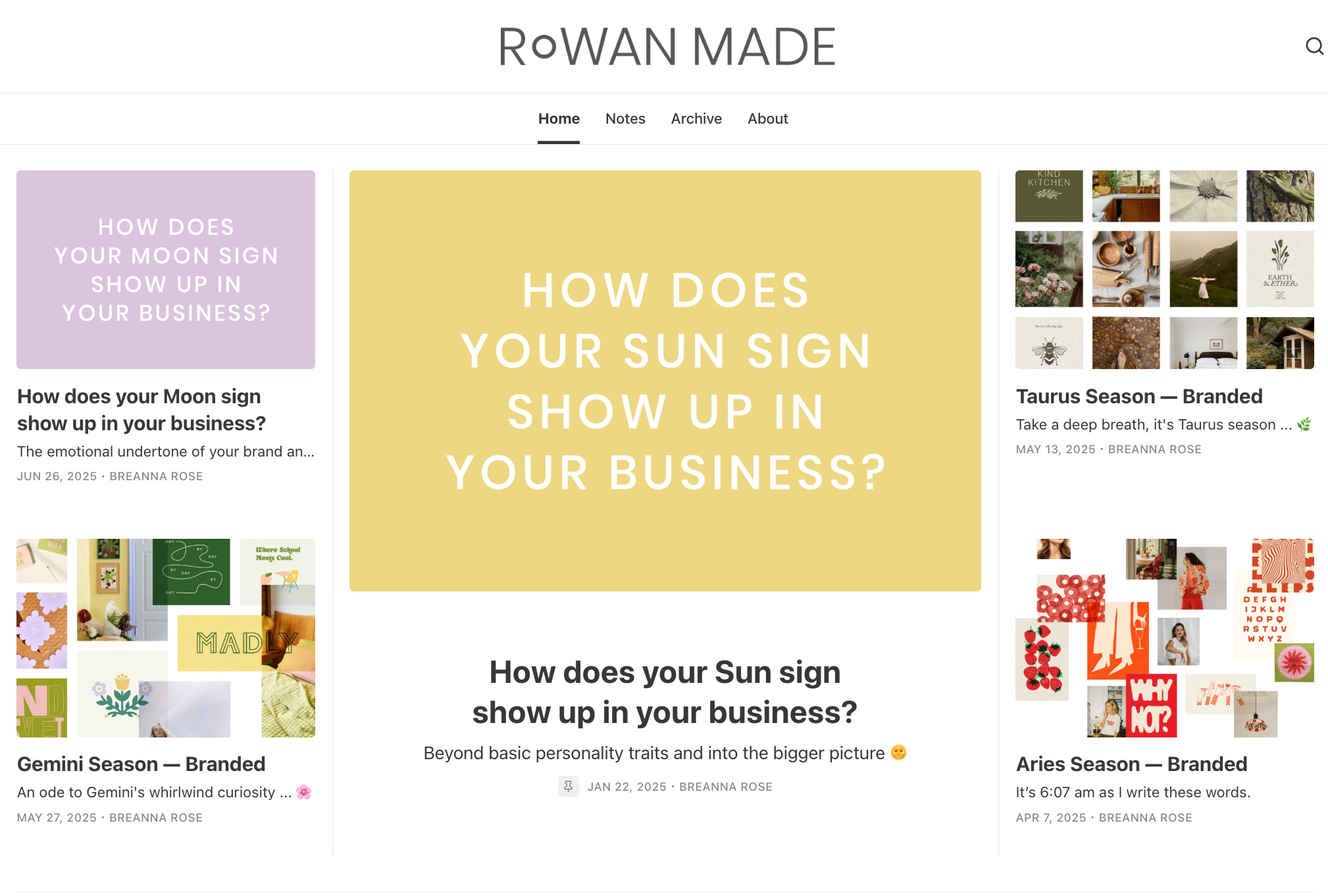
A brand strategist and astrologer, a combination I did not know I needed in my life until I saw it fully executed. The homepage reads almost like her job description made visible, branded zodiac signs, moldboards front and center, a mix of simple text graphics and collage doing most of the talking.
What I noticed is that the color palette gets to be the loud one here, bold and playful, while the typography stays deliberately simple and out of the way. That’s a quiet kind of confidence most brands don’t have the nerve for. She’s not trying to make everything shout at the same volume at the same time, and the page is better for it.
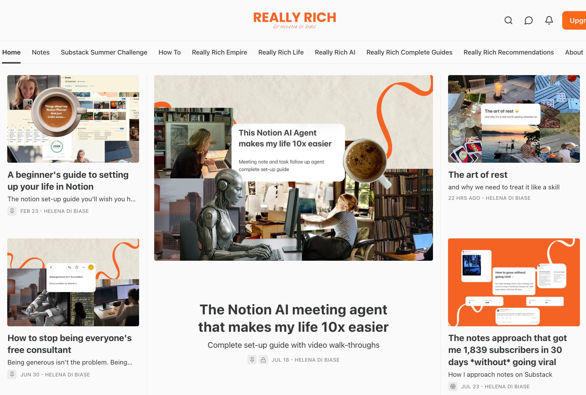
Bold orange and white, a floating ribbon motif stamped onto every single post cover, a clean sans serif underneath holding it all steady. Nothing here is subtle, and it was never trying to be. It’s a confident, slightly cheeky suggestion of exactly what the brand is offering you, wrapped in a name that already tells you where this is going.
Image cutouts and screenshots layer on top of that same orange-and-white system consistently enough that you’d recognize a thumbnail of hers scrolling by at half attention on your phone. Good proof that bold and consistent are not opposites. You genuinely can have both, she’s just living evidence of it.
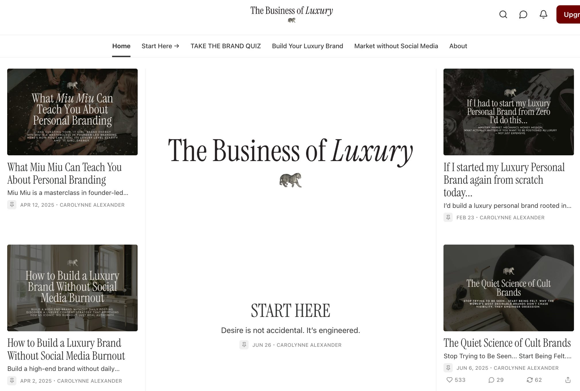
Dark image backgrounds, a clean serif headline, a sans serif subtitle underneath, her logo pinned at the top of every post without a single exception. It’s a formula, and she runs it like a metronome.
My note here, because I could not stop thinking about it: luxury branding runs almost entirely on restraint and repetition, more than any other category I can think of, and she’s applying that exact principle to her own homepage that she teaches her paying readers to apply to their businesses. The sameness isn’t a limitation. It’s the whole argument she’s making, and she’s making it well.
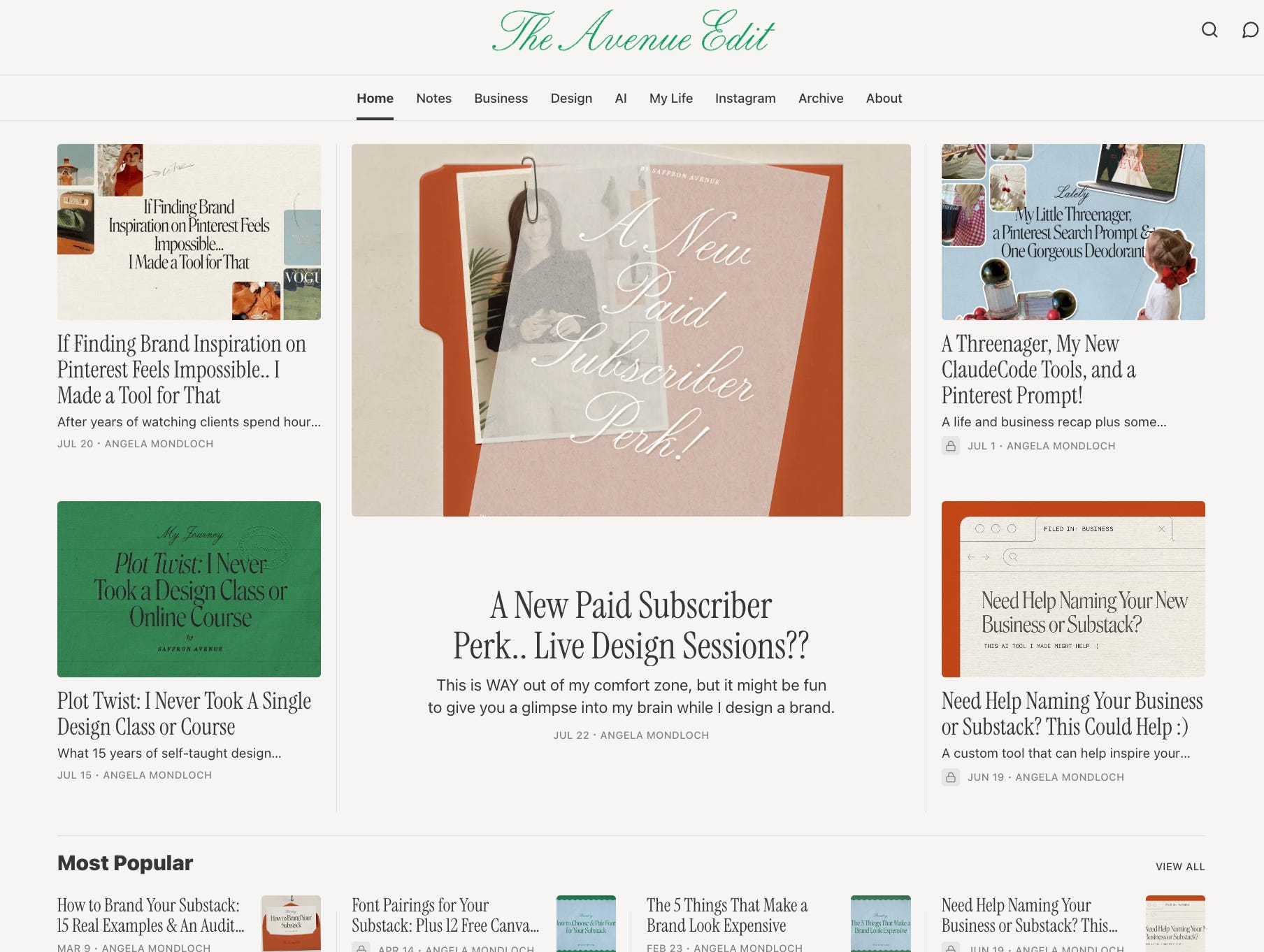
My favorite of the sixteen, and I’ve genuinely gone back and forth trying to figure out why. It has a timeless quality without ever feeling stuck in a decade that isn’t this one. Classic typefaces, an elegant script, a bold retro palette built from soft blue, forest green, and stark orange, a combination I would not have picked on my own and now cannot stop thinking about.
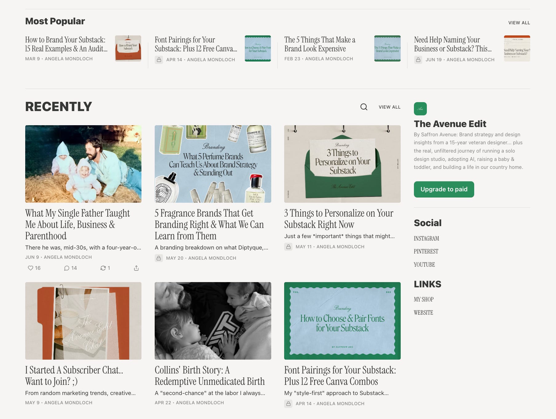
Every post graphic keeps the exact same typographic voice while the layout underneath shifts each time, which means nothing ever repeats itself and yet you’d still know it was hers from across a very crowded room. This is the cleanest example on the entire list of what “cohesive without being repetitive” actually looks like once you build it properly instead of just saying it in a brand deck. Same handwriting, a different sentence every single time.
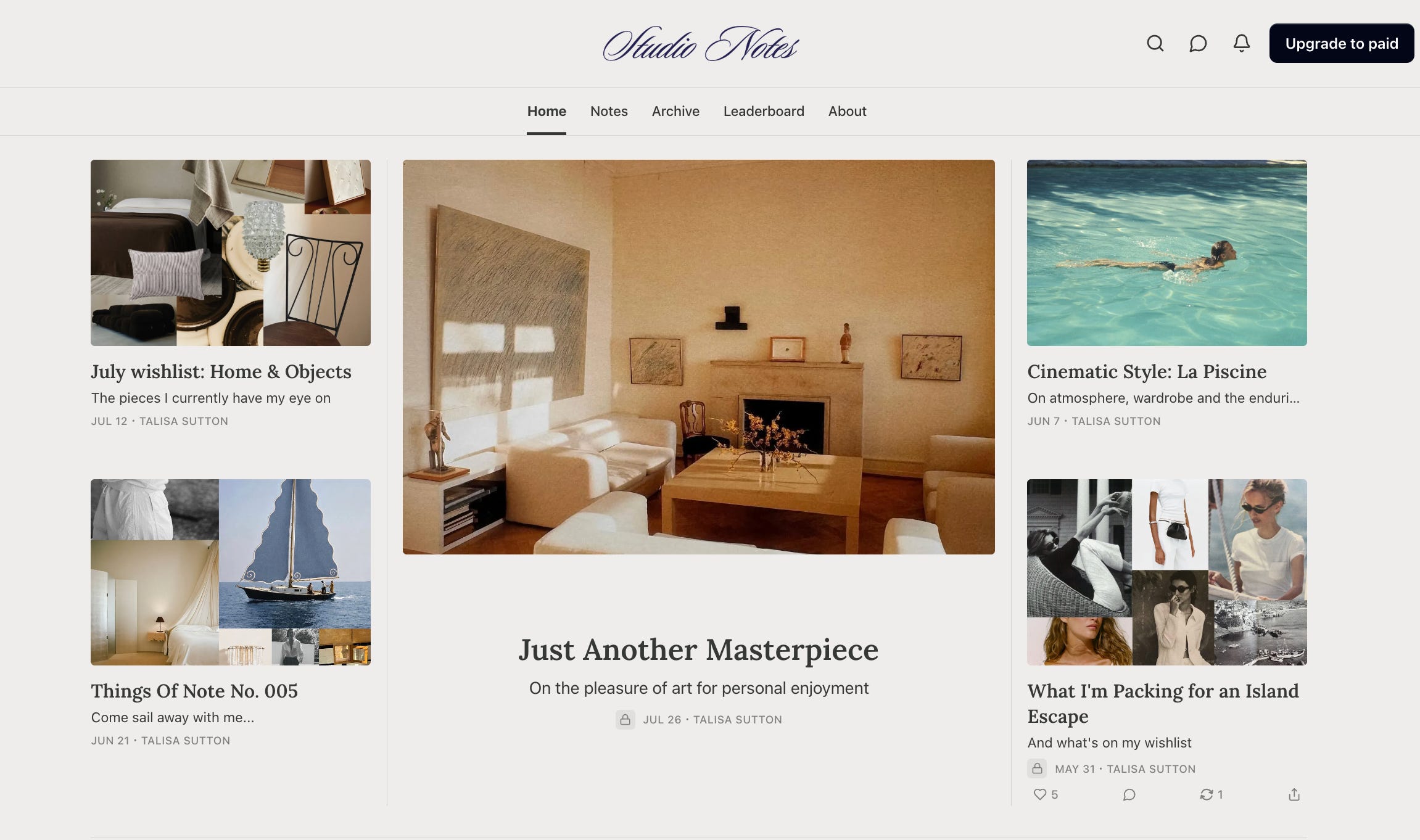
There’s a real stillness to this one that I kept scrolling back up to look at again. It reads almost like a small print magazine, simple photography tied tightly to the subject of each post, a handful of collages used sparingly instead of constantly, a classy little script logo sitting quietly at the top not asking for anything. What actually holds the whole thing together is negative space, more than any single design choice she made. She lets the page breathe, and trusts you to keep scrolling anyway.
My note: it would be easy to write this off as underdone, but that’s the wrong read entirely. This is what happens when someone is confident enough to leave things out on purpose. Not many people trust that instinct enough to actually follow through on it, and fewer still make it look this effortless.
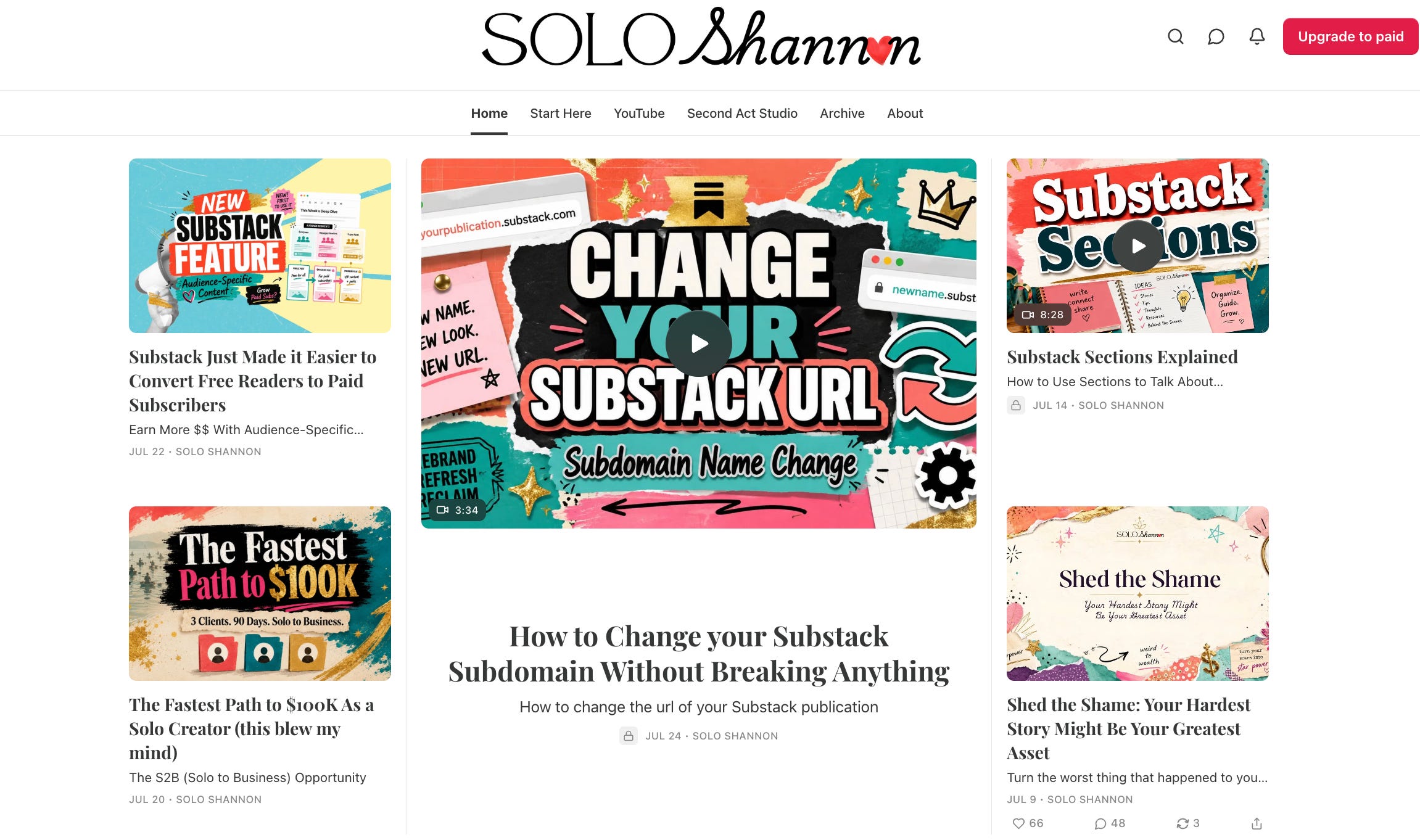
Genuinely bright, genuinely crafty, playing with texture, color, imagery, and font choice all at once and clearly on purpose. On paper this should be a disaster. It reads a little like six different moodboards got into an argument and nobody won. But it comes together anyway, because none of it is accidental, it’s confident chaos rather than the unplanned kind, and once you clock the difference you cannot unsee it in every other Substack you look at afterward.
My note: there’s something almost freeing about watching a brand embrace this much visual play without a single apology attached to it. Most people would have toned it down by post three. She didn’t, and it’s better for it.
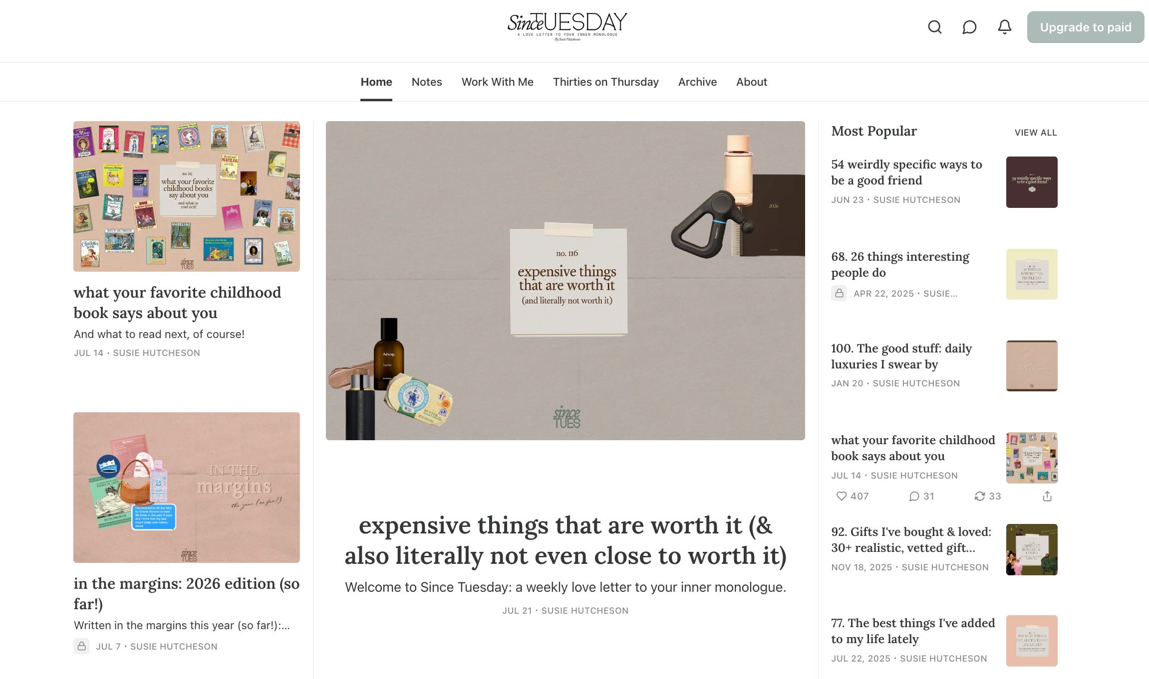
This one has the feel of a scrapbook someone actually finished, the kind with room to breathe on every page instead of every corner crammed full because someone panicked about white space. Pastels and soft pattern run throughout, and each section gets its own small layout treatment, so the homepage never falls into repeating the same visual sentence over and over the way a lot of “minimal” pages accidentally do.
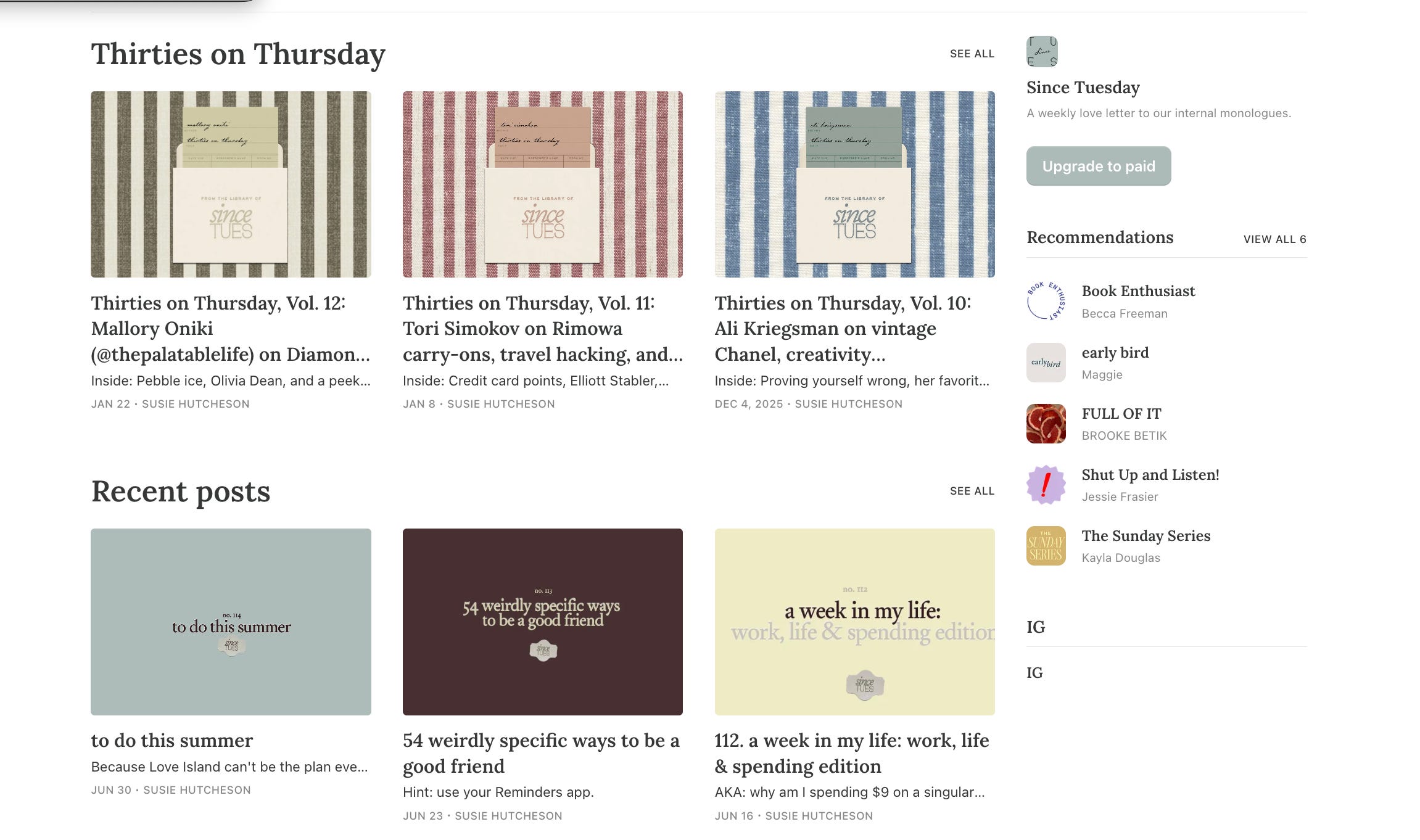
My note, and I mean this as a real compliment: it’s unhurried in a way that’s hard to fake and even harder to sustain. Nothing on this page is trying to convince you of anything within the first three seconds, which is a genuinely bold choice in an attention economy built entirely around those three seconds. It trusts you to stick around a little longer than that. The empty space around each post is doing just as much work as the images sitting inside it, and I found myself slowing my own scroll down without meaning to.
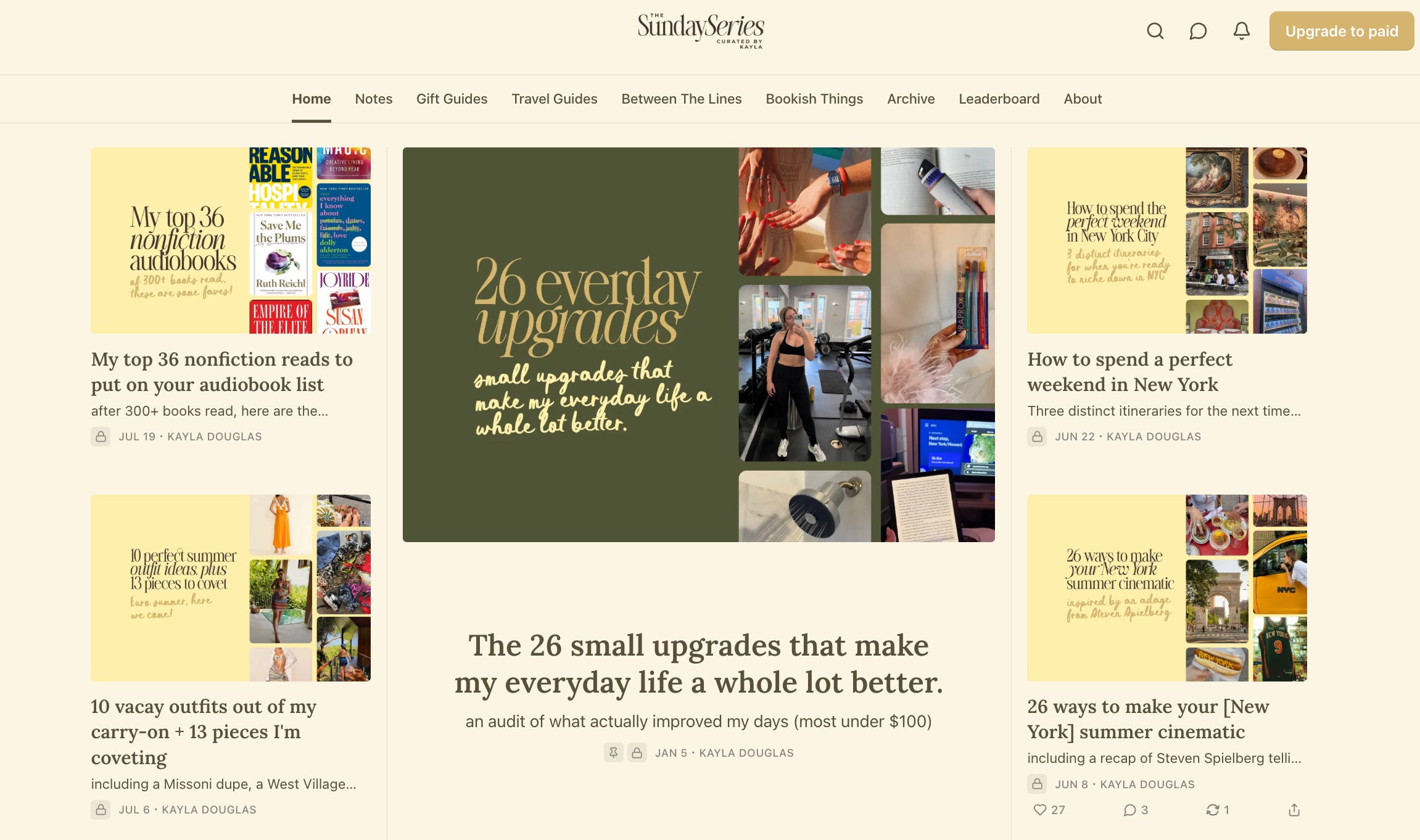
Daisy yellow, dark gold, and moss green, held to the exact same layout across the whole homepage, which gives it an ease that’s genuinely hard to fake. A serif title font paired with a handwritten cursive for subtitles gives the whole thing a warm, slightly nostalgic feel that never once tips over into twee, which is a narrower needle to thread than people give it credit for.
My note: there’s a real Sunday morning built directly into this color story, unhurried, a little golden around the edges, nothing sharp or urgent anywhere in the frame. It’s a good reminder that a palette alone can carry an entire mood if you actually commit to it fully instead of hedging with something safer underneath, which most people do without even realizing it.
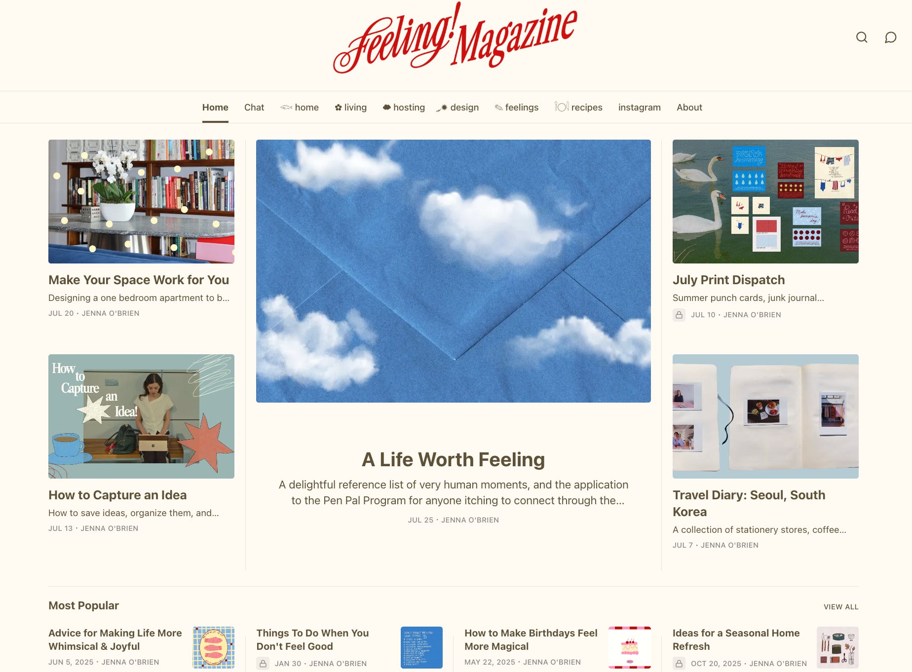
That exclamation point in the name is doing a lot of quiet work, and I appreciate that the branding actually follows through on the promise instead of undercutting it three sections later, which happens more than you’d think. Playful illustration work, a bright, slightly nostalgic palette, a script logo that genuinely looks like it belongs on the cover of a print issue you’d pick up off a coffee table and actually read cover to cover.
My note: it’s warm in a way that feels handmade rather than produced, which is the harder trick by a wide margin, and one most brands never quite land. This one does, on the first try, apparently.
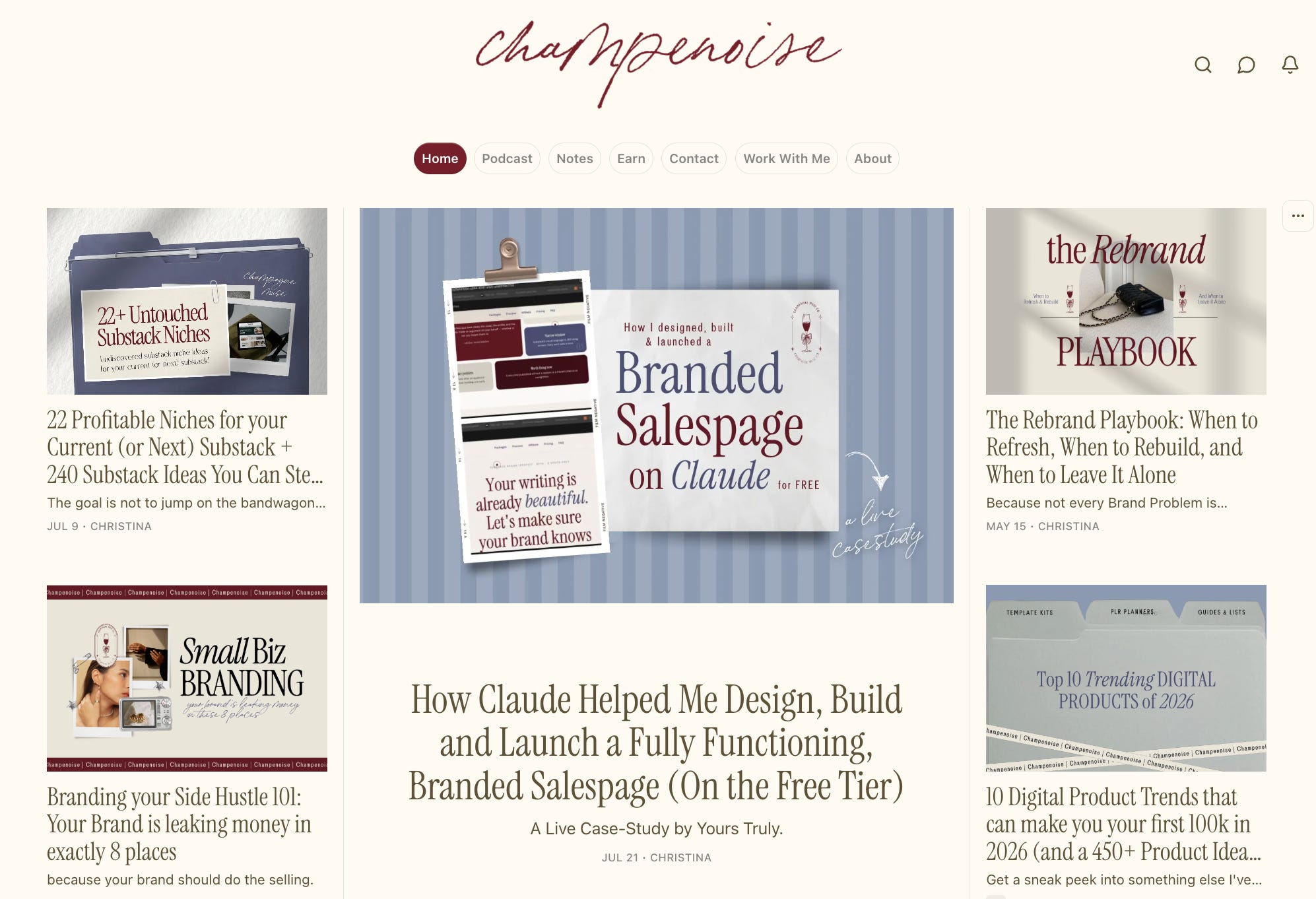
And, well. Mine. Wine, linen, mist, and slate, Instrument Serif paired with Brendon Sans, and a homepage where every post cover gets treated like its own small piece of art instead of an afterthought bolted on right before publishing. I built it exactly the way I tell every client to build theirs, strategy first, visuals second, never the other way around, even on the days it’s tempting to skip straight to the fun part and pick fonts before I’ve figured out anything else.
That usually kicks in around post twelve, so if it’s happening to you, I built something for this exact moment.
It’s a free tool, the Substack Brand Audit. Drop in your Substack URL and your email, and it hands back a short branding report with a few score cards attached, a sampler of the kind of thing I actually do for clients, not the whole meal, just enough to show you where things stand. It’ll flag what’s working in your favor and what’s quietly working against you, and give you somewhere real to start instead of leaving you to just guess and hope.
(The link might take a minute to load, the entire tool is not developed yet and this is only a free sample so bear with me. If you’re facing any difficulties with the link just reply to this email or send me message.)
If you want the deeper version, the one with an actually thorough audit, suggestions built specifically around your brand instead of generic notes, and real strategy for turning your Substack into something that grows and actually pays you back, that lives inside working with me directly as a branding client.
Anyone who runs the audit also gets folded into my private branding newsletter, where I write specifically about growing and branding a Substack (leave whenever you want, I promise I won’t take it personally), and you’ll be first in line to hear about any discounts on my branding services.
Substack is still figuring out exactly what it wants to be. New features keep showing up, more people keep joining every single week, and none of it is happening fast. It’s slow, and it’s steady, which is a strange thing to feel grateful for in an industry that usually only rewards speed. But it also means there’s still real room here for someone willing to actually sit with their branding instead of grabbing the nearest template and calling it a day.
If you’re past the free audit and ready to build that out properly, my Substack branding services: The Brand Intensive, Brand Experience, and Brand Atelier, are open at beta pricing right now. Details live on my Work With Me page.

Comments
Nothing yet. Say the first thing.
Sign in to join the conversation.