
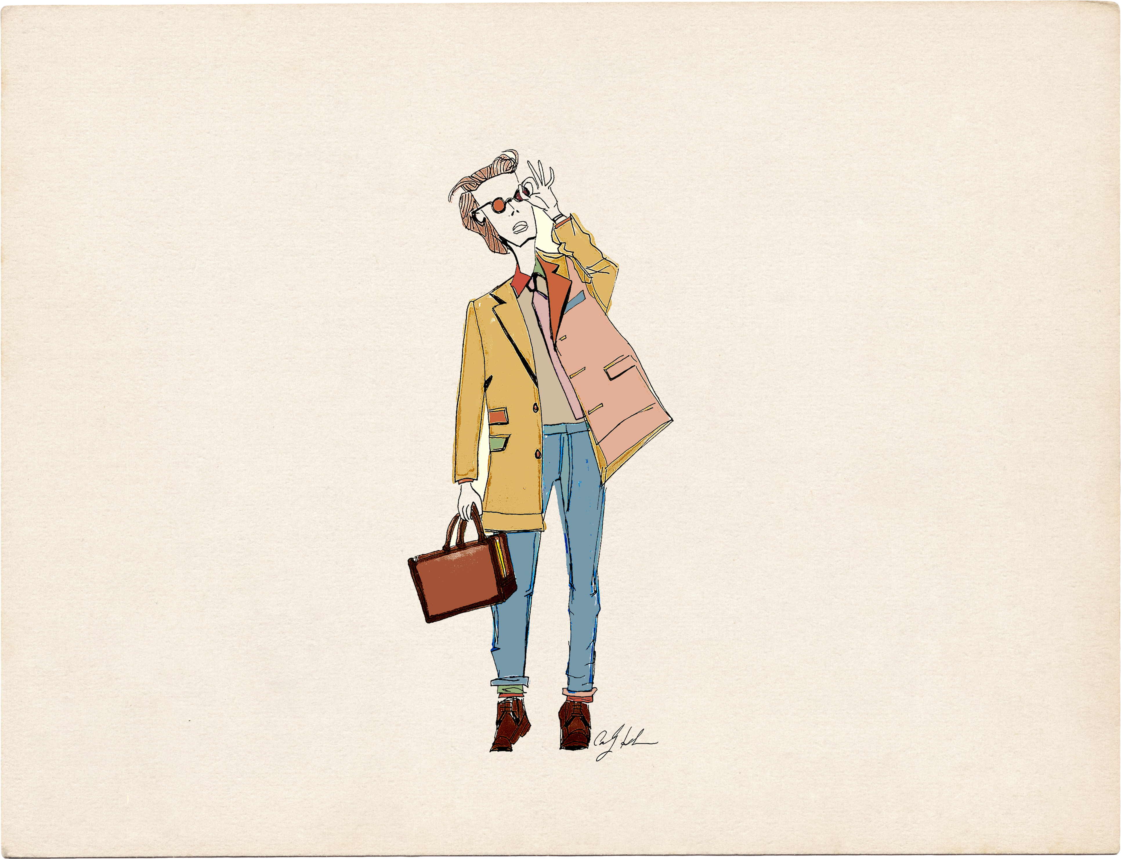
I’d like to take my relationship with color to the next level.
Part of the reason is that recently, color has been appearing more prominently in my work. I just launched my first collection with Paperless Post - a series of invitations ranging from adult dinner parties and weddings to children’s birthdays and celebrations. Knowing the collection would live as a cohesive body of work, I began thinking more intentionally about color. What kind of palette felt like my world?
In many ways, I created that color universe instinctively - choosing tones that felt right together rather than overthinking the theory behind them.
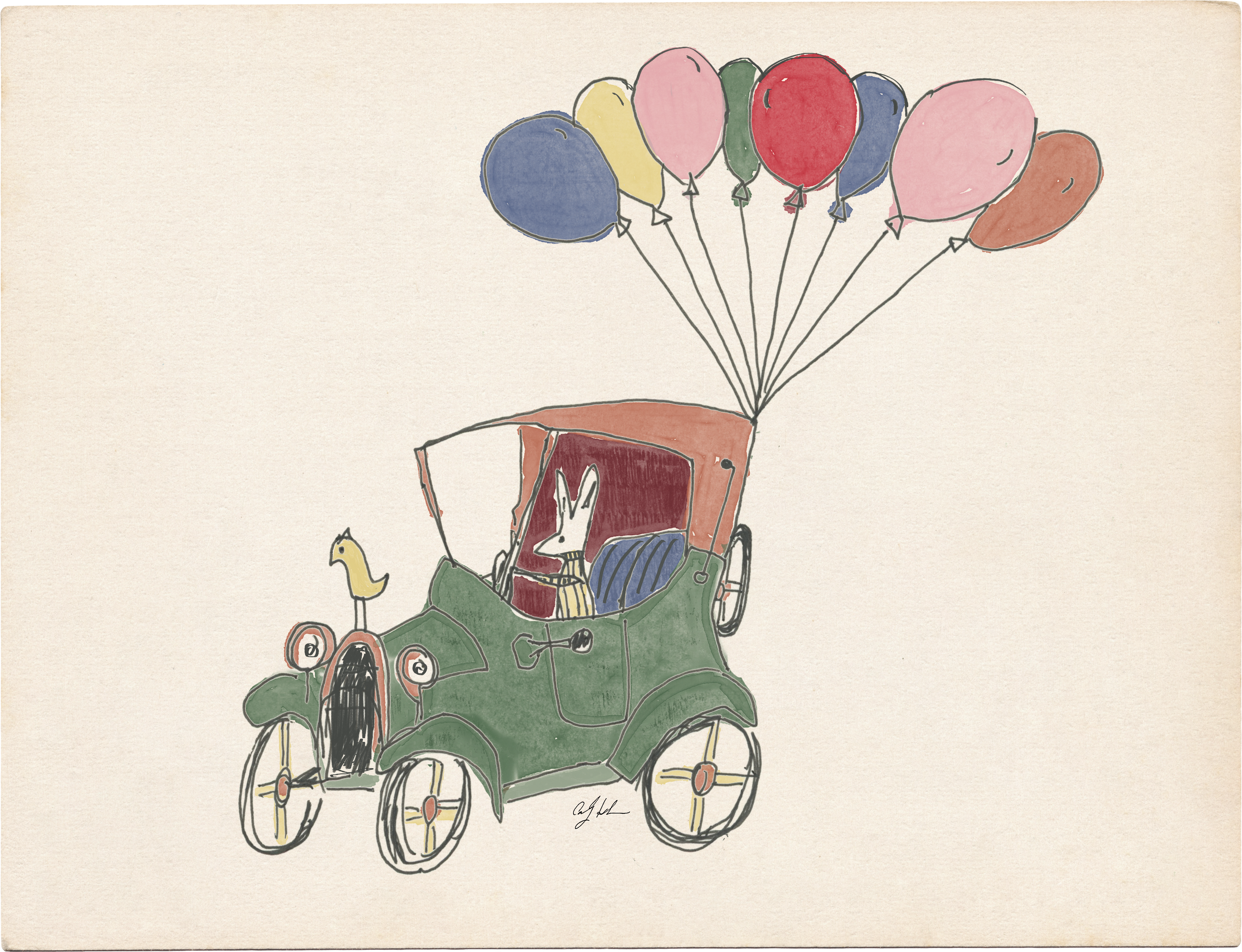
Simultaneously, I’ve been illustrating my first children’s book. That process has raised similar questions: what do I want color to communicate?
All of this made me realize that if color is going to play a larger role in my work going forward, it’s time to understand it more deeply.
When I first began illustrating and sharing my work with the world, there was color - but not much intention behind it. My art supplies were chosen mostly out of convenience.
That doesn’t sound very romantic, does it? A more poetic version might go as follows: “I was drawn to the movement of watercolor…” or “The boldness of oil paint spoke to my soul.” But the truth is far less cinematic. I was working in an office when my unintentional career as an illustrator began, so I used what was around me: pens and printer paper.
Eventually I discovered the art supply store - and more specifically, Copic brush markers. The marker is bold and vibrant, but not particularly forgiving. You pick a color and there it is, exactly as the cap promised, right on the page.
In the beginning, I was drawing a great deal of fashion and street style imagery, often referencing runway shows or editorial photographs. Because of that, the color choices weren’t truly mine. They were dictated by the original images - a coat was camel, a dress in cobalt blue, and my job (I thought) was simply to translate those colors as accurately as possible.
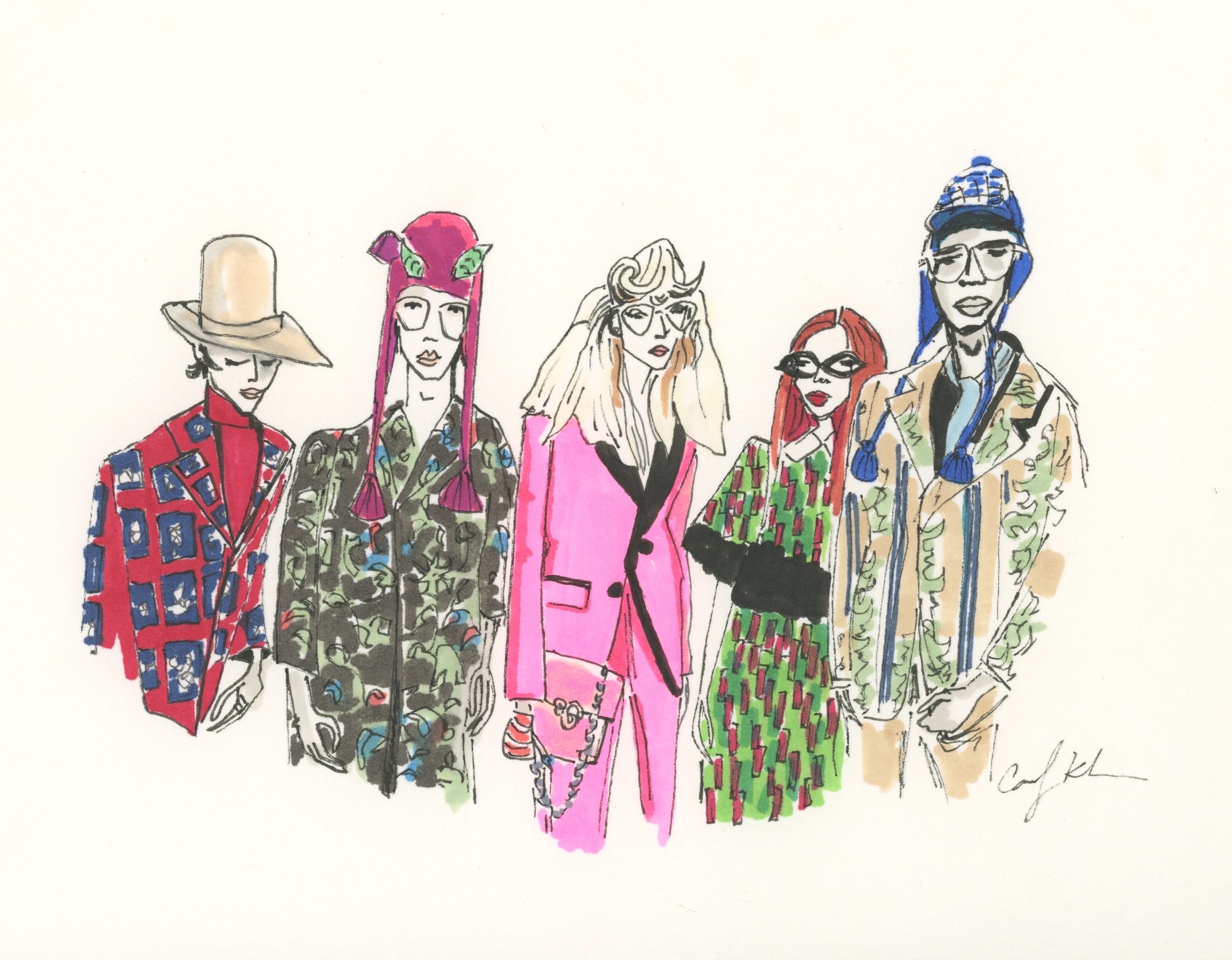
Now, when creating work for myself - or thinking ahead to future books - the palette becomes my decision. And that changes everything.
For a few years, drawing fashion moments backstage, on stage, in the wings, and on the streets became my routine. Eventually, I began to feel creatively stifled. A certain internal pressure to deliver what others had become accustomed to seeing within my work.
So I did something simple.
I took away color.
In black and white I found a new kind of meaning - even a bit of romance. As I grew as an individual, my art developed alongside me. The work remained mostly colorless, with the occasional pop of red. In many ways, that still feels like the core of my artistic ethos.
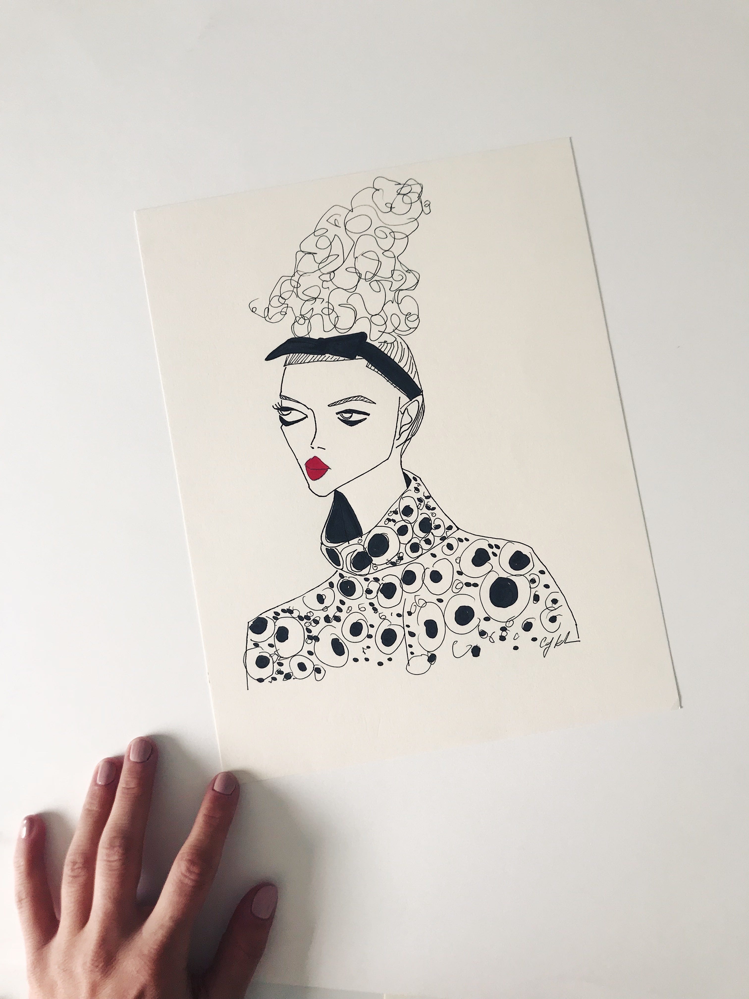
The illustrator Edward Gorey once admitted that he never felt entirely comfortable working in color, which perhaps explains why his strange and wonderful worlds lived almost entirely in pen and ink. I understand that instinct.
But in the past few years - perhaps from moving from New York City to Los Angeles to Miami and now Michigan, perhaps from becoming a mother, or perhaps simply from becoming more myself — I’ve felt the desire to bring color back into the work.
Editorial and brand collaborations began pushing me toward color. Clients were drawn to the line work but often wanted a fuller palette. At first this intimidated me, but it also forced me to grow.
If you saw my illustrations for Bergdorf Goodman the past two Holiday seasons, you know that color began playing a much larger role. While I started with unforgiving brush pens, I eventually expanded into watercolor and began experimenting digitally with color in Procreate.
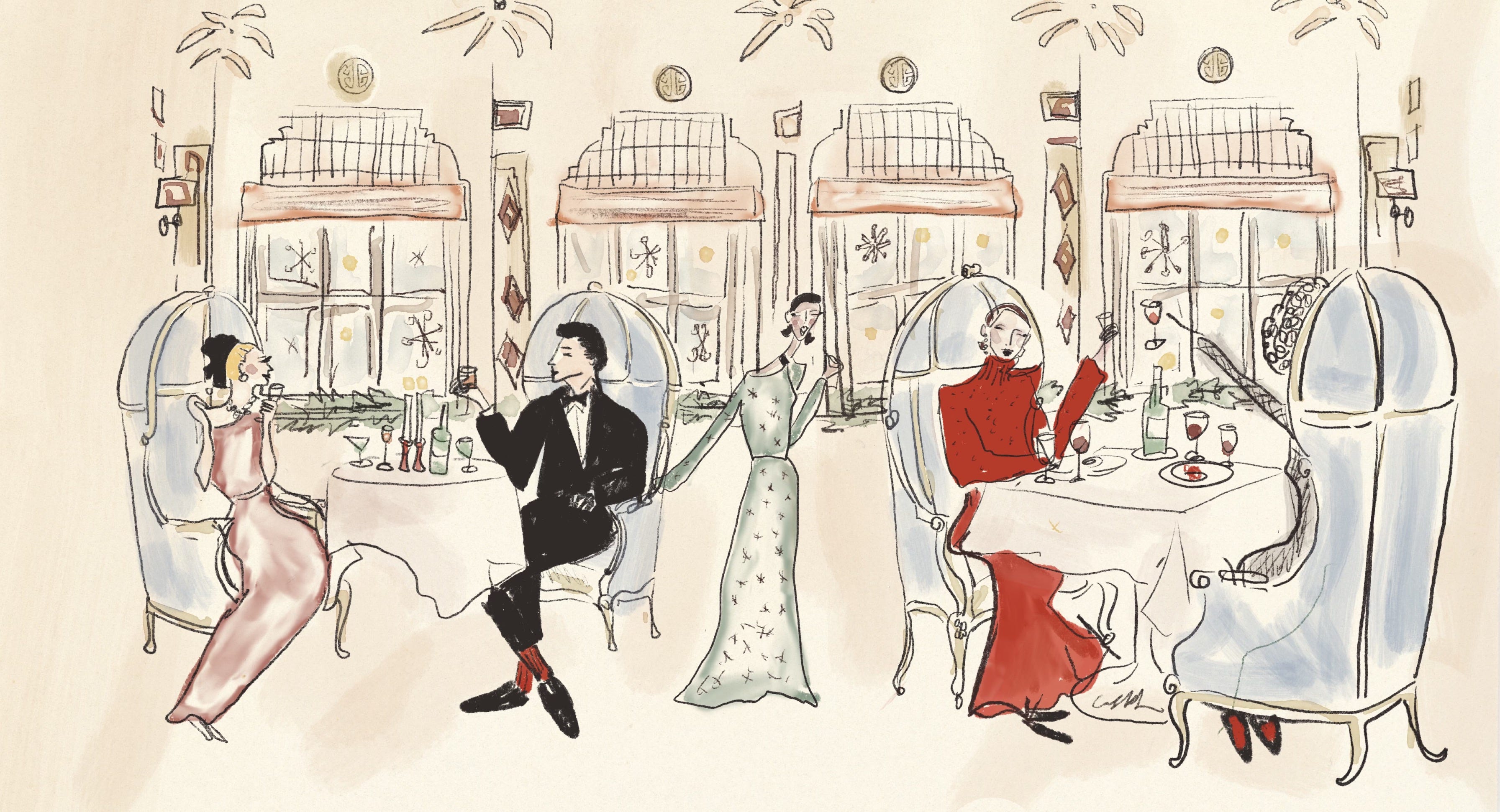
The digital and the analog now inform one another. I can test palettes on the iPad and then approach paper with more confidence. The digital tools themselves have evolved tremendously - the range of brushes and textures is almost endless.
Over the past couple of years, I’ve also begun noticing how much materials themselves influence color. Each medium seems to carry its own palette. There is an inherent romanticism to watercolor - the softness, the way pigment moves unpredictably in water. Colored pencil conveys something entirely different: quieter, more deliberate, built slowly through layers.
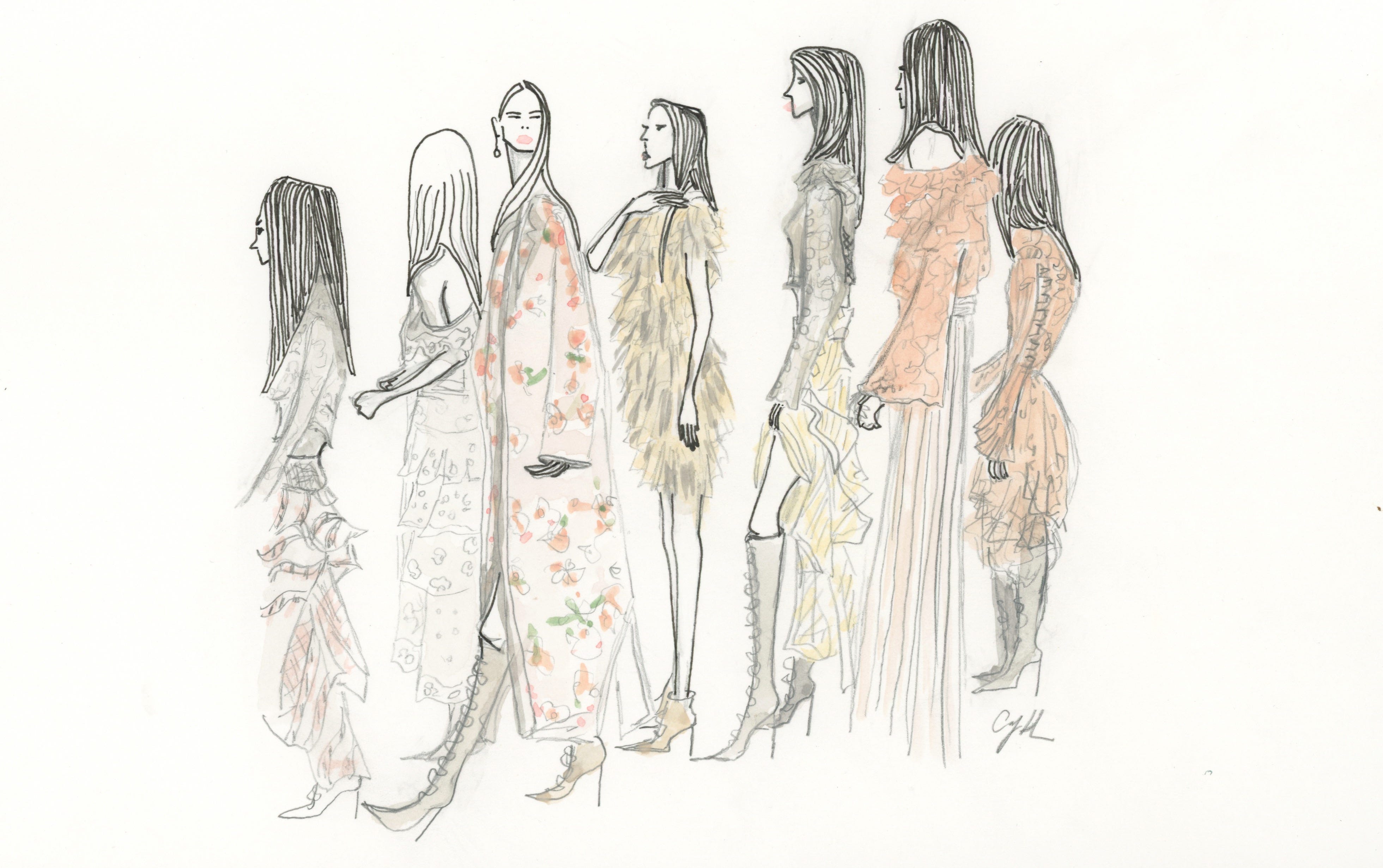
The material becomes part of the color story. So how does one begin to find a relationship with color?
Observation.
Color is everywhere.
What colors do I gravitate toward when designing my home?
When choosing an outfit?
When hanging art on the wall?
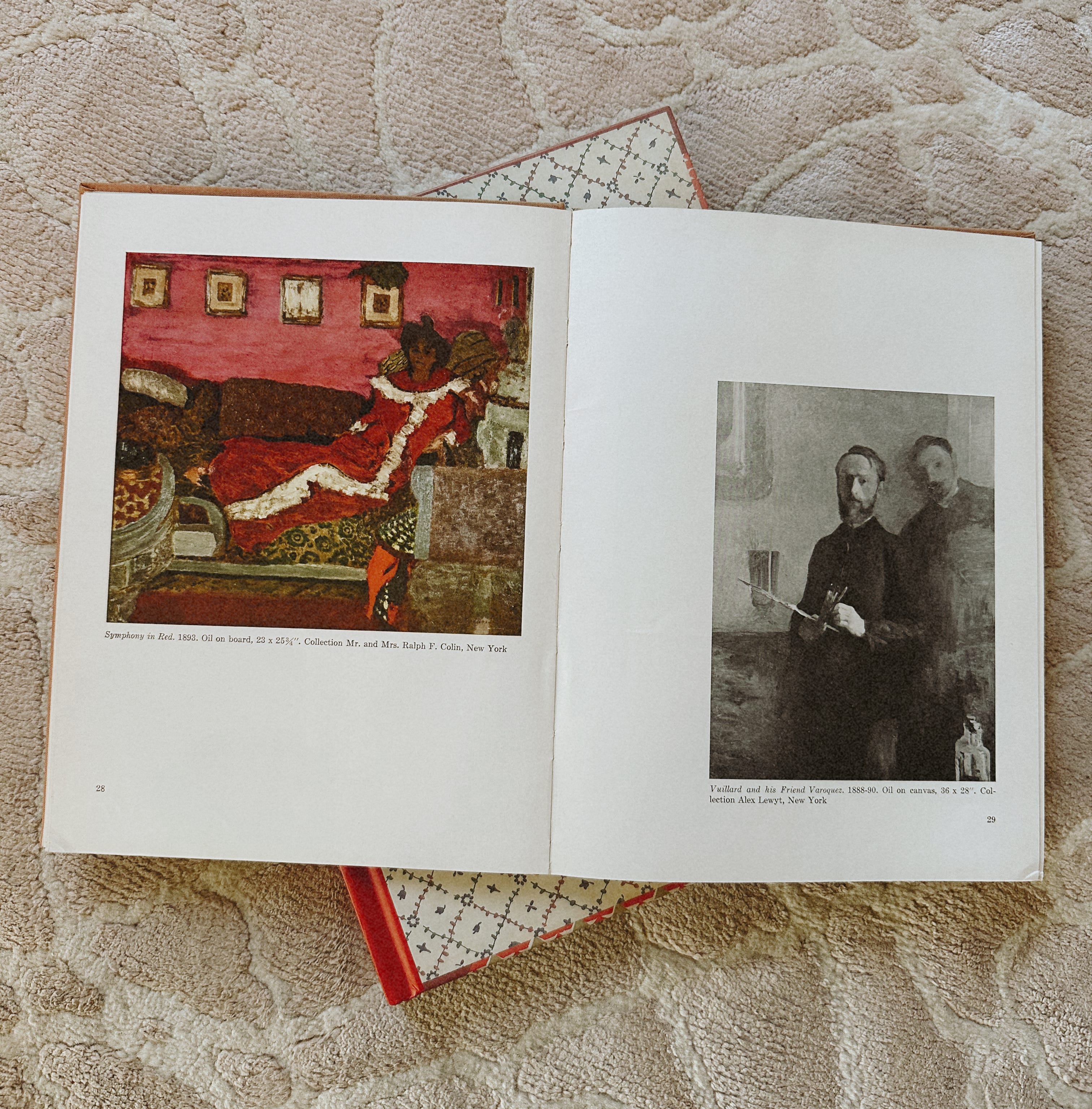
What palettes appear in the paintings I return to again and again?
How are those colors used - boldly, sparingly, subtly?
I’ve also turned to my own body of work from the past ten years. What do I still love? Is there a through line in the selections? How do those palettes align with the ones I’m noticing elsewhere?
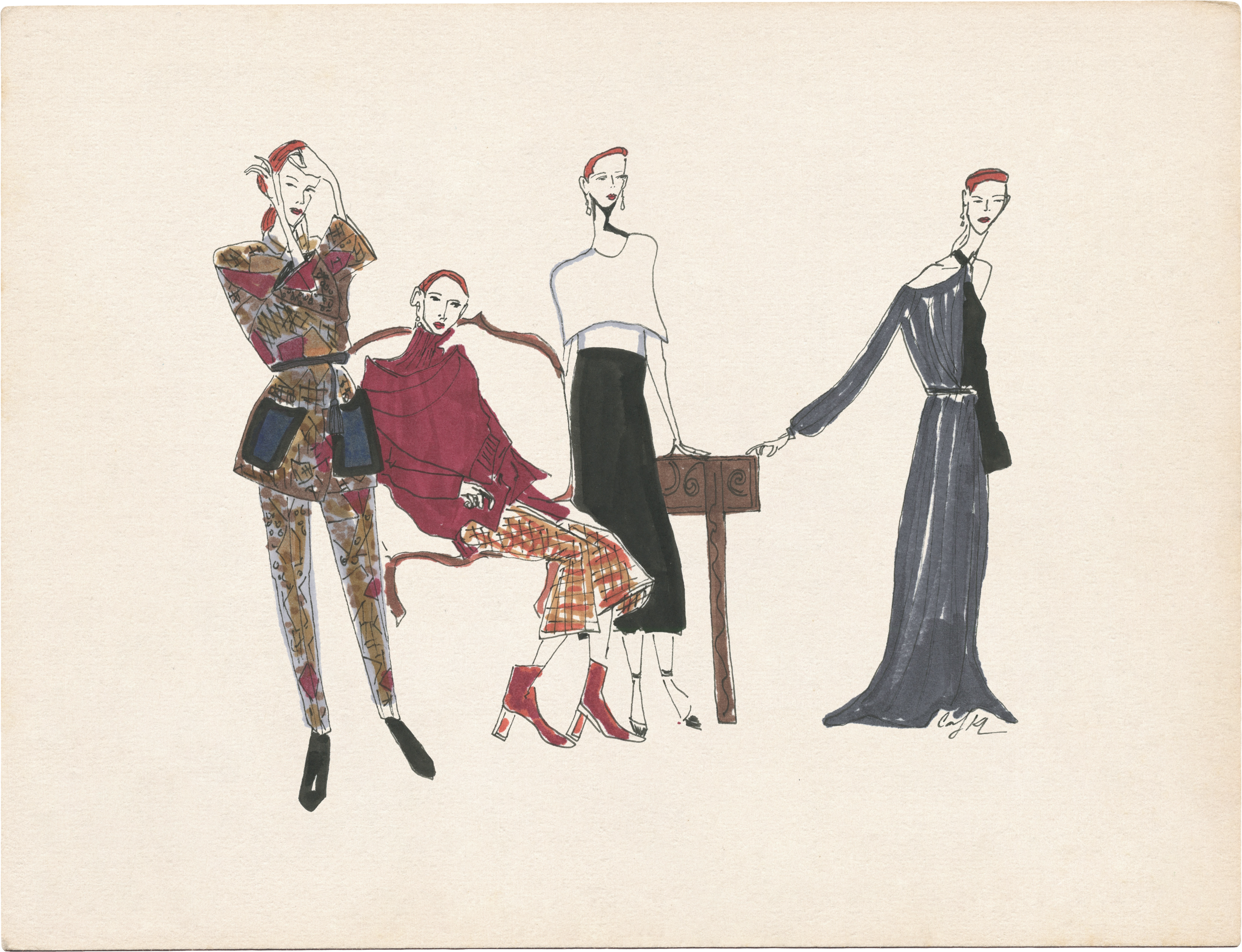
So we start with trusting the eye, and then we educate it.
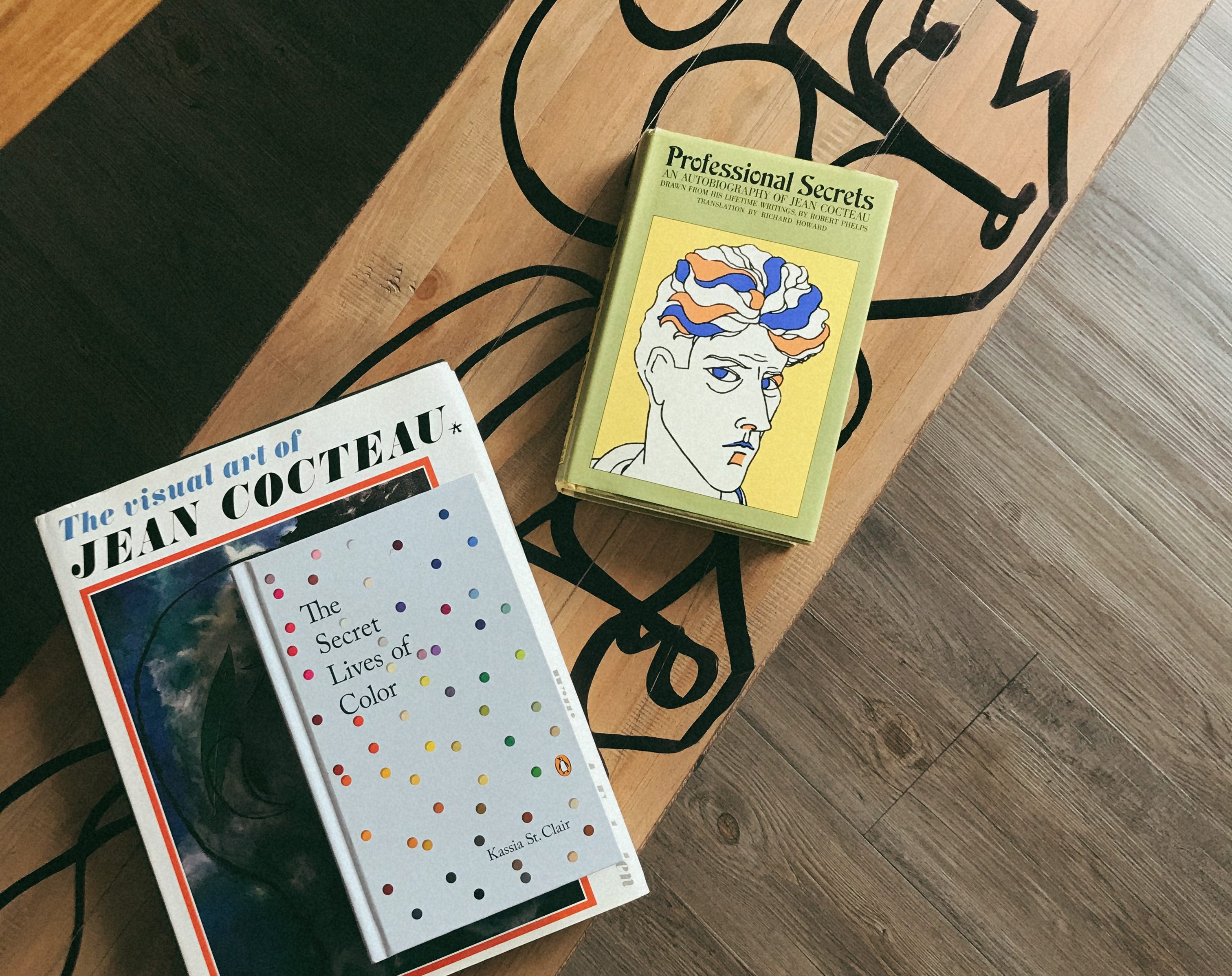
My desk has expanded beyond a workspace - it’s become a place of study.
This feels like the beginning of a small study in color - one I hope we can explore together.
And since we’re here, what better platform to do such work? Substack is filled with creatives who are masters of their own fields, generously sharing their knowledge, curiosities, and discoveries. From interiors to mood boards to discovering female artists you should know, it’s an easy place to get lost for hours.
Here are a few writers I’ve been turning to for color inspiration. (I would list more categories, but my email limit has most definitely been reached).
Kelsey Rose - Absolument !
Kelsey is an art historian, writer, and the Archivist of the Eames Office. An American living in the Basque Country of France, she writes with deep curiosity about art, design, and visual culture. A wonderful place to begin is her essay “Three Pots of Inspiration: emotional hues, Meret Oppenheim, and art with a taste of candy shop.” Within that post she references other Substacks as well - so it’s an excellent entry point into an even larger color rabbit hole.
Ali LaBelle - À La Carte
Ali’s Substack is a masterclass in mood boards. She has an incredible ability to bring together imagery - interiors, fashion, art, objects - into visual worlds that feel both cohesive and aspirational. Her posts don’t just present color; they create an atmosphere you want to step into.
Rose Florence - The Rose Period
Rose writes one of the most engaging art-focused Substacks on the platform. Her piece “The History of Red” is a perfect place to start. She explores art history with intelligence and enthusiasm, constantly introducing readers to artists worth knowing. She’s also the Brand Director at Alex Mill - a brand that celebrates color beautifully. Her Notes often feature a steady stream of female artists to discover…a visual delight.
Beth Mathews
Beth is a graphic designer who explores color through design history and visual culture. Her essay “Why So Many Control Rooms Were Seafoam Green” is a fascinating look at how color choices influence the spaces we inhabit - often for reasons we might never expect.
Jon Klassen & Mac Barnett - Looking at Picture Books
For anyone interested in illustration, this Substack is essential reading. Jon and Mac analyze picture books with the kind of thoughtful attention usually reserved for literature or film. They go far beyond color for me - they are true masters of the picture book form.
Carson Ellis - Slowpoke
Carson’s Substack feels like peeking into the studio of one of the most distinctive author/illustrators working today. Her reflections on drawing, life, and making books are thoughtful and personal, and her use of color - atmospheric, strange, and unmistakably her own - is something I return to again and again.
Christian Robinson - Today’s Special
Christian shares glimpses of his creative process, sketches, and small observations from studio life. His work has a joyful, graphic use of color that feels both playful and deliberate, and seeing the thinking behind it is always inspiring.
If you have favorite Substacks, books, podcasts, films, or other sources you turn to for color inspiration, please do share - I’d love to discover them as well.
After all, learning to see color is a lifelong practice - and I suspect this is only the beginning.
Curiously Yours,
Carly
No posts
Comments
Nothing yet. Say the first thing.
Sign in to join the conversation.