
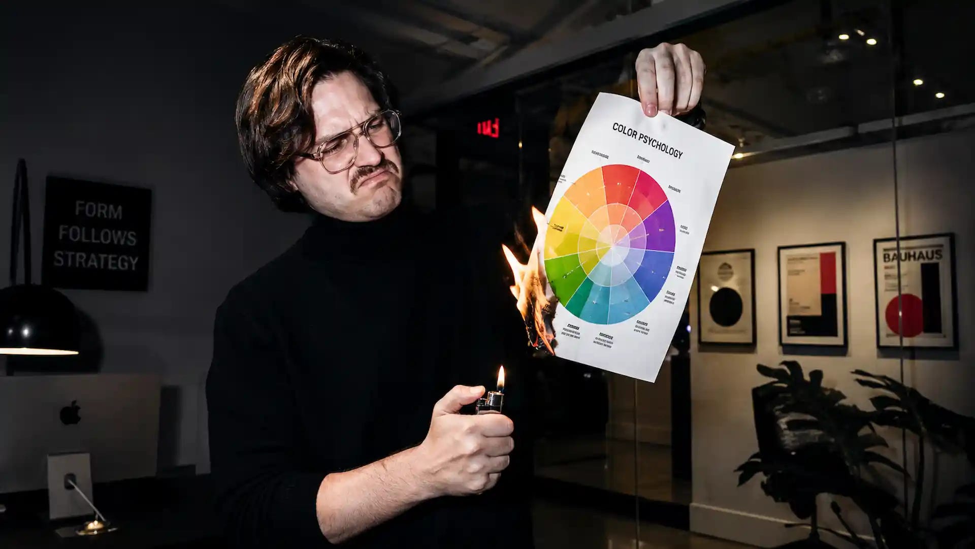
Walk into almost any branding workshop or social feed from a designer and you’ll eventually see it. A colorful wheel assigning neat little personality traits to every hue. Blue means trust. Red means excitement. Green means growth. Purple means luxury. Yellow means optimism. Sometimes orange is friendliness. Sometimes it’s confidence. The details change depending on who’s presenting, but the premise never does: choose the color that matches the emotion you want people to feel.
It’s one of branding’s most enduring myths. Not because colors don’t influence perception. They absolutely do. It’s a myth because the chart presents those influences as universal psychological truths when decades of research suggest something far more nuanced. The chart promises certainty where the science repeatedly finds context.
The strange part is how rarely anyone questions it. The same diagrams appear in agency decks, design blogs, marketing courses, and conference presentations as though they were copied from a single authoritative source. Alongside them comes another familiar statistic: color increases brand recognition by up to 80 percent. Like the personality chart, the number has spread far wider than its evidence. Search for the original study and you’ll quickly discover how difficult it is to trace. The statistic has been repeated so many times that its repetition has become its credibility.
That should concern anyone making branding decisions. The branding industry likes clean answers. Clients want confidence. Designers want frameworks. Personality charts satisfy both by reducing one of the most complicated aspects of identity design to a matching exercise. Decide what emotion the brand should communicate, then choose the corresponding color. It’s simple, memorable, and easy to teach.
Reality is considerably less cooperative. One of the most influential frameworks in modern color psychology is Andrew Elliot and Markus Maier’s Color-in-Context Theory. Rather than arguing that colors possess fixed emotional meanings, they reached almost the opposite conclusion. Color influences perception, but those influences depend on context. The same color can produce entirely different responses depending on the environment in which it appears, the expectations surrounding it, and the experiences people bring with them.
Red illustrates the problem perfectly. On a warning sign, it communicates danger. On a clearance tag, urgency. On a luxury sports car, performance. During Lunar New Year, celebration and prosperity. On the sole of a Christian Louboutin shoe, exclusivity. The wavelength reaching your eyes remains essentially the same. Everything else changes.
That observation may sound obvious, yet it dismantles the foundation of the personality chart. If a single color can communicate completely different ideas depending on where it appears, then assigning one permanent meaning to it is not science. It’s oversimplification and dangerous.
The research becomes even less convincing when you examine some of the studies that popularized color psychology. One of the best-known experiments suggested that briefly seeing the color red before taking an exam could impair cognitive performance. The finding was elegant, intuitive, and quickly became a favorite example in presentations about subconscious influence. Unfortunately, later replication attempts produced inconsistent results, and subsequent reviews concluded that any effect appears to depend heavily on context, methodology, and experimental conditions. Like much of behavioral science, the initial headline proved stronger than the evidence supporting it.
A broader problem exists throughout the literature. Recent reviews of color research in design have identified recurring methodological weaknesses, including vague descriptions of the colors being tested, underpowered samples, and experimental environments that bear little resemblance to how people encounter brands in everyday life. Researchers often report testing “red” without specifying hue, saturation, or brightness, despite those characteristics dramatically changing how a color is perceived. Designers know instinctively that burgundy, scarlet, brick, and crimson create different impressions, yet many studies treat them as interchangeable variables. That alone should make anyone cautious about drawing sweeping conclusions.
None of this means color psychology should be discarded. It means we’ve been asking it to answer the wrong question. The problem has never been whether color influences perception. The evidence overwhelmingly suggests that it does. The problem is assuming that colors possess emotional properties independent of everything surrounding them. Asking whether blue builds trust is like asking whether a particular word always carries the same meaning regardless of the sentence in which it appears. Words derive meaning from context, and color appears to operate much the same way. It contributes to perception, but it does not determine perception on its own.
That distinction changes how branding should approach color.
The industry often mistakes recurring patterns for universal truths. Banks use blue, therefore blue must create trust. Environmentally conscious brands use green, therefore green must communicate sustainability. Luxury brands frequently use black, therefore black must signal prestige. It sounds logical until you reverse the sequence.
What if those associations weren’t created by the colors at all? What if, instead, they were learned through repetition by society?
This explanation aligns far more closely with what we know about human perception and associative learning. Financial institutions have relied heavily on blue for decades because it projected professionalism and consistency within the category. Consumers encountered that visual language repeatedly until blue itself became associated with financial services. The same process occurred with green in environmental branding and black in luxury fashion. Designers then looked backward, observed the pattern, and mistakenly concluded that the colors themselves possessed those meanings. Correlation became causation behind the scenes.
This distinction matters because it changes the job of identity design. The objective is not to discover the hidden emotional properties of a color. The objective is to understand the expectations people already bring into the interaction and then decide deliberately whether those expectations should be reinforced or challenged.
That introduces an important tension in branding: Every successful identity must stand apart from its competitors because recognition depends on distinction. A brand that looks identical to everyone else quickly disappears into category sameness. Yet every successful identity must also communicate confidence because people gravitate toward things they understand. Categories develop visual conventions for a reason. They reduce uncertainty. They help people quickly identify what a company is likely to offer before they have read a single word.
Standing out, then, cannot become the objective by itself. A healthcare company could adopt fluorescent pink and certainly become more noticeable than every competitor. A bank could replace navy blue with bright lime green. A law firm could embrace neon orange. Each decision would increase distinction, but distinction alone does not build confidence. If the visual language creates too much uncertainty, the rest of the brand must work exponentially harder to overcome it. Standing apart remains essential, but not at the expense of being understood.
Balancing those opposing forces is the foundation of strategy. Strong identity systems preserve enough familiar cues to establish confidence while introducing enough distinctive assets to become memorable. They don’t reject category conventions simply because they exist, nor do they imitate them blindly. They evaluate which expectations deserve to remain because they communicate competence and which deserve to be challenged because they produce sameness. The goal is not to fit in. The goal is to become unmistakable without becoming confusing.
Research supports this direction. Studies examining brand color appropriateness consistently find that people respond more favorably when a color feels suitable for the product or service being offered. Notice what the research does not conclude. It does not argue that blue universally communicates trust or that green inherently signals nature. It suggests that people evaluate color within the broader context of what they believe the brand should be. Appropriateness, not symbolism, appears to drive much of the response.
The work of Labrecque and Milne reaches a similarly measured conclusion. Their research identified relationships between certain colors and brand personality dimensions, but those relationships were modest, culturally influenced, and highly dependent on context. They are useful as hypotheses rather than prescriptions. A designer may reasonably begin by exploring blue for a financial institution or green for a sustainability initiative, but treating those choices as scientifically predetermined mistakes tendency for certainty.
This shifts the conversation from symbolism to strategy. Instead of asking what a color means, begin by understanding the category your brand is entering and the expectations your audience already carries. Decide which conventions support the story you need to tell and which have become barriers to distinction. Test those assumptions with real people instead of personality charts. Then apply the chosen palette with relentless consistency so it becomes a distinctive asset people learn through repeated exposure.
Brands are rarely remembered because they selected the emotionally correct color. They are remembered because they consistently expose people to the same recognizable visual system over months and years. Recognition grows through repetition. Familiarity grows through consistency. Meaning accumulates through experience. Color contributes to every one of those outcomes, but never by itself.
The color psychology chart survives because it offers an answer that fits neatly on a slide. Branding has always been more complicated than that. People do not experience colors in isolation. They experience brands as complete systems composed of products, language, environments, service, reputation, expectations, and memories. Color shapes those experiences, but it is only one signal among many, and its meaning is inseparable from the context in which it appears.
The chart asks the wrong question. It asks what colors mean.
Better branding begins by asking what people need to believe, then designing every part of the identity to reinforce that belief. Color remains one of the most powerful tools available to designers. It simply derives its power from context rather than mythology.
No posts
Comments
Nothing yet. Say the first thing.
Sign in to join the conversation.