
When I started my first branding agency, I thought I had a pretty good handle on what separated good design from bad. I was young, ambitious, and fortunate enough to spend time inside larger agencies where I learned from people whose work I genuinely admired. Like most designers at that stage of their careers, I soaked it all in.
At that time, visual languages were remarkably consistent. Swiss grids. Bauhaus-inspired layouts. Dieter Rams and Paul Rand were saint-like. Restrained typography. Intentional white space. Everything unnecessary removed until only the essential remained. The work felt intelligent, mature, and disciplined. And success of any company on the receiving end of that work was assured success.
Advertising had its own version of the same philosophy. Great brands didn’t run promotions. They had big ideas and told emotional stories. They stood for something larger than the features and benefits of the products they sold. If you built the right campaign, people wouldn’t just buy what you made, they’d buy into the bigger idea of what the brand believed.
Nobody ever said, “This is how every business should communicate.” But they didn’t have to. When every design annual, agency portfolio, conference stage, and classroom celebrates the same kinds of work, you stop seeing them as examples and you start seeing them as truth.
So I did what young designers are supposed to do. I took those ideas into the real world with a healthy dose of arrogant elitism. After all, I had the degree and the know how.
Then I started working with local businesses, regional restaurant chains, startups, family-owned companies, and founders who weren’t trying to become the next Apple. They were trying to open a second location. They were trying to hire and train faster than the competition. They were trying to convince someone driving past at forty-five miles an hour to pull into the parking lot instead of the one across the street.
And something uncomfortable happened. The closer I pushed those businesses toward the visual language I’d been taught was “good,” the more often the work underperformed.
Not every time. There are plenty of examples where clean, restrained design is exactly the right answer. But often enough that I couldn’t dismiss it as coincidence. The businesses that gained traction weren’t always the ones with the most refined identities. They were the ones that felt unmistakably themselves. They were easier to recognize, easier to remember, and often more approachable than the polished work I’d been trained to admire.
For a while, I assumed I just needed to get better. But after awhile, years in fact, I began to realize I’d been asking the wrong question. The problem wasn’t my execution. The problem was that I had mistaken the branding of successful companies for the process of becoming one. Those are not the same thing, and I think that misunderstanding quietly shapes far more of our industry than we’d like to admit.
I actually think the next section is where you earn the reader’s trust. Rather than immediately explaining survivorship bias, I’d let readers recognize it in themselves first. That’s much more in line with how you build arguments.
The more I looked back on those early years, the more I realized I hadn’t been taught branding nearly as much as I’d been taught what successful brands happened to look like.
Think about the companies that dominate design education, agency presentations, and conference keynotes. Apple. Nike. IBM. Braun. Starbucks. Airbnb. They’re fascinating businesses, and they deserve to be studied. They’ve solved incredibly difficult problems at a level most companies will never experience. The trouble begins when we quietly assume their solutions are universal simply because they’re successful.
There’s a name for that mistake: survivorship bias. Survivorship bias happens when we study the people or companies that made it while ignoring everyone who tried similar approaches and disappeared. We naturally assign too much importance to the characteristics of the survivors because they’re the only ones still standing. Success makes those characteristics visible. Failure quietly removes the comparison group.
Design isn’t immune to that bias. In fact, I think it’s one of the disciplines where it hides in plain sight. We admire Apple’s restraint because Apple became Apple. We admire Nike’s confidence because Nike became Nike. We admire Starbucks’ simplicity because Starbucks became Starbucks. It’s easy to look backward and connect those visual decisions to their success because the ending is already written.
History rarely works that neatly. A clean logo didn’t build Apple’s distribution network. A minimalist retail experience didn’t create the iPhone. Nike didn’t become a global brand because it could run an emotional commercial without showing many shoes. Those decisions became possible after years of product innovation, operational excellence, relentless distribution, and billions of dollars spent creating familiarity. In other words, we’re often confusing what success looks like with what creates success.
I don’t think design schools do this intentionally. They’re teaching exceptional work because exceptional work is worth studying. The unintended consequence is that young designers leave believing every business should aspire to the visual language of multinational corporations. We inherit the artifacts without fully understanding the conditions that produced them.
There’s another bias at work here too: prestige bias. Human beings have a tendency to imitate people and institutions we perceive as successful. It’s an incredibly efficient shortcut most of the time. If the best chefs sharpen their knives a certain way, that’s probably worth paying attention to. If the best athletes train a certain way, it’s reasonable to ask why. The shortcut’s efficacy slips when we imitate the visible parts instead of the causal ones.
Apple’s minimalist design wasn’t a magic ingredient. It was one expression of a much larger system that included extraordinary products, extraordinary marketing, extraordinary retail, and extraordinary reach. Strip away the rest of that system and you’re left copying the appearance of success instead of the engine that created it.
Once I started seeing that pattern, I couldn’t stop seeing it. The example that finally made everything click wasn’t Apple or Nike.
It was Starbucks.
Starbucks is one of those brands designers love to use as evidence that simplicity wins.
On the surface, it’s a compelling story. The original logo from 1971 was dense with detail. The twin-tailed siren was rendered like an old woodcut and surrounded by the words Starbucks Coffee, Tea & Spices. As the company grew, the logo became cleaner. The illustration was refined. The typography disappeared. By 2011, Starbucks removed its own name entirely, leaving only the green siren.
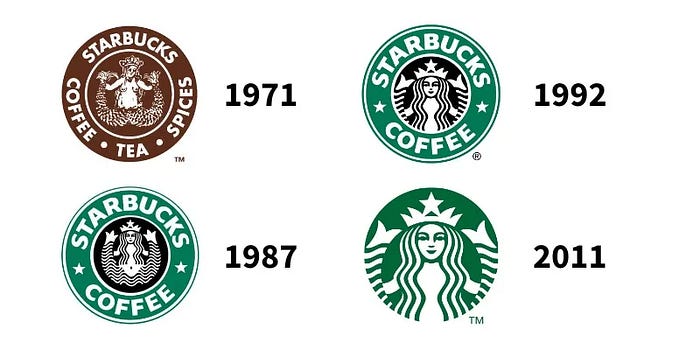
If you’re looking at the logos in isolation, the conclusion seems obvious. Simpler logo. Bigger company. But that’s not what happened.
Starbucks didn’t remove its name while it was trying to convince people who it was. It removed its name after it had already spent forty years doing exactly that. By 2011, Starbucks had more than 17,000 stores around the world. Millions of people carried its cups every morning. The siren had become one of the most recognized symbols in retail. When Starbucks announced the redesign, the company explained that the change reflected confidence in the icon itself and the fact that the business had grown beyond coffee. The logo wasn’t becoming anonymous. It had reached the point where it no longer needed an introduction.
That’s a completely different lesson than the one many designers take away. The simplification didn’t create recognition. Recognition made simplification possible. Once I saw that, I started noticing the same pattern everywhere.
Nike can run an advertisement where the swoosh appears for two seconds because almost nobody needs to ask who made the commercial. McDonald’s can photograph nothing but a carton of fries against a red background and millions of people will recognize the brand before they consciously process the image. Target can communicate with little more than a red circle. Apple can put up a billboard showing the back of an iPhone with almost no copy at all.
None of those companies started there.
They earned the right to communicate less because they’d already spent decades communicating more. They built recognition through relentless repetition, product quality, retail presence, packaging, sponsorships, advertising, public relations, and sheer ubiquity. Their visual systems became simpler as their mental real estate in consumers’ minds became larger.
That’s why I think we’ve accidentally confused a privilege with a strategy. Minimalism often isn’t the path to becoming famous. It’s one of the privileges that fame affords. The mistake is subtle, but it changes everything.
Imagine opening an independent coffee shop tomorrow. Nobody knows your name. Nobody recognizes your logo. Nobody has tasted your coffee. Your storefront has three seconds to tell a passing driver who you are and whether you’re worth stopping for. Is removing information really the right move? Should your logo communicate less because Starbucks communicates less?
Of course not. Your business has a completely different job to do. That’s where context begins to matter more than aesthetics.
A startup, a neighborhood restaurant, or a regional service business isn’t competing with Apple for design awards. It’s competing for attention, trust, and memory. It has to answer questions that global brands answered years ago. What do you sell? Why should I choose you? Can I trust you? What kind of experience should I expect?
Those questions require communication before they require refinement.
One of the most influential ideas to come out of the Ehrenberg-Bass Institute is that brands grow by increasing mental availability. People are more likely to buy the brands that come to mind easily in buying situations, and that happens through repeated exposure and distinctive brand assets, not because a logo is objectively more beautiful or a layout is more restrained. Byron Sharp’s research repeatedly points to recognition, consistency, and distinctiveness as the engines of growth.
That’s a much harder target to hit because it’s contextual. A lobster shack on the coast of Maine, a high-end skincare company in Manhattan, and a family-owned HVAC contractor in Columbus all need to be remembered for different reasons by different people. Expecting them to speak the same visual language isn’t sophistication. It’s category blindness.
Looking back, I don’t think I misunderstood modernism. I misunderstood timing.
I was borrowing the visual language of companies that had already become unforgettable and handing it to businesses whose first challenge was simply to be remembered at all.
One of the reasons I’ve become increasingly skeptical of treating enterprise branding as the standard isn’t just my own experience. It’s that the market itself has been pulling in a different direction.
For most of the twentieth century, local businesses tried to look bigger than they were. Looking corporate communicated stability. Professionalism. Success. If your neighborhood bank looked like Chase, maybe people trusted it a little more. If your coffee shop looked polished enough, perhaps customers assumed it belonged to a larger chain. Scale was aspirational, and branding reflected that aspiration.
But that’s changed. Today, many of the world’s largest companies are trying to recover the qualities that small businesses naturally possess.
Walk through almost any grocery store and you’ll see national brands telling stories about founders you’ve never heard of, farms you’ve never visited, recipes handed down through generations, or ingredients sourced from places with names that sound intentionally difficult to pronounce. Packaging is filled with hand-drawn illustrations, imperfect typography, watercolor textures, stamped seals, handwritten notes, and origin stories. Restaurants that serve millions of guests every week talk about neighborhood sourcing, local partnerships, and craftsmanship. Even technology companies have softened their language, replacing the cold certainty of corporate communication with a more conversational, human voice.
Consumers increasingly say they value businesses that feel rooted in something real. American Express’ Shop Small research has consistently found that most consumers believe small businesses strengthen their communities and intentionally choose to support them because they value the personal connection and local impact those businesses create. At the same time, research into brand authenticity has found that perceived authenticity significantly increases trust, emotional attachment, positive word of mouth, and intentions to return.
The irony is hard to ignore. While many young designers are still being taught to make startups resemble multinational corporations, multinational corporations are spending millions trying to look a little more like the businesses they displaced.
That doesn’t mean every local business should suddenly adopt hand-painted signs or throw away its grid system. It doesn’t mean minimalism has failed or that Bauhaus somehow got it wrong. Every design movement solves a particular set of problems, and modernism solved some extraordinarily important ones. Clarity, hierarchy, usability, and disciplined reduction remain some of the most valuable tools a designer can possess.
The mistake is believing that tools are destinations. A neighborhood barbecue restaurant doesn’t fail because it isn’t minimalist enough. A regional hardware store doesn’t lose customers because its typography isn’t Swiss. A family-owned bakery isn’t successful because its logo would win an award in a design annual. Those businesses succeed when they become recognizable, memorable, trusted, and unmistakably themselves within the communities they serve.
I wish someone had explained that to me twenty years ago. Instead of asking whether my work looked like the branding I admired, I would have asked whether it solved the problem sitting in front of me. Those are completely different questions, and they produce completely different answers.
I still admire Apple. I still admire Starbucks. I still admire the discipline of Swiss Modernism and the clarity that Bauhaus brought to industrial design. None of that changed.
What changed is my understanding of what I was actually looking at. I wasn’t studying a recipe. I was studying the finished meal.
That’s the trap survivorship bias sets for all of us. It convinces us that because we can see the ending, we understand the journey. We copy the visible traits of successful companies while overlooking the thousands of invisible decisions, advantages, years of repetition, distribution, operational excellence, and accumulated trust that made those traits effective in the first place.
The older I get, the less interested I become in whether branding looks sophisticated.
I’m much more interested in whether it gives a business the best chance of becoming the kind of company people will still be studying twenty years from now.
Because that’s the real goal. Not to look like a great brand. To become one.
No posts
Comments
Nothing yet. Say the first thing.
Sign in to join the conversation.