
There are certain elements in design that no one outside of the industry really thinks about until they are forced to, and commercial carpeting is a big one! It is not particularly glamorous, it is rarely the thing that clients get excited about first, and yet it ends up affecting almost everything about how a workplace feels once people are actually in it. So that’s why at Float Studio, we spend an absurd amount of time thinking about carpet.
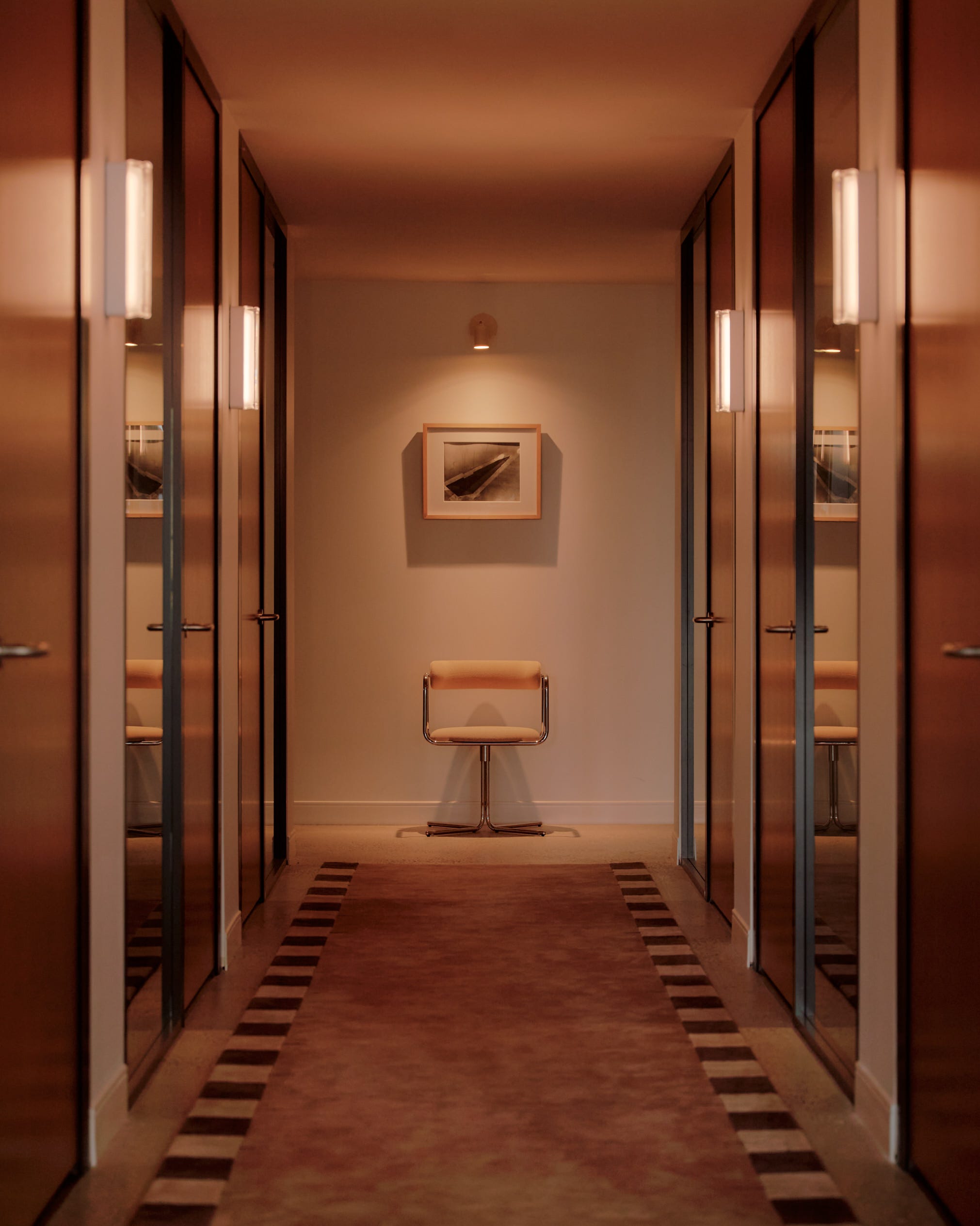
At Float, we are almost always trying to blur the line between commercial and residential environments. We want offices to feel more human. We want people to walk in and feel warmth rather than utility. If we could use residential materials wall-to-wall in commercial spaces, we probably would, but the technical requirements usually make that difficult.
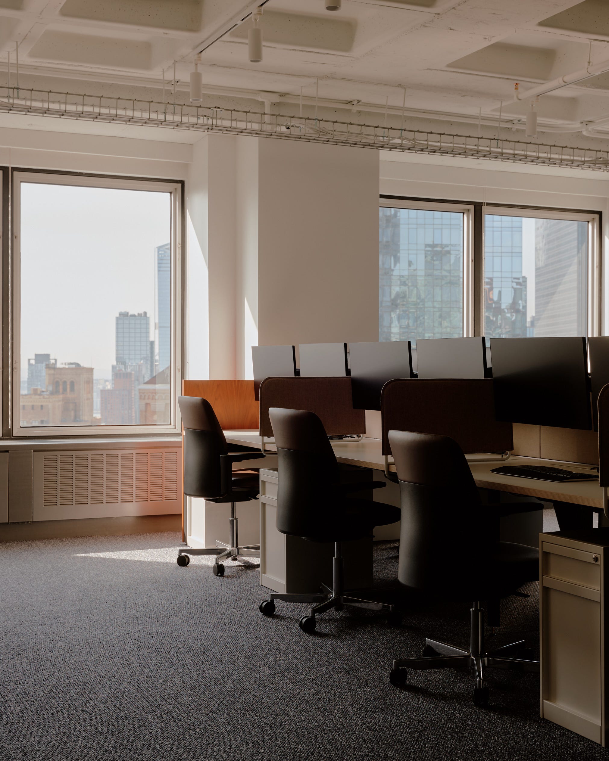
The problem is that commercial carpeting often looks exactly like commercial carpeting. There is a visual language to it that is hard to ignore once you notice it. It’s the quarter-turn installation pattern, and the busyness of the cool greys and blues with striations and pile-height shifts designed to disguise staining. Don’t get me started on the synthetic sheen that catches the light in a way that immediately tells you this was chosen for performance first and aesthetics second. Most of the time commercial carpeting prioritizes practicality over aesthetics and I think it’s high time we change that!
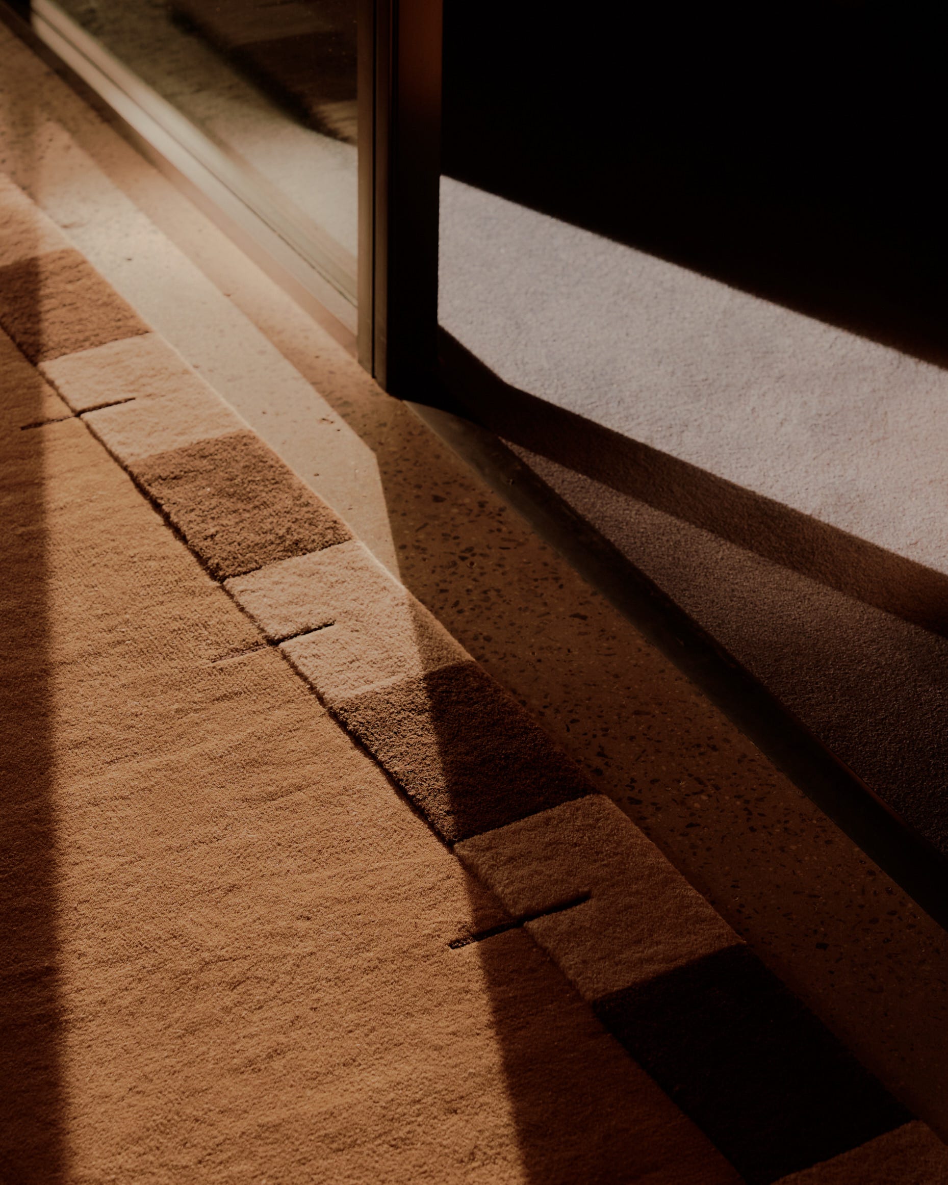
There is, of course, a reason commercial carpeting exists in the first place. In workplace environments it performs in ways that residential carpeting simply cannot. It handles high traffic, wears more evenly, often requires less maintenance, helps absorb sound in large open spaces, and most importantly, meets the fire codes required for covering large surface areas in commercial buildings.
The compromise we find here often comes through area rugs, using broadloom in strategic places, or manipulating commercial materials in a way that feels less “corporate”.
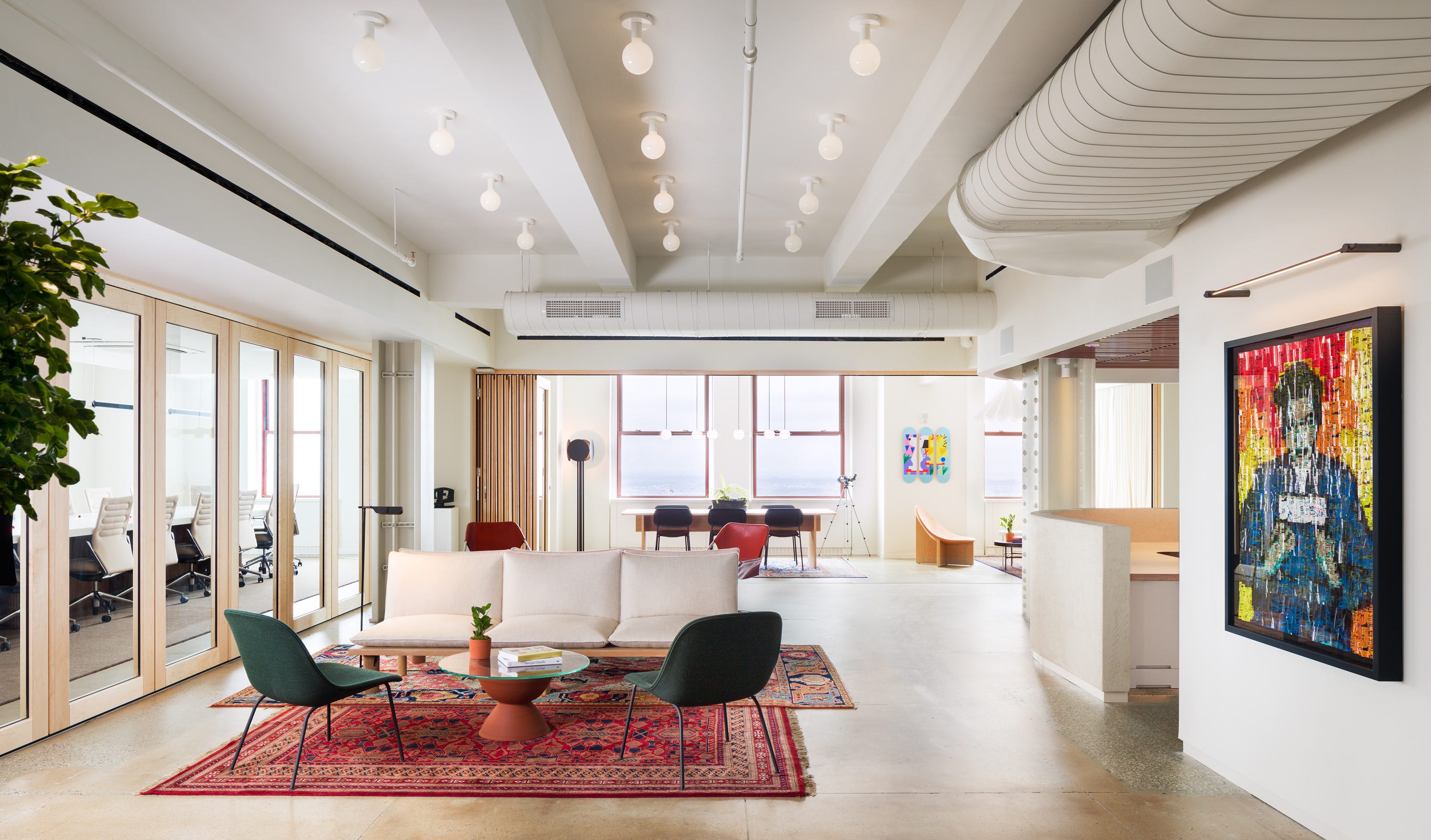
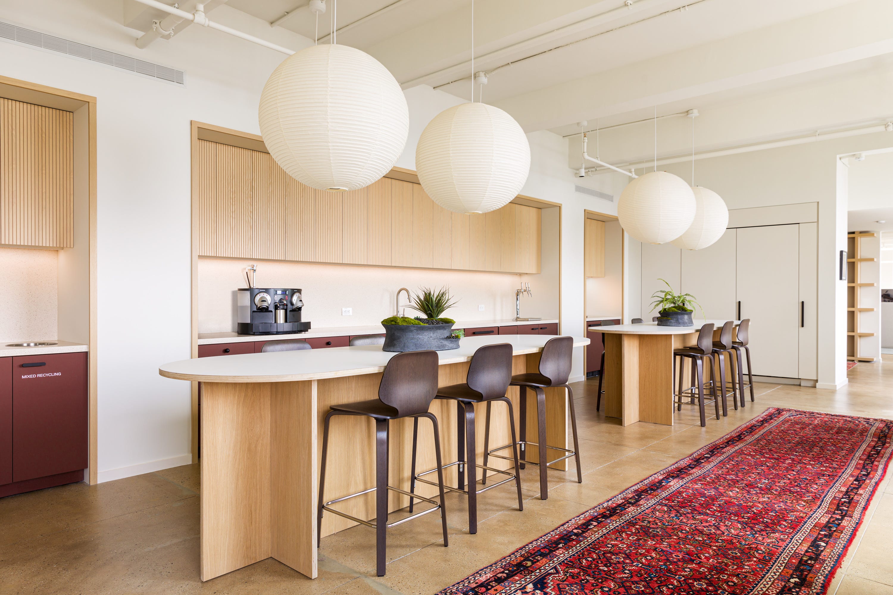
Our project for Kaplan Hecker & Fink is a good example of this. We used a product from Tretford, one of our long-time go-to brands. They make beautiful goat hair carpeting and rugs, along with carpet tile that has far more softness than most products in the commercial market. Their standard tile can be installed in a quarter-turn pattern, which we tend to avoid because it signals “office” almost immediately. We are almost always looking for products that can be laid monolithically, with all tiles running in the same direction so the floor reads as one continuous surface which is what we do with their Interlife Tiles. Tretford also offers broadloom, and for KHF this choice made sense. As a law firm, the heavy traffic is lower and the environment is tidy so we had more freedom to prioritize aesthetics.
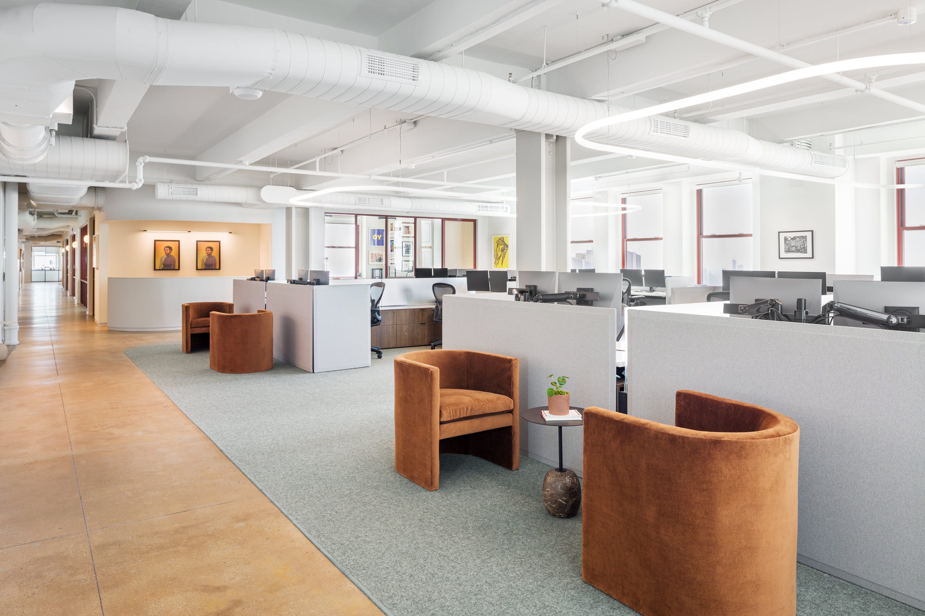
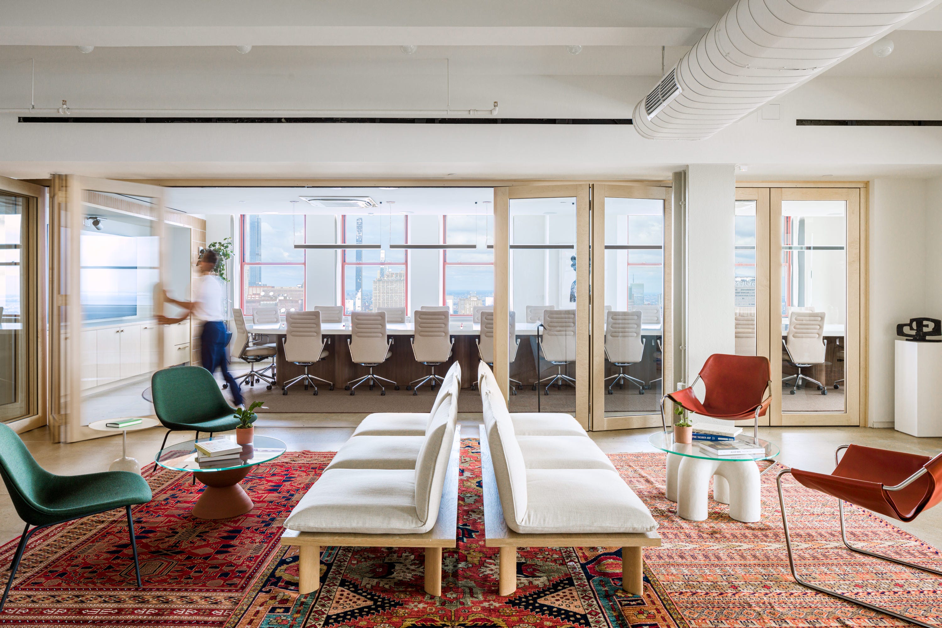
We installed the broadloom to read like a large area rug beneath the workstations and shaped it on site to soften the geometry of the room. Under the conference table, we created an oblong pill shape and worked with the installer to ensure it was finished with a nylon surged edge so it felt custom and residential rather than installed. It worked beautifully because the product allowed for that flexibility and the client’s use of the space supported it.
We’re always looking for that balance between beautiful and functional. What I find is that in the commercial carpeting industry, the products that perform well often do not look good. The products that look soft and residential may not meet code, and the products that meet every technical requirement can feel sterile or overtly commercial. I have yet to find a product that truly checks every box, so often we choose to design our own.
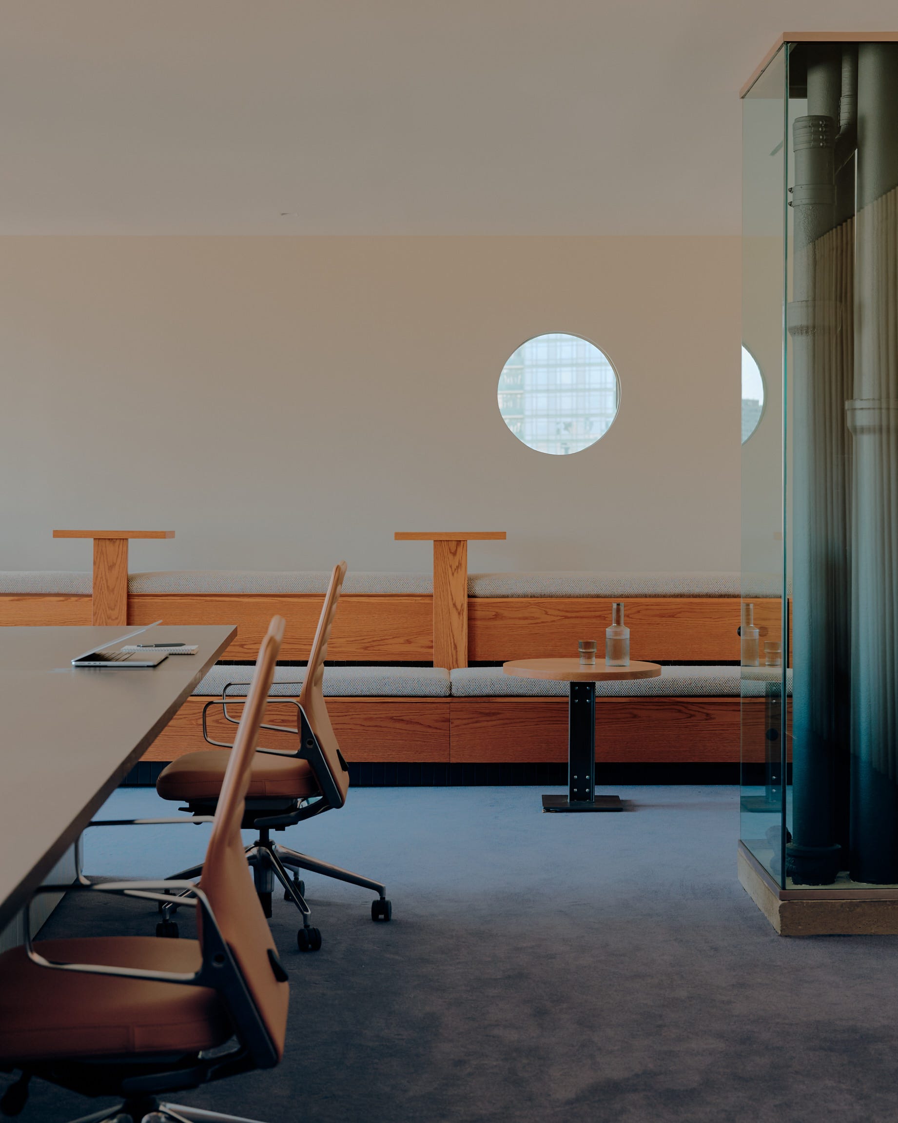
What really signals “this is commercial carpeting”?
Aesthetically, there are a few things that really make a carpet read as commercial. Those are install pattern, size, shape, quality and color.
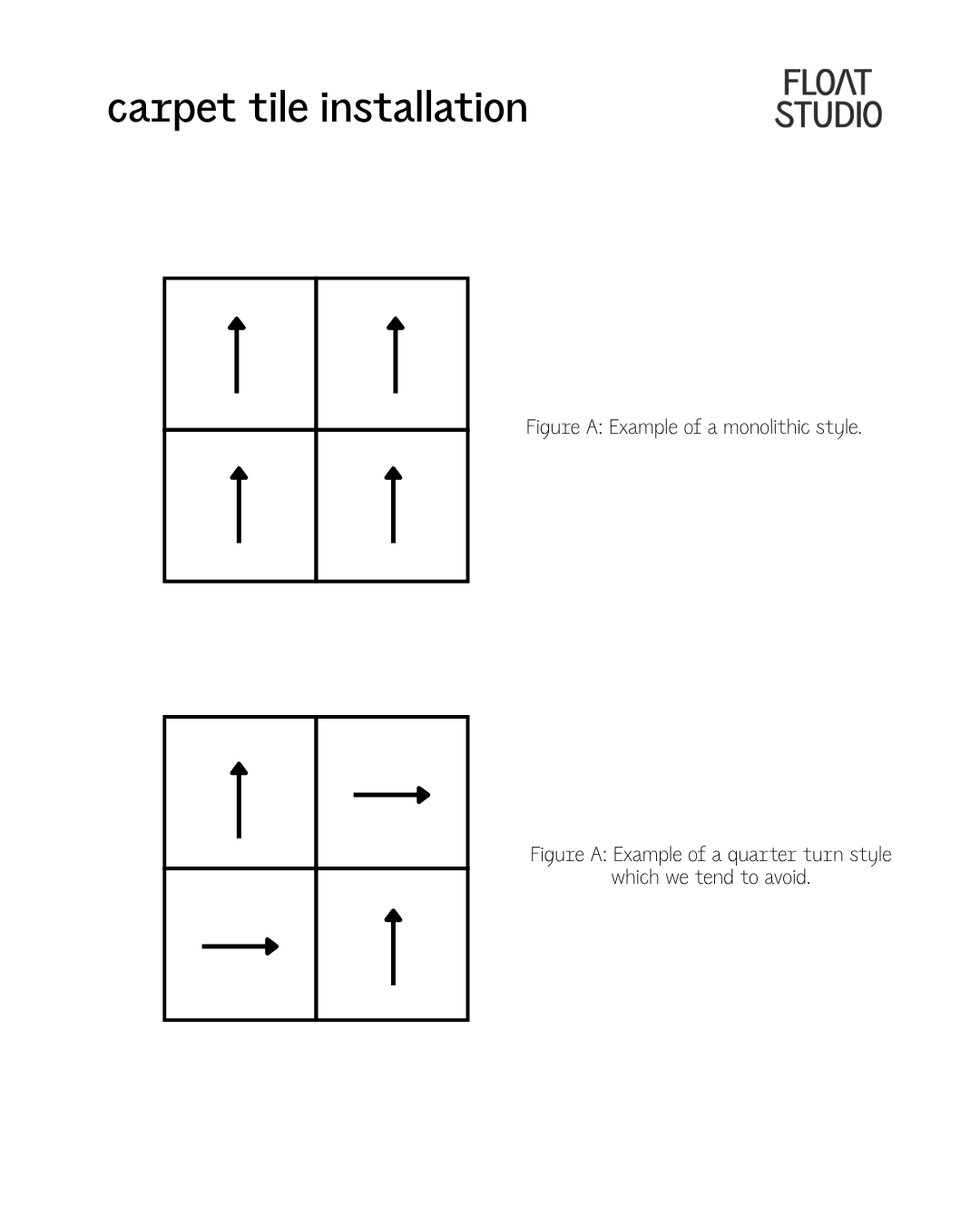
Our goal is almost always continuity. We want the floor to read as monolithic rather than modular and those classic quarter-turn installations just create movement that can feel busy and institutional. The same goes for dramatic pile-height variation or heavy striations that you always see in office carpetings. Those details are often engineered to disguise wear and staining, but visually they create a kind of busyness that does not align with the spaces we are trying to create. The industry often prioritizes performance over appearance, and while we understand why, it can make sourcing frustrating.
Modularity presents its own set of challenges too. Hiding seams is difficult. Some manufacturers are beginning to improve this by cutting tiles with reverse bevels so edges overlap and disappear more naturally. Mohawk is experimenting with this in ways that allow the product to blend better, which is exciting to see.
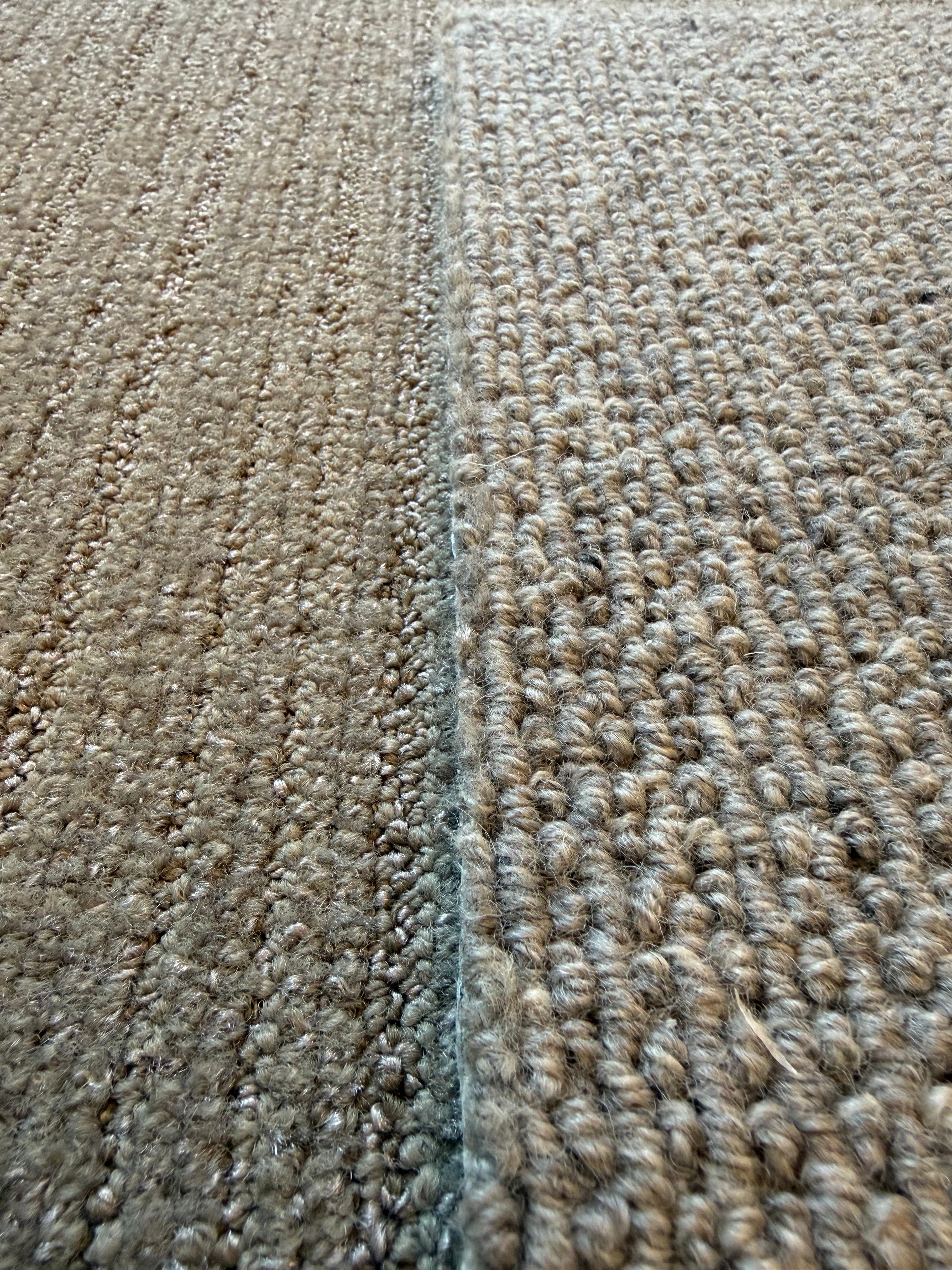
Synthetic fibers are another giveaway. I can almost always tell when something is polypropylene or a mixed fibre by the way it catches the light. Natural fibres have tonal shifts and subtle variation that feel rich and layered in a way dyed yarns rarely do. Even multi-ply twisted yarns with several shades from the same family often fail to replicate the depth and irregularity of something natural. The truth is that most commercial products are designed to appeal to the broadest market possible, and the mainstream market is not necessarily asking for design-forward flooring.
The biggest issue, though, is color. Every time we receive a carpet sample book, we find the same “safe” colors that disappear into the background and offend no one. There is so much room for expansion here!
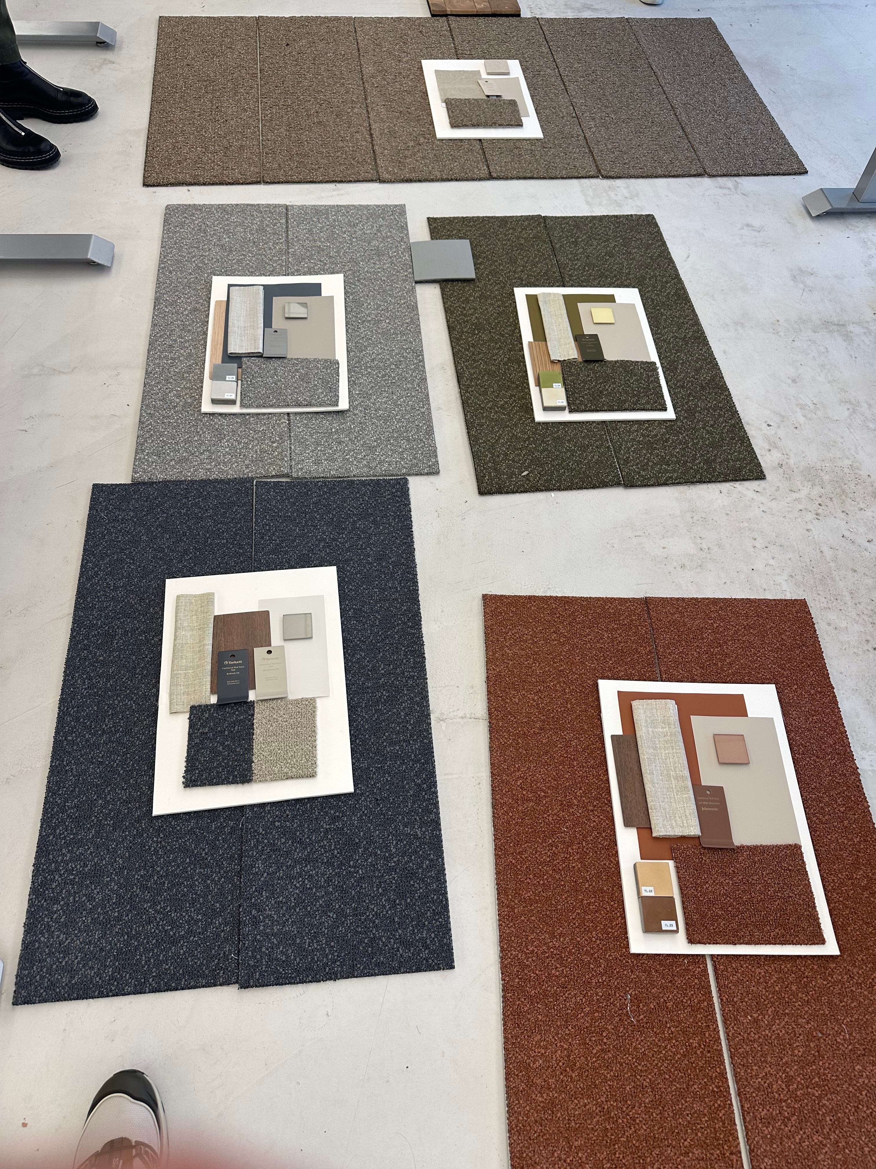
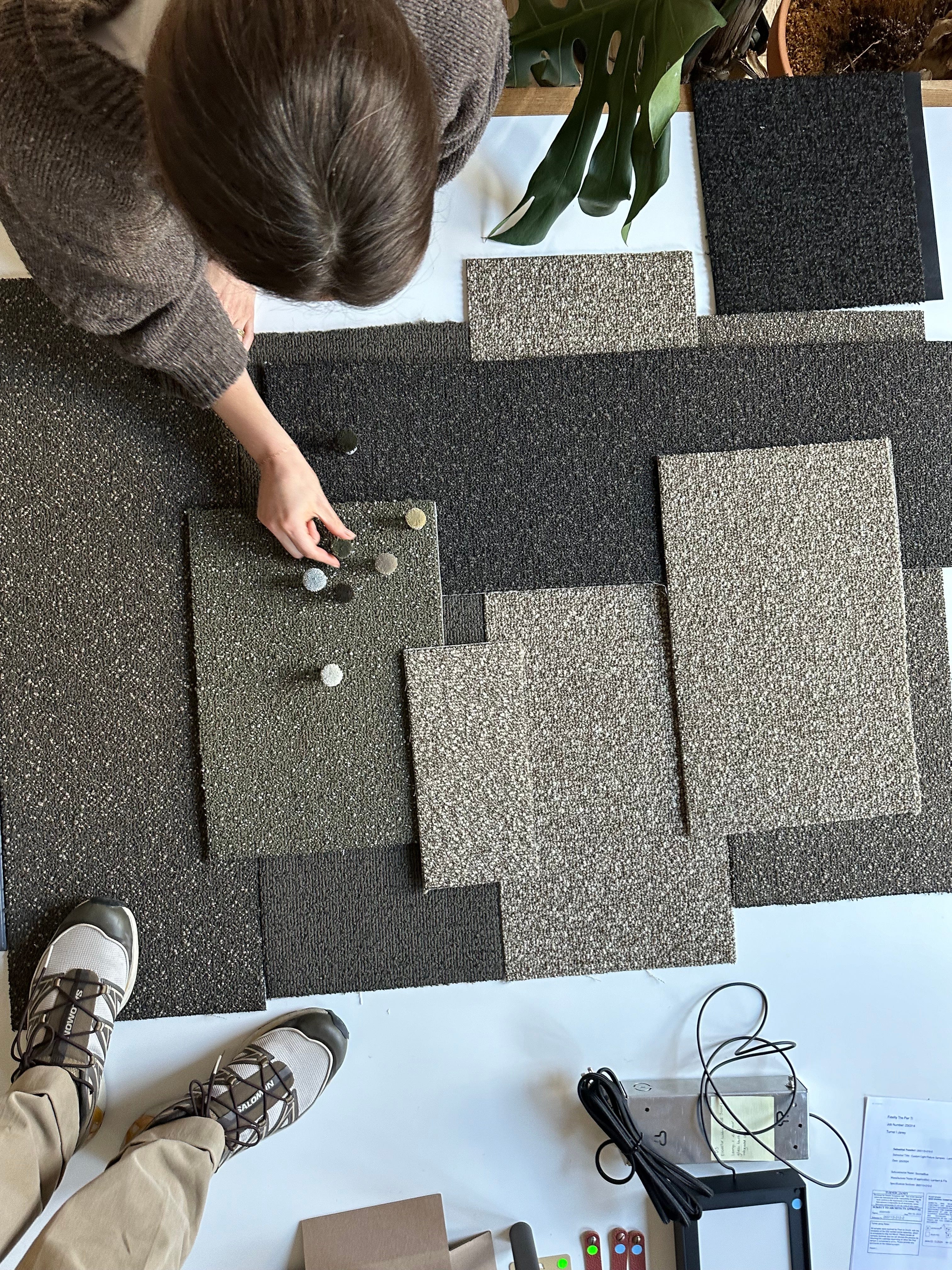
For our latest and largest workplace project, a major financial services company in Boston, we approached carpet sourcing with a very specific list of criteria. We wanted something monolithic and continuous in multiple color families that could subtly signal wayfinding throughout the office. And we wanted those colors to feel muted, interesting, and slightly unexpected like a soft green, a terracotta and an icy blue with yellow loops. We simply could not find it. So again, we worked with Mohawk to design our own. We ended up custom designing and ordering hundreds of thousands of square feet of carpet tile for the project, creating something that felt softer and more layered than anything readily available. On a large scale, it reads more residential than corporate, which is exactly what we were after. Increasingly, this is where we find ourselves landing.
If the market does not offer what we need, we design it.
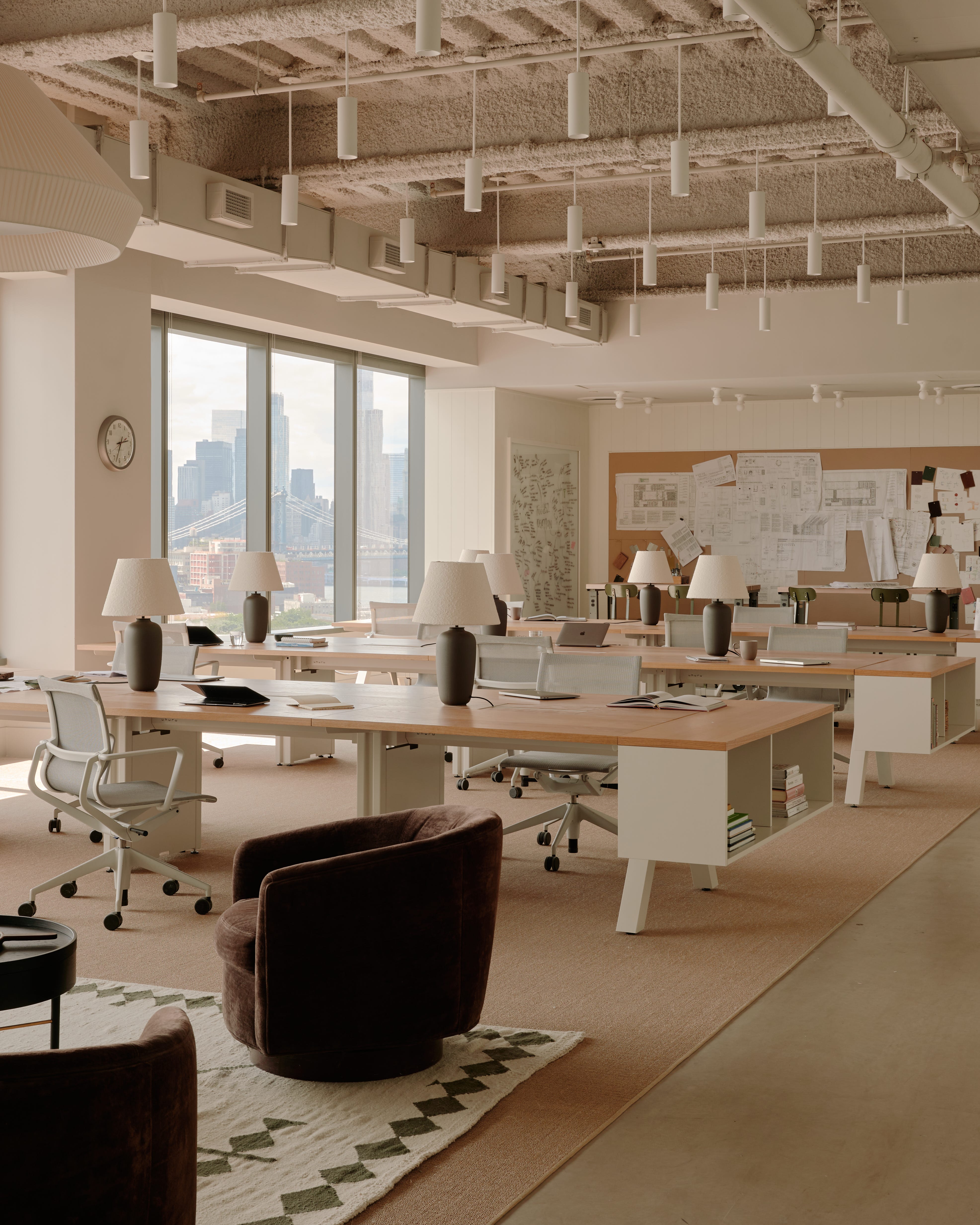
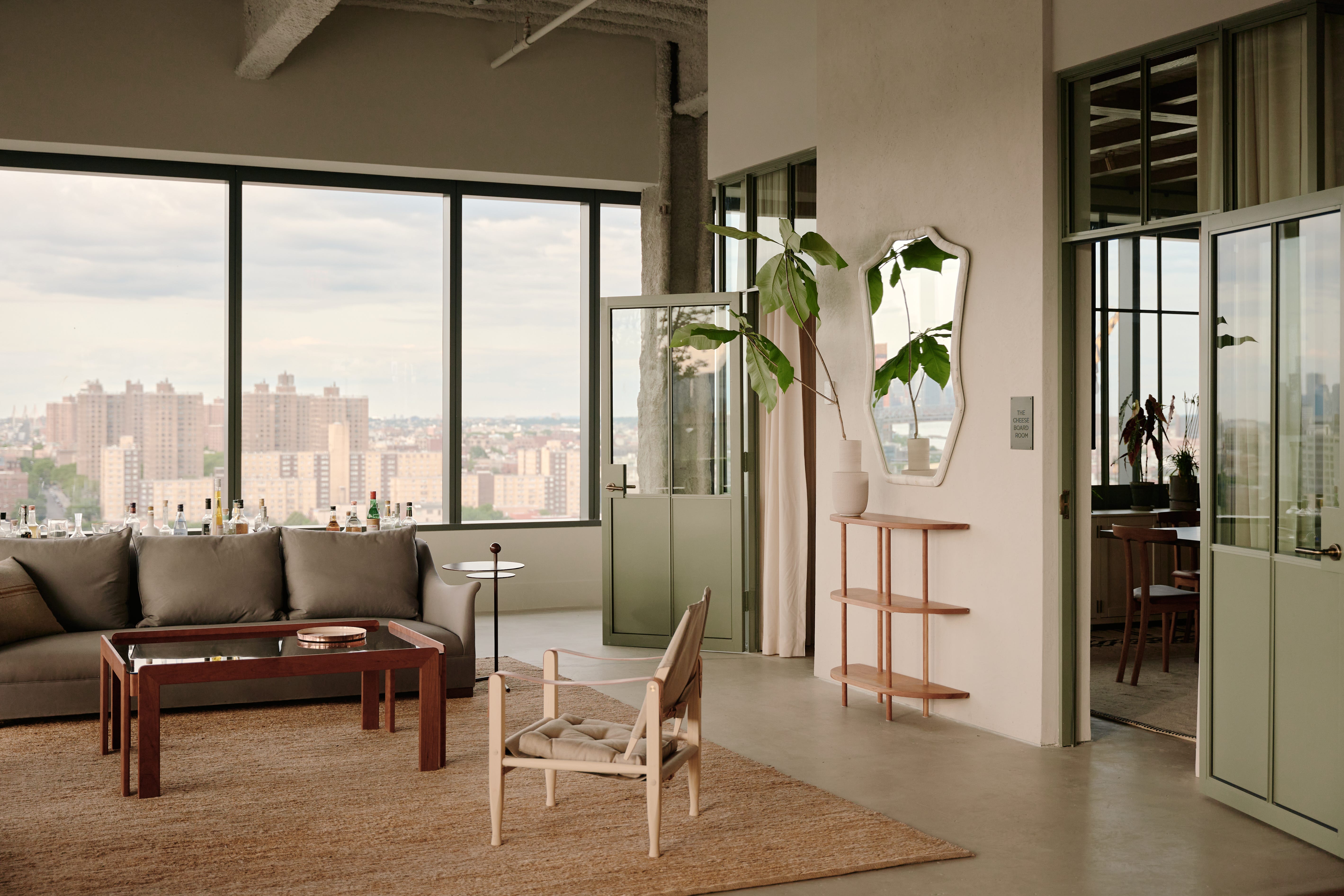
This all connects back to an article I wrote a little while back about how people are craving craft and color! People are also craving natural materials right now like sisal and jute, fibres with texture and tonal irregularity. A true commercial-grade alternative simply does not exist in a way that satisfies us. At Food52, we actually had massive custom sisal rugs made for under the workstations because we could not find anything at scale that delivered the right look, and we knew the client would take care of them.
Is there a sustainable option?
Sustainability also factors into these decisions more and more. Something that surprises people is that nylon is often the best-case scenario. Polypropylene and mixed fibres can be difficult to recycle and often perform poorly aesthetically. Nylon, on the other hand, is highly recyclable, and many manufacturers now have cradle-to-cradle programs where old carpet is taken back and repurposed into new product. In an industry where office turnover is constant and waste is immense, this matters, especially to our studio. We are always asking what the story is behind the product. How recyclable is it? How responsible is the manufacturer? How much waste are we creating?
Where to make your investments?
Then there is cost, which is always a big part of the conversation. Standard commercial carpeting in high quantities typically ranges from $4-$8 dollars per square foot. The softer, more natural-looking options that hit our aesthetic goals can easily land closer to $20 per square foot. Clients are often hesitant to spend there, but we think it is worth it. Flooring covers enormous square footage and influences every visual and sensory experience in the space. If you’re going to spend your money, spend it at the right places. Our go-to brands at Float Studio tend to be Mohawk, Bentley, Tarkett, and Tretford.
And still, even with all of those resources, we are currently working on a tech office with an extremely compressed construction timeline, just under a month, and we found exactly ONE sample we liked.
So if anyone out there wants to make our dream of a better commercial carpeting line happen with us, we would love to talk!
—Brad
Thanks for reading Sightlines! This post is public so feel free to share it.
Comments
Nothing yet. Say the first thing.
Sign in to join the conversation.