
Where do I even begin with grout? It’s one of those details that rarely gets the attention it deserves until the moment you are forced to choose it, usually at the tail end of design planning, exactly when decision fatigue has already set in. It seems minor, almost administrative, but it is in fact the line that frames every tile, edge, and surface in a room. If you’re managing your own project, grout can feel oddly overwhelming. The question of where to begin is understandable, because grout is not just about color. It’s about intention, which is almost even harder to pinpoint.
Let me help you how to figure out exactly what you’re going, even if you don’t know what that is yet.
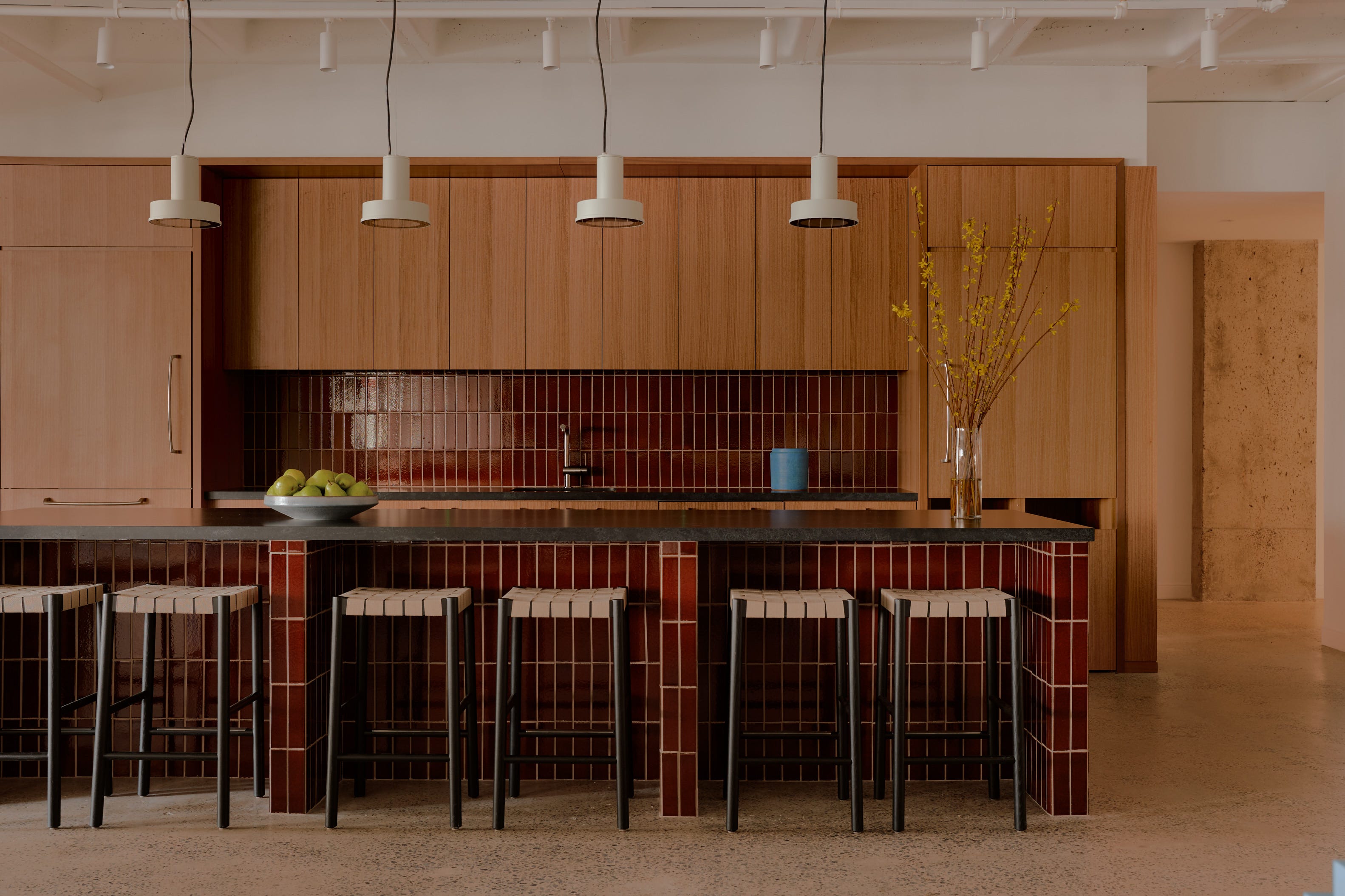
Before we even get to color, the first element I always take into consideration is not tone but size, AKA the width of the grout joint. Whether a tight one-sixteenth or one-eighth of an inch, or something more pronounced like a quarter or even half inch, grout width fundamentally changes how the tile reads.
Smaller joints, often paired with unsanded grout, create a quieter and more refined surface where the tile feels continuous and the material itself takes precedence. Larger joints, typically filled with sanded grout for durability, emphasize the spacing and make the grid more visible. When I specify a tight grout line, it is usually because I want the grout to recede so that the stone becomes the focal point and the installation reads as expansive rather than segmented.
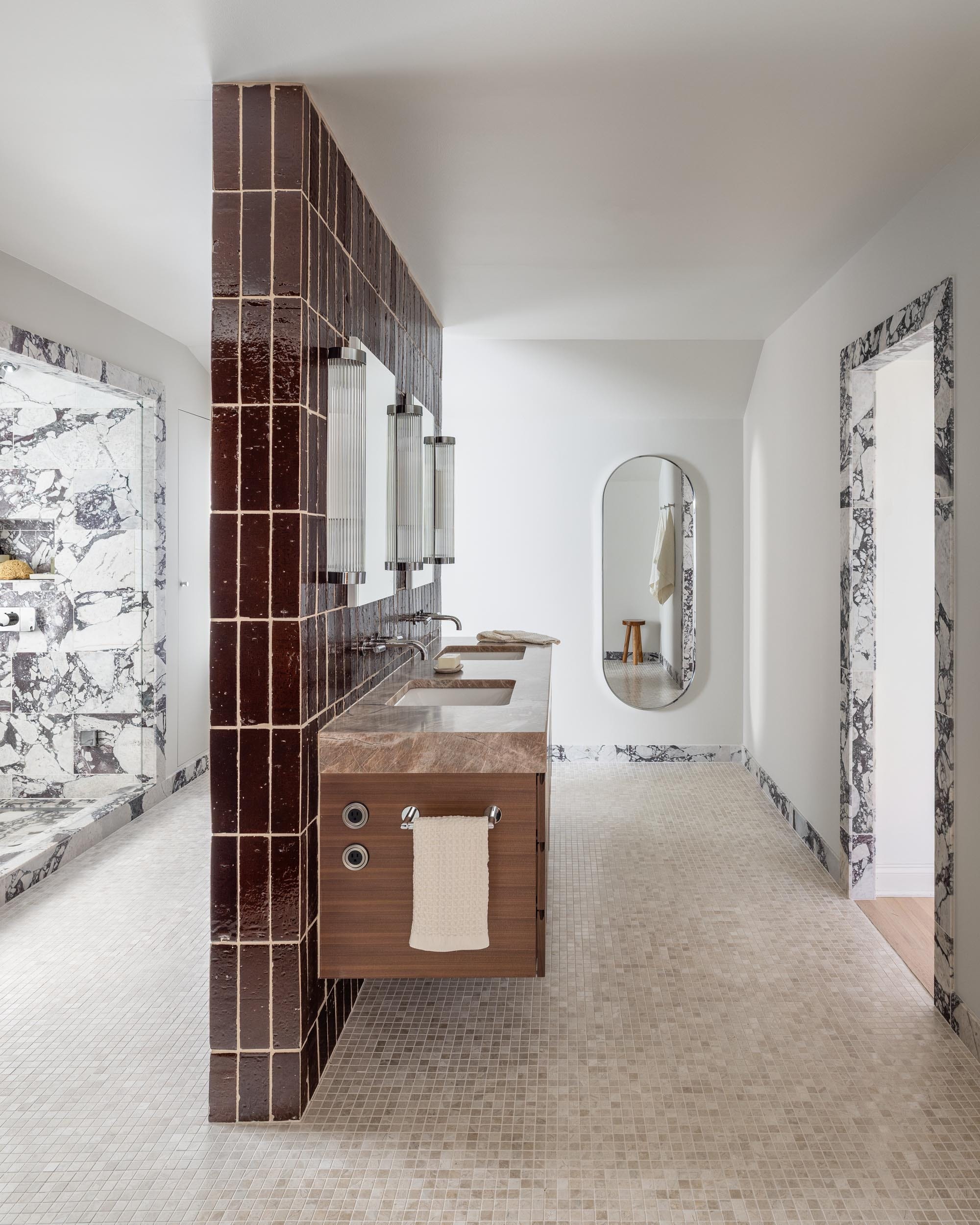
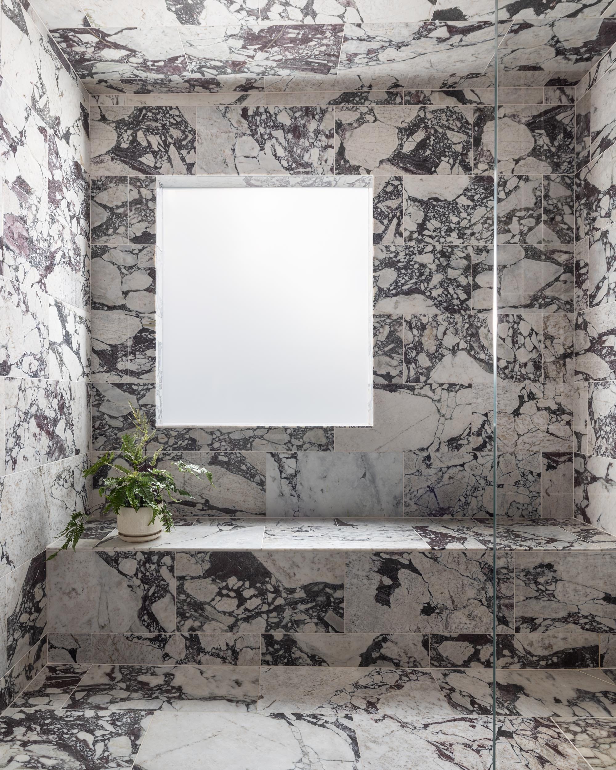
Now, color builds on that foundation. My personal instinct is to select the lighter variation found within the stone or tile itself, which tends to produce a cohesive and harmonious result. In natural materials such as marble, where veining and tonal variation already create movement, introducing a dark or highly contrasting grout can compete visually and disrupt the surface. Instead of appreciating the depth of the stone, the eye is drawn to a checkerboard effect. By pulling from the lighter tones within the material, the grout supports rather than interrupts the composition.
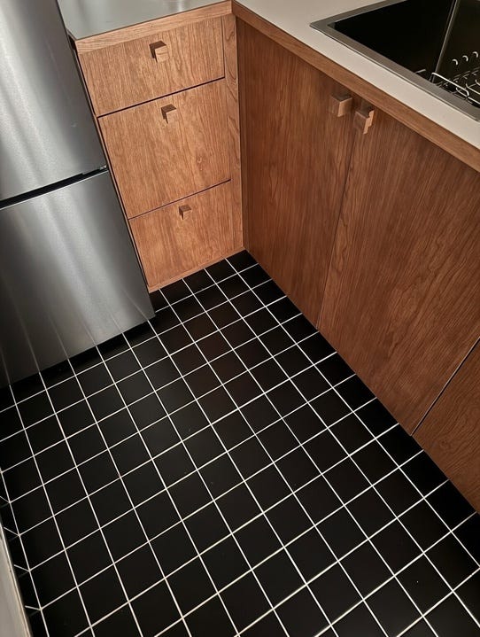
That said, contrast can be powerful when it is deliberate. In spaces where the tile is clean, modern, and uniform, emphasizing the grid can be part of the design language. I recently specified black tile in a kitchen and chose a bright white grout, fully aware that the contrast would be graphic and assertive. The intention was to highlight geometry and create a bold, almost retro effect that aligned with the broader vision for my space.
In another project featuring large-format marble in an office, we matched the grout closely to the stone so the surface would feel continuous and monolithic. Both approaches were successful because the desired outcome was clear from the beginning. Understanding the rules allows you to bend them with confidence rather than by accident.
The location of the tile also plays a critical role in the decision, as performance and maintenance are inseparable from aesthetics. Floors in particular demand a more pragmatic approach, since they are subject to daily traffic, spills, and long-term wear. While a pale grout line can look crisp at installation, it will inevitably show signs of use more quickly than a mid-tone alternative (I took this into consideration for my small kitchen project knowing that I hardly cook or make a mess in there anyways, ha!). Walls, by contrast, offer more flexibility because they are not exposed to the same level of abrasion or staining, which allows for lighter and more expressive choices without the same maintenance burden.
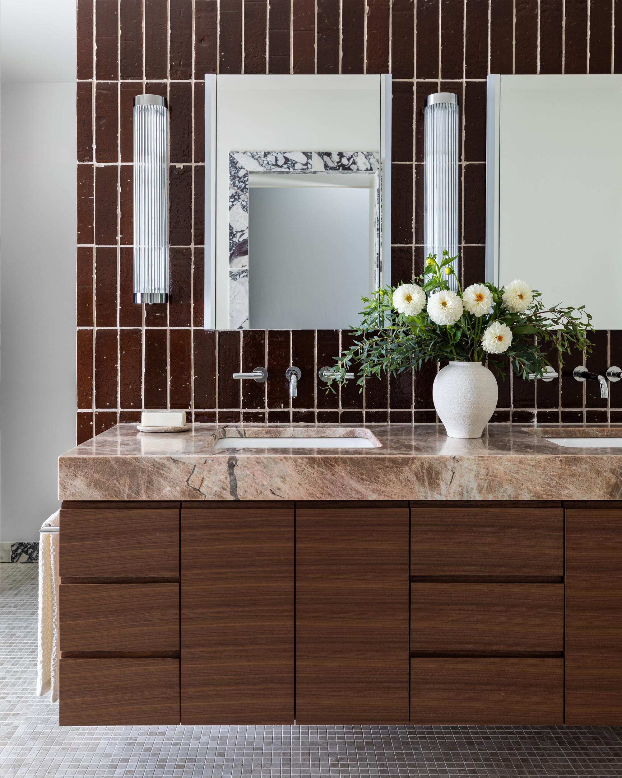
Equally important is where and how and where you make your design choices! Grout colors, especially whites and light neutrals, are highly sensitive to context and can read yellow, pink, or gray depending on surrounding materials and lighting conditions. A sample that appears perfectly balanced in a showroom can shift dramatically once installed on site. Grout should always be reviewed in person, placed directly against the actual tile or stone, and evaluated in the space where it will live. If the project timeline and budget allow, a small mock-up can eliminate uncertainty and reveal how the joint size and color truly interact with the material.
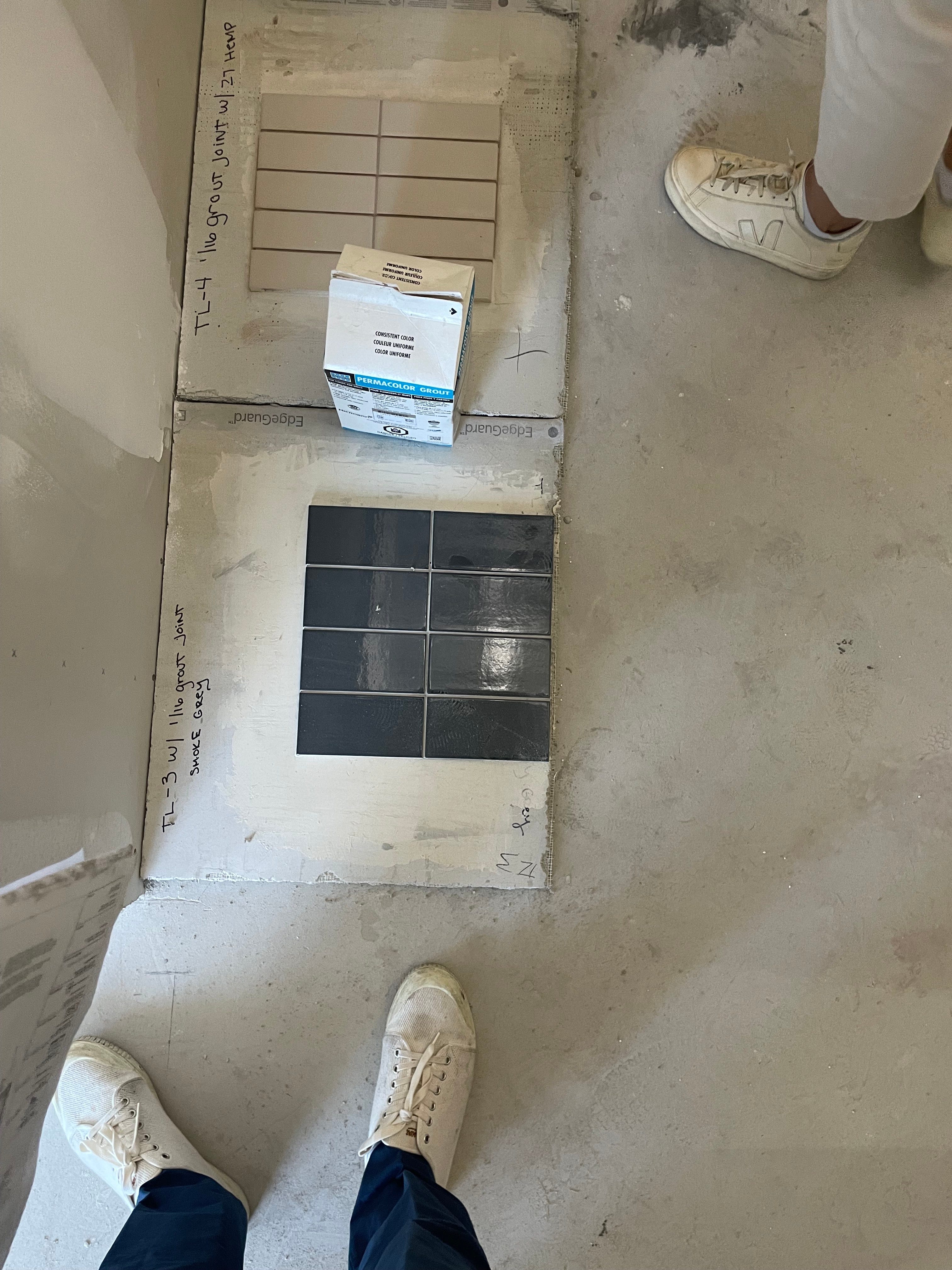
Over time, a few practical principles have become consistent go-tos in my own work:
Floors
Consider traffic patterns and long-term wear before committing to very light grout.
Opt for sanded grout with wider joints when durability is a priority.
Avoid bright white grout in high-traffic kitchens and baths unless you are prepared for upkeep.
When in doubt, choose a tone that blends with the tile to soften visual wear over time.
Walls
Lighter grout is more forgiving vertically and can maintain its appearance longer.
Tighter joints create a refined, continuous look, especially with natural stone.
Contrast can be used intentionally to emphasize geometry in showers, backsplashes, or feature walls.
Because walls are more visible at eye level, subtle tonal shifts matter more and should be reviewed carefully.
Go-To Guidelines
Pull the grout color from the lighter variation within the tile or stone for a cohesive result.
Evaluate samples on site and under real lighting conditions, never in isolation.
Mock up a small section whenever possible to understand scale and contrast.
Use contrast deliberately and only when it supports the broader vision of the space.
Remember that grout is a framing device, and decide whether you want the frame to disappear or to define the composition.
Ultimately, grout is less about adhering to a universal rule and more about articulating a clear intention for the surface. Whether you want the tile to read as seamless texture or as a defined geometric pattern will guide your decision making. Though it may seem like a secondary detail, grout has an outsized influence on how finished and considered a space feels, and when approached thoughtfully and evaluated in context, it becomes a subtle but powerful tool in shaping the overall experience of a room.
If you have any questions drop me a comment or reach out to my studio, Float Studio.
—Brad
Comments
Nothing yet. Say the first thing.
Sign in to join the conversation.