
Most people can picture a standard office reception area: a glass partition, a wooden reception desk, neutral carpeting, maybe a small cluster of stackable chairs and a plant in the corner. Doctors’ offices, accountants, law firms, and dentists all follow the same formula, defaulting to safe solutions that ultimately feel anonymous, rarely communicating anything about the people behind the business which misses an opportunity to establish a stronger sense of place.
What if I told you your brands workspace doesn’t have to shouldn’t feel that way?
I tend to think about reception spaces less as waiting areas and more as introductions. The moment someone enters the space they should immediately feel a sense of the company’s identity, whether that comes through the material choices, the scale of the room, the lighting, or the way people move through the environment. A well designed reception area has the ability to shape an interaction before a single conversation takes place. The time someone spends waiting before a meeting can quietly introduce the values, personality, and culture of a brand, if you seize the opportunity.
As a designer, the language I speak is visual. I read the story of a company through material, lighting, furniture, and atmosphere almost immediately. It’s like a litmus test for how I’m going to feel about the conversation I’m about to have or service I’m about to receive. When a reception area is reduced to a desk and a stack of pamphlets, the space does not tell me anything important. Instead it creates a kind of nervous neutrality that makes me instinctively reach for my phone and pretend to be busy. When the lighting is soft, the materials are thoughtful, and the space offers vignettes that make me curious, something shifts about the entire experience. I begin to relax and look around.
That small shift in comfort and curiosity creates a stronger connection between visitor and brand.
In New York especially, there is a strong understanding of the value of placemaking (and I love this city for it!). While offices are often compact and buildings are historic by nature, the competition for talent and clients is intense so creating a standout experience becomes critical. The spaces that do this understand that the reception area is not just a checkpoint.
At Float Studio, most of our reception projects have been within workplace environments, though each one begins with a different question. For a period of time many offices experimented with fully digital check-in systems, where visitors arrived and interacted only with an iPad. Lately we have seen a return to human interaction. The reception desk is once again becoming a place where someone welcomes you, guides you, and sets the tone.
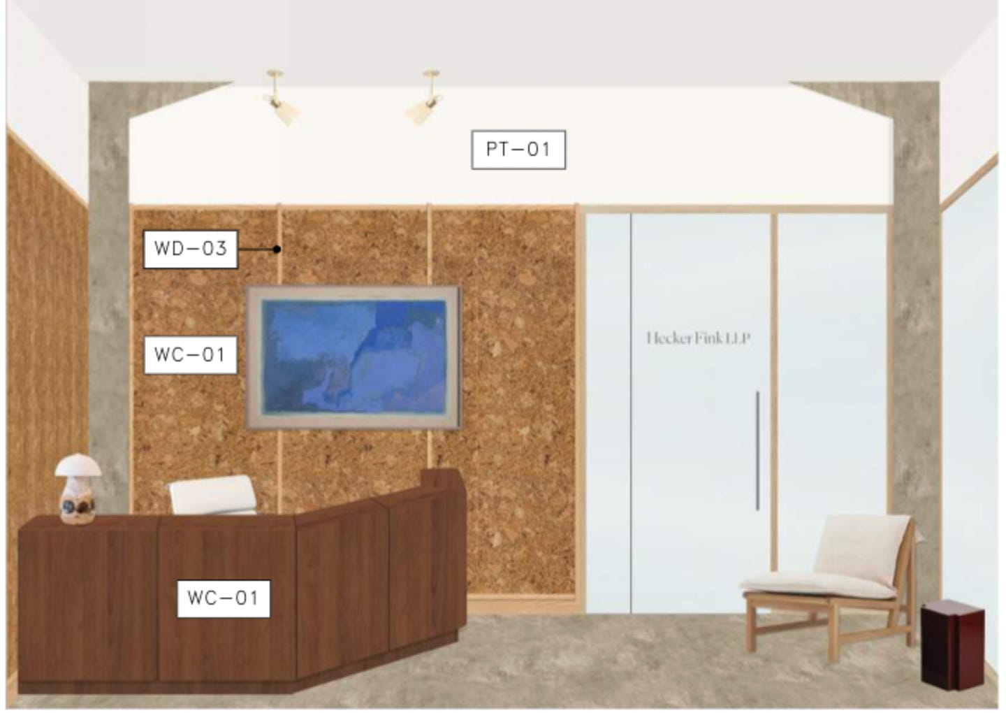
We are currently designing a law firm in Los Angeles where the reception area is intentionally more residential than corporate. Panelled walls and warm materials such as cork, mahogany, and cherry create a sense of familiarity, while the branding is integrated subtly into the architecture rather than displayed as a bold graphic. Cherry wood carries a long association with professional environments, but we are interpreting it in a more contemporary way that reflects the firm’s identity as progressive and design forward. The space quietly signals seriousness while still feeling human.
Looking back across several Float Studio projects, the reception area always becomes a reflection of the brand’s priorities.
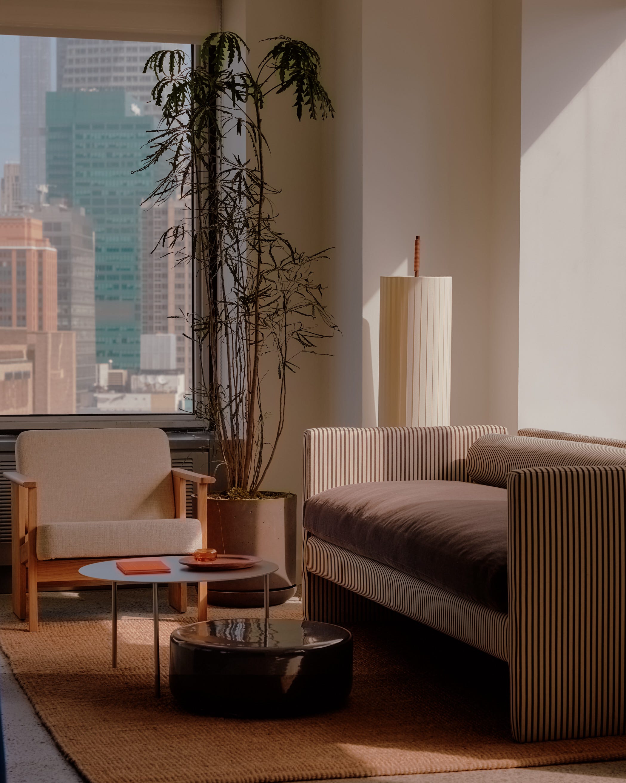
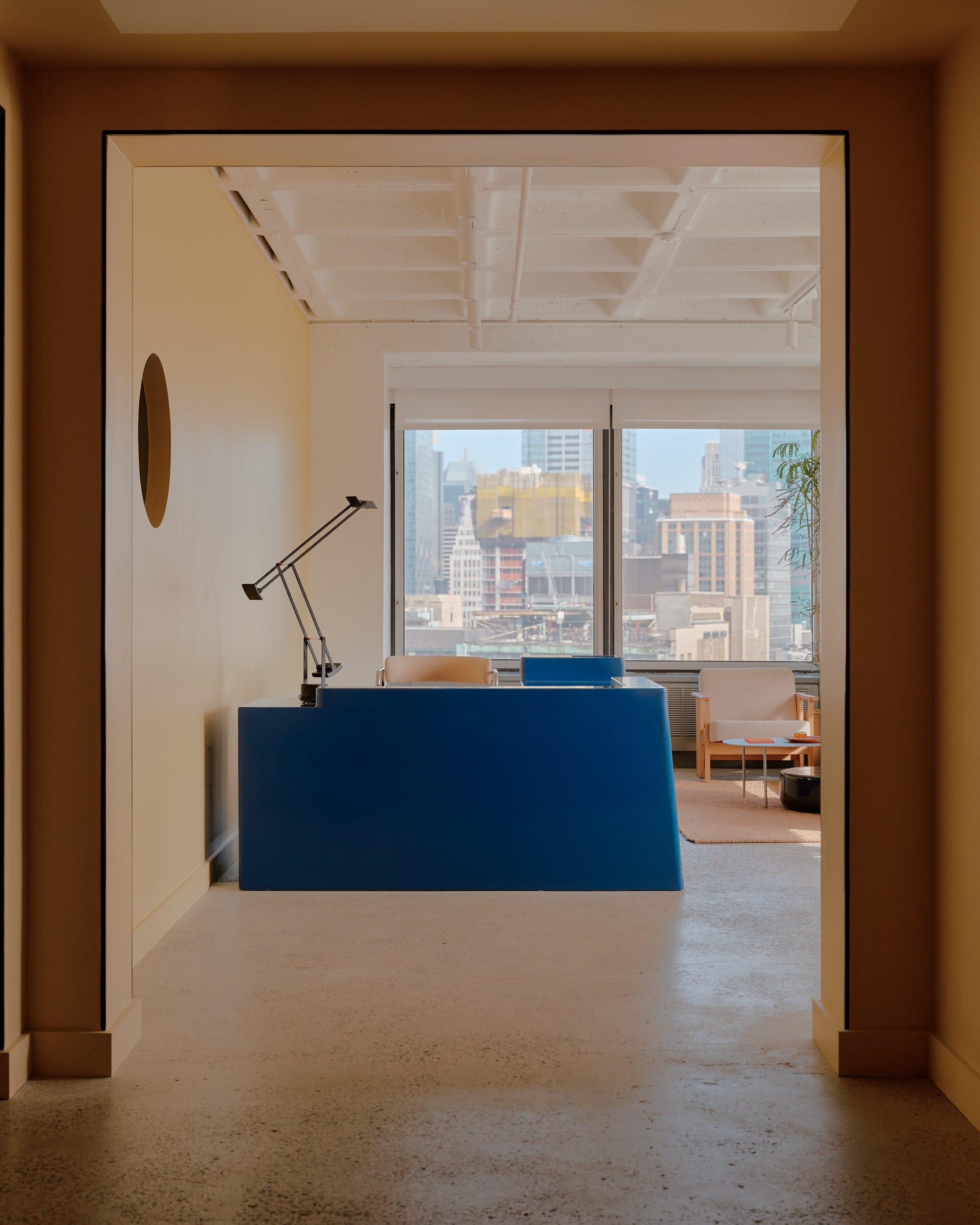
In the reception space for a financial firm in NoMad, the office itself had incredible views but very limited square footage. The partners were deeply interested in vintage furniture, so the reception desk became a sculptural lacquer piece that feels almost like a collectible object. The custom design was inspired by Vittorio Introini, finished in deep Lyon’s blue to fit the brand colours, and perfectly scaled for the compact New York footprint is the anchor of the space. We even worked an interaction into the design, adding a built-in vessel for candy at one end. The walls are painted a warm butter tone, and a striped sofa introduces pattern and energy in an editorial moment. A small circular porthole in the wall allows the reception area to visually connect with the conference room beyond, reinforcing that the office is an active environment rather than a closed front desk. It’s super important to feel a sense of life in a reception area, and not feel closed off from what’s going on in the rest of the office. Ultimately, the goal here was a sense of discovery, inviting curiosity and establishing the office as a place that feels both professional and comfortable.
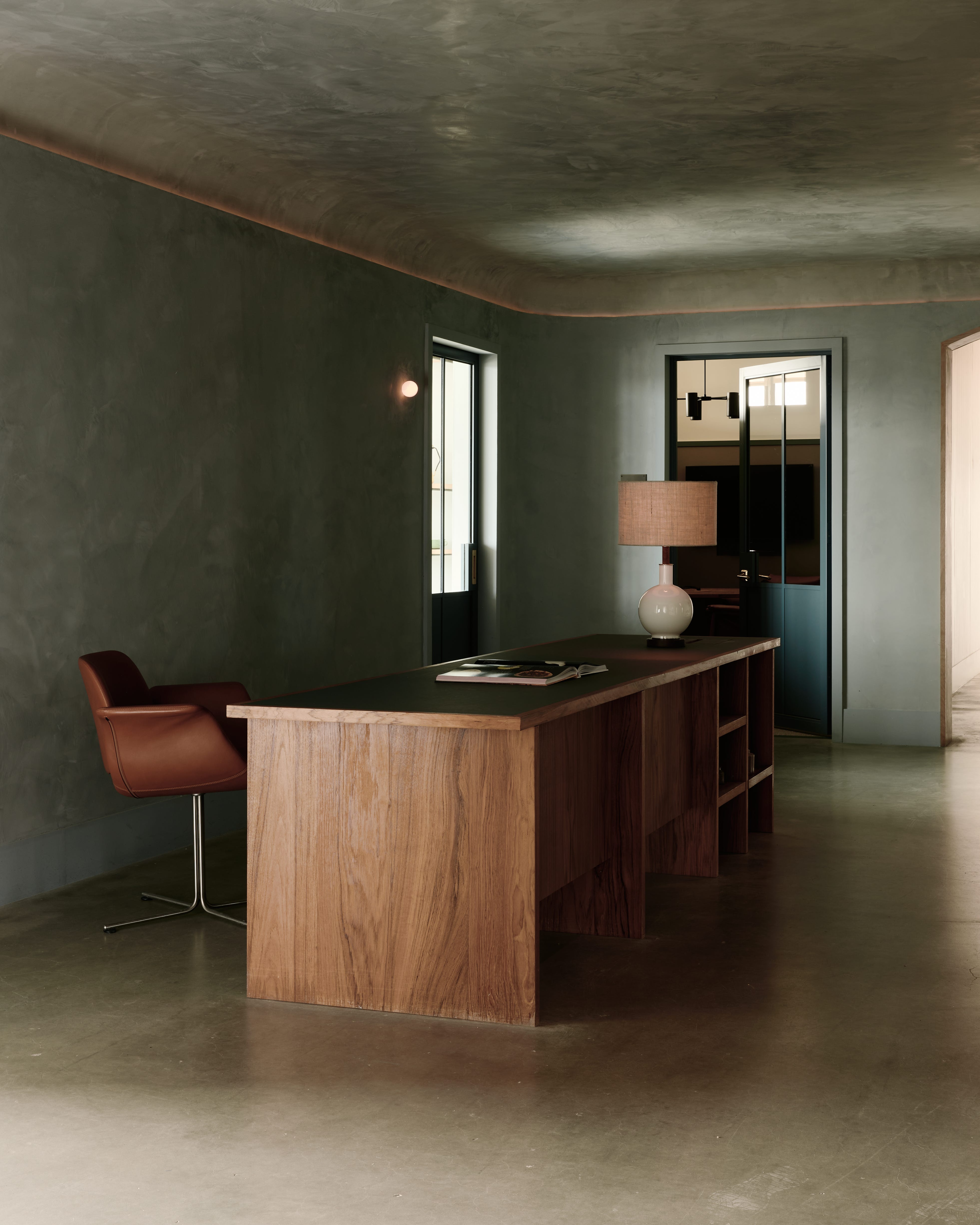
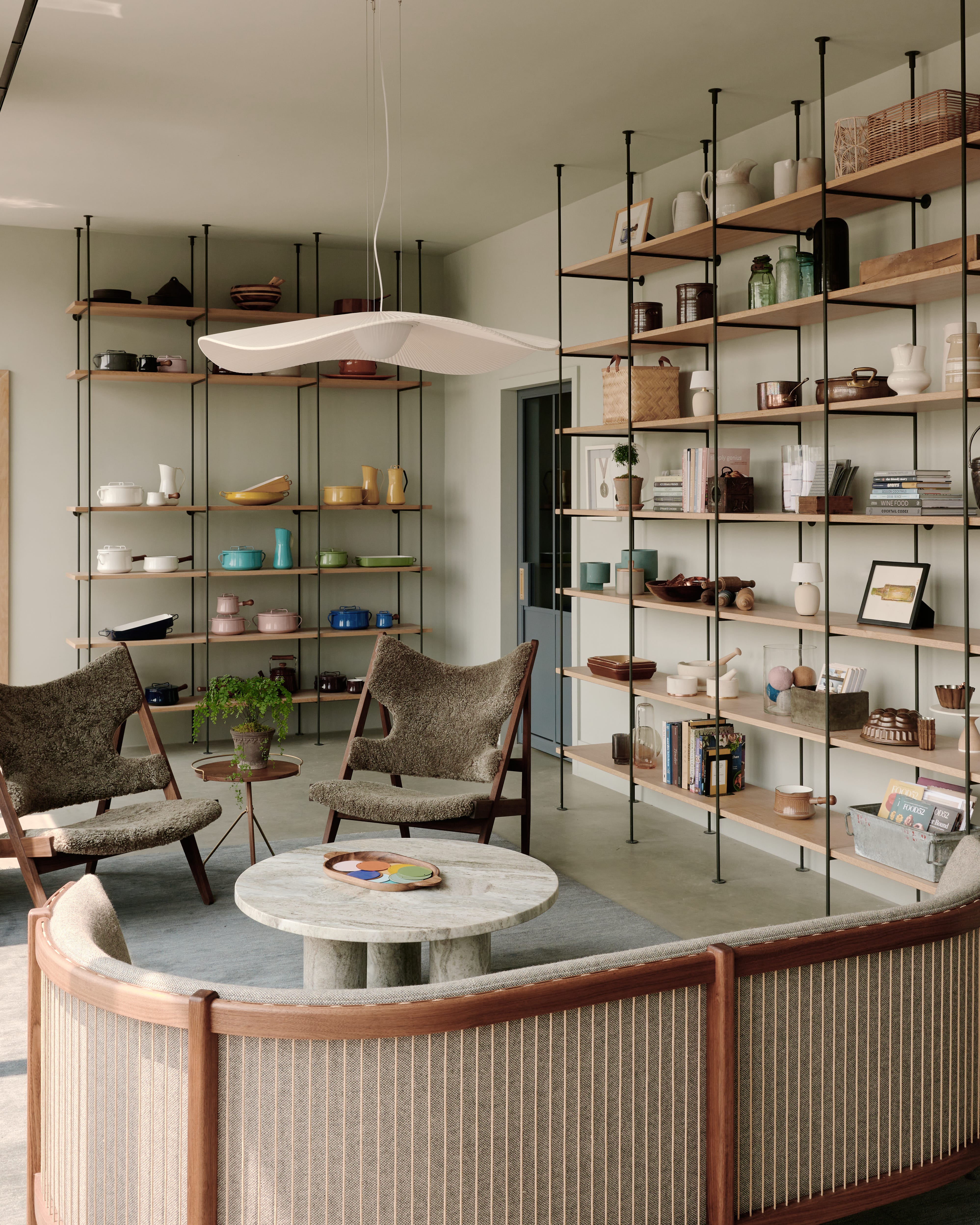
At Food52’s headquarters the design conversation began with architecture rather than furniture. The space itself was massive, with long sightlines that could easily have felt overwhelming and intimidating to visitors. Instead of amplifying that scale, we brought the space inward. Plaster walls and soft cove lighting created intimacy, and making the reception desk felt almost as if it were discovered rather than designed. Immediately behind the desk, through a doorway is a small sitting area where the brand’s products are displayed, turning the waiting moment into an introduction to what the company actually does showcasing DANSK, Schoolhouse and more. By the time someone is called into their meeting, they already understand the brand through this physical and visual experience. Imagine if we just stuck a desk with an iPad in front of this giant space and stuck a “please be seated” sign on the wall…
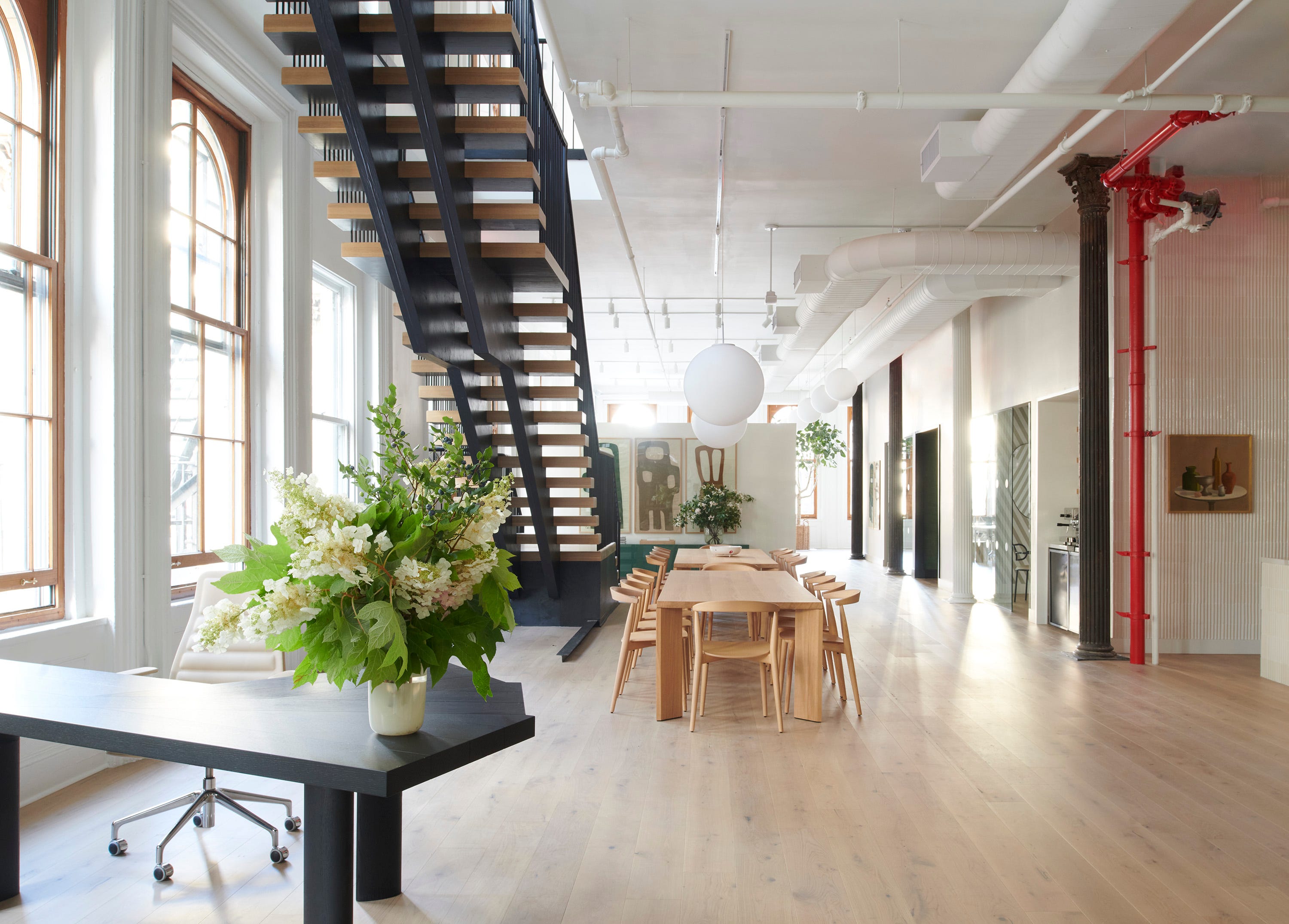
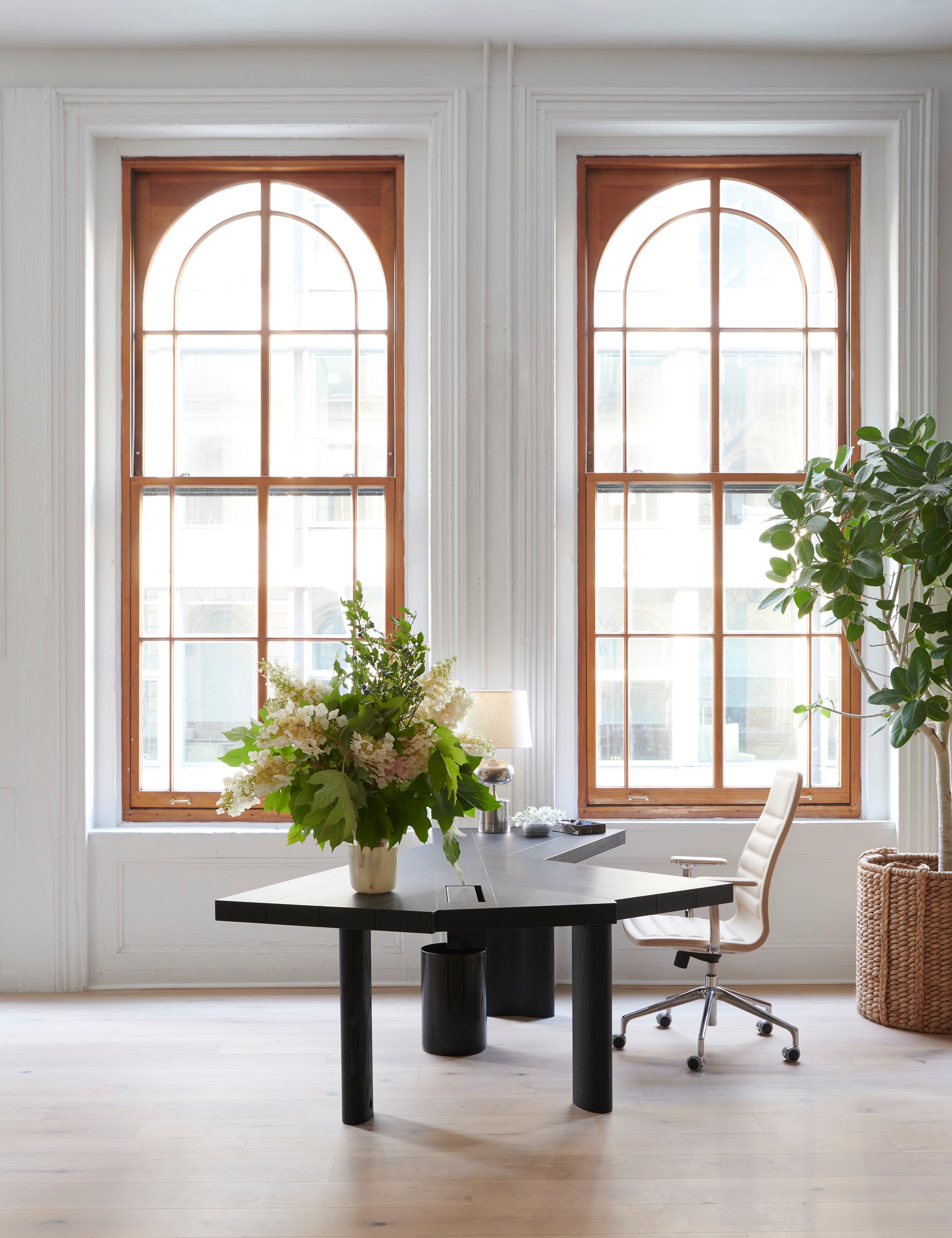
Okay, Schumacher offered a completely different scenario. The architecture itself was dramatic, with a sweeping staircase and large windows framing the space. In this case the most powerful design move was restraint. Instead of adding layers of furniture or screens, we kept the reception area minimal so the architecture could remain the focus. The result is a calm and almost gallery-like entry where the building itself becomes the brand statement. This space was also designed using layers of products from Schumacher and FS&CO’s lines of wallpaper and textiles, which helped tell the story as you moved through the space to your meeting.
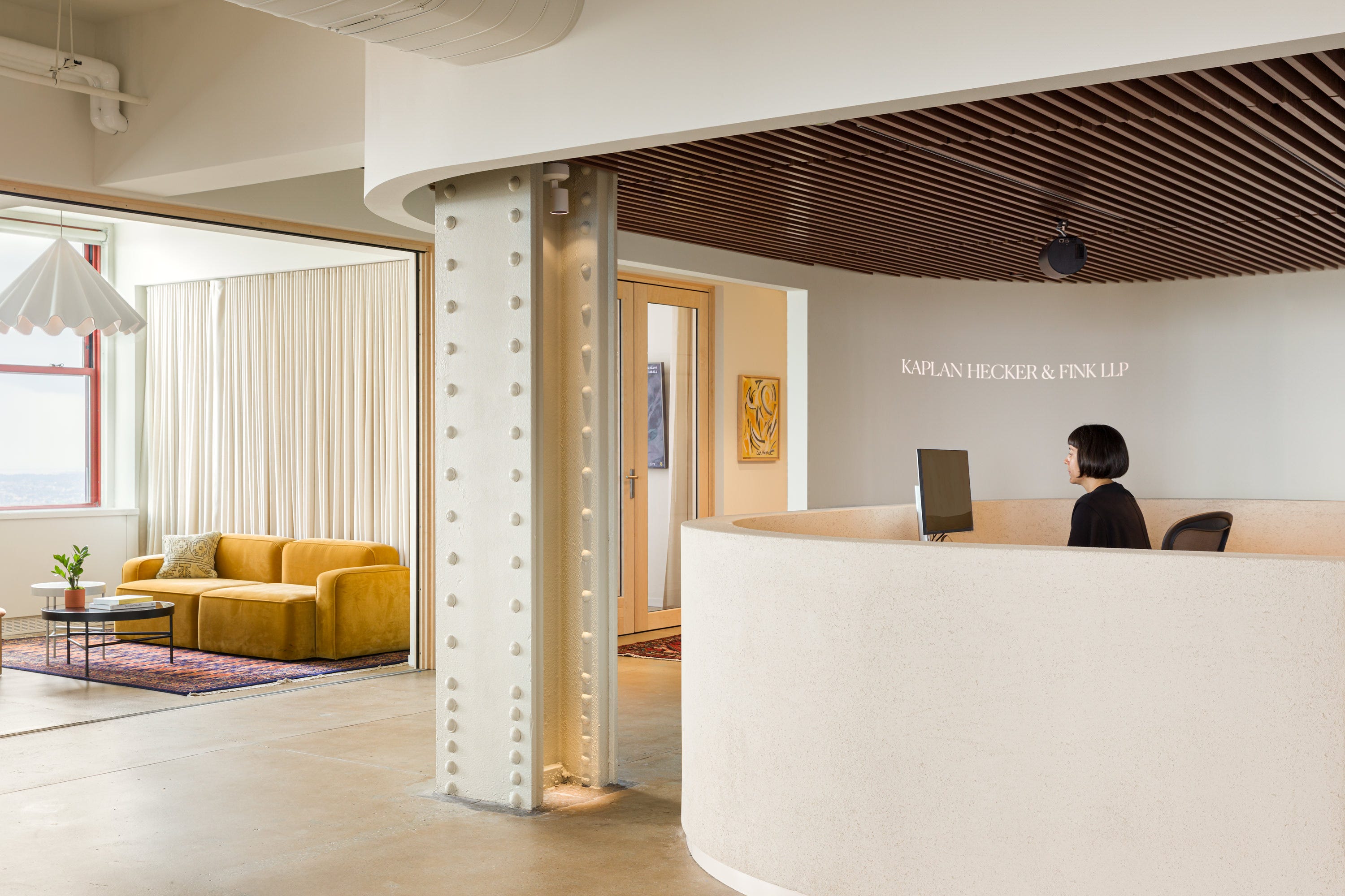
In another law office, KHF, a structural constraint became a design opportunity. The HVAC conditions required a lower ceiling than we would typically prefer, so we curved the wall surfaces to soften the compression of the space for both employees and visitors. Programming also played an important role. Rather than installing a large permanent screen for presentations, we designed the space around a projector system, which allows the room to remain visually calm while still functioning for meetings when needed.
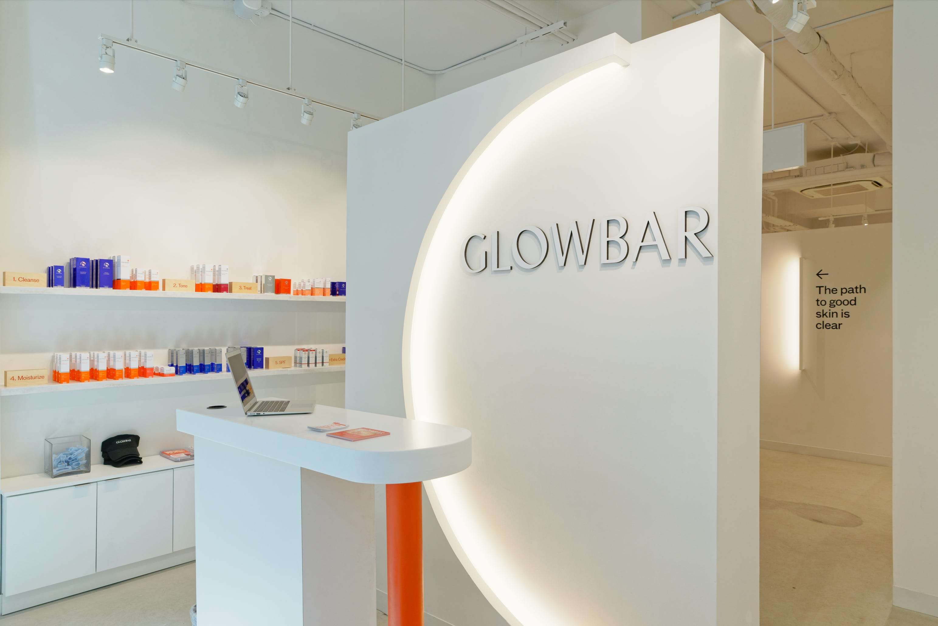
For Glowbar, the reception desk needed to function across dozens of small locations while maintaining a strong brand presence. Instead of designing a low desk where people might linger, we created a standing-height counter that encourages quick check-ins before clients move directly into their treatment. The environment is intentionally bright and minimal, with a signature orange column that signals the brand immediately even within a compact footprint, and shelving allows for ready to purchase products to be made available post treatment.
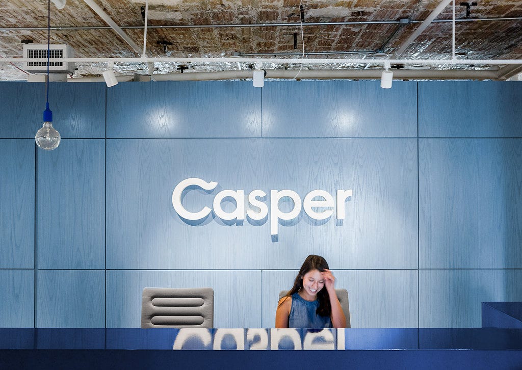
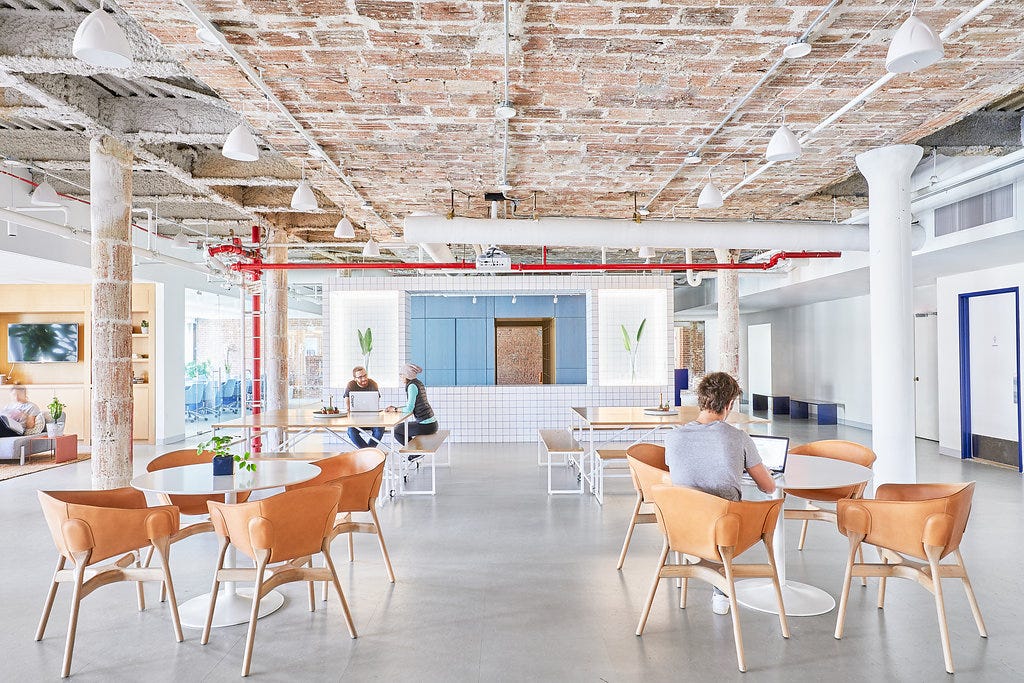
Some reception areas become iconic almost unintentionally. The original Casper office, completed more than a decade ago, used the brand’s signature blue throughout the reception zone so visitors immediately understood where they were. The color carried through the entire office, turning the brand identity into a spatial experience rather than a logo on the wall.
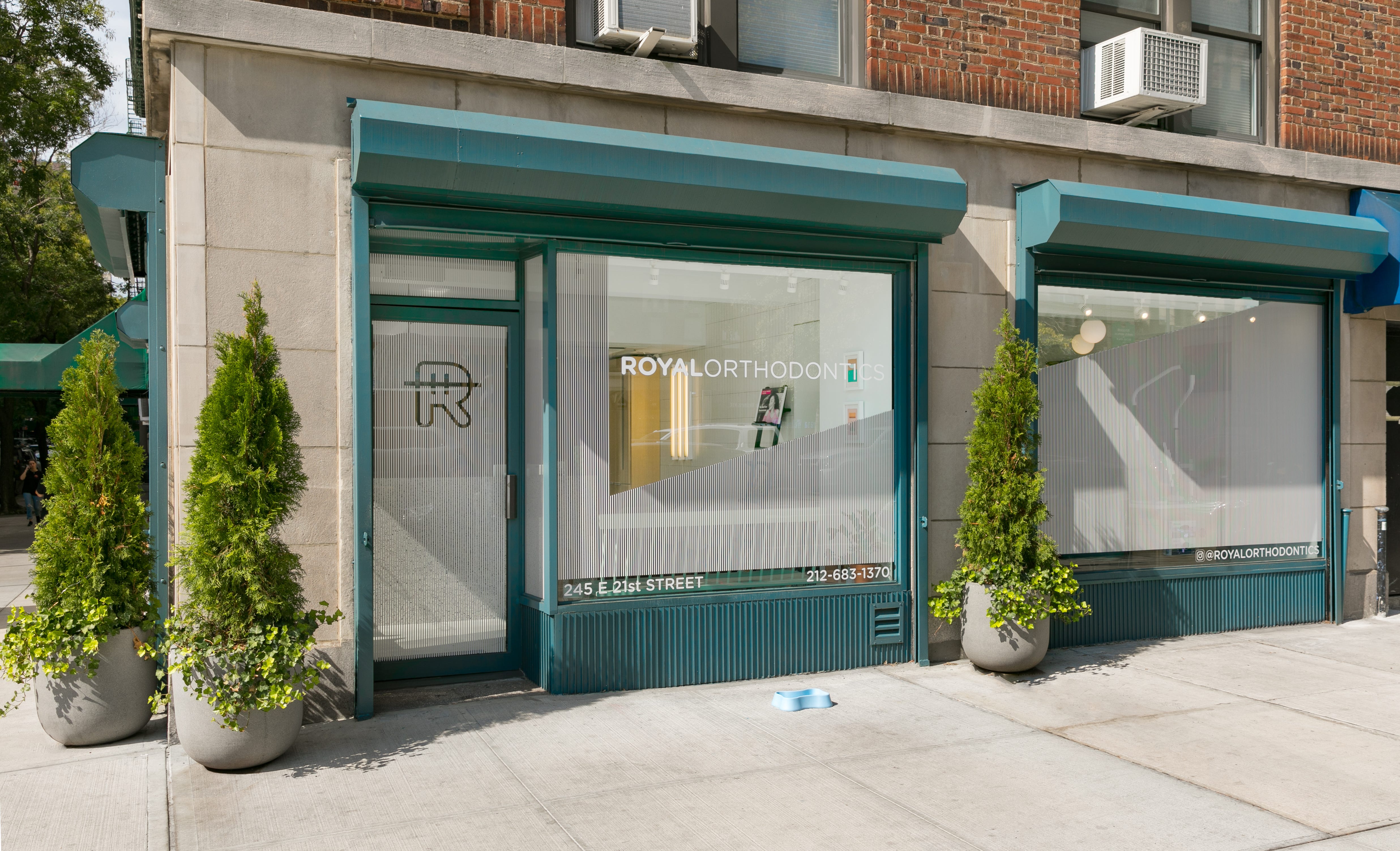
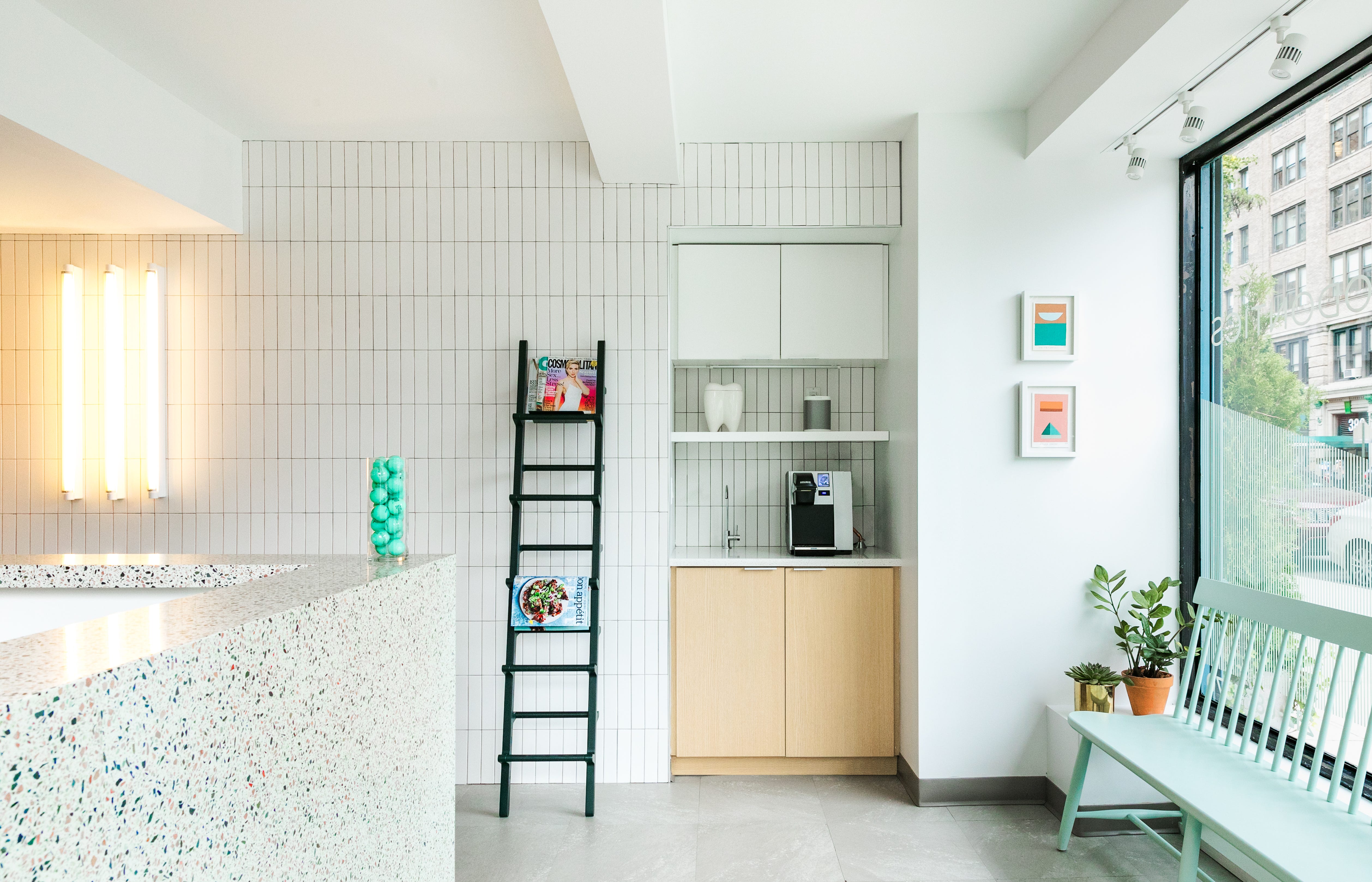
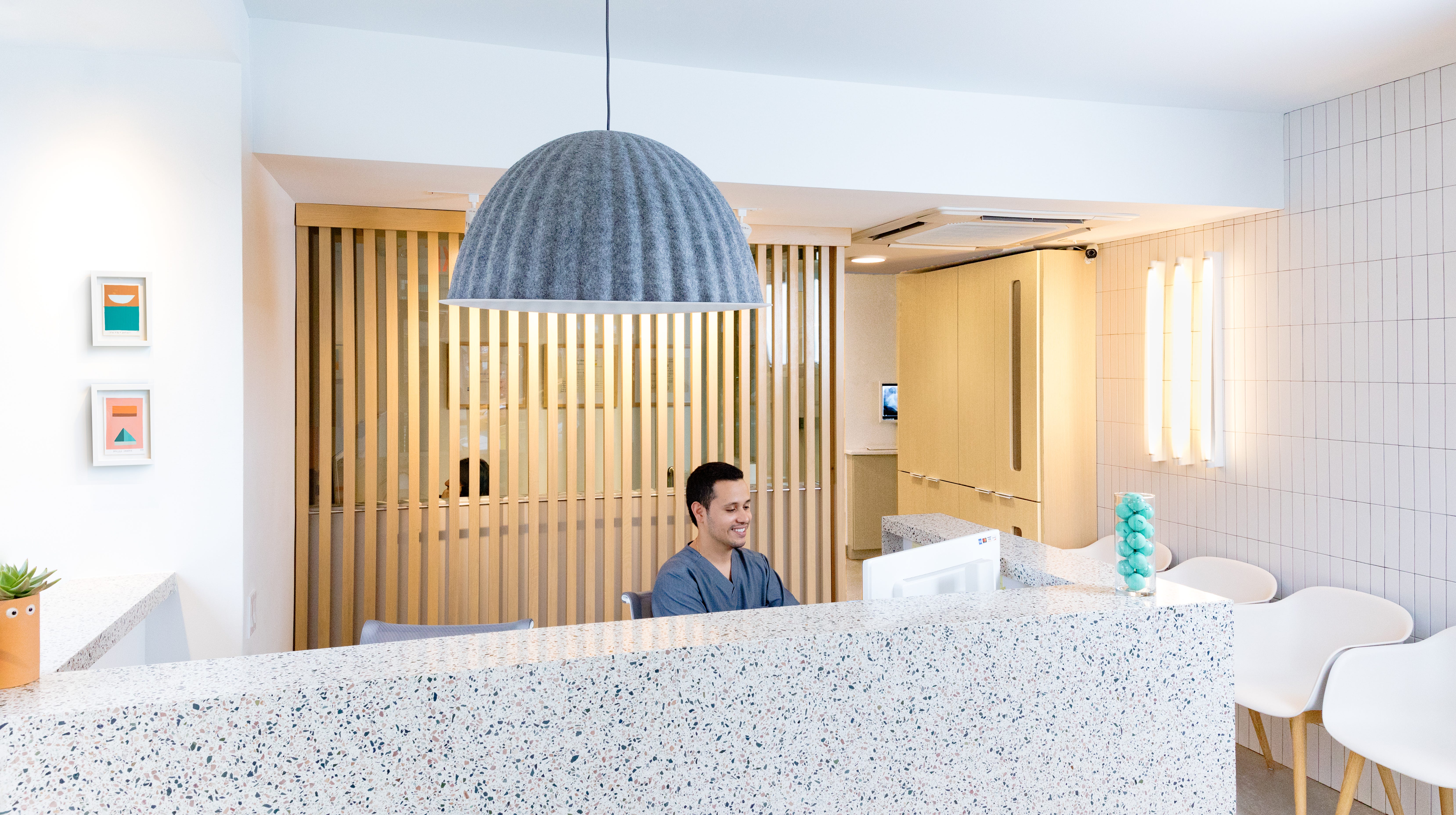
In hospitality-oriented environments, the priorities shift again. The reception area for Royal Orthodontics, a dental practice, was designed around the emotional reality of the visit. If someone is about to spend two hours in a chair, the experience leading up to that moment should feel bright, welcoming, and reassuring. The footprint was extremely tight, so we focused on hospitality elements like accessible seating, coffee, and water, along with bench seating that maximizes the number of guests without making the room feel crowded. We also made it so that the facade of the building felt just as good as the reception area, really maximizing the experience from the moment you arrive at the address.
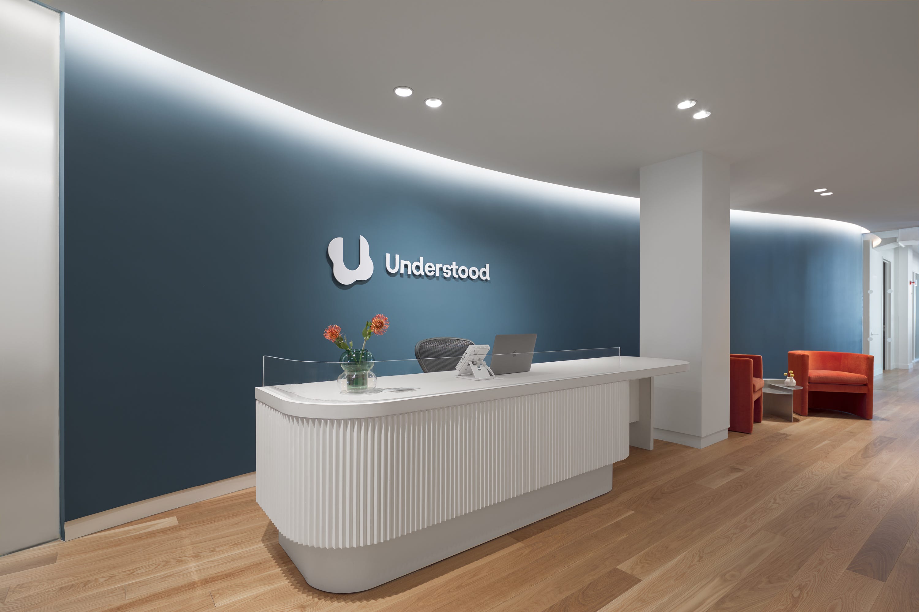
The reception area for Understood presented a particularly meaningful challenge. As a nonprofit focused on supporting neurodiverse individuals, the space needed to feel calm, legible, and unintimidating. We worked closely with the organization to ensure that circulation paths were clear and intuitive. The reception desk was lowered to be more approachable and wheelchair accessible, with a small glass shield that preserves visibility while maintaining comfort. Curved walls soften the geometry of the room, and the brand’s blue color provides orientation without overwhelming the senses.
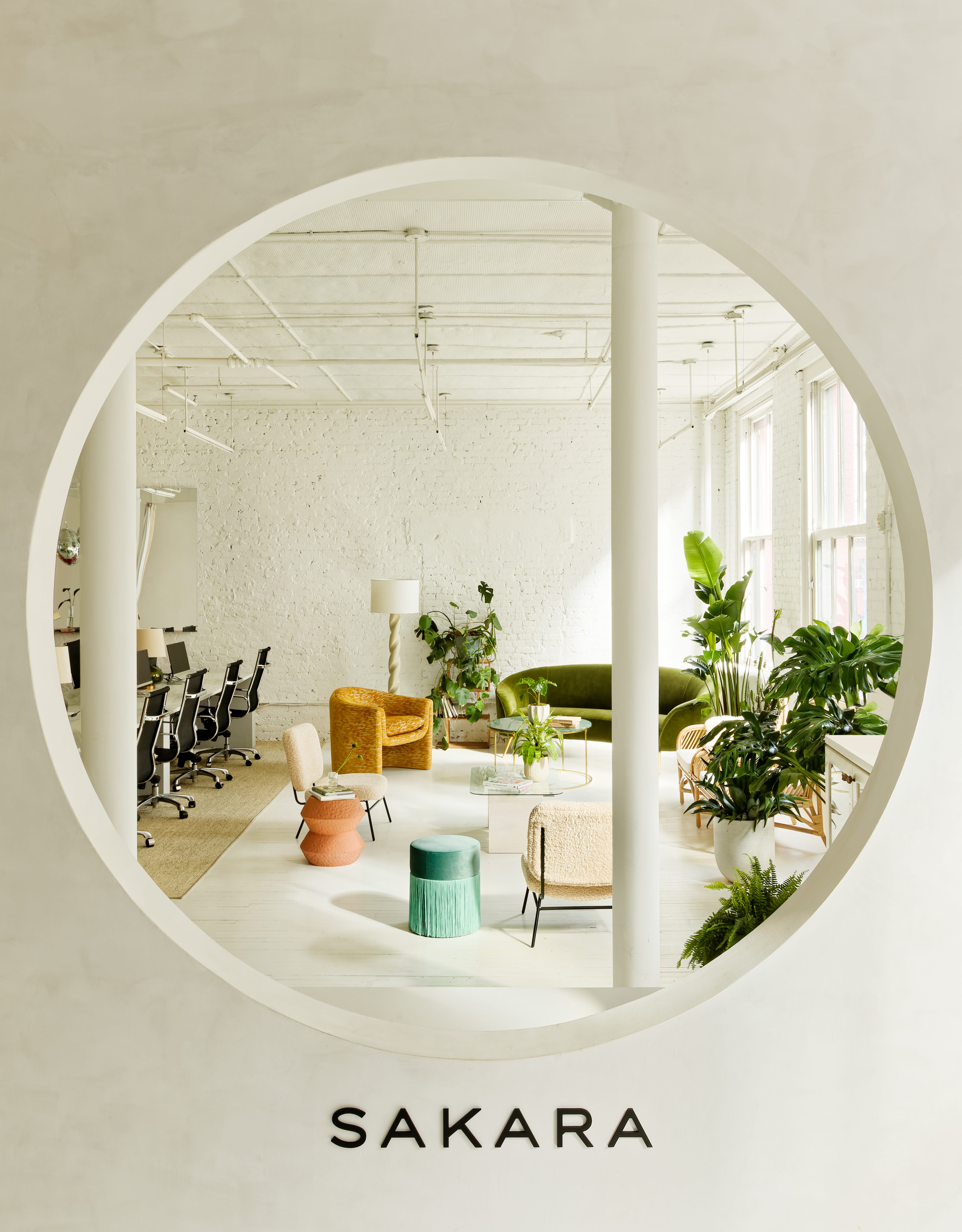
At Sakara Life, the reception area operates more like a portal into the office than a traditional waiting space. Because most visitors are expected and pre-arranged, there is little need for seating. The design instead focuses on framing a view into the workspace while displaying elements of the brand.
Across all of these projects, three questions guide how we approach the reception experience.
What story is the brand trying to tell through the space?
What first impression should a guest walk away with?
How long will someone realistically spend waiting here?
The answers to those questions influence everything from the type of seating to the posture of the reception desk and the overall functionality of the room. Ultimately, reception areas succeed when they stop trying to look like reception areas and start behaving like an extension of the brand itself.
—Brad
Thanks for reading Sightlines! This post is public so feel free to share it.
Comments
Nothing yet. Say the first thing.
Sign in to join the conversation.