
When I think about where design is headed in 2026, I don’t see a single look or style taking over. What I see is a shift in values. The conversations I’m having, the projects I’m working on, and the choices clients are making all point in the same direction: people want their spaces to feel more personal, more human, and more intentional. For me, that shows up most clearly in two areas: Craft and Color. Not as trends, but as a return to things that have always mattered and were briefly drowned out by convenience and sameness.
Craft has become a kind of litmus test.
For years, big retailers have been producing objects designed to look handmade by creating perfectly imperfect pieces made at scale, engineered to feel special. And while that worked for a while, it’s starting to feel hollow. You can sense when something was made for the masses rather than by a person.
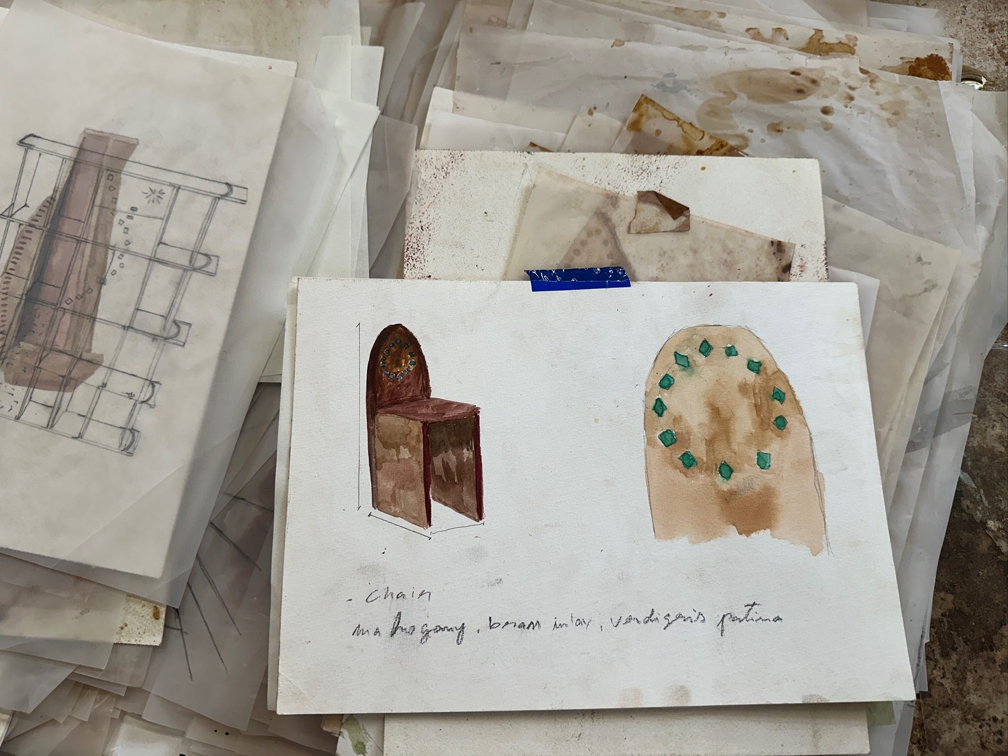
Lately, I’m seeing a real appetite for true craftsmanship: hand-glazed tiles with irregular edges, carved wood that shows the mark of the tool, woven textiles with variation, handmade furniture that feels considered and built to last. The imperfections are the point. Asymmetry, variation, slight inconsistencies in color are the signs of human involvement, and I think people are craving that more than ever.
At Float Studio, in both residential and commercial spaces, we’re seeing a move away from disposable furniture and toward pieces that feel like they can live a long life, collect stories, and age alongside the people using them. This return to craft is deeply tied to identity.
I’m noticing that clients are becoming curious about their own roots and heritage and how that might show up in their homes. There’s a cultural shift happening where people feel more comfortable saying, this is who I am, this is where I come from, and allowing that to inform their spaces. Whether it’s Moroccan, Turkish, Persian, or African textiles (for example), these choices aren’t about following an aesthetic, they’re about telling a story. I think by 2026, we’ll see far fewer plug-and-play interiors and many more homes that feel collected over time, shaped by memory and meaning rather than what’s currently circulating online.
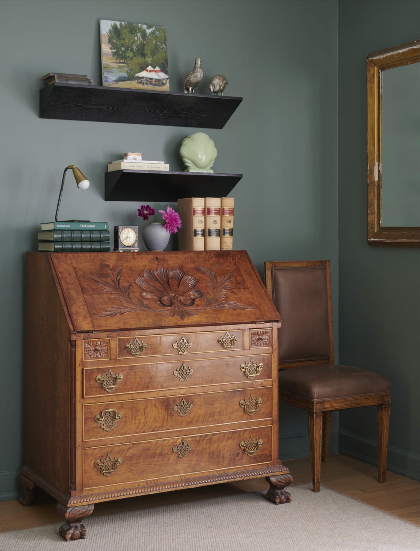
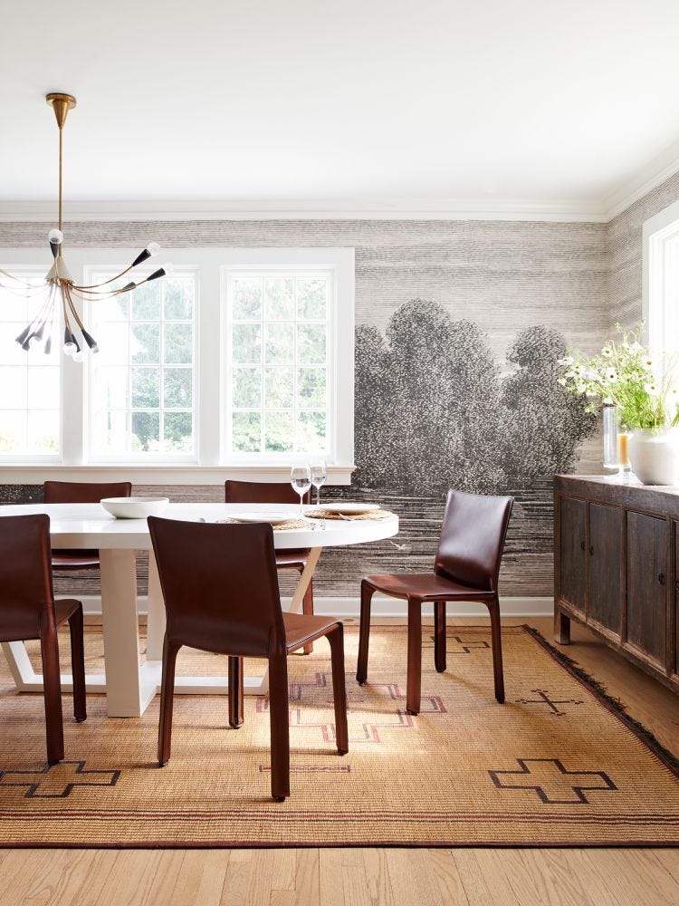
Color is the other place where I see a real shift coming into focus. I hesitate to even call it a trend. I’ve always admired designers who continued to use color confidently through the long beige-grey era, when everything felt muted and cautious. What feels different now is not just that color is back, but that it’s being used with more intention and courage. Color is no longer just an accent, it’s becoming a design driver. I’m seeing combinations I haven’t seen before and catching myself thinking, why didn’t I do that?
It feels like we’ve been looking at interiors through a black-and-white lens for years, and now that lens is coming off.
What replaces it isn’t chaos, but layering. Warm against cool, saturated against neutral, unexpected pairings that still feel balanced. Resources like Japanese color combination books feel newly relevant because they show how intuitive and emotional color can be when you stop over-theorizing it. That said, using color well doesn’t mean making everything colorful. In fact, I think people will get more refined about this by 2026.
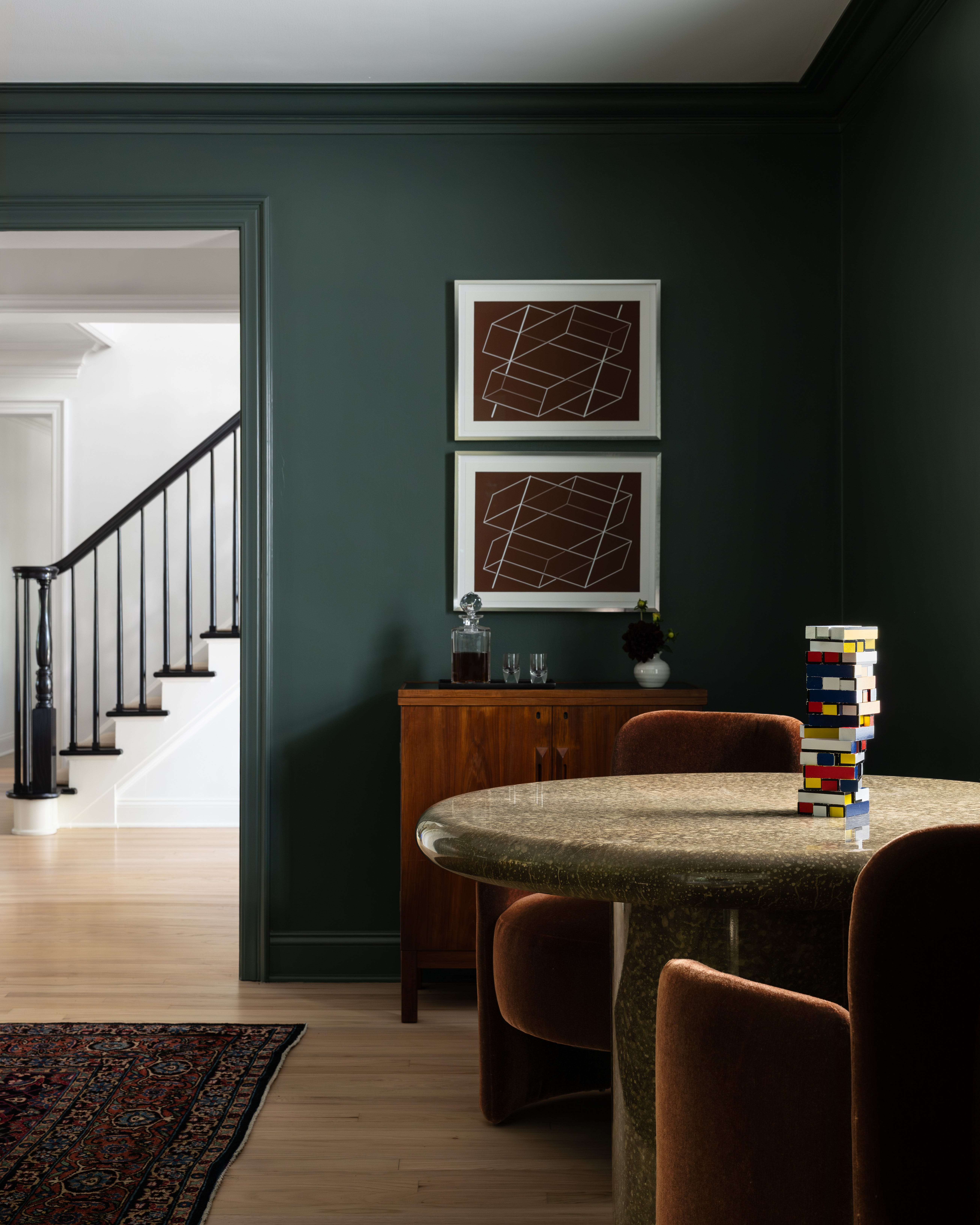
If color is scary to you, start by anchoring the big elements like walls, millwork, and foundational furniture neutral tones and let color live in the layers. Use rugs, textiles, art, objects. These are the pieces that can carry personality without overwhelming the room. Imperfection matters here too. Slightly different reds in the same space. Blues that don’t perfectly match. The old rules of everything coordinated, everything repeated in threes, are starting to feel less relevant. Variation makes a space feel human.
Ultimately, I think the biggest shift is that people are designing from the inside out. There’s more emphasis on how a space feels than how it photographs. Calm, energetic, cozy, grounded; these are the words I hear more than any specific style reference. Heritage might be the driver, or an era, or simply a color that brings joy. What matters is that the choices are personal. Start small. Anchor with neutral. Choose colors you genuinely love. Layer them slowly. Let imperfection in. If 2026 is about anything, it’s about meaning and homes that reflect the people living in them, not the moment they were made.
—Brad
Comments
Nothing yet. Say the first thing.
Sign in to join the conversation.