
Selecting the perfect shade of warm white paint is like finding the perfect pair of lived-in jeans: when it works…it just works, and it never goes out of style.
White paint can certainly be nuanced, but finding the perfect shade doesn’t have to be stressful.
Once you understand LRV, undertones, and shades, I think you’ll find selecting the perfect white to be quite easy!
Read below to learn how I select white paint as owner and principal designer of Boxwood Avenue Interiors, and discover my secret tips for selecting the perfect warm white paint!
When I began as an interior designer, I found picking white paint colors to be a bit formulaic.
With thousands of shades of white, I continually reached for “Pure White” because it provided a clean, crisp backdrop for the rest of the interior. I even used this color in my own home and for the walls in my brick & mortar.
Looking back, I feel foolish for not seeing the nuances of white, but I am happy I have grown to see (and even feel) the importance of the various shades of white available.
You may have the notion that a warm white paint is saved only for traditional design…
This is actually what I believed when I first began designing, but this simply isn’t true. Even the most contemporary spaces are elevated with a subtly warm-hued white paint.
When selecting white paint, it’s important to understand “undertones”. In previous posts about selecting paint, I’ve discussed how my experience as a photographer has served me in being able to visualize undertones. If you aren’t familiar, let me break it down for you!
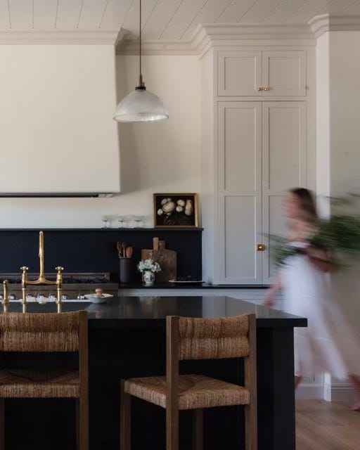
Let’s talk about light.
Light is how we see the world, without it, everything would be dark. Light is vital in photography, design, and all other visual practices.
White Balance: “Establishes the true color of white and produces a baseline.
As a designer, I’d rather have richly hued walls than a space that reads too cool.
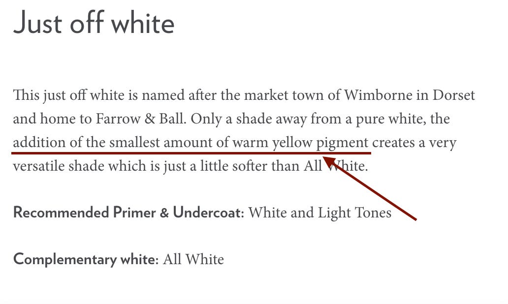
There are four undertones of white: green, pink, yellow, and blue. These undertones affect the visual “temperature” and “tint” of white paint. When you hear people refer to a “cool” white or a “warm” white, this is what they are referencing.

Grey can also be considered an undertone of white, which is achieved by adding a small amount of black to the base white color.
Balancing white is achieved by taking into account the natural light of a space and adjusting the undertones of the shade of white to achieve the desired finished color.
For a warm white, yellow is typically added. As an interior designer, I prefer to opt for a warm white with added grey undertones so that the paint doesn’t appear yellow.
Designer Tip:
When selecting paint, it is so very important to understand how to interpret the light in your home, which will elevate the overall ambiance of your home tremendously.
South-Facing Rooms: Receive more sunlight and tend to be a bit warmer (accentuating yellow undertones), so a neutral warm white is best.
North-Facing Rooms: Receive less sunlight and tend to skew cooler (accentuating blue undertones), so opting for a white paint color with more warmth is best.
East-Facing Rooms: Receive morning sunlight and tend to skew cooler later in the day with more shadows (accentuating blue undertones), opting for a color with a bit more warmth is best.
West-Facing Rooms: Rooms receive afternoon sunlight, which tends to be a bit warmer (accentuating yellow undertones), so a neutral warm white is best.
What is your design style? Take our complimentary quiz to find your design aesthetic and the perfect accompanying white paint color in less than two minutes!
The Best Warm White Paint Color for Cabinets: Benjamin Moore Lime Wash is a beautiful option for cabinetry. This color tends to lean on the warmer side and is perfect for kitchens and built-ins (as well as trim!). It is a bit more saturated than the other whites listed and will provide some contrast against white walls.
The Best Warm White Paint Color for Walls: The Million Dollar Question!
If I could only pick ONE color for my walls for the rest of time, I’d choose Old White by Farrow & Ball. Being more of a purist, this is the most historic of their colors. This is a very saturated color, so if you’re looking for something that provides a brighter base…
My backup #1 recommended color is Alabaster by Sherwin Williams. I mention it below as the best no-fail option, and that’s because it really is a no-fail. It looks good, every time.
The Best Warm White Paint Color for Bathrooms: Try Sherwin Williams Capitol White, this is from their Williamsburg® Paint Color Collection which I love using because the colors have been carefully crafted from historic buildings and shades. This means that the colors are inherently timeless.
The Best No-Fail Option for your Whole House: Sherwin Williams Alabaster is one of the most popular white paint colors for a tried-and-true warm white that looks good in virtually any light. If you’re not quite sure which color is best for your space, but you’d like a saturated white, Alabaster is a safe bet! This color has never failed me. I love this color because it has a bit of mystery to it and comes off as expensive-looking. If you’re looking for a great warm white that skews more modern, definitely give Alabaster a try.
The Best Shade for a Cottage Home: My good friend Jaime, principal of JZ Interior Designs opted to paint her home Wimborne White by Farrow & Ball, and it is the perfect warm white color for her beach cottage home in Laguna.
The Most Popular Choice: Benjamin Moore’s Swiss Coffee at 75% saturation is a popular choice among designers because it offers a rich hue with warm tones. This was initially made popular by Studio McGee, and I must say, it’s a good one. We used this desaturated version of the well known wall color at our Rocky Terrace mountain modern project. The color is warm without being too yellow. I recommend it for walls, ceiling, and trim.
The Best Bright Warm Whites: Sherwin Williams Greek Villa and Benjamin Moore’s White Dove are excellent choices for a bright white that still reads warm (without being yellow). If you’re looking for a nice crisp white for a north-facing room, these are excellent options. White Dove, specifically, is a beautiful option for kitchen cabinets for a clean, bright white look.
Get Your Custom Paint Palette
Personalized Paint Guidance
Looking for personalized guidance to create the perfect paint palette for your home? My one-hour design consultation is the answer!
Gem by Portola Paints: A beautiful rich white paint color perfect for the exterior of a home, especially on brick. This is an amazing color for exteriors.
Farrow & Ball Slipper Satin: A beautiful off-white whose namesake comes from the color of silk used in traditional ballet slippers. This color is a bit chalky and lacks cool blue undertones making it the perfect neutral on walls. It looks beautiful with Old White by Farrow & Ball on woodwork.
Benjamin Moore Lime Wash: A historic color made to look like traditional lime wash and slightly warmer white than any of the white paint colours listed above. This is a beautiful color to add warmth without being stark.
The Best Bright White: Pure White by Sherwin Williams is just that, one of the purest whites (that, along with Chantilly Lace). *See my note below about these colors. But in my opinion, these are too white. That said, if you want something really bright, these are solid options.
The Best Neutral White: Alabaster by Sherwin Williams looks good in every setting. Use it on your walls, ceiling, trim, cabinetry, heck, anywhere!
The Best Warm Off-White: Pointing by Farrow & Ball is a beautiful warm off-white that can be used on walls and/or trim. It also looks beautiful on cabinetry and doors!
*Designer Tip: Chantilly Lace OC-65 by Benjamin Moore or Sherwin Williams Pure White are solid bright colors, but as a designer I shy away from them. They are not the best for those looking for an elevated, warm white shade. Both are more of a bright white paint color with a high LRV.
Natural Light vs. Artificial Lighting:
Simply put, light affects colors. As I mentioned – our perception of color is directly impacted by the light in a space, hence the LRV score provided. Black, or dark colors, absorb light, whereas white, or light colors, reflect light.
There’s a reason the term “natural beauty” exists! Natural light is the most beautiful form of light and will illuminate white walls in their natural state, accentuating the true color of the white paint selected.
Artificial light is a necessity because well, the sun isn’t always shining! This is why it is important to test white paint colors in various settings before committing to a color. White paint will look dramatically different based on the lighting of your home, time of day, and temperature of the lightbulbs in your home.
Designer tip: Not all artificial light is created equal. Many LED bulbs will cast a blue hue in the room, which is truly a scene from a designer’s nightmare. This designer’s nightmare. I much prefer to purchase incandescent bulbs…however, this isn’t always possible, and some fixtures require LED. When you must use LED bulbs, be sure to buy a “warm” color. This is dictated by the Kelvin scale. The best lightbulb temperature is 2700-3000 for a nice warm glow.
South-facing rooms receive less natural light, and the light is generally cooler in temperature – so it is best to avoid cool whites. When selecting a paint color for a south-facing room, opt for a warmer white to accentuate the space. The creamy undertones of a warm white, such as Slipper Satin by Farrow & Ball, are a great option. This can be a living room, dining room, or even bathroom.
Sunny days will cast a nice warm glow within a space. However, keep in mind, it isn’t always sunny (in most locations). Consider the overall climate of the home when selecting your paint colors. Does the sun shine more often than not? Or, is it cloudy? If the sun is ever-present (lucky you!), you can consider cooler whites. If you live in a more moderate climate, select a warmer white which will cozy up your space even on a cloudy day!
As mentioned above, artificial lighting will dramatically affect the color of your walls, especially white walls! This is why it is important to test the paint colors in a variety of lighting conditions, such as time of day, weather, and in natural and artificial light.
To maintain warmth in a space, be sure to select light bulbs that lean warmer, 3000K or less.
As a designer, I would never not test a white sample on a wall. It is very important to test the white paint colors in a variety of conditions.
My favorite way to do this is through Samplize swatches! These are so easy to order and allow you to move the swatch from room to room, sticking it to a wall!
To effectively test a shade of white in your space, review the sample at different points throughout the day and if possible, various weather conditions.
Avoid selecting a warm white that reads too yellow on a sunny day or too cool on a cloudy day. It’s all about balance!
This is especially important in a white kitchen, where you’ll spend a large portion of your time.
Some people wonder, “Should I match my cabinetry paint color to my walls?” You do not need to match cabinetry paint color and wall color. Interior designer’s often mix up the shade, sheen, and color. Personally, I like a little variation.
For example, I might do “Old White” by F&B on kitchen cabinetry and “Slipper Satin” on the walls. Just enough contrast, yet the colors still coordinate.
If you’re wondering, “What is LRV?” You’re not alone!
This acronym stands for “Light Reflective Value” and signals how reflective the shade is.
As a designer, I prefer a lower LRV because I tend to select richer, more saturated whites.
“What sheen of paint should I use?” is one of the most common questions we get asked when it comes to paint.
While there are varying opinions as to which is best, I prefer a flat or matte finish when possible on the walls, and especially the ceiling (please, please, please don’t use a high gloss finish on your ceiling!).
The exception of this rule is in bathrooms, where a satin finish is more appropriate.
As an interior designer, I tend to prefer an eggshell or flat sheen on walls and an eggshell or satin finish on trim and millwork.
However, there are instances where we will intentionally select a high gloss finish or a more luminous sheen – it just depends on the design of the room.
Walls: Flat
Bathrooms: Eggshell or Satin
Trim: Eggshell or Satin
Ceiling: Flat
In conclusion, selecting a warm white paint is easy when you consider the direction of the room and the overall LRV of the shade.
A warm white paint will offer a classic feel and will provide a timeless look to the room. Be sure to consider the undertones of the shade, and always test a sample on the walls before committing!
If you’re planning a remodel, build, or design project…we work with clients across the globe and would love to learn more to see if it’s a good fit. Inquire here.
Comments
Nothing yet. Say the first thing.
Sign in to join the conversation.