
It wasn’t too long ago when we all dreaded when an adaptation rolled around and scrambled to the bookstore to pick up an original cover of a book. Whether it was a full rebrand of the cover or just a small sticker on it, I simply remember not wanting it. That’s not to say I don’t think they should exist, though—I understand the need to market a new film or series, especially one that already has an existing fan base. I think a lot of us just struggled with the feeling that we had often lost the original book.
But I haven’t had that feeling in a while…
We’re living in a world where several adaptations release every single month. You walk into any bookstore these days, and there’s a good chance they have a section of upcoming adaptations. Lately, I’ve made a point to look at the display, and I’ve noticed something interesting: I actually like a lot of the covers.
And just last week, Prime Video and Ali Hazelwood announced the movie tie-in cover for The Love Hypothesis, and it was one of the most positive reveals I’ve ever witnessed.
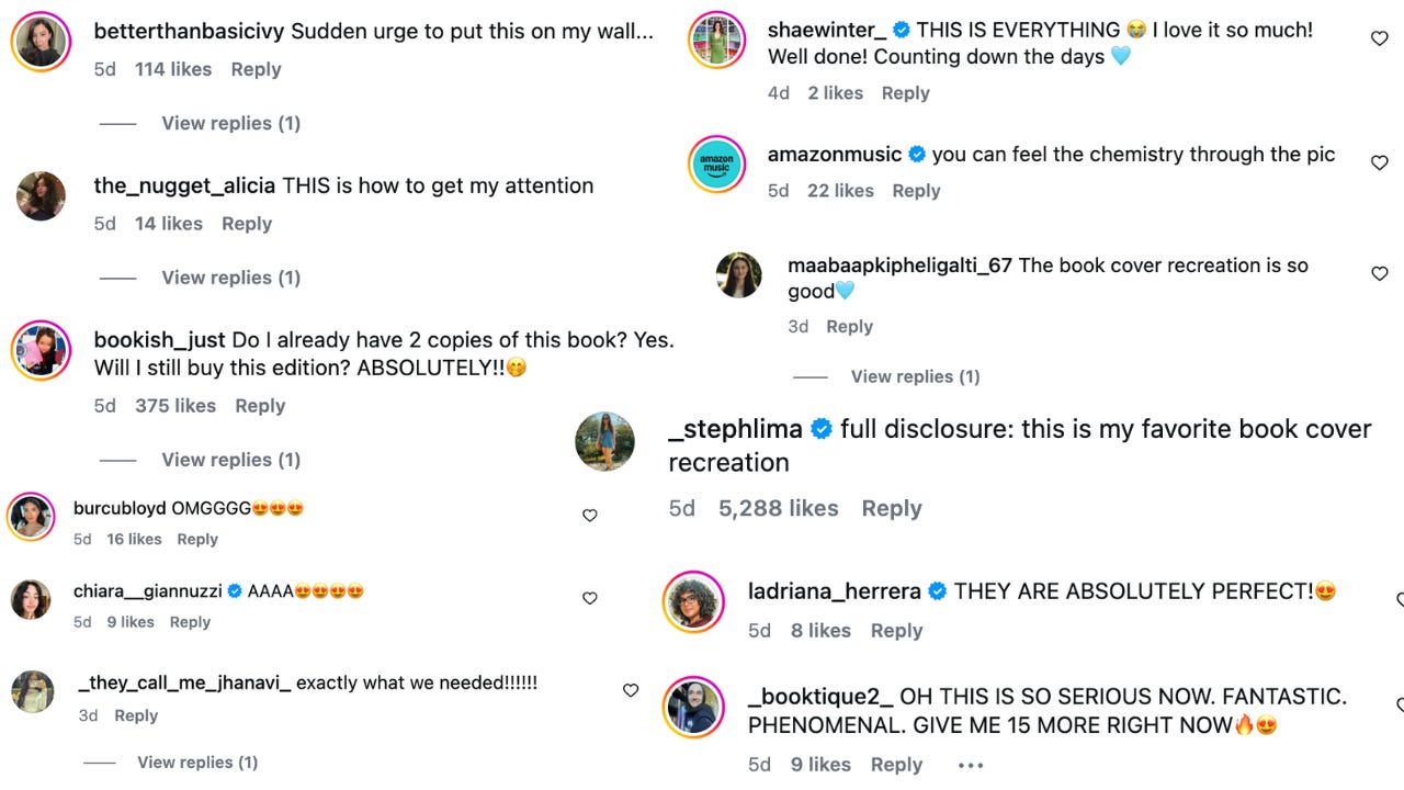
But what was different about this one?
If you’re thinking it’s the simplest answer, you’d be correct: It helps to drive more sales. While we readers are often already attuned to the next adaptation, there is a whole new audience who will watch the next book-to-screen film or series without even realizing it's based on a book. So whether they go on the hunt for the book after watching the trailer or the movie as a whole, publishers want people to find it easily.
The problem? They made it too easy.
Historically, movie tie-in covers felt like a carbon copy of the movie poster. Most often, it was big pictures of the actors, a title, big text that read “watch it now,” and that was all. While it was easy for new audiences to find it, the original audience, who are a large reason it even has an adaptation, were forgotten. The movie tie-in cover found itself on the front display, and the original source material is on a shelf in the back. These books stopped feeling like books and started feeling more like pieces of movie merchandise.
But I think publishers have finally figured out that they don't actually have to choose between selling the movie and preserving the book.
They’re keeping the DNA of the original cover.
Instead of slapping a movie poster on the cover, they’re using key points from the original design, including the:
Colour palette
Imagery or Illustration
Typography
Composition
Instead of feeling like a replacement, the new covers feel like a companion. And it’s a win-win situation: New readers can recognize aspects from the movie, and previous readers feel seen (and might even buy the new cover).
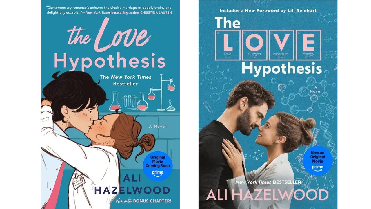
The Love Hypothesis is a prime example. They feel the same. Not only is the cover the same blue shade, but the font colour, the position of the characters, and the science graphics in the background are all relatively the same. Olive’s hair even appears to be in the same updos (it’s the little things that matter).
Changes I can get on board with:
The Kissing Moment: While this is an integral moment in the book, do I think it needed to be recreated in the movie tie-in cover? No. Real people kissing on covers is something I’ve never liked, and that doesn’t start now. I approve this change
‘LOVE’ in the Periodic Table: While some other chemistry lovers and I have noticed that it’s not entirely accurate, I personally don’t care. They kept the same pink colour and made it more of a science flair, and I’m here for it (accuracy or not).
“Ali Hazelwood” in Pink: It should’ve always been in pink. The navy blue doesn’t even sit right with me now, but I love that they kept a very similar font.
What I would’ve loved to see:
Adam wearing something other than black, but I could very much be missing something from the book about his outfit choices.
A bit more pink in the background of the cover, but now I’m truly just being picky because it truly feels perfect.
➡️ What’s your favourite adaptation tie-in book cover?
The Love Hypothesis is not the first time I’ve noticed a movie-tie-in cover done well, but it is one of the best I’ve seen, which is why I wanted to write about it. I like when readers are appreciated, and I felt like that’s what they achieved here. It almost felt satisfying as well?
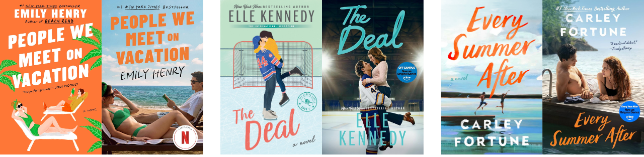
And publishers all seem to be on the same page this year with cover design. People We Meet on Vacation, Off Campus, Every Summer After and Heated Rivalry all nailed their series/movie covers. Whether it’s the same font as the font, same colour palette, or just an overall similar vibe, I’ll take it (literally sometimes too)!
While I don’t buy the movie/series tie-in cover EVERY time, if I’m a fan of the adaptation, you better believe I’m at the bookstore that same day.
The novel was written and published by Ali Hazelwood in September 2021
The adaptation of the same name will release on Prime Video on September 23, 2026
The story follows Olive Smith after she accidentally kisses her professor to prove to her best friend that she is happy and dating. For reasons of his own, Adam Carlsen agrees to fake date Olive.
The movie stars Lili Reinhart as Olive and Tom Bateman as Adam
The film was directed by Claire Scanlon, who also directed Set It Up
…here’s what else is happening in the book world!
Are We Judging Adaptations Too Early? The internet’s reaction to the casting of ‘Better Than the Movies’ proves we’re still falling into the same cycle...
Why Netflix’s Next Adaptation Makes Perfect Sense A classic novel from 1901 is getting a second life and it could be the next big thing...
Everything You Need To Know About Taylor Jenkins Reid’s Next Book
Every Book Adaptation Nominated for an Emmy in 2026 (Your guide to every Emmy-nominated adaptation before the awards in September)
EXCLUSIVE: Elle Kennedy on Building the World of Off Campus
Are We Ruining Adaptations Before They Even Come Out? How The Summer I Turned Pretty fanbase might have gone too far...
No posts
Comments
Nothing yet. Say the first thing.
Sign in to join the conversation.