
Arielle is a scientist.
She writes about research, deep research and deeply hidden truth.
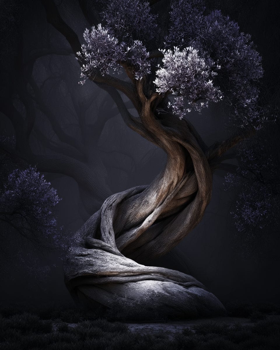
But the visuals I created for her don't illustrate science in a literal way.
They are atmospheric, layered, and artistic.
They create depth.
And that depth gives her publication a distinct character.
That’s the point of a visual style.
It doesn’t have to explain the topic.
It has to shape the experience of reading it.
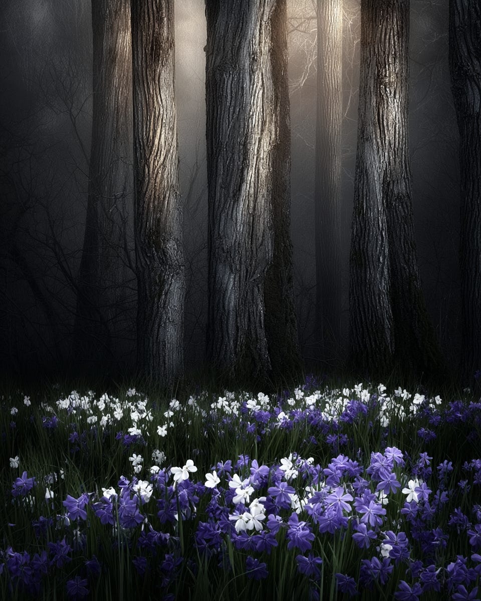
A strong visual identity tells people what kind of world they are entering before they read a single word. And that makes a publication feel more memorable, more intentional, and more like its own.
What’s important about this whole process is that Arielle herself didn’t initially know what she wanted her visual identity to look like here on the platform. However, after preparing some initial proposals and going through a few rounds of feedback, it became clear fairly quickly.
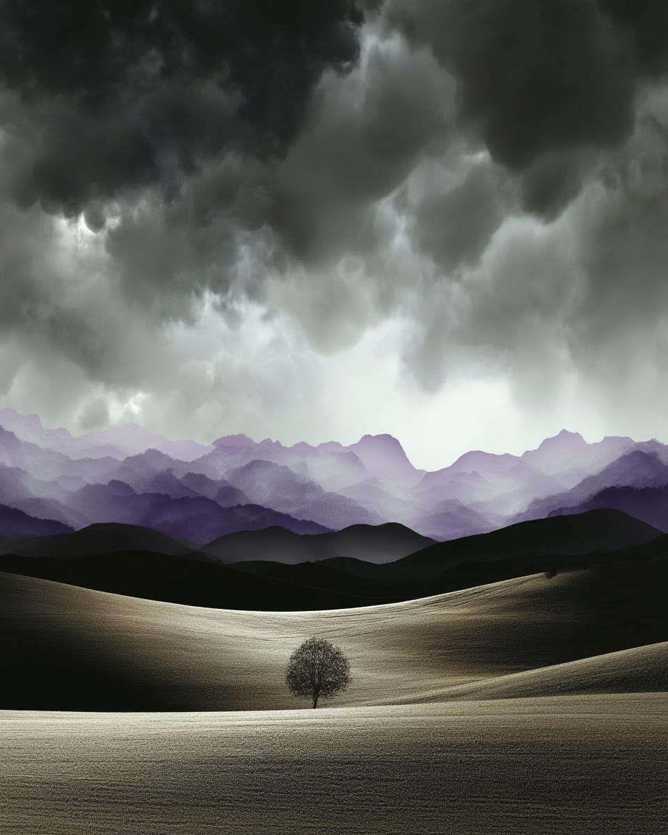
Although Arielle hasn’t used many of the visuals we’ve worked on together yet, she’s already visually prepared for the coming weeks (if not months) on Substack.
Just by looking at her Notes, it’s clear that the ones with visuals are the ones that get the most attention. It’s only going to get better from here.
If you want, I can help you build that kind of visual language for your newsletter.
Link above is for 50% off working with me — available through the end of Sunday.



No posts
Comments
Nothing yet. Say the first thing.
Sign in to join the conversation.