
I’ve been working with images for eighteen years.
First as a graphic designer. Then as a photographer. Then in print production.
Actually, I was doing all three of those things at the same time.
In print a single millimeter off meant the whole job went back to press, the client was furious, and you sat at your desk at 11pm wondering how you missed it.
I missed it because I wasn’t seeing clearly. Not yet.
That took years. Painful, slow, sometimes humiliating years of looking at work I thought was good — and then sitting next to someone who quietly pointed at one thing in the frame and suddenly the whole image collapsed. The light was wrong. The proportion was slightly off. The background was fighting the subject instead of holding it.
I’d nod. Go home. Stare at the ceiling.
And then slowly — very slowly — I started to see it myself.
I’m not telling you this to impress you. I’m telling you this because when AI image generation arrived, I didn’t feel what most people felt. I didn’t feel excitement about speed or volume or the magic of “just type what you want.”
I felt the same old frustration I’d known for years.
Because the images coming out of these tools had the same problems images have always had. Bad light. Weak composition. Wrong proportions. Textures that lied. Colors that drifted. Backgrounds that quietly killed everything placed in front of them.
The tool was new. The problems were ancient.
And nobody was talking about that. Everyone was sharing prompts. Everyone was celebrating volume. Everyone was generating and generating and generating — and most of it looked exactly the same. Technically impressive. Visually empty.
You’ve generated hundreds of images by now. Maybe thousands.
And some of them were genuinely good.
You felt it when they came out — that small rush of yes, this one.
You saved it. Maybe even posted it.
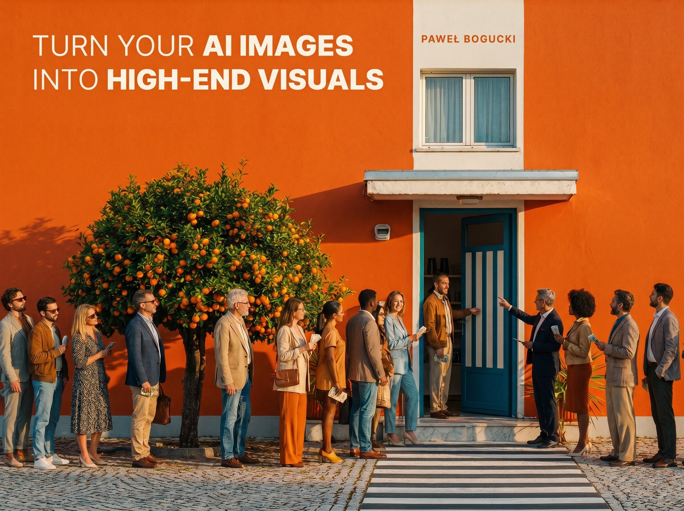
But then you scrolled past someone else’s work and felt something sink a little.
Theirs looked different. Not just better — different.
Like someone made a deliberate decision about every single element in the frame.
The light had a source.
The shadows had depth.
The colors weren’t random, they were chosen.
The background wasn’t filler, it was part of the story.
And you thought: what do they know that I don’t?
It’s not the model. It’s not the prompt. It’s not the tool.
It’s the way they see.
This guide below is about that gap.
Not about generating more but about understanding why a specific light source makes a product look expensive. Why a certain background color quietly destroys an otherwise strong composition. Why a texture that looks fine on a small screen falls apart when you zoom in. Why proportions that are slightly off feel wrong to everyone, even people who can’t name why.
These are not abstract concepts.
They are the exact decisions that separate an image worth looking at from one that gets ignored.
You’ll know to read a frame the way a director reads a shot. You’ll know when the depth of field is lying. When the shadows are too clean to feel real. When the material in the scene doesn’t behave like the material it’s supposed to be.
And then you’ll fix it.
Not by trying another prompt.
By knowing what the problem actually is.
That’s the only upgrade that lasts.
This is the first version of my e-book, which will be expanded over time, so for the first 50 people, the price is just $45; after that, the price will go up. Those first 50 people will receive free lifetime updates to every subsequent expanded version.
Enjoy!
No posts
Comments
Nothing yet. Say the first thing.
Sign in to join the conversation.