
Sun‑dazed fragments of a small vacation: not the Instagram highlight reel, but the in‑between moments – empty deckchairs, a bus with curtains glowing at dusk, a shell in your hand when everyone else has gone home.
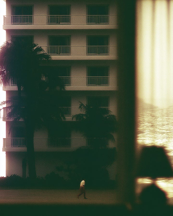
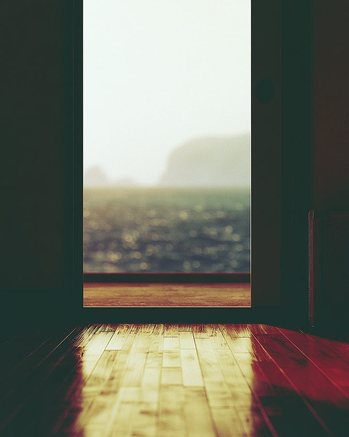
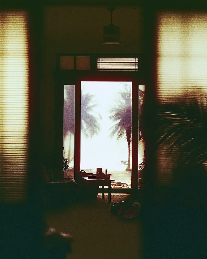
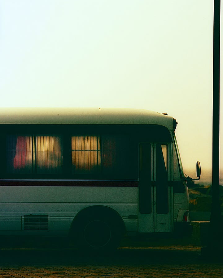
Warm, faded color grading with a greenish cast and soft yellow highlights, like old film left in the sun
Shallow depth of field: only one object in focus (a shell, a chair, a bus window), everything else melts into blur and grain
Lots of negative space – large areas of sky, walls or floor with a single quiet subject
Framed views: doors, windows and blinds cutting the image into rectangles, hinting at the sea or palms outside
Everyday vacation objects as heroes: plastic loungers, pool reflections, motel rooms, silhouettes instead of perfect faces
This style doesn’t scream vacation brochure – it feels like memory, with all its softness and missing details.
By focusing on small, ordinary things instead of postcard views, it makes your reader feel like they’re inside someone’s private summer, not just looking at an ad.
Comments
Nothing yet. Say the first thing.
Sign in to join the conversation.