
Since launching The Substack Bookstore, I keep meeting brilliant authors with slow sales. The writing is strong, the premise is clear, the reviews are kind. The stumbling block is the cover. Too often it’s AI-generated or a DIY job that misses the mark. Readers can tell. They scroll past, and a good book never gets its shot.
Designing a book cover is never just about making something that looks good. The right cover has to carry meaning for the author, signal the genre to readers, and stand out in a crowded marketplace. When those pieces don’t come together, even the strongest manuscript can be overlooked.
I want your cover to earn the click. That’s why I offer Author Growth subscribers a mini audience test with 15 real buyers in your exact genre. Their feedback cuts through the noise of well-meaning friends and family and shows you how your book actually lands with the people who matter most.
To show you what this looks like in action, here’s how it played out with one Author Growth member, , whose book Decode Your Diagnosis went through a cover evolution that perfectly illustrates why reader-tested design matters.
For Decode Your Diagnosis, a book and Substack about navigating chronic illness, the journey to the final cover was as important as the writing itself. What started with a symbol rich in personal meaning evolved into a design that connects instantly with readers, conveys healing, and gives the book its best chance to reach the people who need it most.

Fleur: First Impressions of the Original Cover
When Paul first showed me the early yellow cover for Decode Your Diagnosis, I could see straight away that something was missing. The text didn’t stand out enough, which is always a problem for a title that needs to compete in crowded digital bookstores. Even more importantly, the central motif — the Codex — wasn’t going to resonate with readers at first glance.
The Codex has deep meaning in Paul’s work, symbolising the alignment of mind, body and soul. It’s central to both his Substack and his book. But for a new reader encountering the cover for the first time, it was simply a mysterious symbol with no immediate connection to health, illness, or recovery. In book marketing, clarity matters. A potential reader should understand in a heartbeat what kind of book they are looking at.
Paul: Feedback That Confirmed the Issue
I had already begun to wonder about the visibility of the title, and friends who saw the draft told me the same thing: the text faded into the background. Their feedback matched Fleur’s instinct. I realised the cover didn’t give the book the best chance of reaching the right readers. This was an important moment for me. It meant letting go of a design that felt personally meaningful but wasn’t serving the reader.
Stop launching into the void. Get expert book marketing strategies to help you launch to success.
Fleur: Exploring the Options
I went back to the drawing board and studied what worked for other books in Paul’s genre. Bestseller covers in the health and chronic illness categories often used clean fonts, bold contrasts, and recognisable motifs. From there, I created a series of new designs for Paul. Some still used the Codex but with stronger lettering and sharper contrast. Others experimented with medical motifs such as stethoscopes and ECG lines. The idea was to show a spectrum: one end leaning on Paul’s original vision, the other aligning more closely with reader expectations.
Paul: Choosing a New Direction
When Fleur presented the options, I could see that the Codex still held me back. For someone who lives with a heart condition, the ECG line struck a chord both personally and thematically. It made sense that readers in the health space would recognise it immediately.
The question then became which background colour to choose. A darker palette would be unusual and help the book stand out, while a lighter blue echoed the covers of many successful health titles. At first, I leaned toward the darker option because it felt different. But when I asked for more feedback, people told me the lighter blue conveyed a sense of healing and reassurance. That is exactly the feeling I want readers to have when they pick up the book. In the end, the lighter blue with the ECG line became the clear choice.
Testing the Covers with Readers
We wanted to be absolutely certain that Paul was choosing the right direction, so we put the decision to the people who matter most: readers. We ran an online poll with 15 participants, showing them two options side by side. Option A was Paul’s original yellow cover, while Option B was the new light blue design featuring the ECG line.
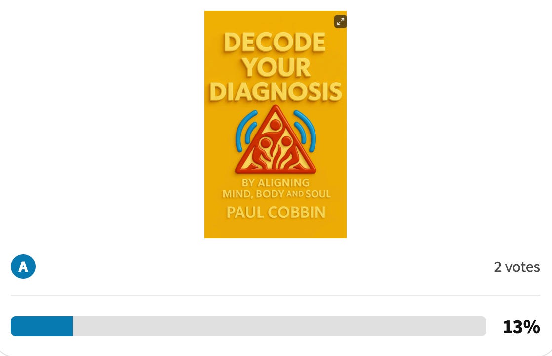
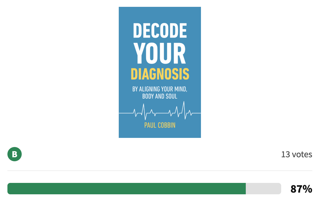
The results were decisive. Thirteen out of fifteen respondents (87%) preferred Option B. They consistently mentioned the calming quality of the blue colour, the simplicity of the design, and the clarity of the cardiogram graphic. Readers felt the new cover was visually appealing, easy to read, and aligned strongly with the subject of health and chronic illness.
By comparison, the yellow cover was seen as busy and less engaging. The feedback highlighted how important colour, readability, and relevant graphics are in shaping first impressions. What mattered most was that readers immediately felt Option B was both trustworthy and approachable — two qualities essential for a book that promises guidance through the challenges of chronic illness.

Fleur: Why the Final Cover Works
What I love about the final cover is that it balances Paul’s personal story with strong market signals. Readers browsing online will instantly recognise the book as belonging in the health and self-help category. The ECG line is not just a medical motif but also a metaphor for the ups and downs of living with chronic illness. And the clean blue background gives the design clarity and trustworthiness. Most importantly, the title is bold and easy to read, even in thumbnail size.
How this all came together
Paul got expert cover support as a Founding Member of Author Growth. This membership gives authors access to practical design help, reader-tested feedback, and guidance that keeps your book aligned with your market while staying true to your message.
If you are an author working on your own book project, you don’t have to guess what will work. You can join Author Growth as a Founding Member and get the same level of support that helped Paul turn an idea into a cover that works.
Comments
Nothing yet. Say the first thing.
Sign in to join the conversation.