
If you’ve been around the graphic design block for a while, you’ve most likely been approached by a client who wants you to design a postcard that resembles those brightly colored vintage postcards, like “Greetings From Arizona!” I know I have, and in those moments, I trembled slightly as I thought to myself, “Ma’am, I do not have the illustration skills to accomplish such a task, but thank you for asking.”
So today, as I was browsing archive.org for a “vintage pencil manufacturing catalog” (as one does), I stumbled upon a world I didn’t know existed: the original source of the Greetings From postcards and the world's largest postcard factory and producer, Curt Teich & Company.
Curt Teich & Company was founded in Chicago, Illinois, in 1898 and closed its doors in 1978, and luckily for us, they had the foresight to save every print sample of every postcard they ever produced, along with the production notes for each. At the peak of their production, they could print over a million postcards a day and were responsible for innovations in printing, such as pioneering offset printing and creating linen paper to preserve the rich color hues in the ink. They also invented their own color process called “C.T. Art-Colortone,” a 5-color process compared to other companies’ 4-color (CMYK) process, by adding a darker blue as the fifth color. If you’ve ever wondered how vintage postcards have such depth and vibrancy, this is how they did it.
Back to Finding Design Treasures…
The large archive I stumbled upon was Curt Teich’s Art Department production notes for these famous Greetings From postcards. Very rarely have I ever seen the design origin and production notes for pieces of our design history like this!
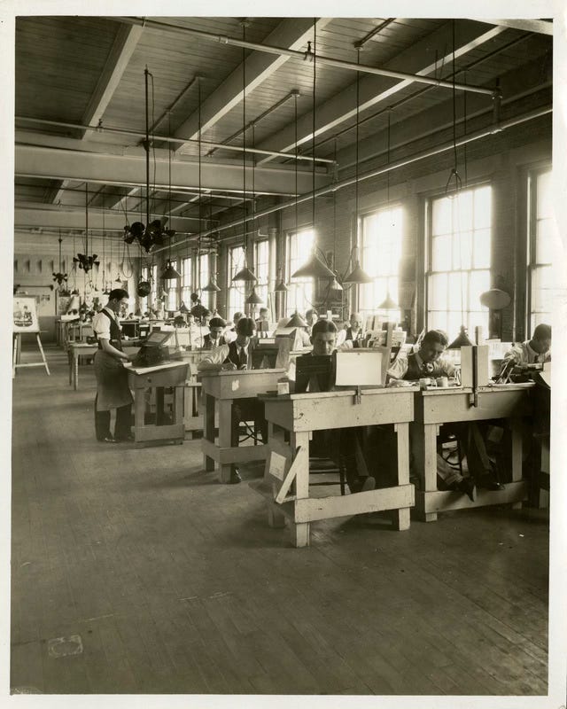
Before we dive into the production notes given to the art department to produce these postcards, I’d like to give you some context on who actually wrote these notes. Curt Teich would send out hundreds of salesmen across the country, each equipped with a camera and an order pad. The salesmen would snap photos of the business, type or write down the postcard title, and give brief art direction on the order form. That’s a lot of hats for one position!
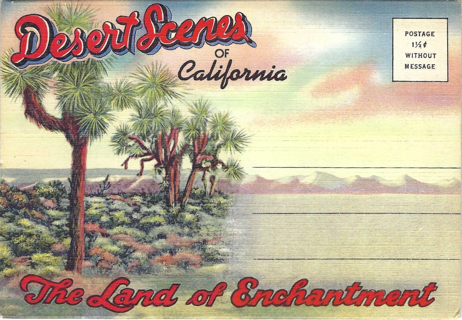
Let’s jump into it… Here’s how the process went. I found these postcard production notes and then googled the postcard’s title and date. It was like one big internet game of hide-and-seek (kind of.) Below you’ll see the found postcard along with the order form & production notes taken by the salesman. I was amazed that the direction was taken to heart by the Art Dept. and it’s reflected in the design!
Desert Scenes of California - The Land of Enchantment: 1933
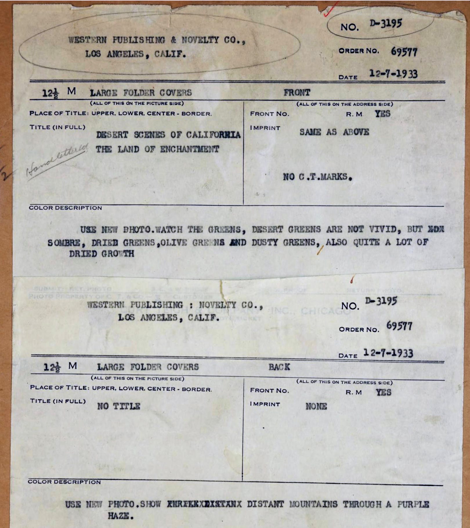
Production Notes:
“Watch the greens, desert gardens are not vivid, but not sombre, ried greens, olive greens and dusty greens, also quite a lot of dried growth”
Second Note: “Use new photo. Distant mountains through a purple haze”
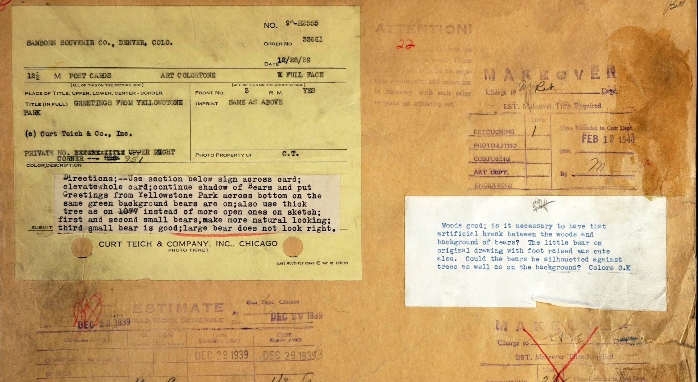
Greetings from Yellowstone Park: 1939
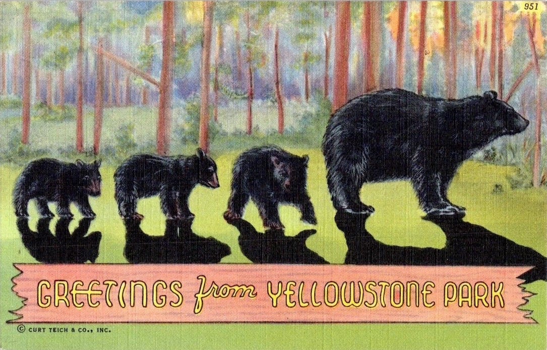
Production Notes:
“Continue shadow of bears and put Greetings from Yellowstone across bottom on the same green background bears are on. Large bear does not look right.”
Retouching Dept. Return Note:
“The little bear on original drawing with foot raised was cute also. Could the bears be sihouetted against trees as well as on the background? Colors O.K.”
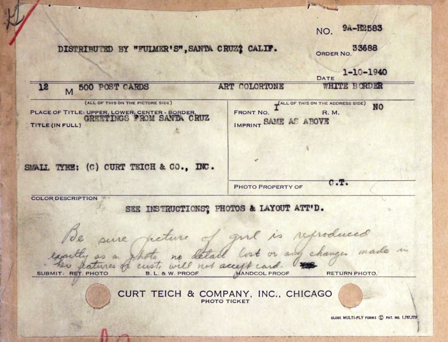
Greetings from Santa Cruz: 1940
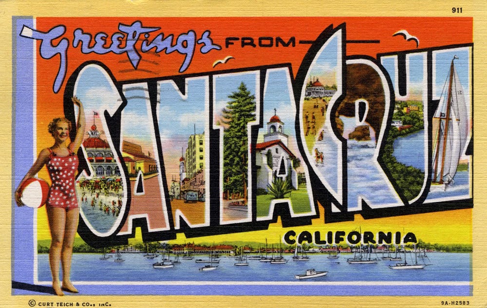
Production Notes:
“Be sure picture of girl is reproduced exactly as on photo, no detail lost or any changes change in her features or cust (customer) will not accept card.”
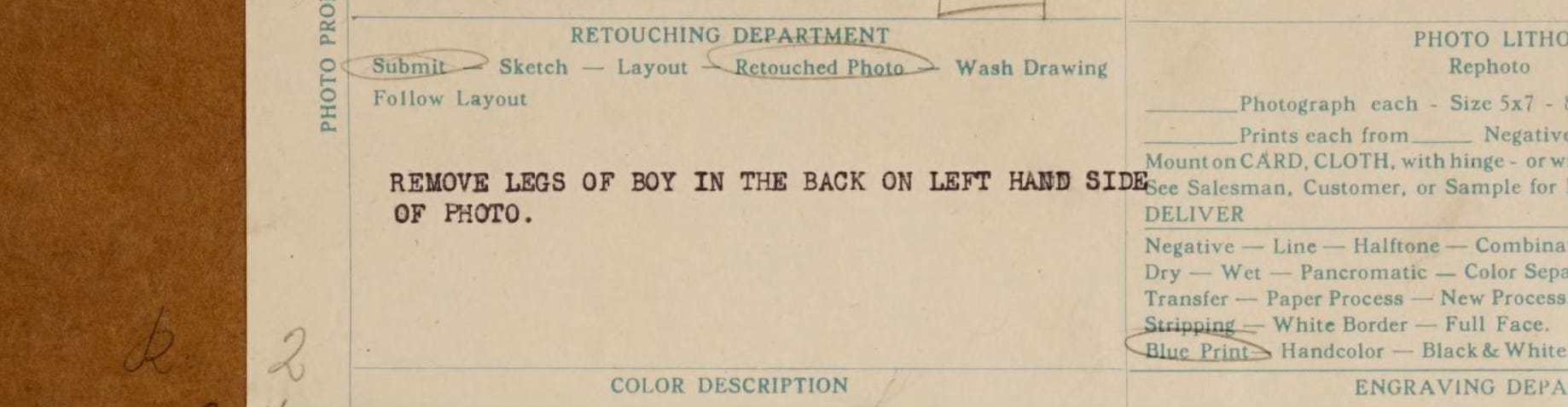
And here are some additional honorable mention notes for the Retouch Dept. I saw on other postcards:
“Remove legs of boy in the back on left hand side of photo.”
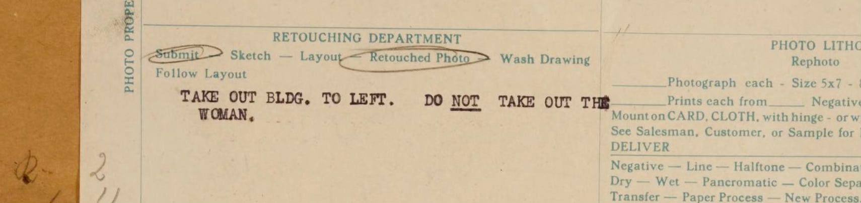
”Take out Bldg. to left. Do NOT take out the woman.”
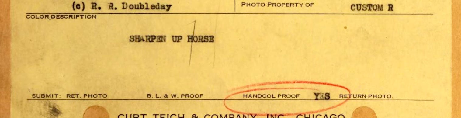
”Sharpen Up Horse”
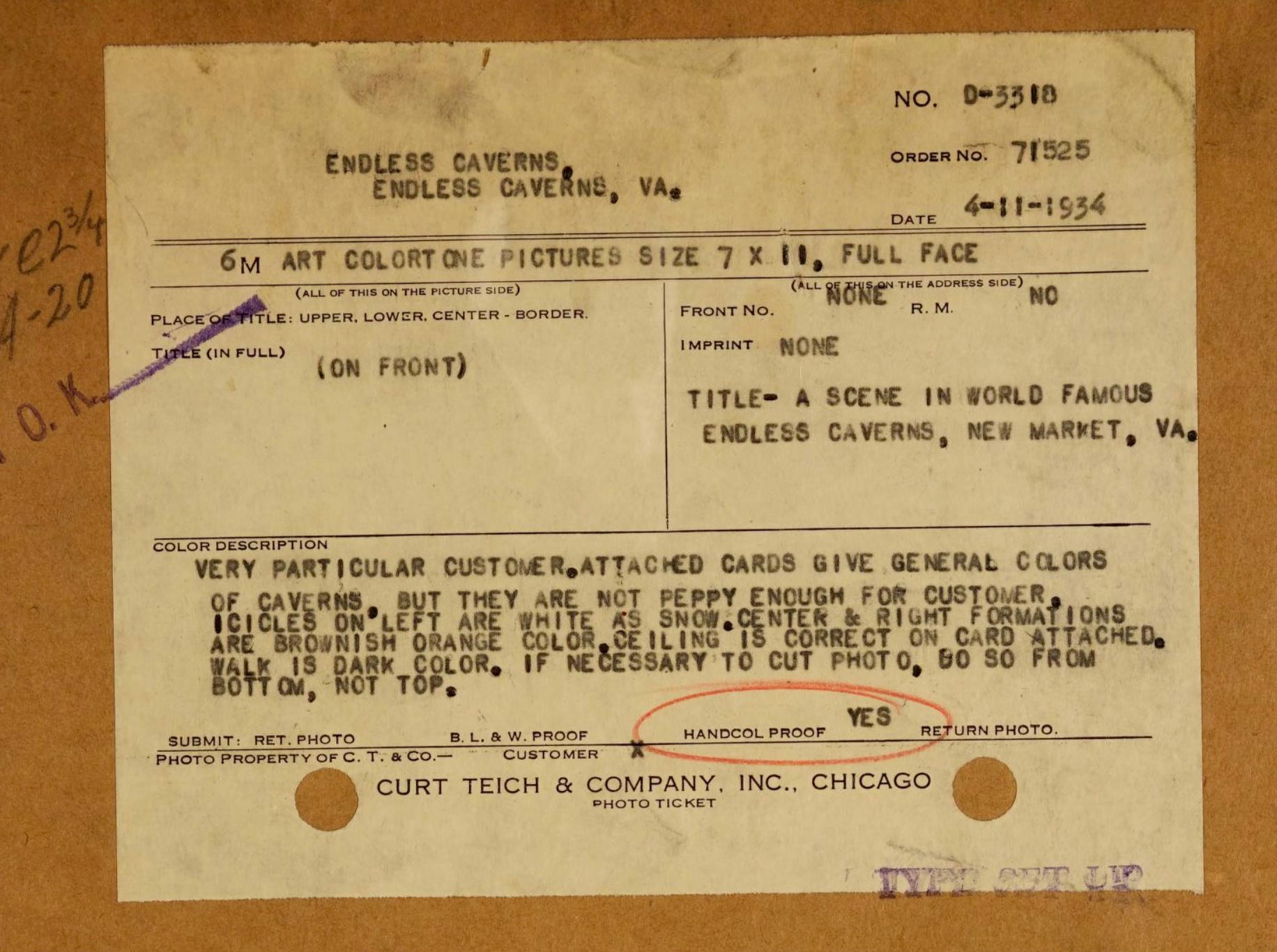
“Very particular customer. Attached cards give general colors of caverns but they are not peppy enough for customer.”
As I mentioned before, it's very rare to see this sort of design note! I’m so grateful they saved every single one of them, and it’s fascinating to see very similar design language and direction spoken in the 1920s as today. I hope you enjoy this peek behind the curtain into one of America’s most treasured design trends.
To see the full postcard collection, visit the Newberry Library.
Comments
Nothing yet. Say the first thing.
Sign in to join the conversation.