
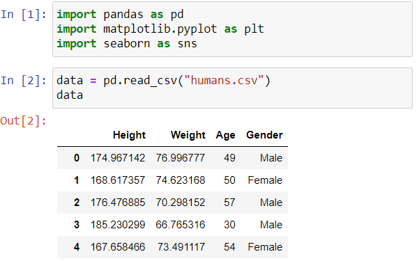
Exploratory data analysis (EDA) is a crucial step in the data analysis process. Data analysts use EDA to get a deeper understanding of the structure, patterns, and potential issues of the data. In this article, I want to share with you four techniques that every data analyst should master: univariate analysis, bivariate analysis, multivariate analysis, and feature engineering. We are going to explore these technical terms and their implications. We’ll break down the technical terms behind these techniques and see how they can be applied to a data analysis process. First, let’s load the libraries and the humans.csv dataset that we are going to use in this article.
Univariate Analysis
A DataFrame is made up of different variables, which are represented by columns. Univariate analysis involves examining the distribution and statistical properties of each variable (column) in isolation. This is important when you want to get a deep understanding of the values in a column. Univariate analysis includes summary statistics, visualizations, and outlier detection. For example, we can use a box plot for outlier detection. Outliers are data points that are significantly different from the rest of the dataset. Outliers can significantly impact the results and insights derived from the data. Identifying outliers allows you to verify their validity and determine if they are genuine data points or errors that need correction. In the example below, we use the box plot to catch outliers in the “Height” column.
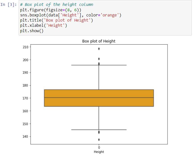
In this example, the box (the orange box) represents the middle 50% of the data in the “Height” column, and the line inside the box represents the median value. The whiskers extend from the box to the minimum and maximum values that are within 1.5 times the interquartile range (IQR). Anything outside this range is considered an outlier. In this example, we can consider 200 and 210 as upper outliers and 145 and 140 as lower outliers, as they fall outside the range of whiskers.
Bivariate Analysis
Once you are done analyzing individual columns, you also want to explore the relationship between two variables. This is known as bivariate analysis. The significance of this analysis is that you want to explore correlations, associations, or differences between pairs of variables. For example, you may want to know how the height of the person impacts their weight. This means that you will have to analyze the “Height” and “Weight” columns for correlations. We can use a scatter plot to analyze if there is a correlation between the two variables:
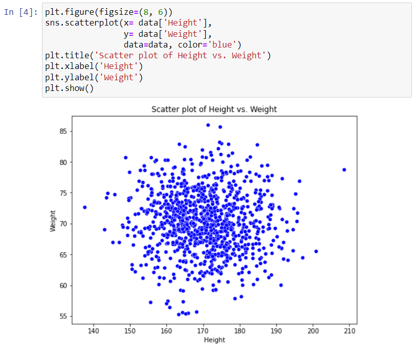
You can see that most of the data points are concentrated in the middle of the plot, indicating that a large number of individuals in the dataset have heights around 170 cm and weights around 70 kg. But we do not see any strong signs of correlation between the two variables. We can safely conclude that the scatter plot shows a weak or nonexistent correlation between height and weight in the dataset.
The Data Analyst Bootcamp Bundle (SQL + Python) 100 Hands-On Data Analysis Challenges
These are the best hands-on materials that teach how to use the important libraries in data analysis: pandas, Matplotlib, seaborn, NumPy, etc. You will also learn to write SQL queries by answering questions that data analysts face in the world, using real datasets. Get the bundle if you want real, practical learning.
Multivariate Analysis
Apart from analyzing two variables, you can also analyze relationships between more than two variables. This type of analysis is known as multivariate analysis. A good starting point for such an analysis is using a pairplot. It tackles the challenge of visualizing relationships between multiple variables simultaneously. A pairplot provides a “bivariate analysis” by examining two variables at a time, but the overall pairplot itself is a tool for multivariate analysis because it allows you to see the relationships between multiple variables in a single visualization. Here is a pairplot of the three variables in the dataset.

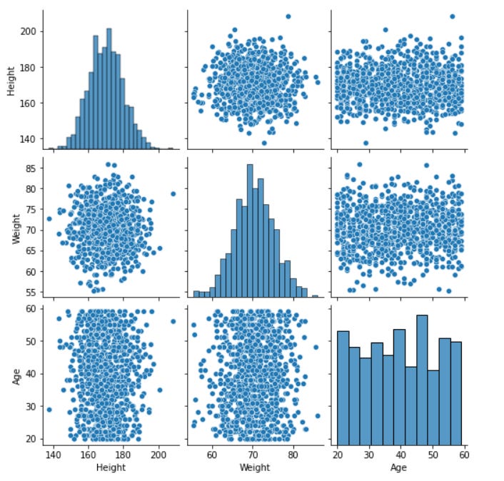
You can see that a pairplot provides both a comprehensive view of the relationships between multiple variables (bivariate analysis) and a univariate view of each variable. The diagonal elements of the plot (histograms) show the distribution of the data for each variable independently. You can use the graphs to assess the shape of the distribution (e.g., normal, skewed, or uniform). The scatter plots in the pairplot help you visualize the relationship between two variables, revealing patterns, correlations, and potential outliers. This pairplot does not show strong relationships between height, weight, and age in this dataset. This is evident from the scatter plots, which do not show any discernible patterns or trends.
Feature Engineering
Feature engineering can also be used during EDA to gain deeper insights into the data. It can be used to transform data into a more informative and usable format for various purposes. Feature engineering involves adding new variables to the dataset or transforming existing variables. Let’s perform feature engineering on our dataset by adding the body mass index (BMI) column.
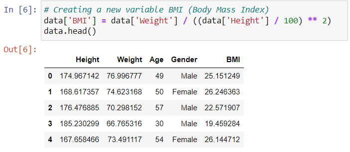
The column “BMI” has been added to the DataFrame. So, by creating new features or transforming existing ones, you might uncover features that are more relevant to your analysis and remove redundant or irrelevant ones.
Wrap-Up
These are just a few examples of the various types of EDA techniques used in data analysis. Depending on the nature of the dataset and the specific goals of the analysis, you may use different combinations of these techniques to gain a comprehensive understanding of the data. The book “50 Days of Data Analysis with Python: The Ultimate Challenge Book for Beginners” provides a comprehensive set of challenges to help you learn various types of EDA. Thanks for reading.
The Python Mastery Bundle
Master Python from the ground up with a hands-on learning bundle designed for beginners who want more than just theory. This bundle combines three practical Python books that help you build strong fundamentals, write cleaner code, and develop real problem-solving skills through consistent practice.

Python and Data Analysis Insights is a reader-supported publication. To receive new posts and support my work, consider becoming a free or paid subscriber.
Comments
Nothing yet. Say the first thing.
Sign in to join the conversation.