
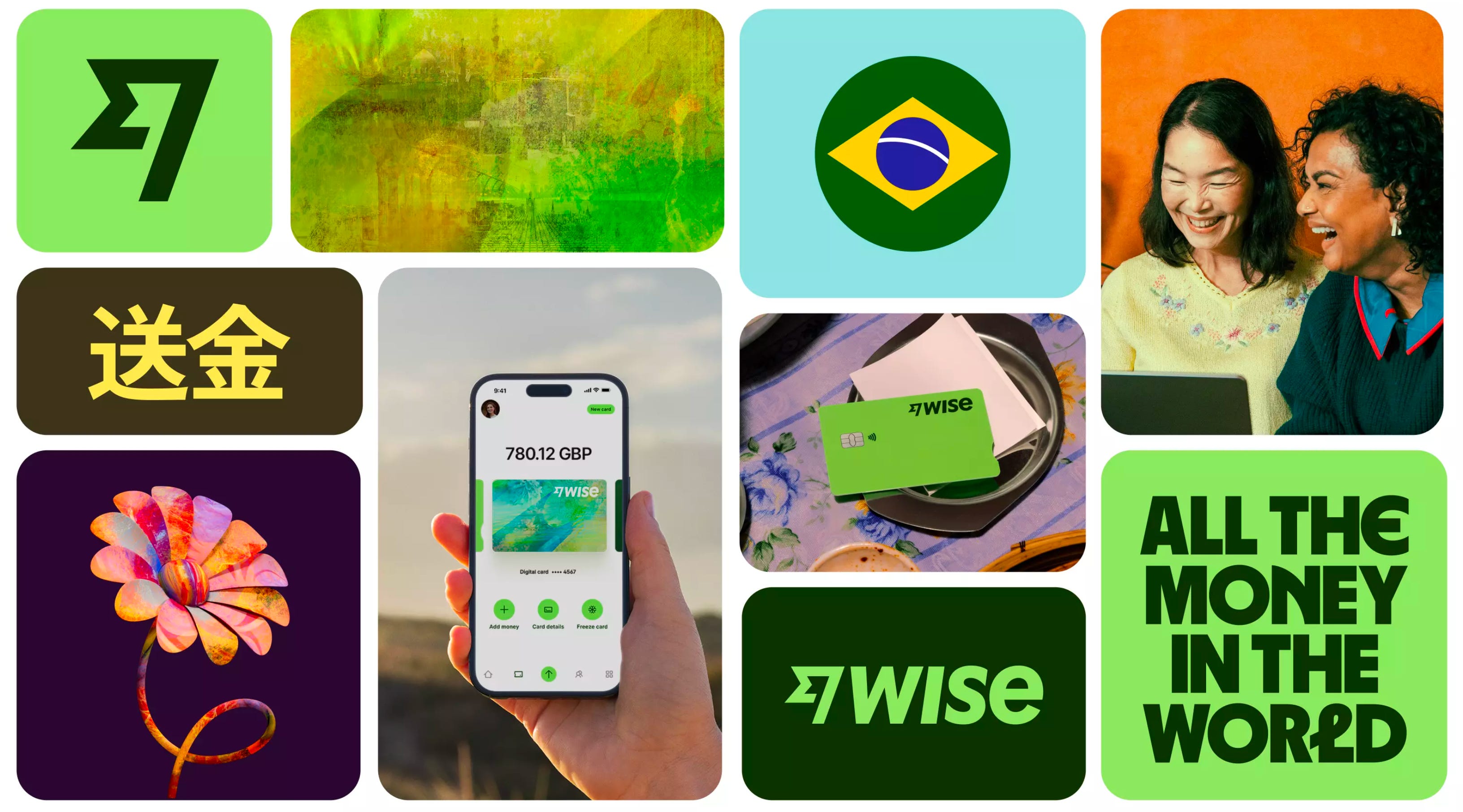
Wise has announced a refreshed version of its brand, and overall, I like it. However, what I appreciate most are not just the visual aspects, but also the details that contribute to the overall visual language.
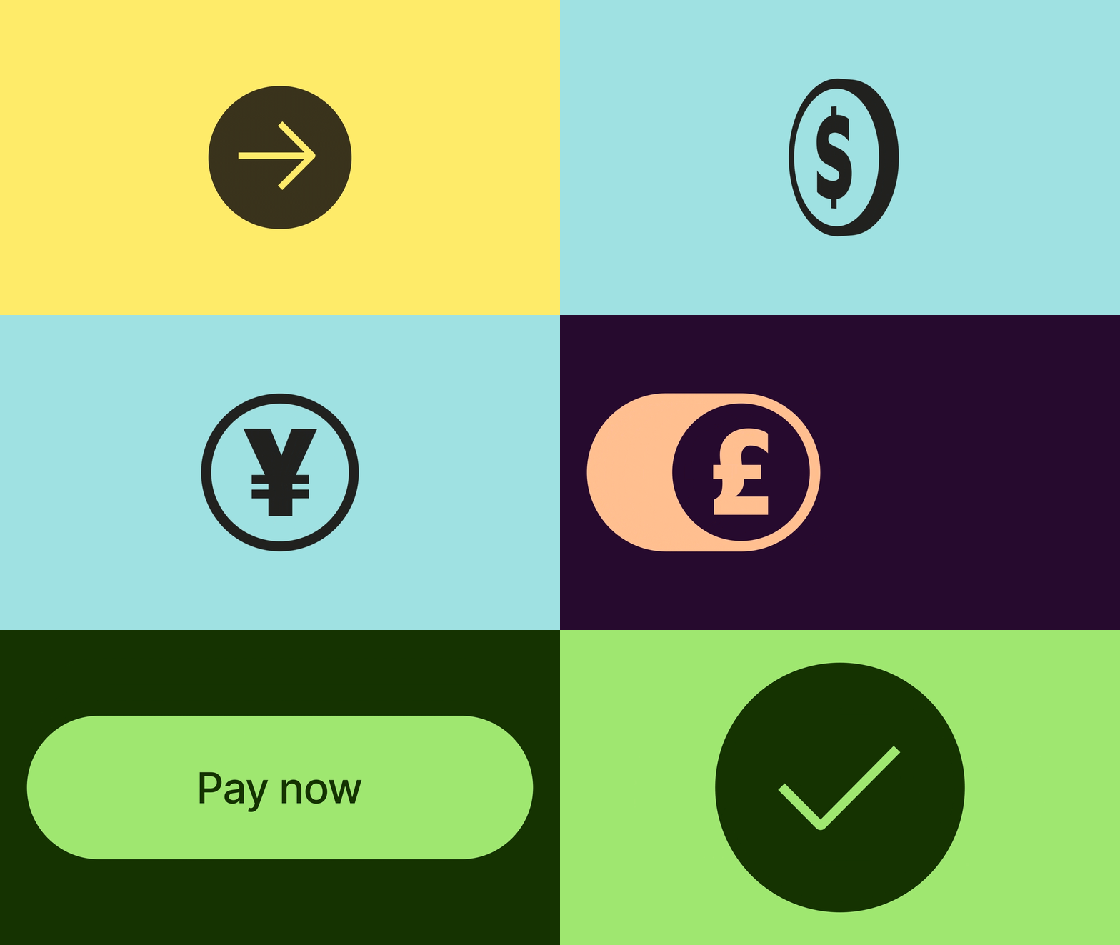
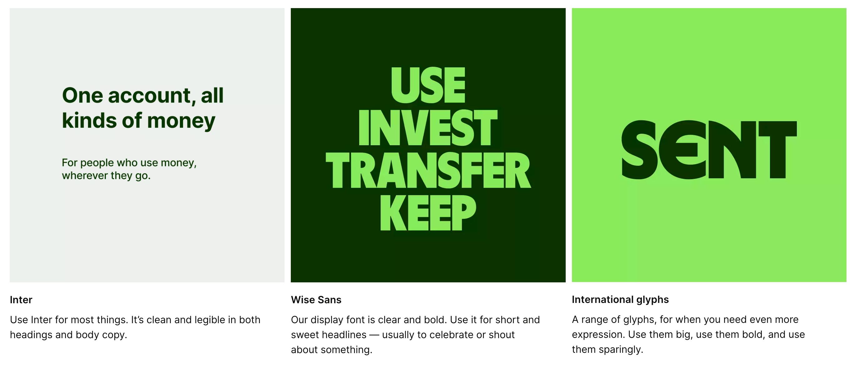
Isn't it interesting how brands name their custom typefaces, design systems, frameworks, and other elements to align with their company vision, product types, and solutions? I appreciate the thought and effort that goes into creating a cohesive brand identity.
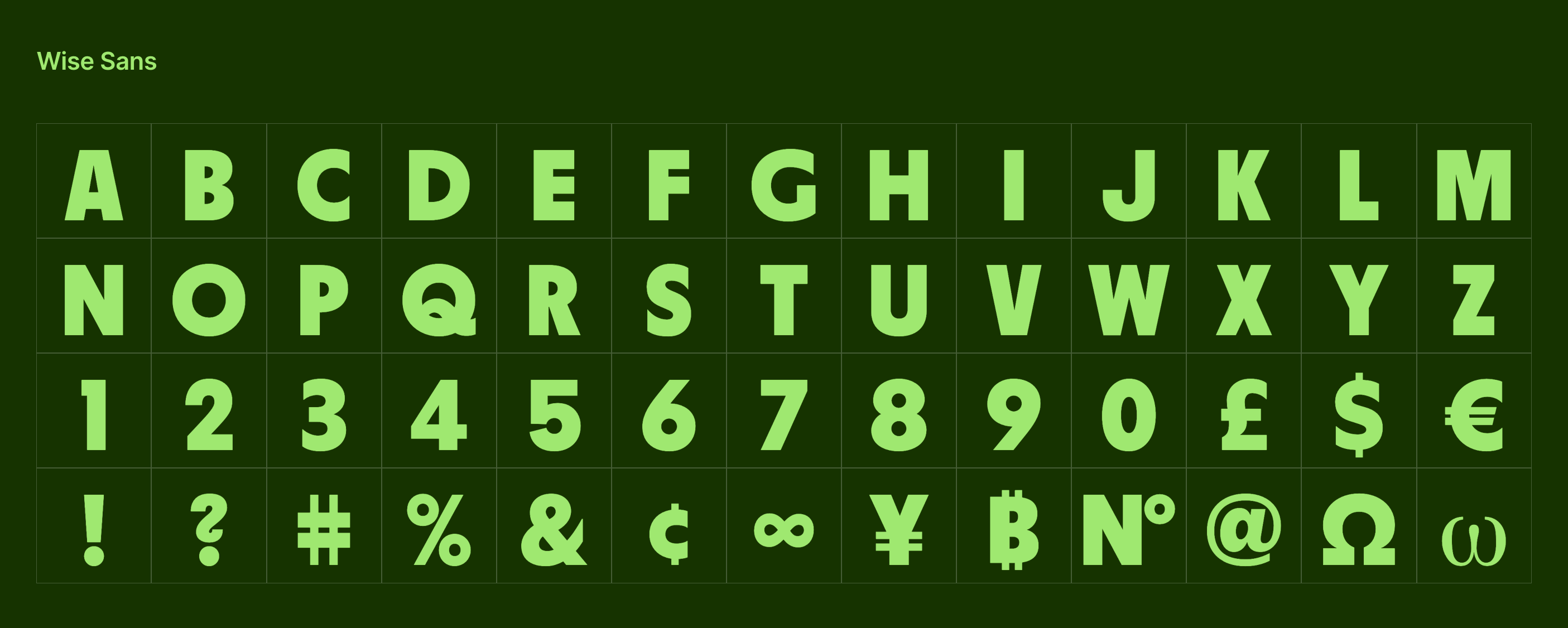
Wise Sans also features currency symbols that are used appropriately based on the country and type of currency. This helps to convey a sense of global reach and understanding of different currencies used around the world. The currency version of Wise Sans is used on marketing assets, blog posts, and other non-product related materials.
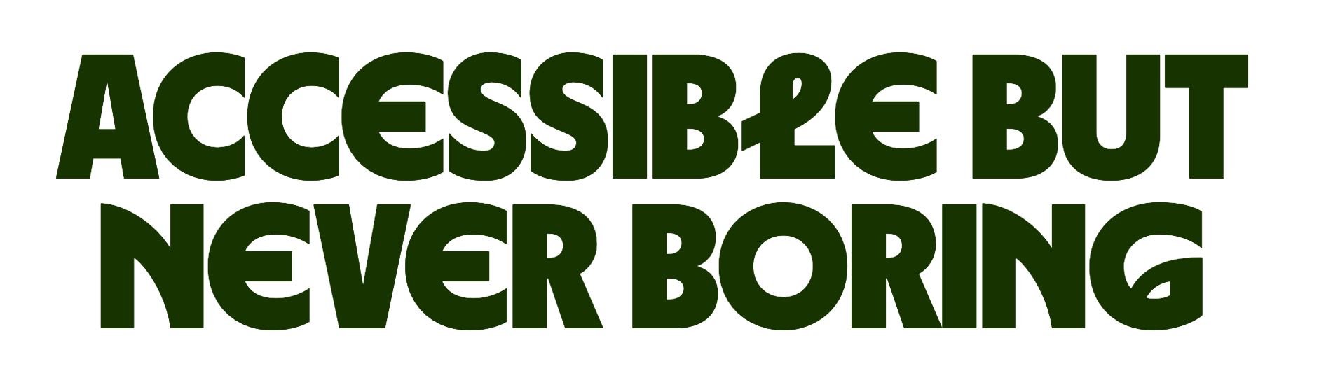
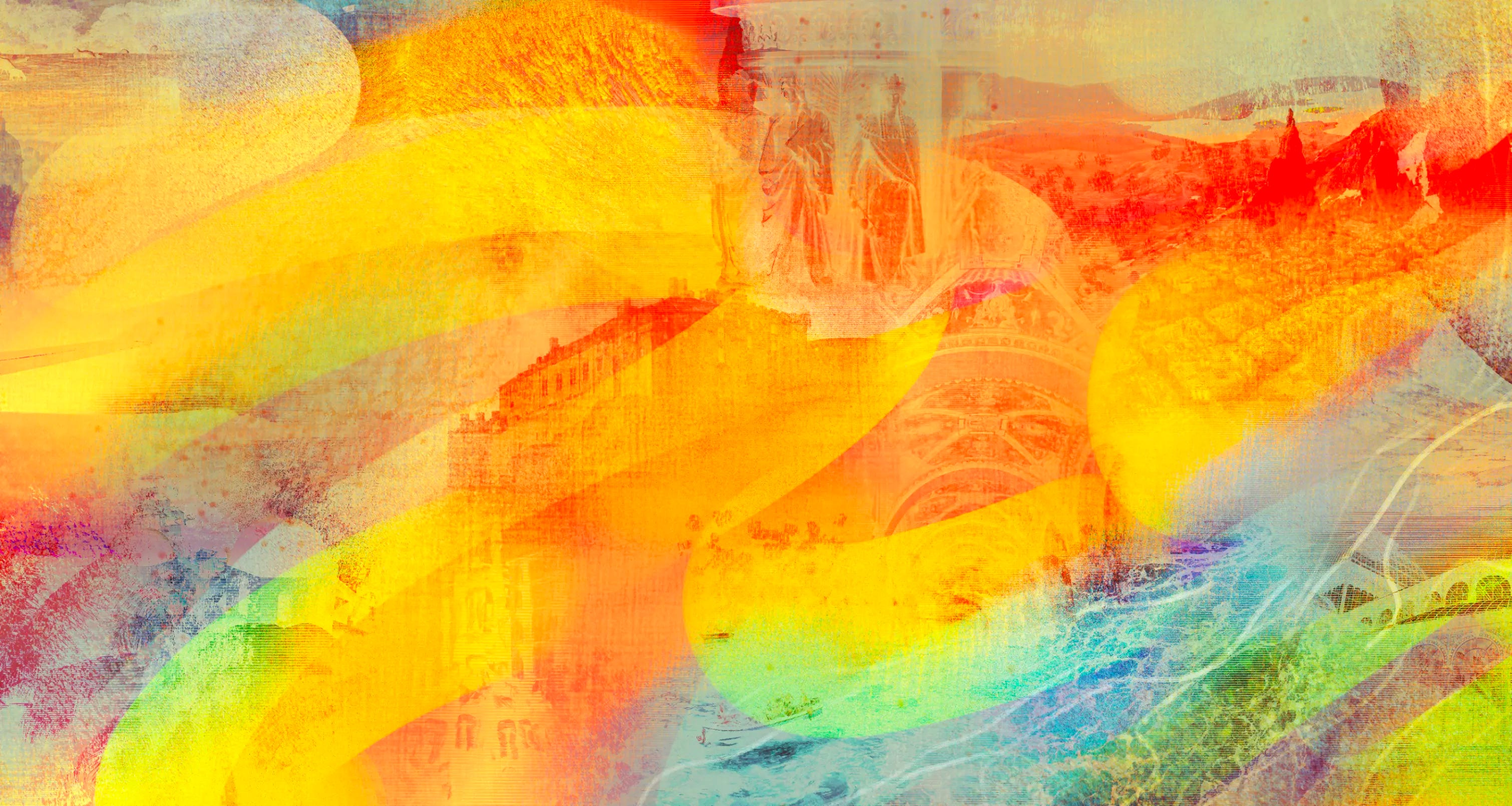
The brand refresh effectively conveys Wise's vision of "worldwide borderless money transfer" across all elements, resulting in a cohesive and strong brand identity.
Wise utilized a combination of gradients and tapestries in their design, incorporating textures from around the world.
The angle of the Earth's axis and the lean of the Fast Flag are the same — 23.5º. Wise, use this angle to represent money being sent around the world. It is another great detail to represent how branding and product vision would be a good fit for each other.
Congrats Ragged Edge and Wise team to bring this excellent work to live!
No posts
Comments
Nothing yet. Say the first thing.
Sign in to join the conversation.