
I’ve been paying attention to moments when users pause.
Last decade taught us: remove friction.
Make it faster. one-click everything.
Celebrate seamless experiences.
Automatic sign-ins.
Instant checkouts.
Any obstacle that slows users down could mean failure of design.
But what if we’re wrong?
The friction obsession
UX treated friction like the enemy.
Something to eliminate.
Optimize away. Reduce to zero.
And sometimes that’s right.
Nobody wants confusing forms.
Broken flows or unnecessary steps.
But we overcorrected.
Now everything’s instant. Effortless. No pause between action and consequence.
And that creates new problems.
When removing friction backfires
One-click purchase:
Accidentally bought $300 item.
No confirmation.
No undo window.
Auto-save everywhere:
Can’t remember last manual save.
No sense of progress or completion.
Instant delete:
File gone.
No trash. No recovery. Panic.
Passwordless login:
Got hacked.
Too easy for attacker.
Too easy for me.
Frictionless isn’t always better, sometimes it’s just reckless.
Three places friction helps
1. Preventing catastrophic mistakes
GitHub makes you type the repository name to delete it.
Not “Are you sure?” dialog. Actual typing. The name.
Takes 10 seconds. Prevents permanent mistakes
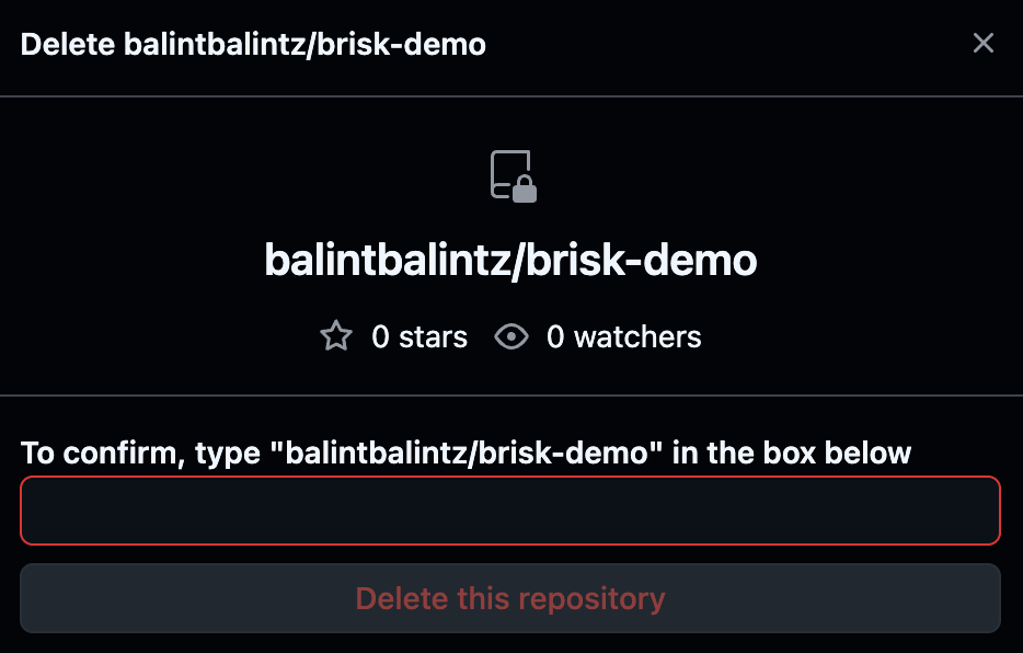
Why it works:
Forces you out of autopilot. Automatic clicking stops.
You have to think. Read. Process. Decide deliberately.
That pause is the point.
2. Creating perceived value
Clubhouse had a waitlist. Made people want in more.
Not because product was better. Because access felt earned.
Duolingo streaks require daily effort. Feels valuable because you worked for it.
Stop one day? Hurts. Because you invested.
Why it works:
The IKEA effect: We value things we partially created.
Effort becomes part of value. Too easy = disposable. Earned = meaningful.
3. Building trust through ceremony
Banking app shows “Processing payment...” for 3 seconds. Could be instant. Isn’t.
Feels more secure. Like something important is happening. Being verified.
Two-factor authentication adds steps. Makes login feel safer.
CVV required even for saved cards. Extra friction signals protection.
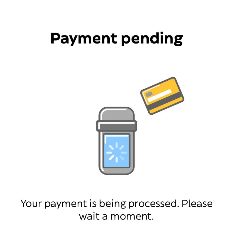
Why it works:
Mental models expect important actions to have ceremony.
Too instant feels careless. Slight delay feels deliberate. Secure.
Matches expectations for high-stakes actions.
Psychology insight
🧠 Dual-process theory and deliberate thinking
The brain operates in two modes: System 1 (fast, automatic, intuitive) and System 2 (slow, deliberate, analytical).
Frictionless design keeps users in System 1. Fast decisions. Minimal thought. Efficient but error-prone.
Strategic friction forces System 2 activation. Slows down. Engages conscious thought. Better for high-stakes decisions.
This is why typing a name to confirm deletion works better than clicking “Yes.” Active engagement prevents autopilot mistakes.
Where teams get this wrong
Add friction everywhere “to be safe.”
Now every action requires confirmation. Dialog fatigue sets in.
Users stop reading. Click through automatically. The friction becomes invisible.
Or worse: friction without purpose.
Extra steps that don’t prevent anything. Don’t add value. Don’t build trust.
Just slow things down for no reason.
That’s not strategic friction. That’s bad design.
The rule
Friction should have a job:
Prevent costly mistakes
Signal importance
Create investment
Build trust
No job? Remove it.
Clear job? Keep it.
Real example: Stripe
Could make refunds one-click. They don’t.
Requires typing refund amount. Even for full refund.
Why?
Prevents accidental refunds.
Makes you confirm the number.
Think about it.
Small friction. Big protection.
The audit
Map your high-stakes actions:
Deletes. Purchases. Account changes. Data exports.
Ask for each:
Is there enough friction to make users pause?
If someone can delete everything in one accidental click, that’s a problem.
Is the friction doing something useful?
If it’s just “Are you sure?” that gets auto-clicked, it’s not working.
Does the friction match the stakes?
Buying $5 item? Don’t need three confirmations.
Deleting account? Need more than one click.
When to add friction
Irreversible actions. Deleting. Canceling. Publishing.
High-value transactions. Money transfers. Purchases over threshold.
Privacy/security moments. Login. Sharing data. Account access.
Moments you want investment. Onboarding. Setup. First success.
Everywhere else? Remove it.
When to remove friction
Reversible actions. If undo exists, confirmation isn’t needed.
Low-stakes decisions. Color changes. Layout preferences. UI settings.
Frequent actions. If users do it daily, don’t slow them down.
Expected speed. Search results. Page loads. Saving work.
Frictionless isn’t the goal. Appropriate friction is the goal.
Sometimes that means instant. Sometimes that means pause.
The question isn’t “how fast?” It’s “how safe, how valuable, how trustworthy?”
Speed is one variable. Not the only one.
If your “Are you sure?” dialog gets clicked through without reading, it’s not preventing errors. It’s just annoying. Either make the friction meaningful or remove it.
Brisk - I’m building a client platform for freelancers. If you’re one, check it out.
The Psychology Behind Design - Learn how to design products that engage using psychology tactics explained from 28+ key principles, grab the free version.

See you next week 🙌
— Balint
No posts
Comments
Nothing yet. Say the first thing.
Sign in to join the conversation.