
Let me ask you something, think about the last hotel you stayed at.
Do you remember check-in? Probably vaguely.
Do you remember the room? Maybe. Do you remember checkout?
I bet you do. Especially if it was bad.
If they charged you for something unexpected, or the process was confusing, or you waited fifteen minutes to hand back a key card – that’s the memory that stuck. Even if the room was beautiful and the breakfast was incredible, the ending colored everything.
This isn’t just a hotel thing.
It’s a human thing. And it’s happening in your product right now.
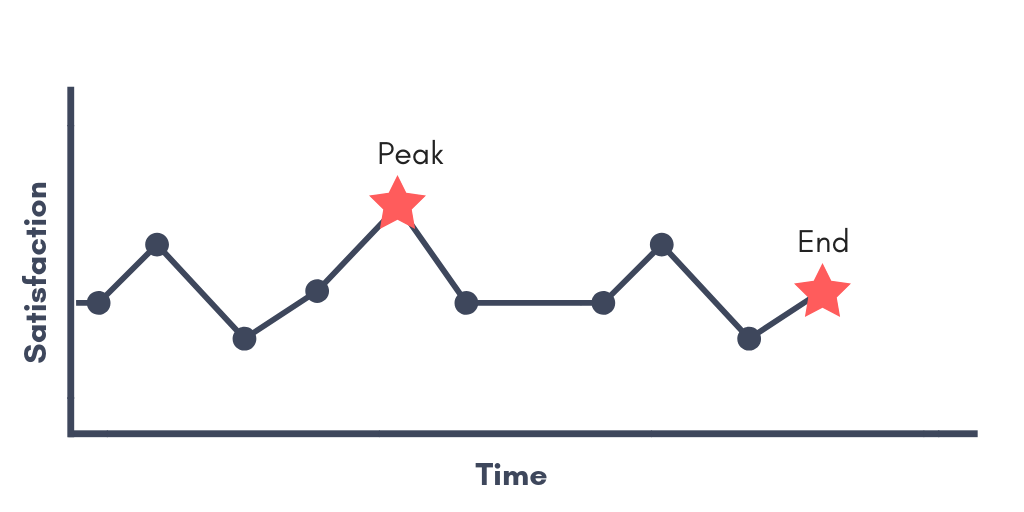
In the 1990s, psychologist Daniel Kahneman ran an experiment that changed how we think about experience.
Participants put their hands in painfully cold water in two conditions.
The first: 60 seconds of cold water.
The second: 60 seconds of the same cold water, followed by 30 seconds of slightly less cold water.
The second condition was objectively worse. More total pain. More time suffering. But when asked which they’d repeat, most people chose the longer version.
Why? Because it ended better. The slight improvement at the end rewrote their memory of the entire experience. Kahneman called this the peak-end rule: people judge an experience based on how they felt at the most intense moment and at the very end. Everything in between? Mostly forgotten.
Now think about how most digital products end their key flows.
A user completes a purchase. What do they see?
A generic confirmation page. “Order confirmed. You’ll receive an email shortly.”
Maybe a green checkmark. That’s it. Move along.
A user finishes a complex onboarding. What do they see? They just... land on the dashboard. No acknowledgment. No celebration. No “you just did something worth doing.”
A user cancels their subscription. What do they see? Either a guilt trip (”Are you SURE? You’ll lose ALL your data!”) or nothing at all.
These are ending moments. And most designers spend almost zero time on them because the “important” work is done – the user already completed the action. But psychologically, these moments are disproportionately powerful. They’re the last thing the brain encodes, which means they become the dominant memory of the entire experience.
I started paying attention to this after a small experiment on a project last year.
We had a multi-step flow where users set up their account preferences. It wasn’t exciting work – mostly choosing notification settings, linking accounts, setting display options. Functional stuff. The completion rate was fine but user satisfaction scores for the setup process were lukewarm.
We didn’t change a single step in the flow. What we changed was the last screen.
The old version: “Setup complete” with a button to go to the dashboard.
The new version: A personalized summary of what they’d just configured, phrased in encouraging language. “You’re all set. You’ll get weekly performance summaries every Monday, your accounts are linked and syncing, and your dashboard is customized to show what matters to you.” Below that, a small message: “Most people take about 10 minutes to set this up. You did it in 7.”
Same flow. Same steps. The satisfaction scores for the setup process went up noticeably. Not because we made the process better, but because we made the ending feel better. And the ending is what they remembered when we asked them about it.
There’s a flip side to this that’s equally important, bad endings are disproportionately destructive.
If a user’s last interaction with your product is a confusing error message, an unexpected charge, a clunky cancellation process, or a dead-end screen with no clear next step – that becomes their memory of you. Not the hundred smooth interactions before it. The one bad ending.
This is why cancellation flows deserve as much design attention as onboarding flows. I know that sounds counterintuitive. Why invest in the experience of someone leaving? Because people who cancel with a good experience come back. People who cancel feeling frustrated tell their friends.
The best cancellation experiences I’ve seen acknowledge the decision respectfully, offer a clear summary of what happens next (”your account stays active until March 15, and your data will be saved for 90 days”), and leave the door open without guilt (”you can reactivate anytime”). It’s the product equivalent of a breakup where both people walk away thinking “they were actually really decent about it.”
Here’s the practical thing I’d encourage you to do.
Map every major flow in your product and look specifically at the last screen.
The end of onboarding.
The end of a purchase.
The end of a support interaction.
The end of a cancellation.
The end of a report or export.
For each one, ask: does this ending make the user feel good about what they just did?
If the answer is “it’s fine” – that’s not enough.
“Fine” is forgettable and forgettable endings mean forgettable products.
A few small things that make endings land:
Summarize what just happened in human language.
Not “Transaction complete” but “You just sent $500 to Sarah. She’ll see it by tomorrow morning.”
Acknowledge the effort.
If the user just went through a complex flow, recognize it. “That was a lot of steps – thanks for sticking with it.”
Show what comes next.
Endings feel better when they’re actually beginnings.
“Your account is ready. Here’s one thing you might want to try first.”
Add a small moment of delight.
A nice animation.
A warm illustration.
A playful line of copy. It doesn’t need to be much.
Just enough to make the brain go “that was nice” right before it encodes the memory.
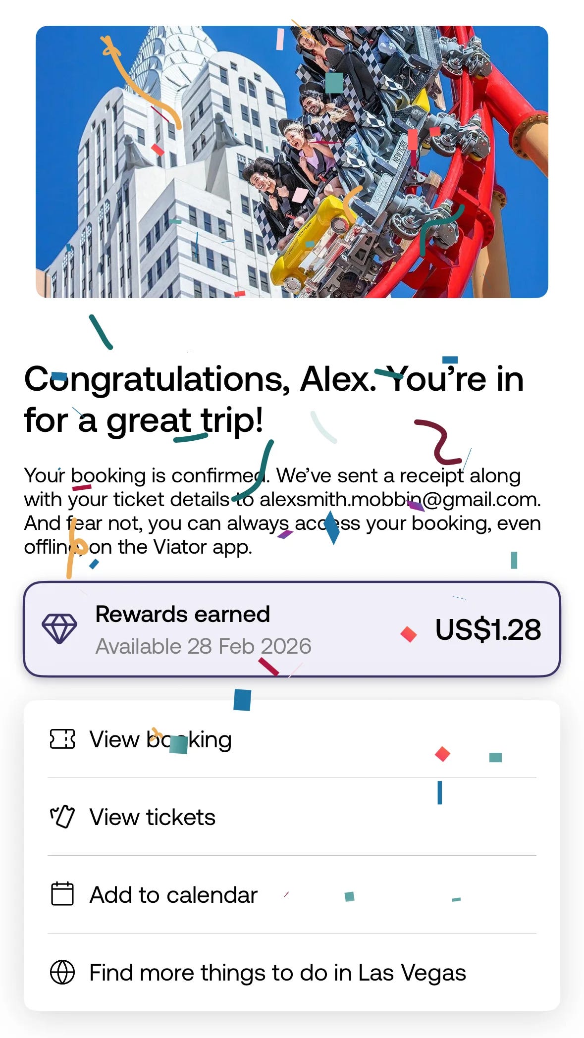
You probably spent weeks designing the middle of your product’s key flows. The forms, the steps, the layouts. That work matters. But the screen your user sees last is the one that writes the story they tell themselves about the whole experience.
Make it a good ending. Because in their memory, it becomes the whole thing.
Thanks for reading :) If something in this issue resonated, please reply and tell me.
Even one line. These replies are my favorite part of writing this newsletter.
See you next Thursday 🙌
— Balint
What else am I working on?
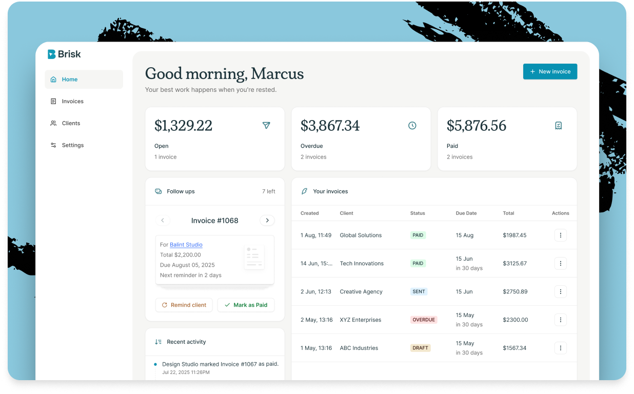
1. Brisk - I’m building a client platform for freelancers. If you’re one, check it out.
2. The Psychology Behind Design - Learn how to design products that engage using psychology tactics explained from 28+ key principles, grab the free version.

No posts
Comments
Nothing yet. Say the first thing.
Sign in to join the conversation.