
Hello Dear Readers, years ago I took a watercolor class to discover why I was having so much trouble mixing watercolor paints. On the first day I learned it was because I was using cheap paints. Paints are typically made up of pigment and a binder. Cheaper paints have more binder while expensive paints have more pigment. Since then I haven’t questioned the idea that you need good paint to make a good painting. At least until this past week.
Become a free or paid subscriber to “Audry Without An E” to have the Thursday letter sent directly to your inbox.
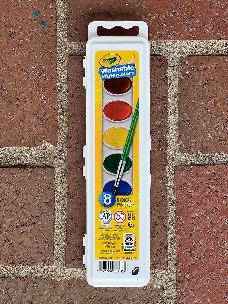
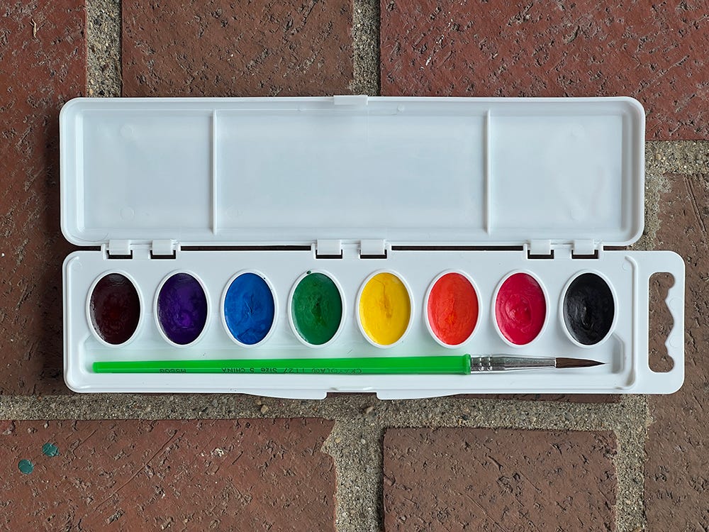
While grocery shopping I saw all the back to school gear and spotted a cheap watercolor set. I passed it by, but got to thinking, could I make a pretty painting with a cheap set? Is it even possible? I went back and spent a little under $3 to find out.
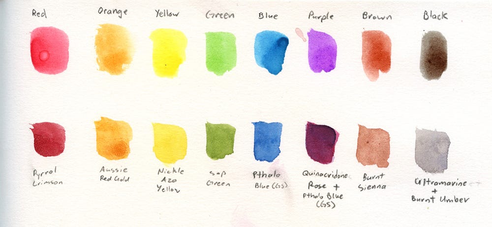
In the interest of trying to only compare the paint, I added some controls. I painted everything in a Strathmore 500 series Mixed Media sketchbook and I committed to only using the brush that came with the cheap set. I started out by making a color chart. The top is the Crayola set, the bottom is the most equivalent Daniel Smith colors I own. I don’t actually have a convenience purple or black, so I painted in the color mix I use instead
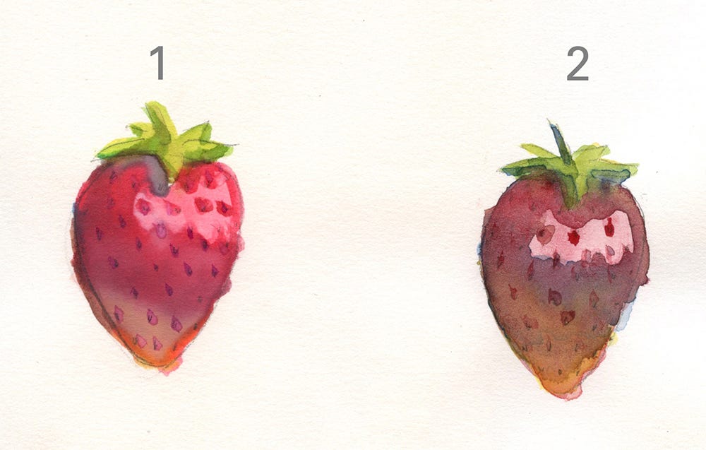
Then the real test. I drew two strawberries and tried to paint them as similarly as I could. Can you tell which strawberry was painted with which brand?
If you guessed #1 is Crayola and #2 is Daniel Smith, you would’ve guessed better than me. When I finished I found myself liking the Crayola one better. However, I knew I was at a little bit of a disadvantage because I wasn’t painting in a palette I would’ve normally chosen for myself. I ended up painting a third strawberry using Daniel Smith in colors I would have chosen for myself. (Pyrrol Scarlet, Pyrrol Crimson, Hansa Yellow Deep, Pthalo Green (BS), Ultramarine, and Burnt Umber.)
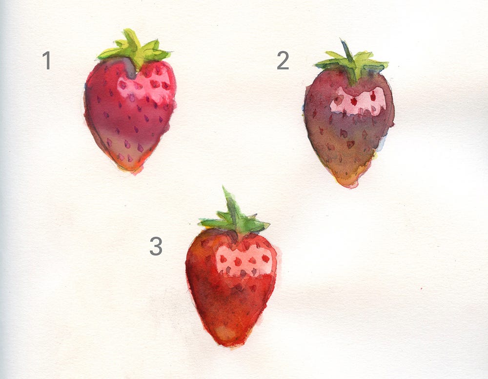
In the end I surprised myself by still liking the Crayola strawberry the best! I enjoyed painting with Crayola and having a restrictive palette was a fun challenge. In fact the only thing I didn’t like about the set was the paint brush. The cheap brush keep losing hairs and didn’t have the good point I am accustomed to with my quill style brush.
So the big question we are left with is, are expensive paints worth the money? I think so. You get more color options and have a higher degree of control with mixing. If I were to paint a larger composition with something specific in mind, I’m sure I’d get frustrated with the limitations of this palette. What I didn’t expect was that you can paint something attractive with cheap paints too!
A Few Obsessions From This Week
I discovered this week and I am swooning. She is the kind of person I wish lived near me so I could nerd out about whatever latest craft obsession has taken hold. One of her latest interests is making cockaded ribbons. Guys, I want to make a cockaded ribbon now!
Did you know there is an antique pattern library? While looking into cockaded ribbon work I discovered this gem. There are many scanned antique craft magazines on this site and you can download them! They only ask that you keep it for personal use.
Ready to read more comics? Check out audrywithoutane.com
Interested in what other projects Audry is involved with? Go to audrynicklin.com
Enjoy knitting? Visit Audry’s knitting pattern site at bear-ears.com
Become a free or paid subscriber to “Audry Without An E” to have the Thursday letter sent directly to your inbox.
Comments
Nothing yet. Say the first thing.
Sign in to join the conversation.