
I need to give this project a name. I keep referring to it as “generative audio visual art project” but I’m at the point where enough progress has been made to consider some names.
I’ve got into the habit of noting words that keep reoccurring thematically (or technically) when I’m working on a project so that I can use them as a starting point. These lists can also help you see connections and larger thematic ideas across the work that can be explored.
I chose the name LOOM.
A loom is a machine of becoming. It doesn’t present a finished work, it weaves over time.
That mirrors the system on many levels - generative, temporal, pattern based. The music isn’t a track list so much as something being made while it plays. Stitching sound, visuals and time, slow emergence, interlaced threads representing audio layers… memory, recursion, return-with-variation… It is representative on many levels.
I also love how the central “OO” typographically hints at infinity, much like the looping style of the sound and the cycles of time that shape them.
constraints + randomness → emergent form
I had the idea of creating a set of symbols (icons), one for each time cycle. As a timeframe ends and the sound and visuals transition to the next phase (e.g. dawn > day) the symbol would also change on screen. I like the idea of it looking cryptic or encoded with information, connected as a family but clearly depicting a unique state.
I want it to be circular to fit the idea of time cycles and loops. It would also sit next to the play button in the header which is also a circular icon, so maintaining that style would keep it consistent/balanced.
My initial idea took a circle and divided it into 4 segments, each segment represented a single time cycle (dawn, day, dusk, night) starting at the bottom left and moving around clockwise as the cycle progressed. When inactive, the circles would rotate to form a flat edge. When a cycle became active, it would rotate into the correct circular position.
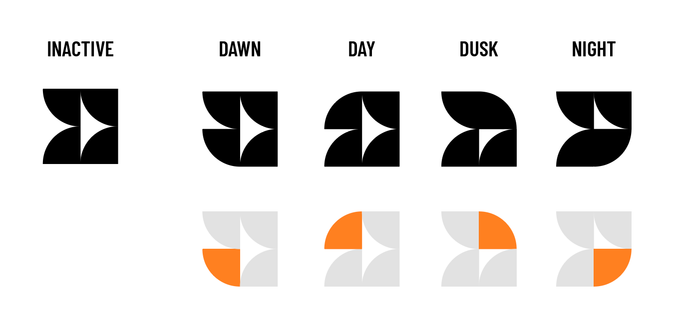
I like the simplicity of this design but it didn’t quite work on the page, I knew I had to dig a little deeper and create something that felt more like a code to decipher, more alien in nature.
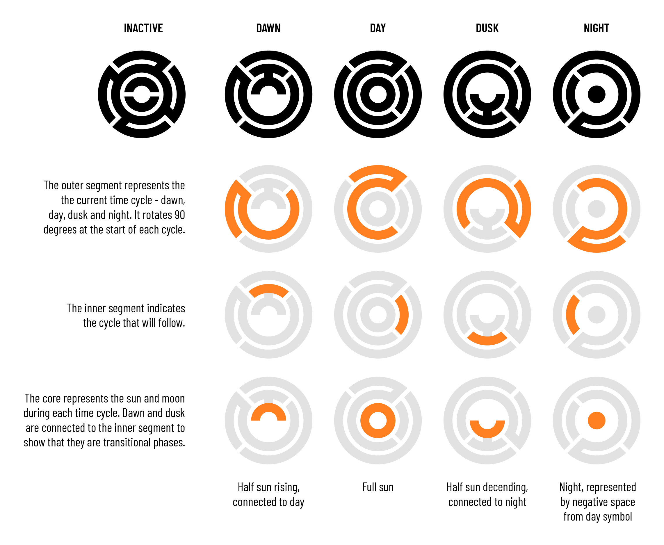
These revised “glyphs” are made of 3 concentric circles, each representing a part of the time cycle:
Outer layer → active cycle
The cycle indicator rotates to represent one of the four cycles.Inner layer → next cycle
High lights the cycle that will follow the active cycle e.g. dawn → dayCore → sun/moon position
The core represents the sun and moon during each cycle. Dawn and dusk are connected to the inner layer to show that they are transitional phases.
The “inactive” version is the state that exists before the user presses the play button. This state shows all the potentials that can exist before the seed is created.
I’ve been fascinated by crop circles since I was a kid so some of that influence might be showing in these designs.
I want the UI to remain fairly minimal, but also challenge the user. If you want to understand it, you need to explore.
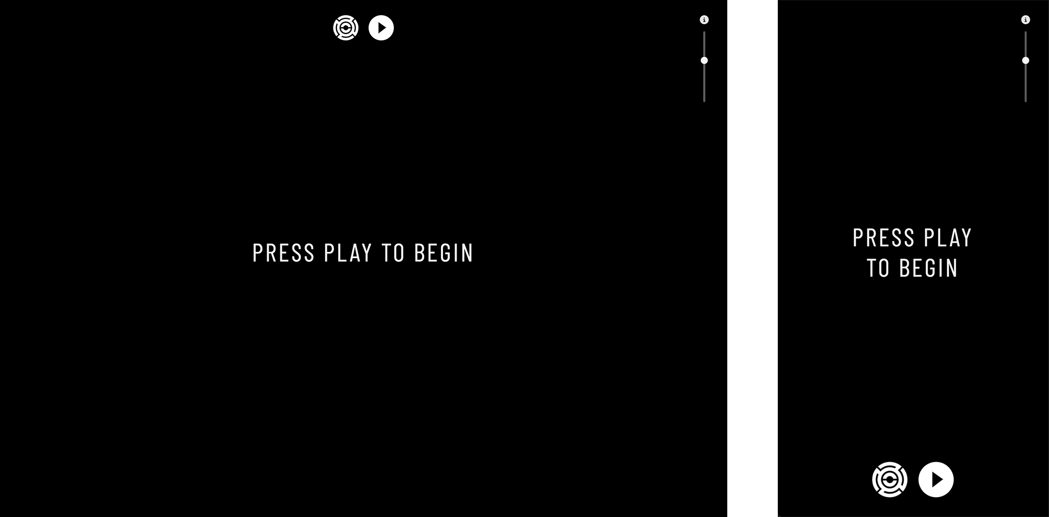
I also want it to work across devices in a natural way - on mobile the cycle icon and play button switch from top (desktop) to bottom aligned. The buttons also get a boost in size for ease of use.
The screen prompts the user to press the play button which will create the seed that sets the whole system in motion. The first sound and images will begin to fade in, and form emerges. Once initialised, the prompt to ‘press play…’ changes to show the seed code.
Tapping the seed code will inform the user that the code has been copied. You then tap the cycle icon (next to play) to open the seed modal. Here you can paste the seed code to recall the session starting point at any time. This feature is a little hidden which is intentional, there is an “info” icon at the top right of the screen that a visitor can click to see instructions and some info about the project. But, exploration is encouraged.
The seed displays in the center of the screen, almost like a track name might show when a song is playing. The typeface I have used is a google font called Barlow Condensed. It reminds me of DIN, a typeface that I love to overuse.
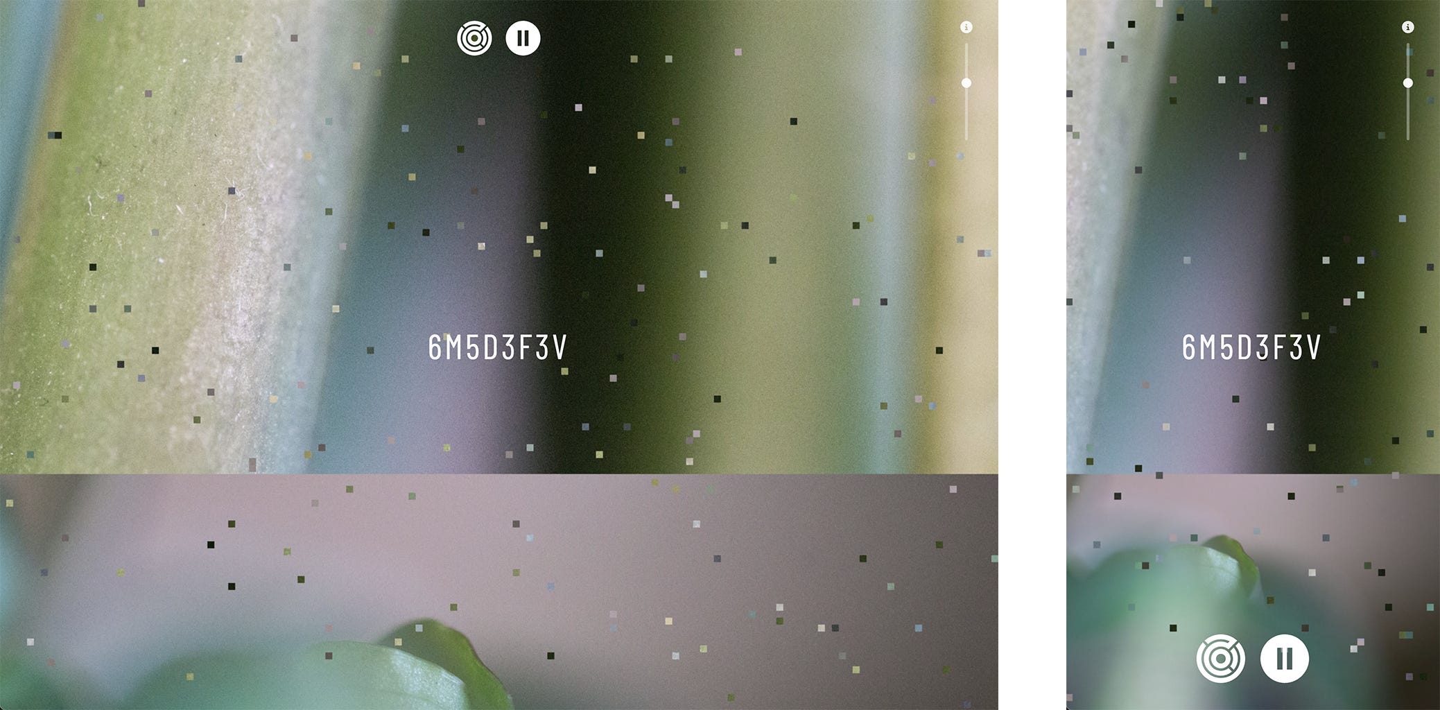
These are just test photos but I definitely like the textural nature the macro brings. Using two random (seeded) images together makes the pixel swapping a lot more interesting as it intensifies.
Once the pixel swapping was working it made me aware of how important the overall colour is in each photo, as the pixelation increases and it moves deeper into abstraction some interesting combinations can occur. This will definitely influence the photography phase, which is what we will dive into next…
Comments
Nothing yet. Say the first thing.
Sign in to join the conversation.