
Hey! Welcome to Since Last Commit, a publication where I share all of my learnings while building Android applications. These days, I am building the Hangar App, more about that later.

With Android 13 (API 33), we were introduced to themed icons. A feature that allows app icons to change from its default color to a color scheme inherited from the home screen background or theme color set by the user. In my opinion, this made the home screen feel less busy and presented an opportunity to personalize my mobile space. I even found myself grouping all of the apps that supported themed icons and moved the others to a different page to stay within my theme palette.
Real estate within the app ecosystem is important. There is a large investment cost to obtain a user from the Google Play store (that is where app store optimization comes in) and then to retain the user with constant usage of the application. A user may have a large number of apps installed on their device, so there is a challenge of where your is placed amongst the competitors.
Apps placed on different screens on the device may not get used as often as the apps that are always visible to the user on the home screen. It is an interesting thought to learn the factors behind the user’s decision to place a specific icon in a certain place. There is an opportunity to optimize the real estate portion of an app (through various means of course) to maximize the number of times a user sees the app and open it.
I started to play around with themed icon on my personal app. I will post some useful resources below, but the process was pretty simple. If you have a project that already has an adaptive icon (might be labeled as ic_launcher_app.xml), you will see that it has
a background layer pointing to a drawable (usually a color)
a foreground layer pointing to a drawable (of an asset vector)
To support themed icon, a new monochrome layer will need to be added. Example of the implementation can be found below. If your app icon is simple, you can use the same foreground drawable in your monochrome layer. If you do not have an adaptive icon or require any advanced customization, check out the official documentation in the resources below.
<?xml version="1.0" encoding="utf-8"?>
<adaptive-icon xmlns:android="http://schemas.android.com/apk/res/android">
    <background android:drawable="@color/ic_launcher_app_background"/>
    <foreground android:drawable="@drawable/ic_launcher_app_foreground"/>
    <monochrome android:drawable="@drawable/ic_launcher_app_foreground"/>
</adaptive-icon>Android Studio’s preview (with the .xml file of the adaptive icon opened) can be used to test out the themed icon. After I was happy with a quick check, I installed the app on my physical device and tried out different themes with my favourite background while turning light and dark mode to check out different state the themed icon could be in. Here is how it turned out.
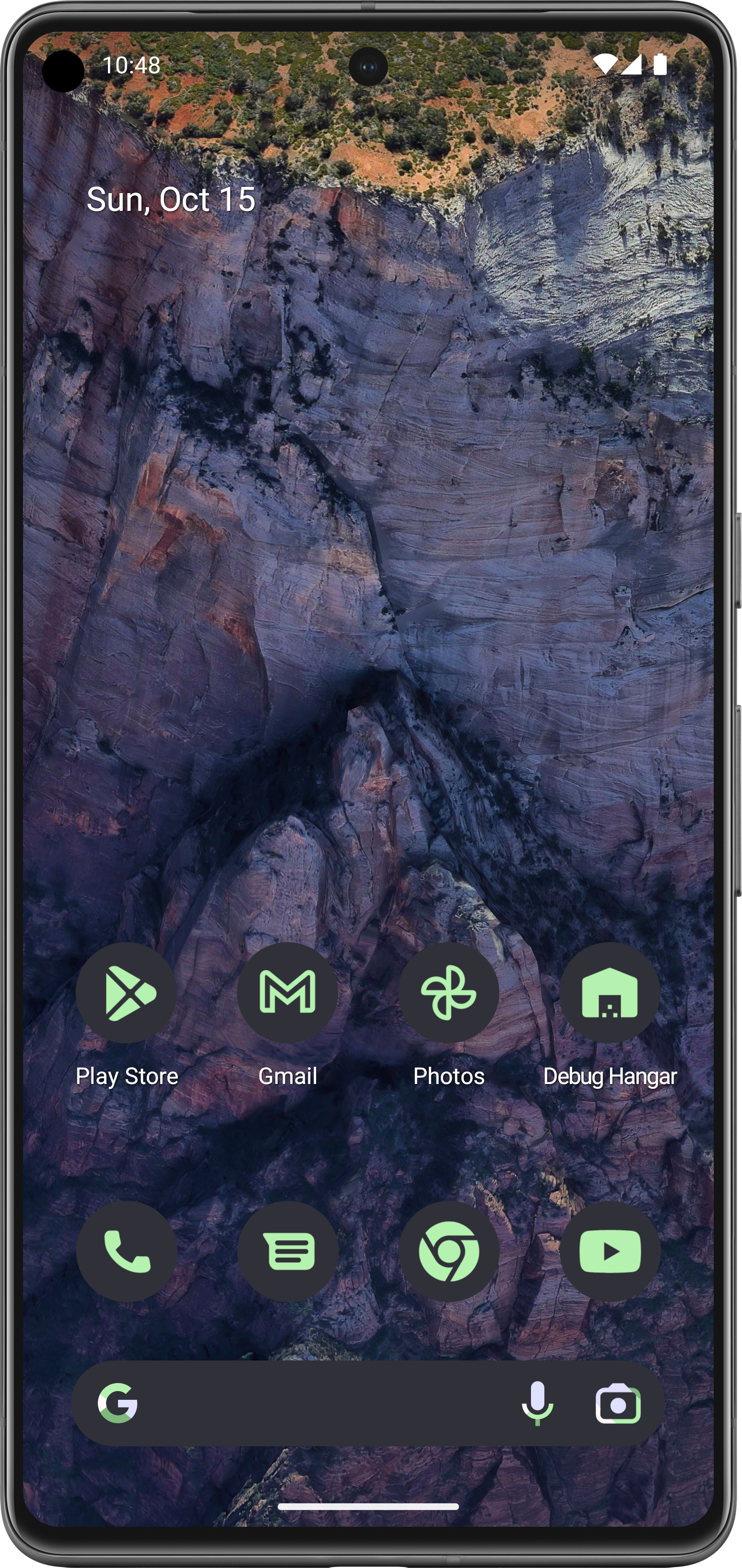
Adaptive icons were introduced in API 26 to provide additional flexibility of app icons being rendered on devices from different manufacturers. The size, shape, visual effect and coloring of an app icon can be unique to each device configuration. In this case, adaptive icon require a background layer (a drawable defining the background color) and a foreground layer (an asset representing the icon). With the monochrome layer, you can provide the same foreground drawable asset (if the shape is simple) or provide a different asset that better supports the monochrome asset.
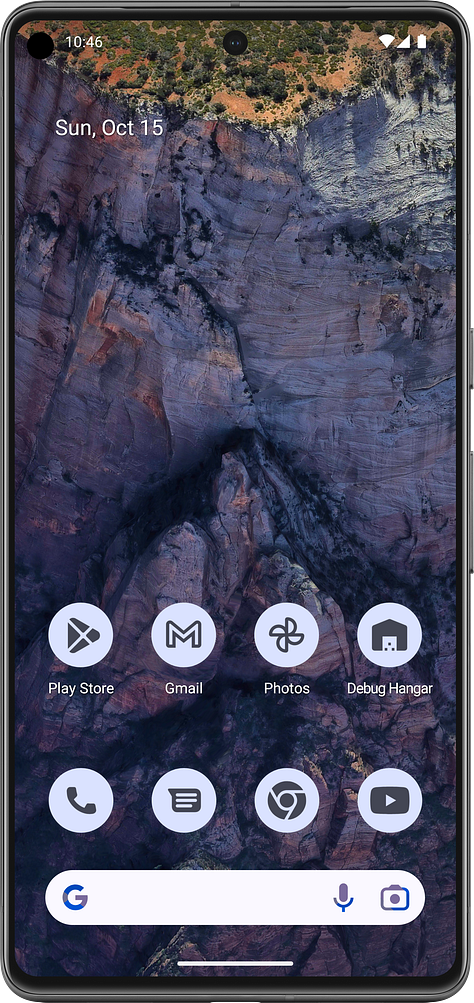
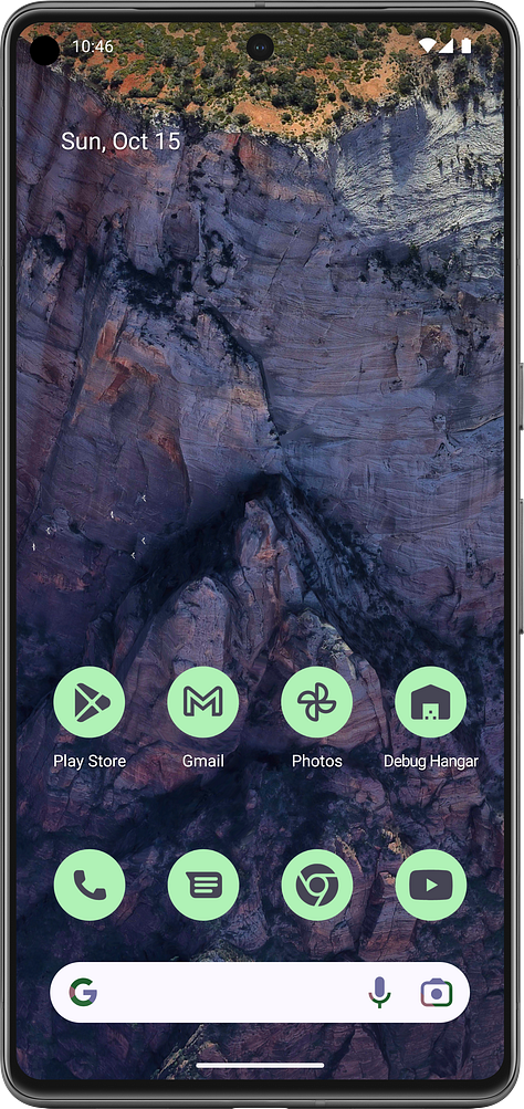
After adding the monochrome layer, here is how the Hangar app icon looks like on different theme color configurations.

Try out the Hangar on the Play store
That’s all for this post. Here was a quick summary of what I have been working on lately on the Hangar Android app. If you are interested in following my Android development journey, consider subscribing and sharing this newsletter. Thanks!
No posts
Comments
Nothing yet. Say the first thing.
Sign in to join the conversation.