
Hi everyone,
On my Substack I often try to articulate my personal creative frustrations. Things I "hate" about my own work, decisions I'm trying to understand and trace back to where they came from. I've been thinking about something that comes up in almost every campaign I work on, especially for the bigger, well-known brands with images to protect and serious budgets behind their campaigns. I've sat with this one for a while because it touches a part of the industry that's hard to talk about without being misread.
The images are getting safer. Every year, every season, every brief. The lighting is safer. The sets are safer. The concepts are safer. The copy is safer. We have optimised campaigns for the absence of risk and removed, in the process, the thing that made people feel something when they looked at a brand. I notice it in my own work and decisions all the time.
What I want to write about isn't a culture war piece and it definity isn't a complaint about progress. It's about a process. About what happens to images when a brief has to pass through six rounds of approval before it reaches anyone who will actually photograph it. About how that process produces a particular kind of flatness in the image because of the layer of decisions made above it.
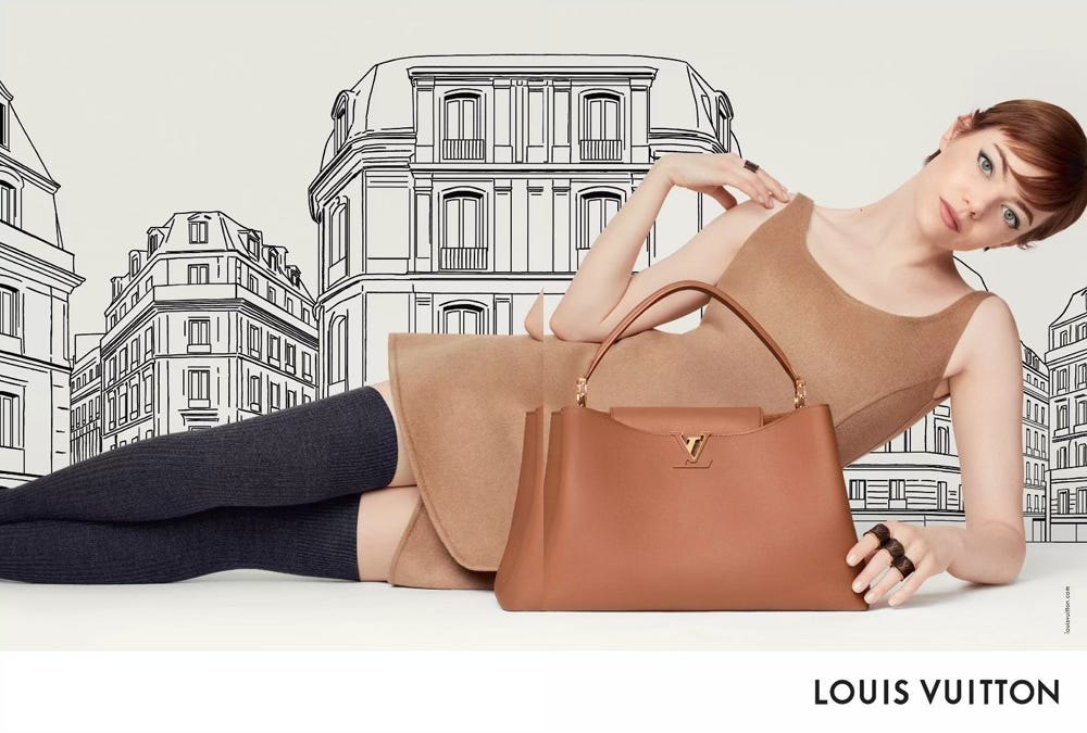
On May 21st I'm reopening the Strategic Art Direction programme for the summer. Eight weeks, starts June 10th. It's the course where I teach the full process behind how I think about and build images. On May 20th paid subscribers and the waitlist get first access. It’s been sold out everytime. If that sounds like something you need, you can get on the waitlist here so you're first to know when spots go live:
Head to the ART DIRECTION chat on the Substack app or website, because I am offering 3 scholarships.
Here is what a typical campaign brief looks like in 2026. I am paraphrasing, but if you work in this industry you'll recognise it immediately.
"The campaign should feel elevated. It should feel inclusive. It should feel authentic. The casting should reflect our audience. The imagery should be timeless but culturally relevant. We want it to feel bold but not polarising."
That brief says almost nothing. Every word in it has been chosen to avoid being specific, because something specific could later be misinterpreted. "Elevated" means very little. "Inclusive" started as a creative intention and has become, in many briefing rooms, a compliance category. "Bold but not polarising" is a phrase that asks the art director to do something interesting and quietly make sure no one notices.
I sit in these meetings. I read these decks. The people writing these briefs often want something braver, that's the strange part. What softens the brief isn't a lack of ambition from any one person. It's the cumulative effect of a process designed to filter risk out of every word. A casting choice that might be misread. A reference that could be taken out of context. An image that might end up in a screenshot online with a caption the brand never intended.
So the brief gets softened. The concept gets softened. The imagery gets softened. By the time the campaign goes live, it sits comfortably alongside every other campaign that went through the same process. We stopped feeling attached to brands because, for the most part, brands stopped saying anything specific. The ones that did say something, in their own particular ways, built communities that feel alive. They made a point and accepted that some people would not love it.
I want to be specific about what safety looks like in art direction decisions right now, because I think people outside the industry imagine this is mostly a debate about political correctness. It isn't. It's about something more granular: the way every part of an image gets routed through risk assessment before it ever reaches a set.
Copy that has been through legal three times. By the time a campaign tagline has been reviewed by brand safety, legal, and regional marketing, it has been stripped of anything that could be interpreted in more than one way. Ambiguity is what makes language interesting. A line that can only mean one thing is usually a line that means very little. I get the worst migraines from being asked to write taglines that need to do five things at once and then watching the only working version get flagged in legal review. By round four I'm submitting word combinations in bulk and hoping one survives.
References stripped of meaning. I worked on a campaign last year where we had a strong concept built around a specific cultural setting. We had thought about it carefully, including how it would land for the people whose world we were drawing on. The concern came up in approvals that the setting could be read in a way the brand didn't intend, and the conversation that followed never got beyond risk. The set became a white studio. I love a white studio when it's chosen, but this one wasn't a creative decision. It was the absence of one. It is what you get when every reference that could mean something gets removed because anything that means something could also mean something else, and the process is not built to hold that complexity.
This is the part I find most difficult to write about, because the concerns raised in those meetings are not always wrong. Some references really do need careful handling. The work of engaging deeply with a reference, understanding its context, talking to people for whom it matters, is real work and worth doing. It’s also harder work than removing the reference, and it costs more time, and so the easier path tends to win in the room. The result isn’t a more thoughtful image. It’s an emptier one.
Casting from a list rather than for an idea. There’s a difference between casting for an idea and casting from a checklist. When a creative director casts a face because that face carries a specific energy, a specific tension, a specific relationship to the clothes, that’s a creative decision. When casting becomes a process of confirming that the line-up satisfies a long list of internal stakeholder requirements before anyone has decided what the image is actually about, you can feel the difference. The audience can feel it too, even if they can’t name it. One produces images with charge. The other produces images that look like a stock library with better lighting.
This isn’t an argument against considering who is in an image. The composition of fashion imagery has changed enormously in the last decade and that change has been long overdue and necessary. It’s an argument against treating that consideration as a substitute for having a creative idea. Casting that’s only doing the work of risk management isn’t serving the audiences the brand says it wants to reach. It’s serving the brand’s approval process. Casting that’s doing both, that has a real idea behind it and is also thoughtful about who appears, is what the strongest work has always done.
Casting that buys credibility instead of building it. There's another version of the casting problem worth naming. When a brand can't quite articulate what it stands for, the temptation is to cast a face that arrives with credibility already attached. A musician currently in cultural conversation. An actress with a film out. A model who has already fronted three other luxury campaigns this season. Each of those choices can be a strong creative decision when there is a real reason for it. They become a problem when the brief was always going to be soft and the celebrity is doing the work the concept should have done.
The image looks important because the face is important. But the face is also fronting a watch campaign, a perfume campaign, and a denim campaign in the same month, and the brand becomes one entry in a portfolio rather than the place where that person made sense. When everyone casts from the same short list of culturally pre-approved faces, every campaign starts to feel like the same campaign with different products in front of it.
I like to keep a folder of campaigns that could not be made today. Not necessarily because they would offend, but because they have a point of view so specific that someone, somewhere, would object. I love researching them and reinterpreting them in today's context through a different concept to see what it does to the zeitgeist. I call it soft provocation, a very soft one.
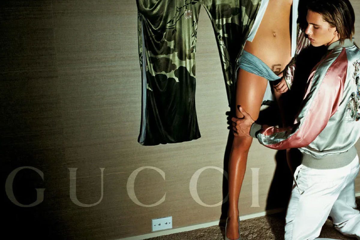
Tom Ford's Gucci campaigns weren't great because they were provocative. They were great because they were specific. Every image had a point of view about desire, about the body, about who was looking and who was being looked at. You could disagree with that point of view, and plenty of people did. But you couldn't ignore it. The images had charge because they stood for something, and standing for something always means standing against something else.
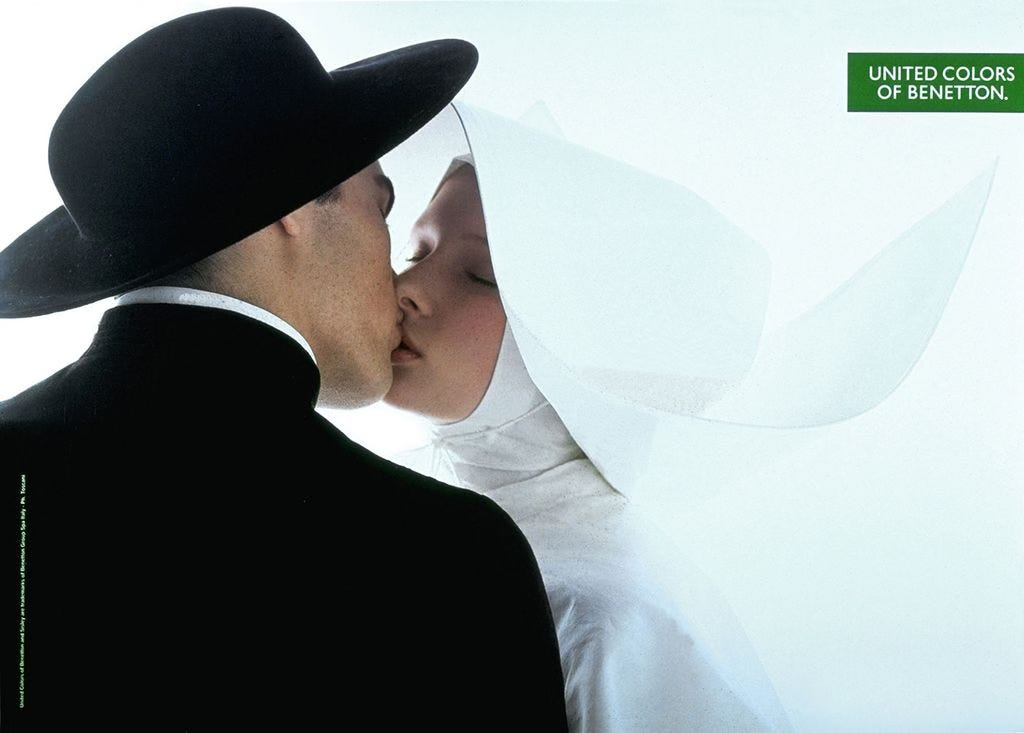
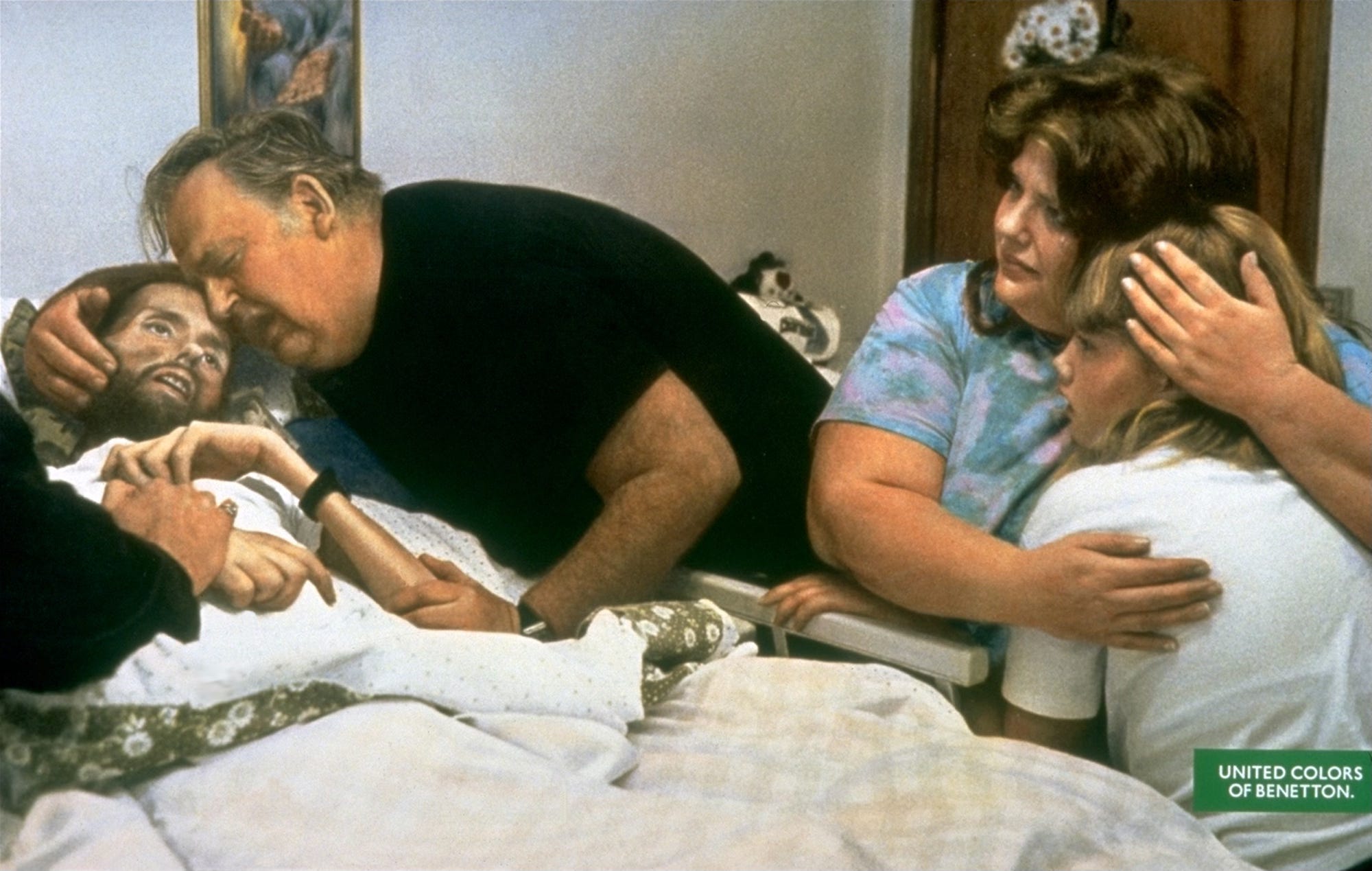
Toscani's Benetton campaigns were not advertising in any traditional sense, but more served as arguments, and that was because of how the public reacted to them. They used the space a clothing brand normally fills with product shots to say something about race, death, religion, and the body. Were they controversial? Obviously. Did some of them cross lines? Arguably. Here is what matters thirty years later: people still talk about them. They still feel something when they see them. Name one Benetton campaign from the last ten years. You probably can't, because the brand stopped saying anything.
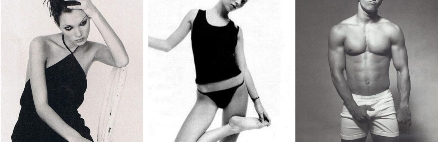
Calvin Klein in the 1990s understood that a brand that makes some people uncomfortable is also a brand that makes other people feel like they belong. That discomfort is a mechanism. When you see an image and feel "this is not for me," you are also defining the group of people for whom it is. That boundary is what creates belonging. A brand that's for everyone is a brand that's for no one.
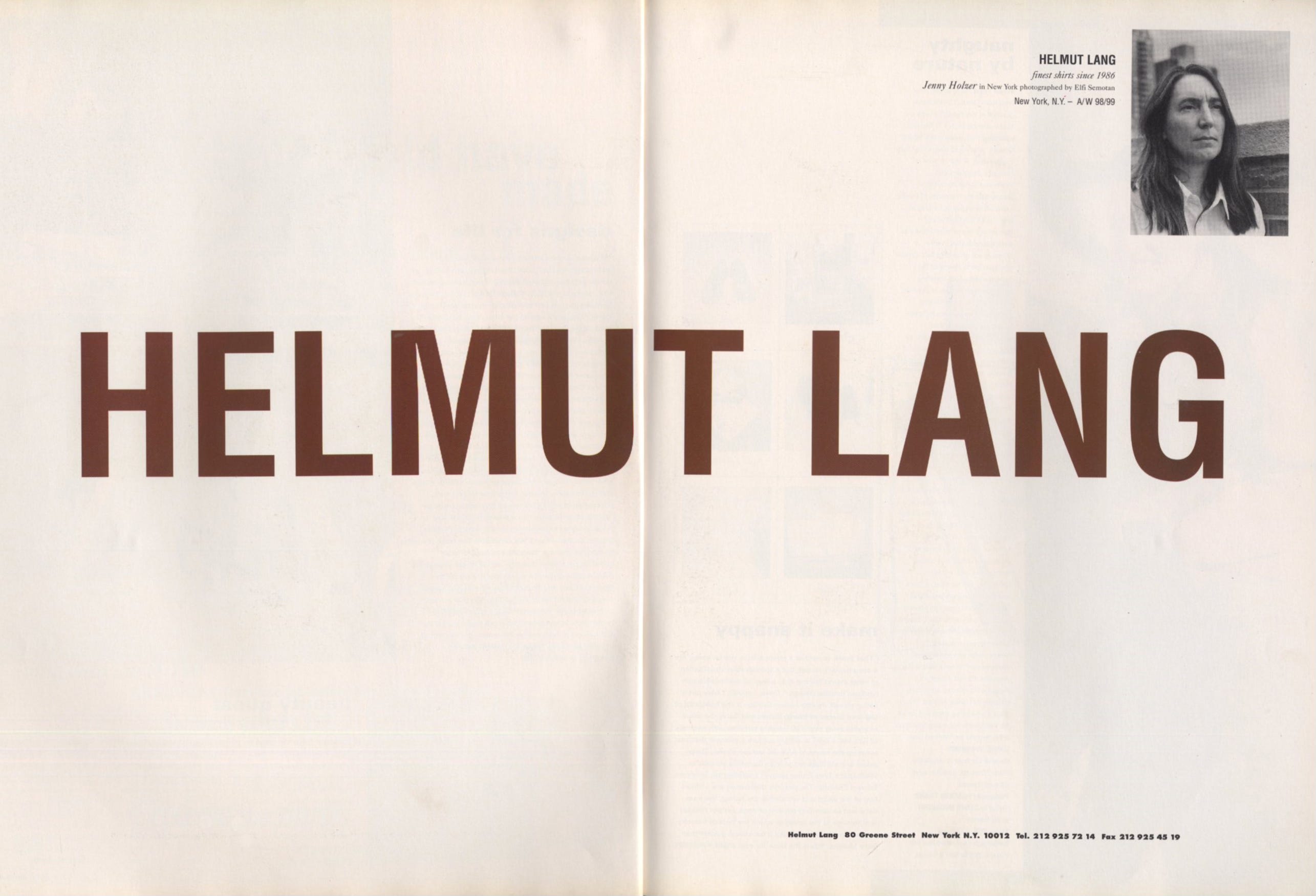
It wasn't only about sex or shock either. Helmut Lang provoked people by refusing to give them what they expected from a fashion image. No glamour. No performance. No desire. The images were flat, matte, almost rude in their plainness. That was the position. It worked precisely because some people hated it. The people who understood it felt like they had found something that the rest of the industry hadn't caught up to yet. That feeling is what builds a cult following.
The argument here isn’t that the work used to be braver and now isn’t, we can arguably talk that the 90’s was all about desire and sex and that in itself is a provocation. The argument is actually that being specific is harder now and some brands are still doing it well. The ones doing it well aren’t necessarily the loudest. They’re the ones that have decided what they actually believe about their world and let that belief shape every part of the image.
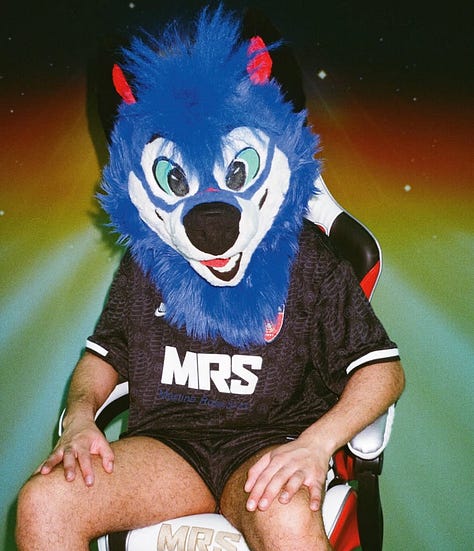
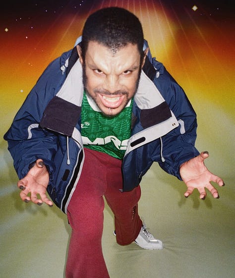
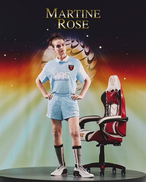
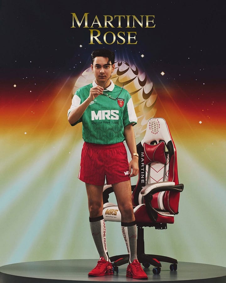
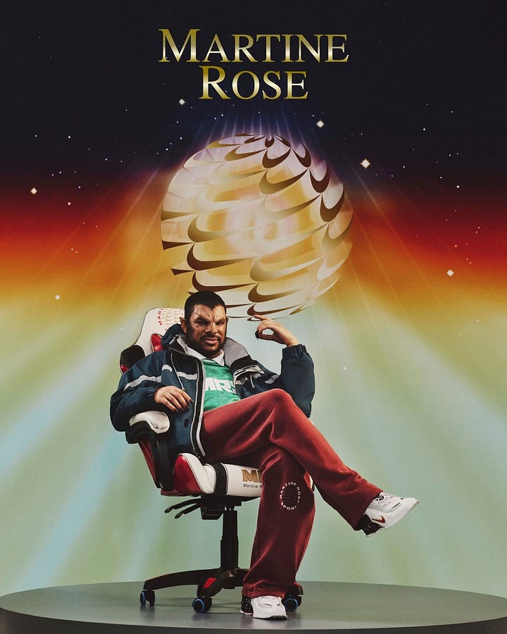
Martine Rose builds her work from a specific point of view about British subcultural style: working-class menswear, ravers, football casuals, queer London. The casting refuses to flatter the viewer. The locations look like real places where real people would actually be. Some campaigns go all in on bold graphics that feel niche to the target group, but are reinterpreted into the brand’s world. Some people don’t connect with it. That’s part of the design. The people who do feel like they have been seen by a brand that already knew them.
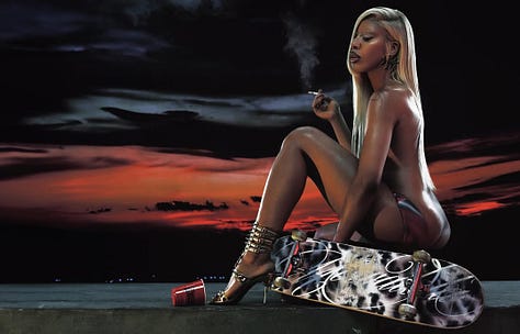
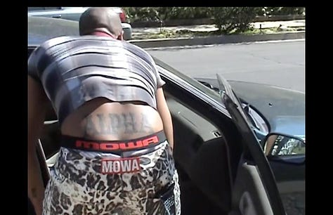
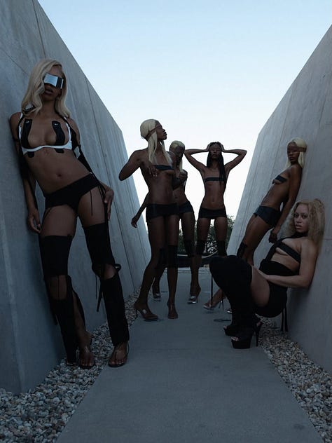
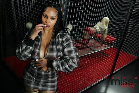
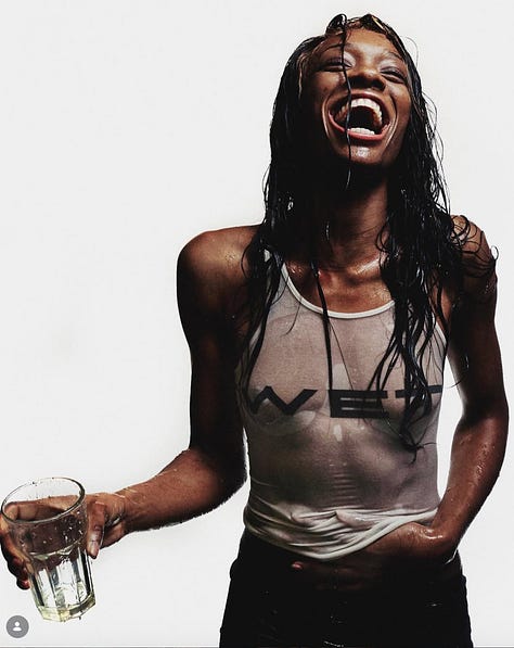
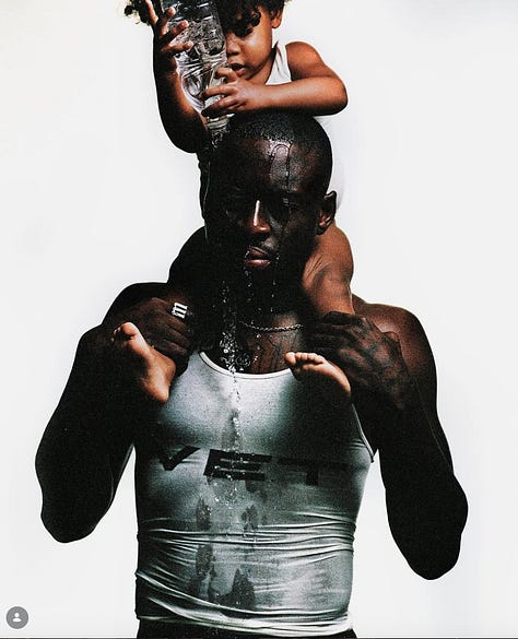
Mowalola makes images about sexuality, gender, and Black bodies that aren't softened for crossover audiences. The work pulls from Nigerian heritage and queer London nightlife and doesn't translate either for outsiders. It either resonates or it doesn't, and the brand has built a real following among the people for whom it does. That clarity is what gives the imagery its charge.
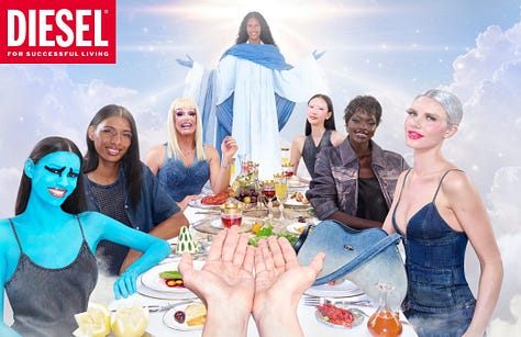

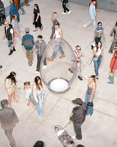
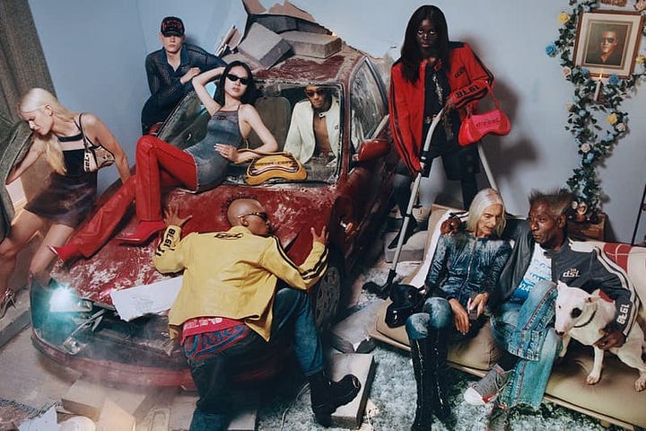
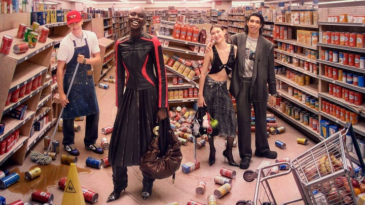
Diesel under Glenn Martens (Diesel has a big history of very bold campaigns!) has rebuilt the brand around denim, characters, and a kind of chaotic confidence that most luxury houses spent the last decade systematically removing from their imagery. The shows and campaigns get talked about because they are willing to be one thing, very loudly, instead of trying to be five things quietly.
What these brands share isn’t a visual style, quite the opposite really. It’s a willingness to be specific about who they are and who they’re for, and to accept the consequences of that specificity. That’s the mechanism the rest of the industry has misplaced. And that makes each thing they put out in the world part of their own argument and unmistakingly theirs.
Something has changed in the last five years that goes beyond brand strategy. The distance between what an image actually says and what people project onto it has become enormous, and the response from brands has been to remove anything from their images that could carry a second meaning. Second meanings are where most of the interesting art direction lives. An image that can only be read one way isn’t really an image. It’s a product shot with a model in it.
I’m not saying audiences are wrong to read carefully. They live in a media environment where subtext is often the real text, where coded messages do exist, and where the most charitable reading of something can occasionally be the naive one. The work of being read carefully, of understanding what your image actually says before you put it out, is part of the job. What I’m describing isn’t a problem with the audience. It’s a problem with how the industry has chosen to respond, which is by stripping out the parts of the image that would have given the careful reader something interesting to read in the first place.
The answer isn’t to go back to an earlier era of fashion imagery. That era had real failures: the near-total whiteness of the work, the thinness mandates (which I feel like we are slowly going back to today unfortunately), the assumption that one viewer’s gaze was the only gaze that mattered. Those weren’t aesthetic choices, they were structural ones, and the industry’s reckoning with them has produced work that’s broader, sharper and more interesting in important ways.
What I’m describing is a process problem inside a real correction. The correction isn’t the issue. The issue is that the approval process has absorbed the language of inclusion and turned it into compliance language, where “inclusive” stopped meaning “thoughtful about who this image is for and what it does” and started meaning “structured so that nothing in it can be objected to.” Those are very different briefs. The first one produces images with a point of view. The second one produces images that pass through review without friction.
The brands that will build real communities in the next decade, the kind where people feel like they’re part of something, will be the ones willing to be specific. Specific is a different word from offensive. Specificity produces disagreement because the moment you say “this is what we believe,” you’re also drawing a line around what you don’t. That line is where belonging starts. Brands that try to belong to everyone end up belonging to no one.
I think about this every time I sit down to work on a brief. The question used to be “is this good?” The question has become “will this survive the approval process, or will I spin in circles?” Those are different questions. The first one produces strong images. The second one produces safe ones.
As art directors, we have a choice in the room. We can keep making images that are designed to pass through the filter without friction. Or we can start making the case, in the brief, in the concept, in the casting conversation, that friction isn’t the enemy. Friction is the proof that the image means something. The work of holding the brief open long enough for a real idea to land, of pushing back when “safe” is being used as shorthand for “empty,” that’s part of the job too.
The industry has become so afraid of the wrong reaction that it has eliminated the possibility of any real reaction at all. After being able to articulate this, my own challenge for the coming months is to rethink how I bring conversation, excitement, feeling and play back into the work I make. I’d love to know what you’re noticing in your own briefs and on your own sets.
Love,
Zoë
Join the ART DIRECTION chat with all your career- and creative related questions! (no self substack promotions please) but it’s a great way to find connections or get answers to what you need from a global creative community.
Comments
Nothing yet. Say the first thing.
Sign in to join the conversation.