
There's no right or wrong colour to wear today. There's only the mood you're in, and whether your outfit is successfully translating it or not.
My husband and I were talking about rule-based versus resonance-based ways of operating (he wrote about it here), and I haven’t stopped thinking about it since. He is teaching this from a sound point of view, and I’m sharing this from a visual (= style) perspective. Both are ways to navigate a room and express yourself.
Rule-based comes from outside you: someone else’s formula, applied to your life, it sounds like “do this, don’t do this, follow this recipe”.
Resonance-based comes from within — you, sensing what’s true for the moment, able to explain why it’s right, because you feel it before you can even name it.
Getting dressed works the same way:
You can follow a formula — the textbook pairing, the “correct” way to wear a colour, the outfit someone else told you was right for you…
Or you can get dressed from resonance: tuned into your own mood, your own taste, what feels true for the version of you showing up today. Tuned in with your environment.
One comes from outside. The other comes from your center.
This is what the Tibi Color Wheel actually can be when used in resonance with you.
But proceed with caution, my dear, as it can appear as a rulebook telling you what’s correct. I’ve been using this tool1 for two years now, so let me share from my lived experience.
This matters because your visuals — how you dress, look, and present yourself — tell who you are before you’ve said a single word.
You’ve felt it before: when your outfit is in resonance with your mood, your environment, and the job to be done, you feel GREAT.
Amy Smilovic, founder and creative director of Tibi2, built this wheel out of necessity: a visual way to instantly grasp how to combine colour with intention. Used to design collections and educate customers, the Color Wheel is made of four rings, moving outward from black at the center (ring 1) to the boldest, most saturated colours at the edge (ring 4). My wardrobe is even organized following this logic.
But I’m not here to reproduce her whole system. Amy and her team spent years teaching it during her weekly Style Class, where live styling and shopping are interwoven.
I’m here to tell you what happened when I stopped reading it as a rulebook and started applying it and using it as a mirror: how it helped me decide what to buy, what to leave behind, and what to wear in my daily life to feel like myself — chic and chill, grounded yet creative.
Because the Wheel is not a fortune teller. It doesn’t tell you what will ultimately happen, but it tells you what’s possible. Not one possible outcome, but a variety of life lines depending on the colour choices you make that day. Just like the next step you’ll take, it helps you match the mood you’re actually in.
So before we go further: don’t ask “what am I supposed to wear.” Ask: “how do I want to feel today.”
✦
And how I think about them when getting dressed.
It has its own ring, because just a splash of black in an outfit will bring its specific quality: something modern, edgy, serious, strong, mysterious, moody, severe, sharp…. Black has its own tone. It’s not quiet, and can feel like a statement.
Black is precise.
For me, a splash of black is always like the full stop in your (visual) sentence. Often, for me, if it’s not worn as a top and/or bottoms, it’s a black pair of sunglasses, black ballet flats, or black sandals.
Consider texture and texture play, when adding black!
Play with: level of sheerness vs. opacity, flat vs. knitted, matte vs. glossy, smooth vs. shiny vs. croc embossed.
I tend to choose the option that gives me black + something more and avoid what feels one-dimensional.
My school uniform was navy and white, so whenever I see those neutrals together, I’m mentally sent back to this time: when all I had to do was get up early, get dressed in navy and white, study hard overtime — without ever having to think about trends, shopping, and personal style.
The neutrals are the white, cream, navy, brown, and grey. Easy-to-name colours, they feel reliable and familiar.
When worn in an outfit, they add something timeless, classic, refined, polished, crisp, and clean.
If it’s hard to name, then you’re probably looking at a Ring 3 colour.
They are nuanced.
Essentially muted and soft, they sit “in-between” neutrals (ring 2) and brights and pastels (ring 4), bridging the gap.
They are called: dusty blue, copper, mustard, teal, rust, mushroom, olive green, stone grey, plum, steel blue, sage… You’re tempted to say dusty, smoky, muddy, rusty, dirty, earthy, greenish, pinkish, brownish, etc. Not two people will name it the same way.
To find those shades, you can always look up the colour description on the website.
Amy Smilovic says it best: “Ring 3 is the missing link in most wardrobes. They are the least obvious choice, but they’re often the hues that bring everything together. They soften the edges of an overly classic vibe that an outfit made up of only Ring 2 can emit. They give creative confidence to a look.”
For this reason, they are the glue, the bridge, the connector.
They bring a sense of ease, calm, and softness — not only you feel calm, but the person looking at you feels calm too, because it’s visually soothing.
They add depth and interest. It’s deeply satisfying, actually!
What works the best and the hardest for me is when a Ring 3 “-ish” colour has also an interesting texture (sheer, glossy, shiny). It adds an extra dimension while keeping the soothing quality. This brings even more nuance and range.
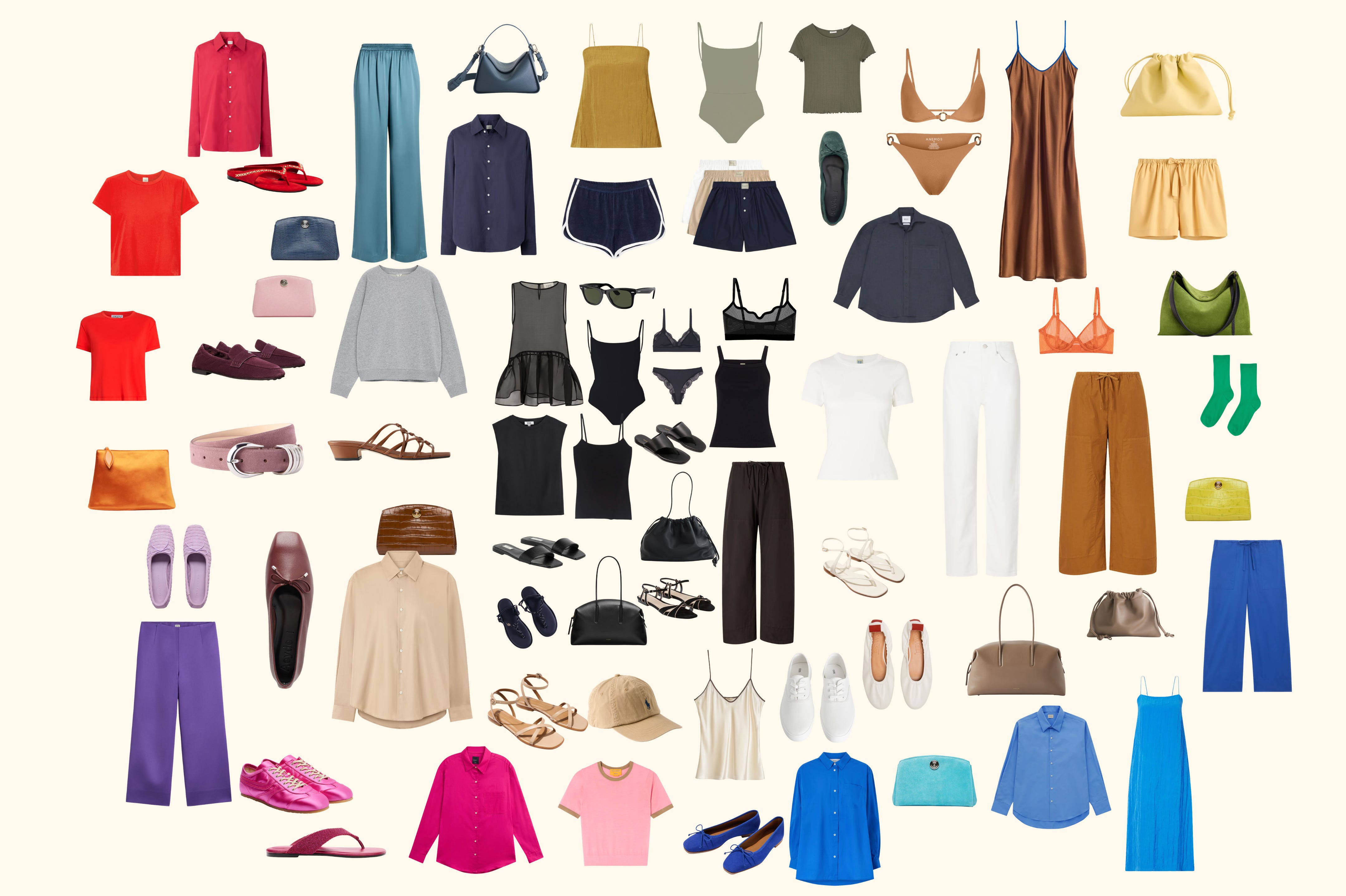
For example, the taffeta pants, this silk dress, this nylon quarter zip parka in sage or a suede shoe:
Easy to name, they are bright and pastel colours.
Think: what you’ll find in the Peppa Pig universe.
Primary and secondary colours.
They bring high energy, punch, excitement, joy, energy, and good chaos.
Just one pop of Ring 4 can bring a lot of energy and “wake up” your outfit.
A key piece for me this season has been my crisp blue shirt. I have been wearing it a ton, and it always gives me that energized feeling.
A personal observation: I love when the bright and pastel have an interesting texture, finish, or shape.
Think: a pink cashmere tee, cobalt suede flats, pink beaded sandals or pink satin trainers:
✦
The Color Wheel isn’t “the rule”.
It’s a compass… a tool to check how you want to feel, and see what to add, remove, or adjust to get there.
Three concrete, low-effort, and high-reward actions to start using this.
→ Save and restack this letter to find it easily whenever you need to revisit it.
Pick one action, and try it this week:
Merchandise your wardrobe.
Organise your wardrobe by colour ring!
From left to right: Black → neutrals (brown, navy, grey, cream, white) → “-ish” colours (ochre, dusty pink, burgundy, terracotta, olive, etc.) → brights and pastels (true red, blue, green, pink, purple, yellow). Refer back to the Color Wheel if needed.
Your wardrobe will feel new. Like a window display just got swapped.
Investigate your taste.
Open your Screenshots folder.
Look for what you saved because it made you feel something — style images, but also nature (still the greatest muse for colour). Notice the pattern. Notice the pop, if any.
Then describe it in moods, not colours. “I like this rust tone” translates as “this feels grounded, warm, unshowy.” Then, translate it within your wardrobe, and wear it.
Alternatively, start a note in your Notes app, add a screenshot, and write down what you observe, like, and want to try.
Build your Outfits Bank.
You get dressed every day… so start documenting it.
A daily mirror selfie, saved to one folder. I call mine “Outfits Bank”, and revisit often to see what worked and what didn’t. Documenting your real life daily outfits is the fastest way to see what actually feels like you. And this, my dear, is priceless.
✦
A rulebook would tell you: wear this ring for this occasion, pair this colour with that one, follow the formula.
That’s outside-in.
It might look right.
It might even get compliments.
But it won’t feel like you, because it was never yours to begin with.
Resonance asks a different question: not “what’s correct”, but “what’s true, right now”.
Some mornings, that’s a strong Ring 1 — sharp, powerful, done explaining yourself. Other days, it’s a dominant Ring 3 — soft, unnamed, in-between, exactly like I feel.
The wheel doesn’t tell you which one is right.
It just gives you the language once you’ve already felt the answer = your vibe.
That’s the whole shift.
Not learning a new rule.
But learning to trust what you already sense… and finally having the colours to say it out loud.
One takeaway, in the comments?
You don’t need to have this all figured out. Just tell me: what’s one thing from this letter you’re taking with you? A ring that felt like you. A line that landed. Even just “I never thought about it that way”. I read every single one — and it helps me know what to write next:
Until next time!

❤️ If you liked this newsletter, clicking “like” helps more people discover my work. Leave a comment, I read them all!
🙂↔️ Find all the active discount codes here. Follow me on ShopMy, Instagram, and Tiktok.
If you’re a frequent reader, you know this is how I love to filter my edits. I hyper-fixate on one colour or one colour ring at a time, browsing for all of us…
From the Archive, 6 selected letters:
Comments
Nothing yet. Say the first thing.
Sign in to join the conversation.